
Bootstrap Table: Basics, Extentions and Examples

Effective website layouts are essential for presenting information in a user-friendly manner. And, Tables are a valuable tool for organizing content in a clear and accessible manner.
And then it comes to layout. A well-designed layout enhances readability and entices visitors to explore your site.
When it comes to creating clean and responsive tables, Bootstrap can be a game-changer. Bootstrap table allows you to present data in an organized and visually appealing manner.
In this guide, we’ll explain the basics of Bootstrap tables and provide downloadable examples to help you start your projects.
Getting Started with Bootstrap Tables
Bootstrap tables have additional benefits such as different table styles and responsiveness. First things first, let’s get started with the definition and instructions to set it up.
What is a Bootstrap Table?
A Bootstrap table is a component that allows you to display tabular data on a web page. It’s based on HTML’s <table> element but is enhanced with Bootstrap’s CSS classes to make it more flexible, responsive, and visually appealing.
Setting Up Bootstrap
Before we dive into creating tables, ensure you have Bootstrap integrated into your project. You can include Bootstrap in your HTML file by linking to its CDN or by downloading and hosting it locally.
<!-- Linking to Bootstrap via CDN --><link href="https://stackpath.bootstrapcdn.com/bootstrap/4.5.2/css/bootstrap.min.css" rel="stylesheet">Basics of Bootstrap Tables
To create a simple Bootstrap table, here we created a basic table with headers (inside <thead>) and data rows (inside <tbody>). The following HTML structure is the HTML structure of your first bootstrap table.
| # | First Name | Last Name | |
|---|---|---|---|
| 1 | John | Doe | [email protected] |
| 2 | Jane | Doe | [email protected] |
Enhancing Bootstrap Tables
Different bootstrap table classes can be used to add a more stylish flair to your table. These include:
- Striped Rows
- Bordered Table
- Hovered Rows
- Condensed Table
- Responsive Table
Striped Rows
Adding the table-striped class to your table will alternate the background color of each row, improving readability.
| html |
|---|
| <table class=” table table-striped”> <!– … –> </table> |
Bordered Table
To add borders to your table, include the table-bordered class:
| html |
|---|
| <table class=” table table-bordered”> <!– … –> </table> |
Hovered Rows
The table-hover class enables a hover effect on the rows, providing visual feedback to users.
| html |
|---|
| <table class=” table table-hover”> <!– … –> </table> |
Condensed Tables
Bootstrap lets you make your rows more compact with the table-condensed class.
| html |
|---|
| <table class=” able table-condensed”> <!– … –> </table> |
Bootstrap Responsive Table
Bootstrap makes it easy to create responsive tables that adapt to different screen sizes with a Table-responsive class.
| html |
|---|
| <div class=”table-responsive”> <table class=”table”> <!– … –> </table></div> |
Bootstrap table examples with codes
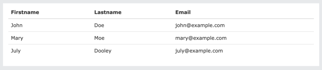
Bootstrap Basic Table
A basic Bootstrap table has light padding and only horizontal dividers.
The .table class adds basic styling to a table:
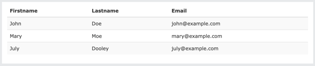
Striped Rows
The .table-striped class adds zebra-stripes to a table:
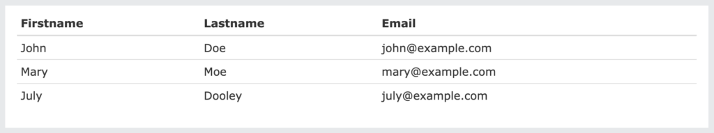
Bordered Table
The .table-bordered class adds borders on all sides of the table and cells:
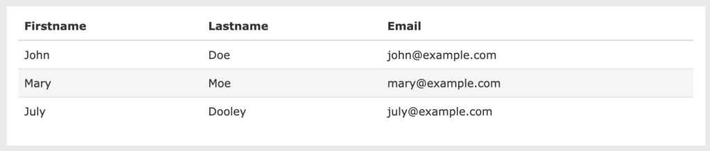
Hover Rows
The .table-hover class adds a hover effect (grey background color) on table rows:
Condensed Table
The .table-condensed class makes a table more compact by cutting cell padding in half:
Contextual Classes
Contextual classes can be used to color table rows (<tr>) or table cells (<td>):
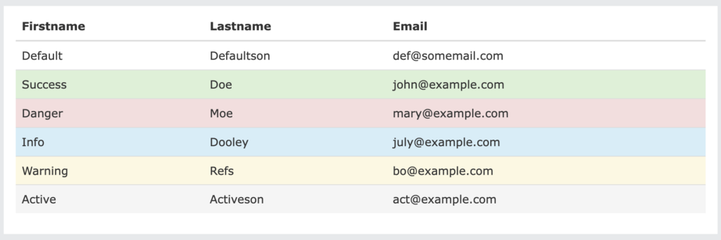
The contextual classes that can be used are:
[ninja_tables id=”17347″]
Responsive Tables
The .table-responsive class creates a responsive table. The table will then scroll horizontally on small devices (under 768px). When viewing anything larger than 768px wide, there is no difference:
| html |
|---|
| <div class=”table-responsive”> <table class=”table”> <!– … –> </table> </div> |
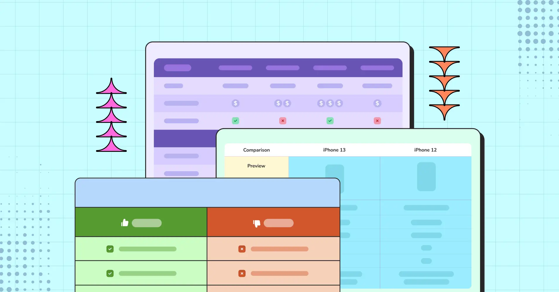
Bootstrap Table examples you can use and download
[ninja_tables id=”17366″]
Ninja Table Bootstrap tables
So these were the code things for your website tables. But You know what, Ninja Tables enables you to create all these tables and make them responsive with just a click. The best part is you can customize them in the easiest way possible.
Ninja Tables comes with 100+ table design customization with the 3 most popular design libraries including Bootstrap 3, Bootstrap 4, and semantic UI. Now you don’t need to code your every table.
Basic table with searching and sorting options
[ninja_tables id=”4697″]
Tables with striped rows
[ninja_tables id=”17356″]
Bordered tables
[ninja_table_builder id=”17357″]
Tables with hovering rows
[ninja_tables id=”10650″]
Create Smart Data Tables Easily!
Final verse
When choosing Bootstrap tables for your website, carefully consider what you aim to highlight for your viewers. Whether it’s a pricing table, a data table, or text content, think about the optimal placement of each section to ensure maximum readability.
Integrate elements like buttons, panels, checkboxes, and more if they contribute to better comprehension.
👉 Explore the best jQuery Table Plugins with advanced functionalities such as search, pagination, or sorting, and many other advanced options.
The most exceptional tables are those you tailor to your specific needs, as you possess the keenest understanding of what complements your website’s aesthetics and objectives.
Infuse your unique ideas into the design, ultimately drawing in a broader user base.
Or, use the last option to make it as easy as a pie. And customize your tables on every occasion. Create amazing tables for your websites and customize them however you want.
Ninja Tables– Easiest Table Plugin in WordPress
Hopefully, you got what you wanted from this blog. Follow us on Facebook, Linkedin, and X to get all the latest updates and blogs. Subscribe to our youtube channel for latest videos and tutorials.
Hey…wait!
Try the easiest table plugin made for you!


Add your first comment to this post