
Your Favourite Table Plugin Just Got Revamped!
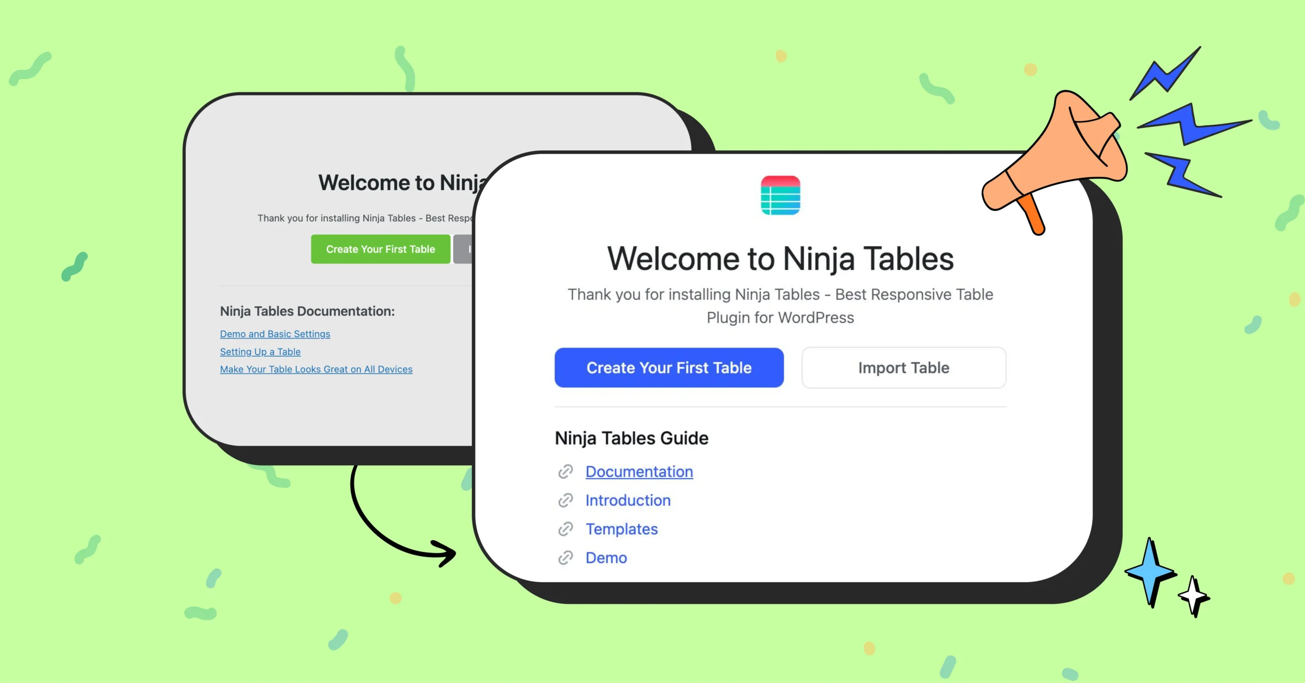
Hey Ninja Tables lovers! We have some exciting news for you! The plugin you know and love just got a fresh new look. Last time we brought you a brand new website with everything you need. This time, it’s the plugin UI.
Whether you’re a longtime fan or just getting started, we think you’ll love what’s new. And don’t worry, this UI update will not hamper the plugin features and functionalities at all.
Let’s dive into the details of this much-anticipated update!
What’s New: A Much Needed Makeover!
It’s been some time since Ninja Tables gave you something new and exciting. Remember the times we came up with a properly researched website design and a free table template page for you?
Our goal is ultimately making things easier and creating tables fun for you.
This is why we’re getting you a fresh new look for the plugin- Some minor changes in the UI, a complete UI refactoring.
- Removed visual clutter and turned to a clean and sleek design. No more outdated styles or design inconsistency.
- Easier navigation. Simplified menus, improved labels, and restructured content.
- The color palette is now simplified and follows a design structure. White space and redundancies are managed just right.
- Improved visual hierarchy. Elements were misaligned in the previous version for years. We’ve realigned components to a grid system and standardized spacing. And visual cues were added to guide users from most important to least important elements.
- Element spacing, padding, and alignment. The spacing between and within UI components (margins & paddings) are now improved, ensuring readability.
- Introduced radius to buttons, cards, input fields, and containers. Sharp-edged UI elements were updated with consistent border radius, which is easier on the eyes and adds a modern and friendly aesthetic.
- Improved overall user experience.
- And some guidelines where you might need them
Keep reading to see the changes.
Changes in Ninja Tables: Before and After
The Ninja Tables plugin UI is now polished and modernized for a smoother and more enjoyable experience.
With a refreshed color palette and a cleaner layout, table backend is now easier on the eyes, letting you have more fun in creating tables.

So, welcome to the brand new look!
All Tables
As soon as you start with Ninja Tables, you’ll see the new UI. Every nook and cranny is updated for this release so you don’t feel the clutter anymore.
The current design in the All Tables window looks like this:
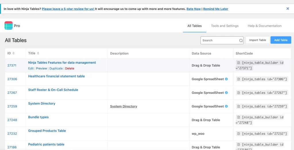
If you’re used to this layout, you’re in for a surprise (a good one!).
Now, the latest UI update has transformed the bulky and chunky-looking list.
This is the new update.
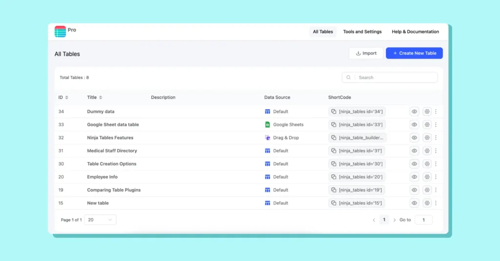
It’s clean and doesn’t look bulky at all. You can see the data source even clearly, thanks to the icons. And the “Preview” and “Settings” icons direct you to just where you need.
Want to delete or duplicate a table? Click on the three dots for those. No more hovering over a table to see the options. It’s all visible now.
Table Creation Options
Changes made here might catch you a little off guard. The current plugin UI showcases 9 table creation modes when clicked on “Add Table.”
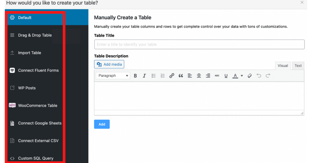
But now, the “Import Table” option won’t be available here. The list will now contain 8 table creation options instead of 9.
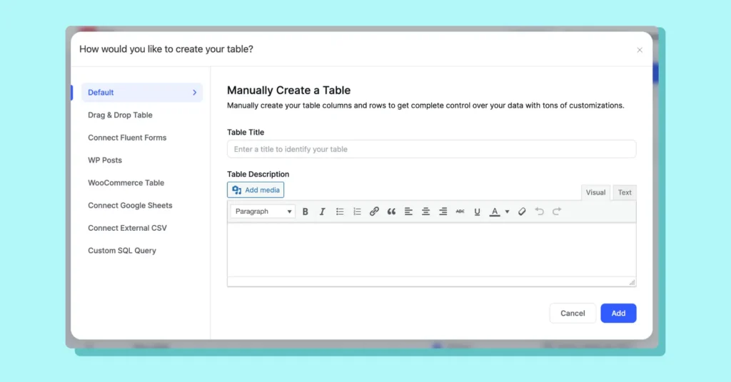
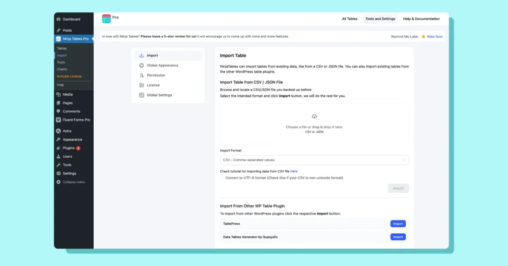
But don’t worry. The import option isn’t removed. You can still use this feature from the “Import” option in the sidebar or from “Tools and Settings” at the top. See the following image.
As we’ve listed the UI refactoring points, you can see how the buttons, placement, and colors look very modern from these images.
A small update but with a big impact indeed!
Table Features
Consistency and design guidelines are maintained all over the plugin. So all the tabs you click will show you their new looks.
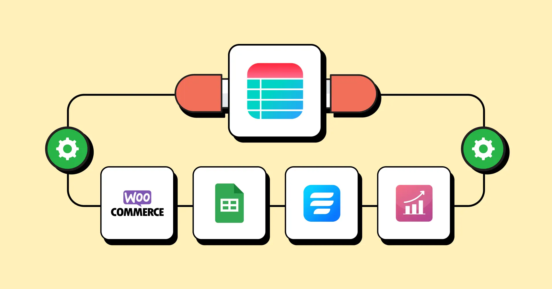
Custom filters, table columns, import option, conditions, transform value, and everything you have been enjoying for the past 8 years, now will look different, but will work the same way you want.
Table Design
Another significant change happened in the Table Design tab.
It was functional, sure. But this style won’t match the brand new aesthetic we’re introducing.
That’s why this tab also saw some changes. It now looks simpler and not too overwhelming.
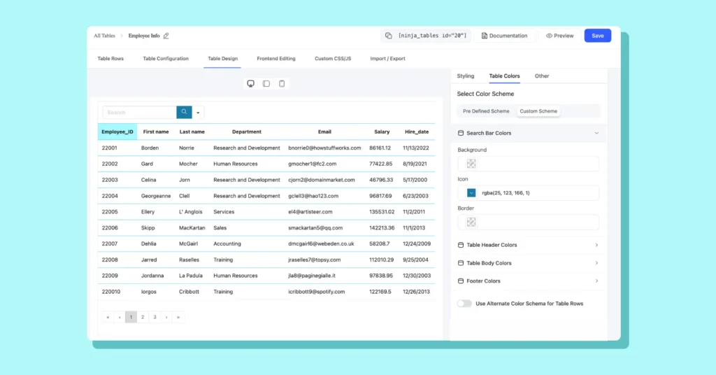
Table Backend
Now to the best part.
You must be wondering with all these tweaks and big-word changes, what if the table backend gets messed up?
Worry not because the table backend looks even better and clutter-free in the latest UI.
Here’s what the previous version shows you as a table backend.
This works for all of us. It’s classic and we’re used to it.
However, the icons look a little too prominent and the overall look is pretty boring.
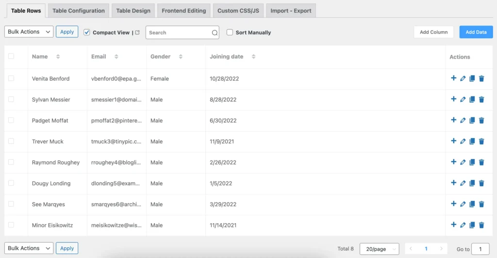
After the UI update, you’ll see it changed into the following.
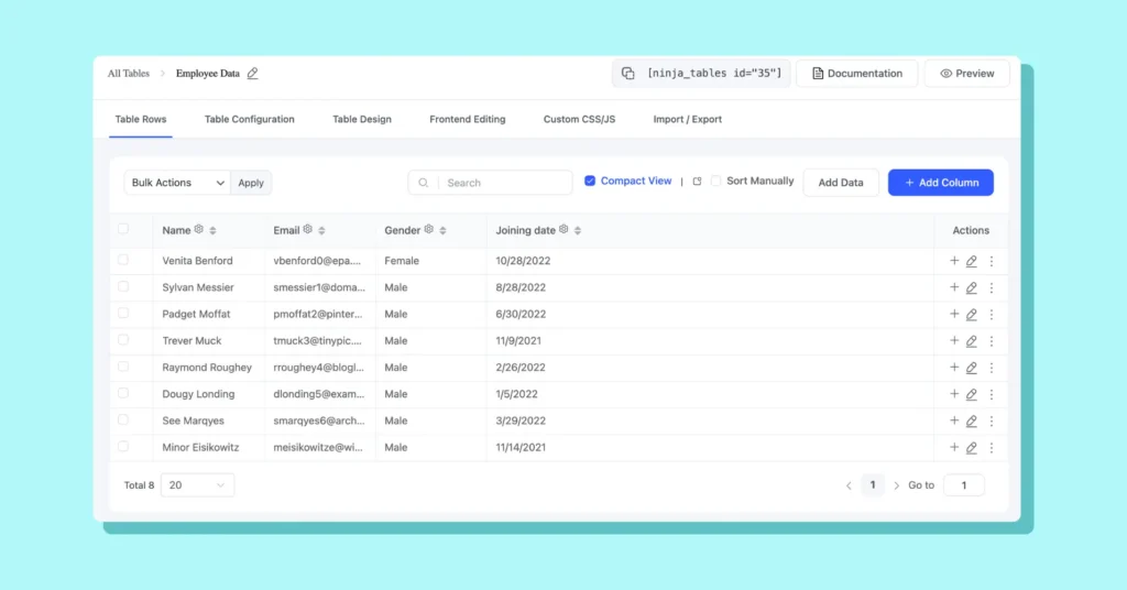
The table column settings icon is now visible without hovering and the icons match the sleek theme.
What to Expect in the Future
This simple UI update is just another beginning for us.
We’re committed to making Ninja Tables the best table plugin out there. In the coming future, you can look forward to:
- More performance and usability enhancements
- New features based on your feedback
- Continued focus on accessibility and ease of use
- New table templates so you can save more time
Your suggestions drive our roadmap and keep us inspired. So keep them coming!
Get In touch with Ninja Tables
That’s It For Now!
We’re thrilled to share this update with you and can’t wait to hear what you think. Explore the new UI, and let us know your thoughts.
As always, thank you for being part of the Ninja Tables community. Your support and suggestions are always our inspiration.
Stay tuned for more updates, and happy table-making!
Ninja Tables– Easiest Table Plugin in WordPress
Add your first comment to this post