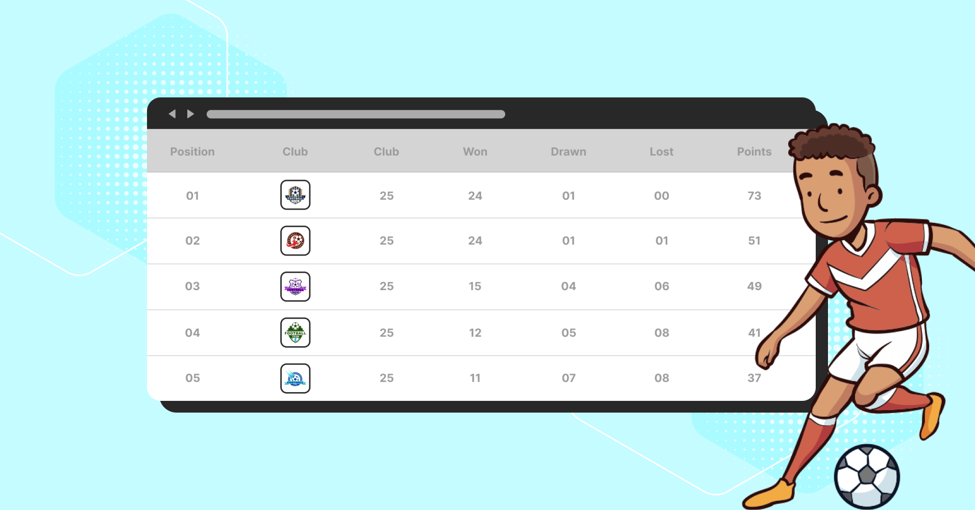
Comparison Table Best Practices to Boost Customer Experience

What is a buyer’s journey? Awareness, consideration, and decision?
An informative content or listicle can influence the awareness part of the journey. The pricing page can guide consideration, and the sales page can convince the customer for a decision.
But, one extended page can orchestrate all three of them. Yes, that is a comparison table. A comparison table helps users with their awareness, consideration, and decision.
In this article, we will talk about how to make a good comparison table, its importance, and best practices to boost your customer experiences.
Importance of a comparison table
If we talk about small purchases from eCommerce, there are not many situations where we need a feature comparison table. So, users will often say that it clutters the interface and that they never use it.
The reason is simple. Customers wouldn’t even think of comparing a few books or pairs of socks. But will they purchase a mobile or bike without exploring their options thoroughly?
In fact, when a customer is going to make a large purchase, sometimes they get locked up in choice paralysis. And as a retailer, you never want to see them in a deadlock situation like that.
That’s where a feature comparison table can help to simplify their decision-making process. As Joe Leech states in his webinar on purchasing decisions, users have either non-considered or considered purchases in mind when shopping online.
Non-considered purchases
Non-considered purchases are quick and low-effort. Whenever we need any ordinary stationery, weekend getaway, or something like that, we often purchase them on the go, skimming over recommendations and shopping by price, shipping, and convenience.
Considered purchases
Considered purchases are slow, high-effort, and need consideration. When we buy a refrigerator or bike, we explore our options thoroughly. No one wants to end up with something that isn’t good enough or doesn’t fit or to be replaced soon after.
In that case, a comparison table can improve user satisfaction a table can guide an indecisive customer skillfully to a sound decision in a moment of doubt before leaving the website or starting to look around.
Comparison table best practices
When creating a comparison table, you should think outside the box. It not only works simply to differentiate two products or services but also aids in potential clients’ awareness, consideration, and decision-making.
Now, what makes you stand out from the crowd when all the brands use comparison tables?
Following some strategies and best practices can make your table efficient and benefit you with many loyal customers.
- Compare up to five items in a comparison table
- Use meaningful attributes and be consistent
- The comparison table should be easy to skim
- Sticky column headers are a must
- Highlight the most preferred product
- Make an SEO-Friendly product comparison page
- Second opinions matter, as do shareable URLs
- Optimize the comparison tables for mobile devices
Compare up to five items in a comparison table
A comparison table with more than five items to compare can be confusing. To make things simpler for the visitors, restrict the options or items.
If you discover more than five identical products from other manufacturers, you can reduce the number of possibilities on a comparison page by evaluating them.
Use meaningful attributes and be consistent
One of the biggest problems with most comparison tables isn’t their design; it’s content. A handy comparison table becomes useless when attribute information is incomplete or inconsistent across similar offerings.
You should include qualities in your comparison table that your users will truly care about. Don’t just fill the table with every piece of metadata you have because it will make it difficult for users to perform their tasks.
Try contextualizing unfamiliar terminology whenever you can and relating nebulous characteristics to specifics. Additionally, you can Include links to information or in-context tooltips with definitions to give meaning to obscure properties.
| Features | Ninja Tables | wpDataTables | TablePress | WP Table Builder | ||||
|---|---|---|---|---|---|---|---|---|
| WooCommerce | ||||||||
| Google Sheet data sync | ||||||||
| Fluent Forms | ||||||||
| WP Posts | ||||||||
| Charts | ||||||||
| Simple Table Creation Options | ||||||||
| Drag & drop | ||||||||
| Pre-built templates | ||||||||
| Conditional formatting | ||||||||
| Table design | ||||||||
The comparison table should be easy to skim
It takes a lot of effort to weigh the advantages and disadvantages of various items. Make sure your users can concentrate on the crucial aspects. Make the table simple to scan for differences, similarities, and keywords.
- Maintain the regular table arrangement
- Represent options as columns, and characteristics as rows, with column labels above the rows
- Align each column’s text consistently
- Keep your wording brief, and avoid using long sentences when possible
- Color coding can be useful
- The rows can be kept distinct and separate by using row borders, shadows, or additional spacing
Just be careful not to sacrifice readability while retaining sufficient contrast.
Comparing Top Table Plugins | |||||
Features | Ninja Tables | wpDataTables | TablePress | WP Table Builder | Data Tables Generator |
WooCommerce | |||||
Drag & Drop | |||||
Conditional Formatting | |||||
Dynamic data types | |||||
Google Sheets Data Table | |||||
Sticky column headers are a must
A sticky header is one of the most important elements of a comparison table. Human has limited short-term memory, and they can frequently forget which column corresponds to which product.
Keep column headings fixed while users scroll, especially when dealing with long lists of attributes that take up many screenfuls.
Highlight the most preferred product
Making the most popular product stand out encourages public interest. That’s why you can highlight the premium features. Studies show that middle-of-the-road items tend to catch people’s attention more. They referred to this as the center stage effect.
It’s a best practice to ensure users see the most preferred product first—That’s why you can highlight the best one with a drop shadow or a different background color. And Use the center stage effect tactic to make anything the center of attention.
| Features | wpDataTables | Ninja Tables | TablePress | WP Table Builder |
|---|---|---|---|---|
| WooCommerce | ||||
| Drag & Drop | ||||
| Conditional Formatting | ||||
| Dynamic data types | ||||
| Google Sheets Data Table |
Big tables for big data
Yes, conciseness is the key, but you have to make it detailed when necessary. Half a story can do more harm than not telling a story at all.
In such cases, we make big tables like the one below. It helps show all the important stuff in one glance and compares the features of FluentCRM’s free version with the pro one.
Core Features | Feature Breakdown | ||
360° Contact Overview | |||
Free Good for storing and monitoring general contact data and activities |
| ||
Pro Get all your contact data, activity, purchase behavior, and history in one place and truly discover the person behind the email address |
| ||
Contact Management & Segmentation | |||
Free Good for storing and monitoring general contact data and activities |
| ||
Pro Get all your contact data, activity, purchase behavior, and history in one place and truly discover the person behind the email address |
| ||
360° Contact Overview | |||
Pro Get all your contact data, activity, purchase behavior, and history in one place and truly discover the person behind the email address |
| ||
Free Good for storing and monitoring general contact data and activities |
| ||
Free Good for storing and monitoring general contact data and activities |
| ||
Make an SEO-Friendly product comparison page
In the race of hundreds of competitors online, your website must stand out from the crowd. When you create any page like this, you must ensure that people find it in the search engine results pages.
For that, always Keep updated with the new SEO rules and standards.
Use an eye catchy and well-researched title and create a great first impression by writing an enticing meta description. You can begin with a question or phrase most people are curious about. And finally, Never forget Image alt texts.
Ninja Tables is an SEO-friendly table builder that can build any table without a single line of coding. It also offers comparison table design template free.
Second opinions matter, as do shareable URLs
We already know that comparison tables influence considered purchases. A study shows that 85% of people ask for a second opinion from co-workers, friends, and families before making any big purchase.
So, if your data tells you that many of your customers need a second opinion before purchasing items, let your users save the comparison for later or share it. That’s why every comparison should have a unique URL.
Optimize the comparison tables for mobile devices
Some websites undervalue optimizing comparison tables for small-screen devices. When 92.1% of users access the internet from mobile phones, it’s certainly not a wise decision.
So you must optimize your comparison tables on mobile phone devices. Particularly making your entries scannable and providing users flexibility over what they wish to see. And for this, think about making the table into tabs or lists for small screens.
Free table templates
It’s best not to waste time creating a data table from scratch. You’re lucky if you’re using Ninja Tables, because you get a free table template page to download templates from!
Be it product comparison, pricing comparison, or feature comparison, pick any template and customize to fit your need.
Start making amazing comparison tables
Many of the rules outlined here can be summed up by saying, do the customer’s work first and foremost. Don’t have them search for unfamiliar terms on Google or slow them down with unusual, excessive, or repeated information.
Consider a comparison table as a tool to assist users in selecting the best option rather than an opportunity to upsell. It may be alluring to steer consumers toward the most expensive option, an honest comparison will be the more beneficial end of the day.
NB: All the tables here are made with Ninja Tables
Ninja Tables is a complete table builder plugin with all the above features. You can create any kind of table, even with the free version of this comparison table plugin. And with the pro version, you can do magic.

Ninja Tables– Easiest Table Plugin in WordPress
Those are all for today. Hopefully, those strategies will help you make an amazing comparison table for your website. You can also check pricing table best practices for in-depth knowledge about pricing tables.
See, how to create a product comparison table in WordPress for free. Feel free to comment below and let us know your thoughts on this article.


Add your first comment to this post