
Ways to Create a Responsive Table in WordPress
Tables are visualization tools that help you display large amounts of information in an organized way. But it’s truly difficult to add responsive tables to a website. If you’re one of the 7.1 billion mobile users reading this from your small mobile screens, you know what we’re talking about.
Most tables are effective on traditional computer displays with bigger screens but can often create an unappealing experience on mobile devices. Here comes the need for responsible tables to let visitors view and use the data in your tables, no matter their device.
In this article, we’ll look at responsive tables. And then, we’ll elaborate on 2 ways to create a responsive table in WordPress without compromising UX.
Let’s dive right in!
What Are Responsive Tables?
A responsive website table is designed to showcase data properly on various devices and screen sizes.
The layout adjusts to fit the available screen space, making it easy to read and navigate on devices with smaller screens, such as smartphones and tabs.
Responsive tables are important because more and more people are accessing the internet via mobile devices, and it’s important to ensure the user experience (UX).
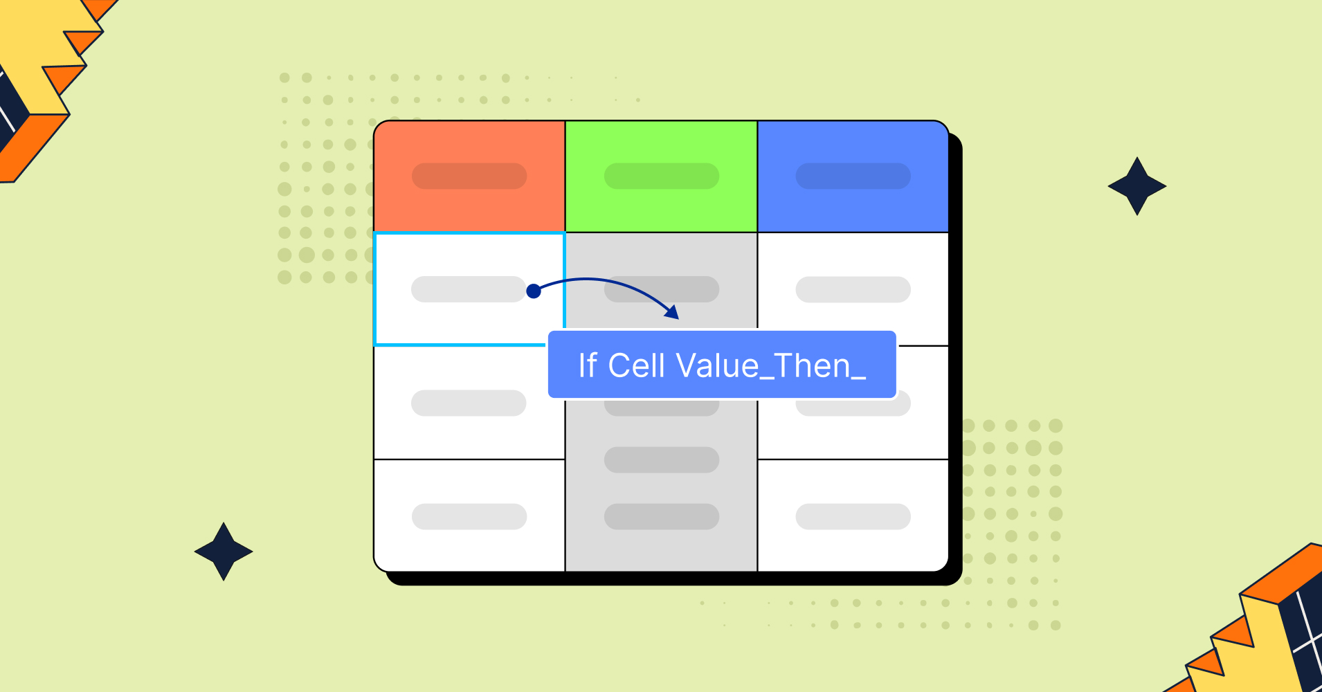
Some techniques that can be used to create a responsive website table include:
- Collapsed tables: Prioritise preliminary information, and table rows must be collapsed into separate cards.
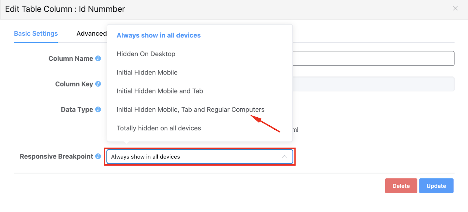
For example, collapsed columns in Ninja Tables. After inputting the table data, you have to set the responsive breakpoint of the columns to hide them for a collapsed layout.
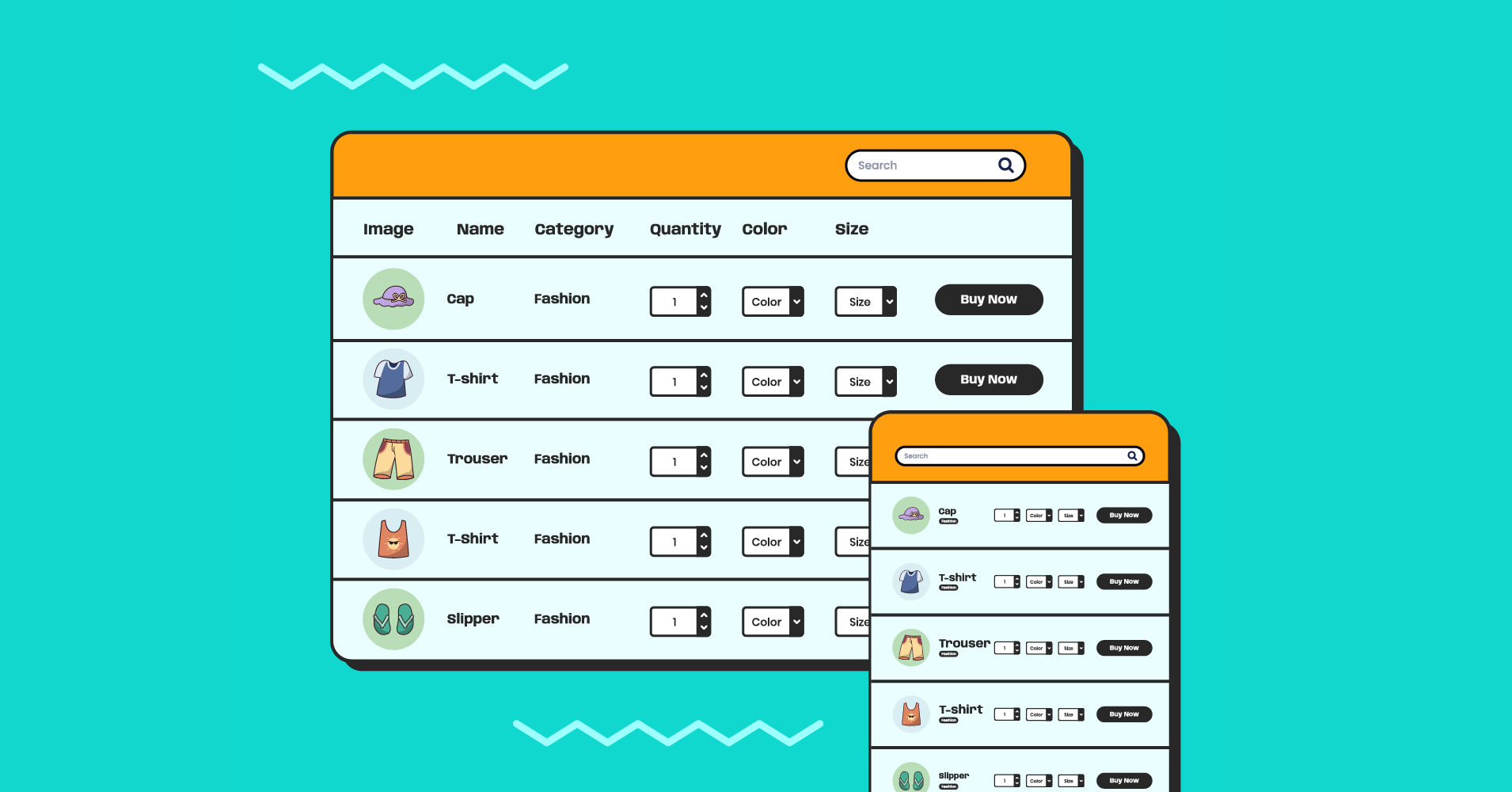
Here’s a table example with responsive breakpoint – WP Posts Table template. - Stackable table: Make your table more descriptive by collapsing the table rows into separate cards. The rows become columns, and the columns become rows.
With Ninja Tables, it’s easy to make your tables stackable on mobile devices.
Go to the Table Design tab >> Enable Stackable Table from the right side checklist menu. Update settings, and your table will be stackable on the front end.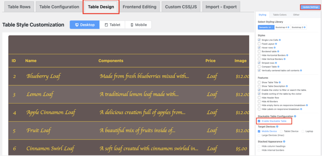
- Movable Tables: Visualize the whole horizontal table with swipe gestures to see the entire table simply.
You don’t have to do much for a movable table when you make it with Ninja Tables. But as a best practice, you must remember some important facts – Sticky column, sort/filter/search, resizable columns, and an indicator for horizontal scroll. - Shorten tables: Display the key data, hiding unnecessary columns and leaving only the crucial data on display. It’s a common pattern of tables. Add a view more button or input a link on the appearing part of the table. On the downside, it gives limited space for data and needs to resign. So, if you don’t want to drop any of your data, go with the above solutions.
2 Easy Ways of Creating Responsive Tables
Several viable solutions exist for creating those responsive tables and improving your site’s user interface (UI) and user experience (UX).
There are 2 approaches to making a responsive table in WordPress.
- With minor coding (HTML/CSS)
- With a table plugin
Let’s take notes.
How to create a responsive table in HTML and CSS
First, we’ll look at how to get the job done without a plugin.
It will require coding: specifically, Cascading Style Sheets (CSS).
We recommend working in a staging or development environment rather than your live website until you design a proper table.
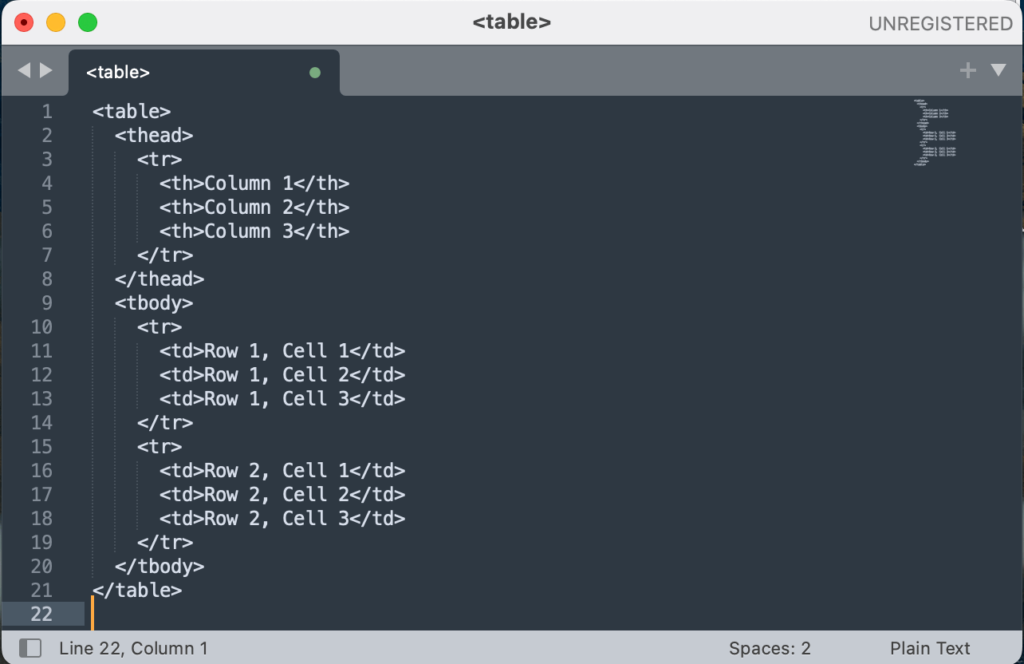
Step 1: Create an HTML structure
Create the HTML structure for your table. The structure should include the <table>, <thead>, <tbody>, <tr>, and <td> elements, as well as any <th> elements for table headings.
Step 2: Add style block
Add a style block to your HTML file and set the table’s width to 100%. It will make the table fluid, stretch and shrink with the available screen space.
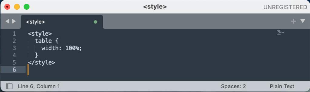
Step 3: Use media queries
Use media queries to apply different styles to the table at different screen sizes. For example, a media query can rearrange, hide, or display columns horizontally on smaller screens.
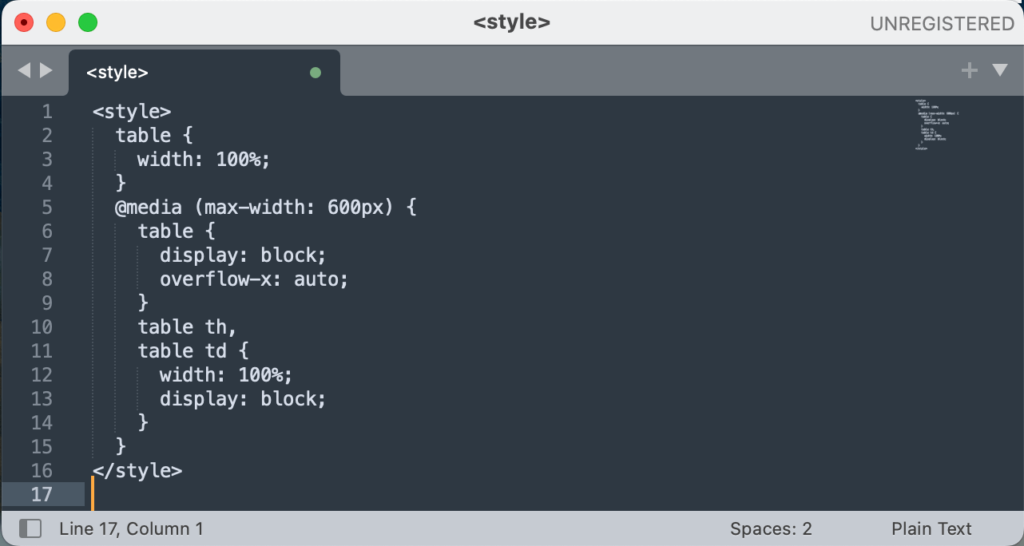
This table will have a fluid layout and display vertically on screens wider than 600 pixels and will be displayed horizontally and given a scrollbar on screens 600 pixels or narrower.
You can customize the responsive behavior of the table further by using additional media queries and applying different styles as needed.
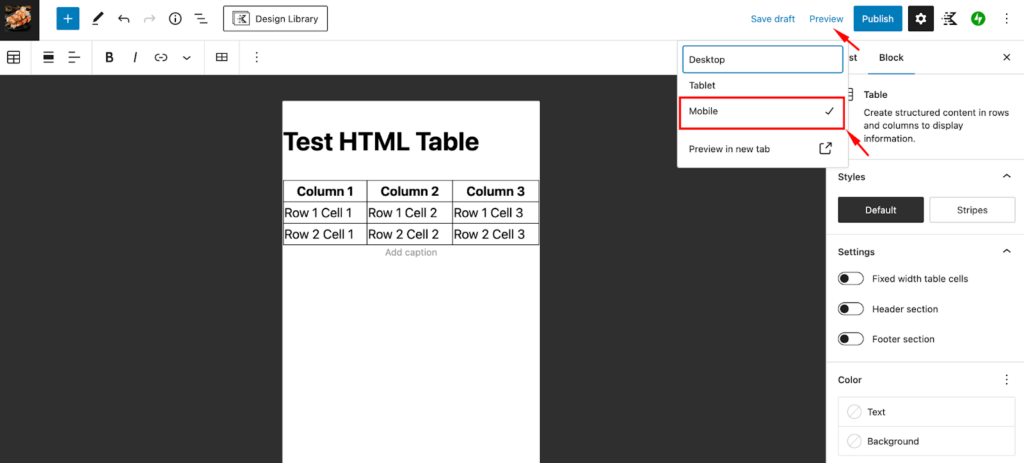
Step 4: Test responsiveness of tables in WordPress
WordPress contains a built-in screen test feature that helps you test content on three different screen sizes. Click on the tablet or mobile phone view icons to test your table’s responsive style from the bottom of the screen.
Or, on the preview button of any page or post, you can check out the mobile view of your tables.
The process works fine for those comfortable with HTML and CSS, but it is time-consuming to set up and troubleshoot.
Using a WordPress table plugin is a much faster, better, and easier way to make your tables responsive. The options come built in!
How to create responsive tables with a table builder plugin
If you’re not comfortable with coding, there is another option- a robust table builder plugin that can help you create a responsive table easily for your website.
Yes, it is Ninja Tables.
Helping 80K+ users worldwide, it’s one of the most reliable table builders for creating website tables and making them responsive.
Check the step-by-step tutorial of responsive table-making with Ninja Tables.
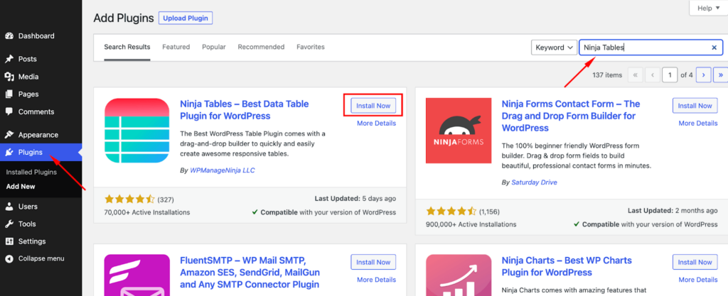
Step 1: Install and activate Ninja Tables
Install and activate the Ninja Tables plugin on your WordPress website.
Step 2: Add tables and input data
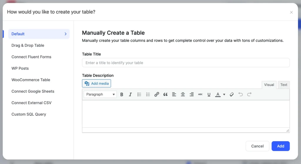
Go to the Ninja Tables menu in the WordPress dashboard. Now, click on the Add New Table button.
Enter a name for your table and click on the Create Table button.
Use the table editor to add rows and columns to your table and enter the data you want to display in the table cells. When you have finished creating your table, click on the Save Table button.
Pick what table creation mode you want. Ninja Tables has 10+ options to create dynamic WordPress tables. And 50+ table templates as well.
Try downloading one and practise responsive features yourself.
Step 3: Format your table
Now that you have a table with information, you can explore Ninja Tables Table Settings and style options. You can access more settings from your table editing window along the top tabs and down the screen’s right-hand side.
Here, You can also customize the appearance and behavior of your table, such as choosing a color scheme or enabling features like sorting and filtering.
You also get to make your table “stackable.”
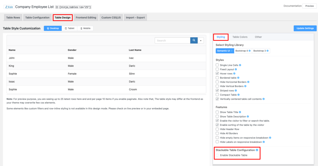
“Stackable Table Configuration” is how you can choose to separate table rows and make them stack on top of each other to create multiple stacked tables. It’s a fun responsive option Ninja Tables users enjoy.
And on the other hand, they can also choose to hide one or more table column to make the table fit into any screen. This feature is called “responsive breakpoints.”
Step 4: Test your table made with Ninja Tables
With Ninja Tables, it’s very easy to test the responsiveness of your table while editing. The Table Design tab has three options for testing screen responsiveness. Just select Desktop, Tablet, or Mobile to view to check the front end.
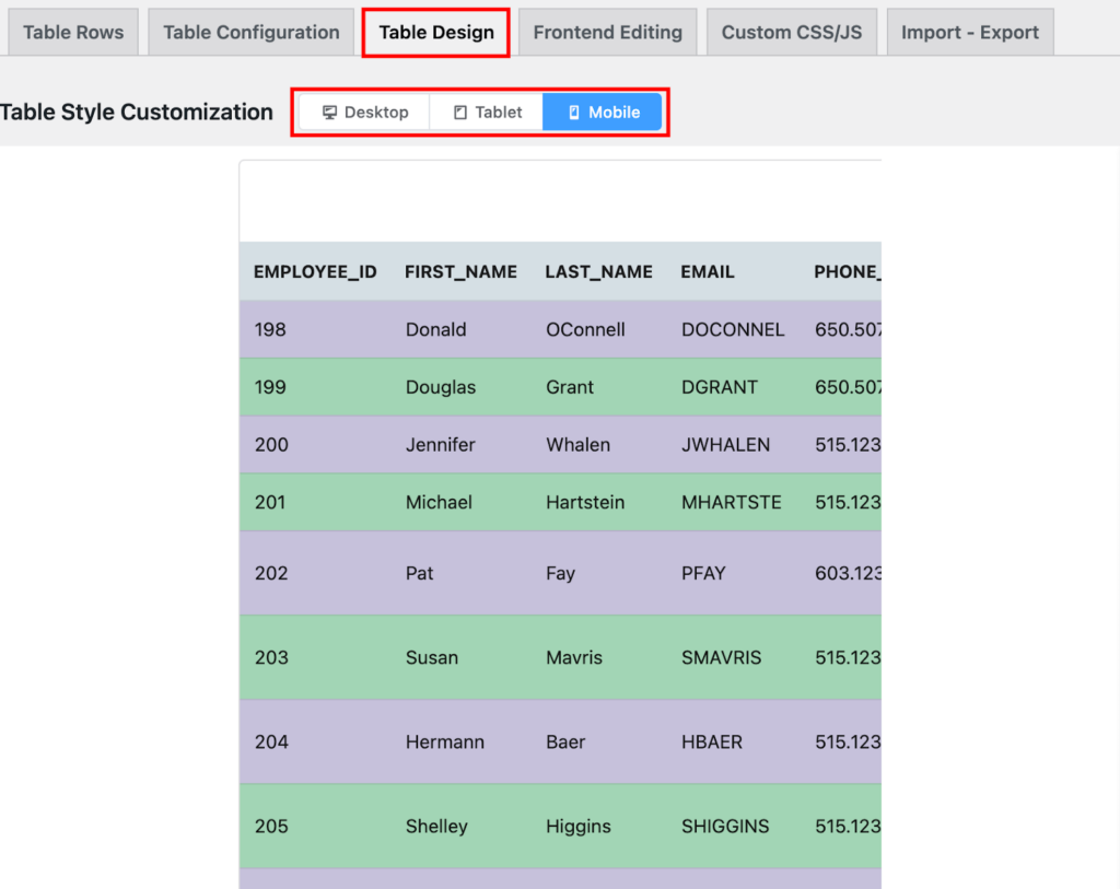
Ninja Tables is responsive for any device and you can customize responsive modes yourself.
Ninja Tables Drag and Drop Table Responsiveness
Ninja Tables comes with a drag-and-drop table builder option in it. It is one of the simplest ways of table building and making it responsive with this module.
Go to Ninja Tables table creation menu and select “Drag & Drop Table.”
For mobile table UX of tables created in this module, you need to enable a responsive table, and your table is responsive for all screen sizes.
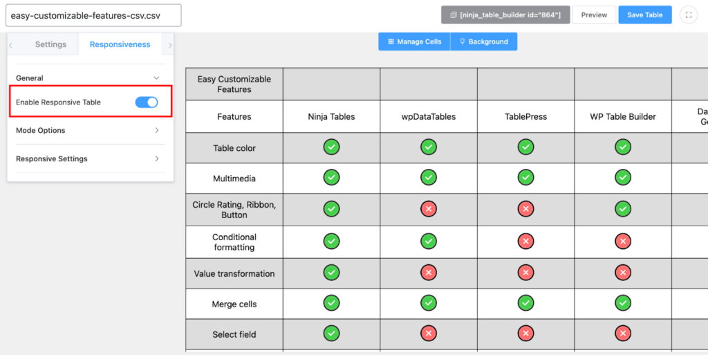
You can also customize responsive modes and control the layout. See responsive desgin documentation for Drag & Drop.
Start Creating Responsive Tables
If you are still unsure of making your tables responsive, you will need it soon. Almost 60% of website traffic comes from mobiles. Mobile table UX is not a matter to underestimate.
We showed the 2 easiest ways of creating responsive tables for your websites. With coding and with Ninja Tables.
It goes without saying that Ninja Tables is one of the best options for any table building for websites. Not to mention the WooCommerce and Google Sheet Integrations made this plugin more effective. Any table you create can be responsive.
Ninja Tables– Easiest Table Plugin in WordPress
You can use HTML or Ninja Tables for your tables. The main focus is you have to visualize your table the most efficiently. Both are effective ways but vary a bit in ease of use.


Add your first comment to this post