
Bad Data Visualization Examples: Fix It or Risk It

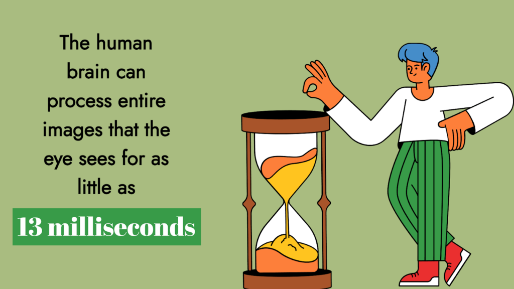
After three days of hearing something, people will likely remember only 10% of that information. On the other hand, with a relevant image of that same information, people retained 65% of them.
-Brain Rules By John Medina
If you search for ‘image vs. text,’ you will find hundreds of pages and statistics mentioning how different and important both are. All of them talk about the importance of data visualization.
If data is king, data visualization is the kingmaker.
We’ll take a closer look at data visualization and some examples here. You will also find some best practices and methods, and we’ll introduce one of the best tools for those actions.
Without any fuss or delay, let’s dive in.
What is data visualization?
Data visualization is the practice of putting information into a visual context, like graphs or maps. It’s nothing but to make it easier for the human brain to grasp and draw conclusions.
The major objective is to make it simpler to spot patterns, trends, and outliers in big data sets. The terms information graphics, information showcasing, and statistical graphics are frequently used interchangeably.
It is one of the vital processes in data science. A component of the larger field of data presentation architecture (DPA) aims to point out, locate, manipulate, format, and deliver data as effectively as possible.
Learn more about data visualization.
Different types of data visualization
In the early days of visualization, the most popular method was turning the data into a table, graph, or pie chart using a Microsoft Excel spreadsheet.
Let’s look at some popular techniques.
- Line charts: The most basic and common techniques used. It is used to show how variables can change over time.
- Area charts: This is quite similar to line charts. It shows multiple values in a time series or a sequence of data collected at consecutive, equally spaced points in time.
- Scatter chart: This technique displays the relationship between two variables. These charts have an x- and y-axis with dots representing data points.
- Bar chart: It can be a horizontal bar or a vertical one. It is usually used for comparing categories and groups.
- Doughnut chart: It is one of the most popular charts showing the relationship between parts and a whole. It can contain more than one data series.
- Radar charts: It’s a way of showing multiple data points and variations between them. These types of charts are often useful for comparing two or more different data sets.
- Polar charts: Pie charts similar with the same angle for each segment- the segment’s radius differs according to the value. This chart type is often useful when we want to show comparison data and a scale of values for context.
- Treemaps: This method displays hierarchical data in a nested format. The rectangles used for each category are proportional to the size of the whole. Treemaps are best for comparing multiple categories and relating with the whole.
- Population pyramids: This option uses a stacked bar graph to visualize the complex social narrative of a population. It is best used when you want to display the distribution of a population.
Comparison charts are widely used in any business or individual website.
Charts and graphs are not the only mediums of visualizing data. Tables are also popular, thanks to the organized and polished display. But for that, you need the right tool.
Google Sheets has the table mode and there’s Tableau or Airtable. But for WordPress sites, Ninja Tables is the best choice!
Learn more about table data visualization.
Good data visualization examples
Data is beautiful – it can inspire, give knowledge and add value to the readers. To keep you inspired, we’ve gathered some good data visualizations.
- A graph with a full overview containing 100 descriptions in it
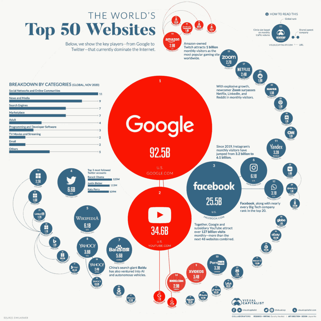
Want to know the websites with the most traffic? The best visualization option is a bubble chart showing all the information on a single screen.
This chart conveys the relative size of different sites’ audiences. Also, it includes a smaller bar chart within the larger one to show the industries that top the niche.
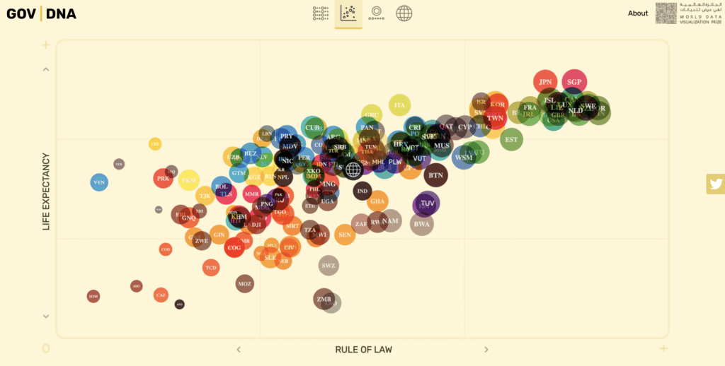
World happiness reports or life expectancy worldwide are questions of hundred years. GOV DNA made it really amazing with a dynamic scatter chart.
They answered the question in a scatter plot visualization that lets anyone explore how nations approach governance in the new age.
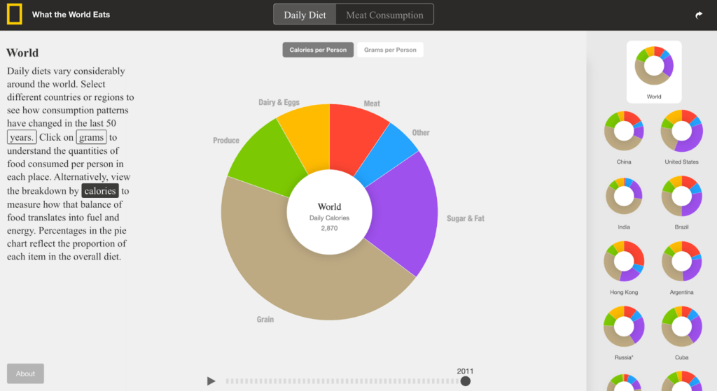
Diets around the world vary by location and date. Here is a doughnut chart that visualizes different countries during different periods to see what people were eating.
The page contains individual area charts for different countries. It’s well-descriptive, even without any description. How else can visualization be so effective?
- The best table never leaves anything forgotten


The best league points table must contain some important data that all the users need. This table lets you find all the games won list points and gives almost all the important things.
It’s made with Ninja Tables. With this table plugin, you can create any kind of table! And most importantly, It offers you many customization options for your best data visualization experience.
Check out some templates.
What is a good visualization of data?
It’s a big question to answer. But, no matter the variables available, there are a few rules of thumb to make your visualizations powerful for illustrating the concept after your data.
- Think about how the background and the figures contrast. The general guideline is to have a gradient in similar shades for online observation. But if you know the audience will probably print the graph, you may wish to have a version with distinct patterns.
- Determine acceptable cutoff points for each variable. By doing this, you may compare current performance to prior results and get advice on how to prevent showing misleading discrepancies between categories. To help the team decide whether the campaign is worthwhile repeating or if the results can be built up, you may want to show how previous campaigns fared in a line chart that shows how a digital ad performed over time.
- Label bar graphs with numbers, but not so many that the information becomes confusing. Long numbers are typically difficult to read. When accuracy to the nth degree isn’t crucial, use a shorthand that everyone on the team is familiar with. On a bar graph, the number “10,523” can be displayed as “10K.”
- To emphasize scale, group data by value whenever possible, but be careful not to obscure the distinction between categories.
We have simplified data visualization for you!
Important aspects of a good visualization?
A good data visualization should establish two aspects of the presented data:
- It should be eye catchy and related to the information you want to present
- Easier for the audience to skim the information and consider the outcomes
A visualization should simplify the complexity posed by the variable and data selections to aid management in gaining a clear understanding of the data.
It should show a hierarchy of the relationships between the data and your company’s concerns, highlighting underlying themes that appeal to the target audience.
Therefore, you would select a statistic that is immediately recognized by them if you were presenting data to a marketing manager who is interested in online interaction. Always be aware of the intended audience and what the imagery is meant to convey.
Interactivity introduces yet another layer of complexity. You can have interactivity over time to give the rate at which a metric or result is occurring or in a side-by-side comparison. The challenge lies in deciding what method best tells the story.
Research data is often buried in a table, so selecting interactions for a table of comparison must be intuitive, especially if it is developed from a programming framework.
Bad data visualization
To start with the examples of bad data visualization, we’ll examine some of the misleading data from real-life examples.
Each of these unbounded examples has the potential to derail strategic efforts and take you to an informational dead end.
Take heed of these poor visuals, and you will know what to avoid when visualizing your business’s most invaluable data.
- A confusing graphic is always aesthetically unappealing
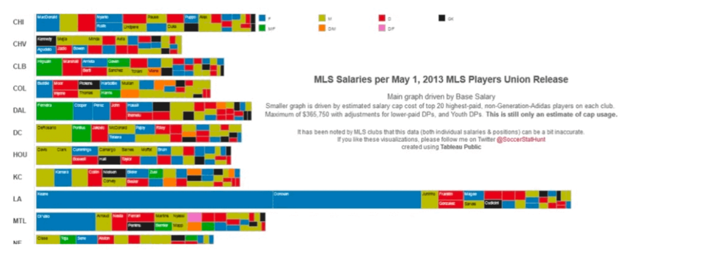
This above graphic looks too busy with a lot of information. The audience will be overloaded with information to figure out anything of substance.
And that’s why it’s quite unappealing visually. Which by itself is not a big issue but certainly something a designer should consider.
- A chart without rule is always discouraged
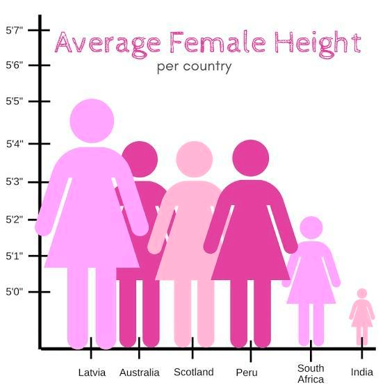
The rule is the Y-axis of a bar graph must start from zero. The above graph violates that. It makes it seem like Indian women are one-fifth the size of Latvian women or something like that.
And here, figures scaled on the X-axis add no information too. Not a fan of using random figures being used in place of bars.
- Comparing things should appear side by side
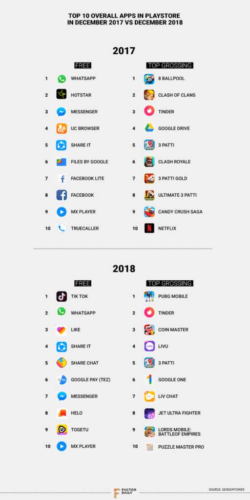
This is not a visualization in the strict sense, but the way the data is visualized makes it incredibly hard to read and understand. The vertical format means it’s impossible to compare 2017 and 2018.
2017 and 2018 are side by side, showing the list as shown here, but with “match the following lines.”
- The color scheme makes up half of your data visualization
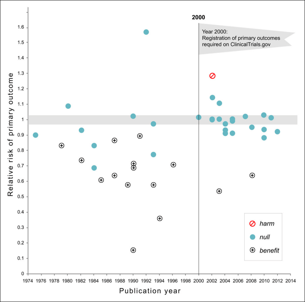
The graph coloring scheme is not a fact to underestimate.
At first, no one could get that there The graph coloring scheme is not a fact to underestimate. At first, no one could get that there were three different kinds of points in this scatter plot, and even after figuring it out, it demanded a big effort to make out any patterns in the data.
You would want these graphs to stand independently. It is easy to show that there was a regime change after 2000 when there was a regulatory regime change.
What is considered a bad graph?
It is ideal for interpreting big data. However, there are bad data visualizations too. To be fair, it should follow some basic principles.
- Using the wrong graphs or charts for a particular purpose
- Make better use of colors.
- Creating misleading graphs or charts
- Incorporating too much information in one graph
A bad graph is constructed in a way that does not convey data in a manner that is clear to the audience. For example, a graph may not have labels for one or both axes. The person who created the graph may have done it unintentionally, but it is still considered a bad data visualization example.
Why can Bad data visualization distort information?
Although an incorrect chart can appear to be a little mistake in the overall scheme of your company, it can have serious consequences.
By their very nature, erroneous data visualizations give your audience a false impression of the information being provided. This misconception can result in incorrect insights and bad business decisions, all while giving the impression that the data supports them.
A chart or graph that is formatted incorrectly could, if taken to the extreme, result in legal or regulatory problems. A deceptive data presentation, for instance, could influence investors to buy or sell firm stock in a financial report.
For these reasons, professionals must possess a solid understanding of data science. In today’s corporate climate, it is essential to be able to tell when data is reliable and full and spot differences between figures and any representations made from them. An efficient way to develop these skills is through an online business analytics course.
Best practices in data visualization
All of us want our Business Intelligence (BI) and analytics solutions to transform data into insights. However, the data is handy only if understood and visualized in a better way. In this section, we will point out the best practices of data visualization:
- Know your audience and find out their pain points
- Choose the right and relatable visuals and color scheme
- Stick to your context
- Keep visualization simple and digestible
- Design to keep users engaged
Best methods to Visualise data
It’s easy to make graphics images for the designer. But what about those who are not good at designing? For them, Images are not the only option. A good visualization can be a table, a chart, or even a fresh PDF.
A table or chart can be way better than a plain image if you talk about SEO friendliness. Google can only see the alt text of an image. But when it is a table or chart, google can fetch the whole HTML of the tables.
Those HTML help your content merge with Google data schema markup and rank on the SERP.
Those who prefer images to enhance visual appeal, then can use royalty free images by Depositphotos. Sites like this have extensive collection and can change the look of any project.
Additionally, when 90% of any website visitors first browse from mobile devices, the visualization tool must be mobile responsive too.
Here we Introduce Ninja Tables which lets you create any kind of table and many kinds of charts. And the best thing is tables built with this table builder are SEO-friendly and mobile-responsive.
Ninja Tables comes with a robust chart builder plugin- Ninja Charts (In free and pro version both).
With this plugin, you can make many kinds of charts and graphs without a single line of coding. You can make charts from tables and Fluent Forms data too.
Conclusion
Here, we tried to connect all the good and bad data visualization so that you can have a clear picture of what you should implement and what to avoid.
Make it accurate and effective for whichever type of option you opt for. The software you use must be effective with your data.
It would be great if your data visualization software handles any kind of data sources. Without a powerful and flexible tool, you could create a beautiful structure on very shaky foundations. Make it clean and prepare your data properly.
Don’t worry if you feel like good data visualization is challenging. We got you covered. And, For table data visualization, there’s always Ninja Tables!
So, those were all for today about bad data visualization examples. Tell us your thoughts on this article in the comment section.
Ninja Tables– Easiest Table Plugin in WordPress


Add your first comment to this post