
Color Palettes for Data Visualization

Cinéphile or not! You’ll most definitely know a Wes Anderson movie scene from miles away. That eclectic color palette is unmistakable – pastel hues and bold pops of color create a visual extravaganza.
Now, let’s talk about colors beyond the silver screen.
As a table builder plugin ourselves, we stand firm on emphasizing the use of color in data visualization.
Just like movies, finding the right color palettes for data visualizations can create visual masterpieces.
Colors set the mood, tell stories, and elevate understanding. Let’s join the party and turn numbers into a cinematic experience. Ready to add life to your data? Lights, camera, visualize!
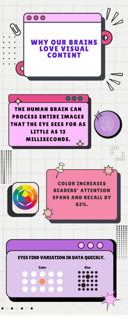
How Does the Brain React to Color
Beyond texts and numbers, there is a secret language that speaks directly to our perceptions- The language of colors.
65% of people are visual learners. Preattentive visual property is processed in our memory in less than 500 milliseconds – that’s how quickly your eye and brain grasp essential information.
Decode data like a pro by tapping into the properties of visual stimuli, like- color, form, motion, and spatial positioning.
Check out the infographic below to understand how our brains are automatically wired to perceive relationships and variations through color and shape, allowing for instant understanding with just a few glances.
Visual variables
The original set of “visual variables” consists of seven factors: position, size, shape, value, color hue, orientations, and texture.
Here comes data visualization with all these elements packed inside. It represents data in graphical or visual formats and uses charts, maps, etc to convey complex information in proper orientation.
Data visualization color palettes dig deeper into the data and tell stories.
“For us, color is a powerful model system that reveals clues to how the mind and brain work”- Conway.
Join us as we explore all the nitty-gritty of color psychology, contrast, and accessibility.
How do we see colors when used in data visualizations?
Choosing color in data visualization is an important tool for communicating quantitative information, as well as for visual appeal.
For example, you made a table using precise numbers, but you want your viewers to focus on a particular value. How could we scan through all the numbers and quickly come up with the highest and lowest figures? Not easily.
But the same data becomes much clearer and understandable when presented visually in a bar chart with highlighting with colors for high or low numbers.
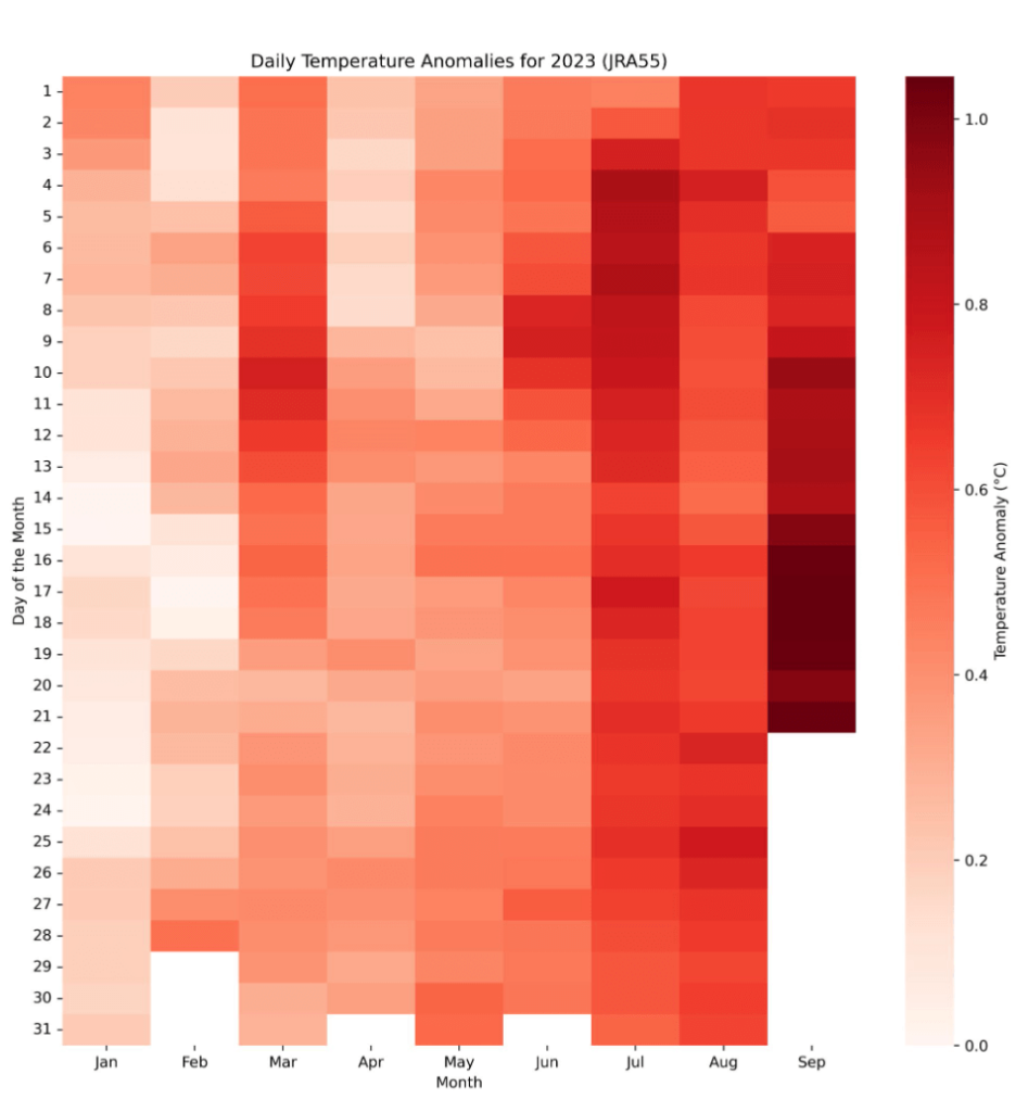
For 2023’s highest temperature during La Niña, a spreadsheet full of numbers can be hard to grasp. Similarly, a heat map color palette is easier to comprehend for daily temperature anomalies.
Furthermore, the psychological impact of colors should not be underestimated. Colors can evoke specific emotions and influence perceptions better than numbers ever could.
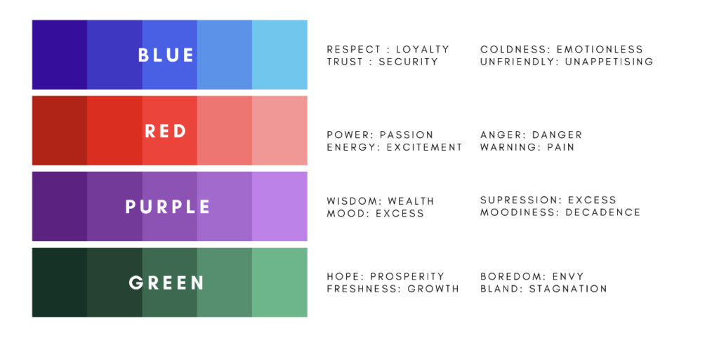
Understanding Color Psychology
Imagine your bedroom walls are vibrant purple. Or calming blue or green. Whichever color is your favorite and makes you relax, it should be on your bedroom walls.
Much like personal style consultants help find your best colors, visualization demands a similar consideration. It’s about developing a language that speaks volumes visually.
Color psychology explores how colors affect our emotions and behavior, with each hue having unique connections that influence mood and decision-making.
Color theory, shaped by personal preferences and culture, combines science, psychology, and emotion to emerge as a powerful force in design.
Colors have different meanings based on their context of use, generating unique feelings or emotions, and those are categorized under color association.
Color variables
Our brain perceives color based on lightness (black to white), saturation (dull to bright), and hue (red, orange, yellow, green, blue, purple).
Lightness, saturation, and hue – form the core of color theory based on human perception. These 3 measurable channels enable the development of a color palette and help us understand what colors should be used.
Now, the challenge is in your hands – wield your color palette effectively to lighten up your data.
Data Visualization Color Palettes
The set of colors applied can completely shift the meaning of the data.
A skillfully composed palette orchestrates a visual symphony, transforming numbers into vivid stories that jump from the page and stick in the mind.
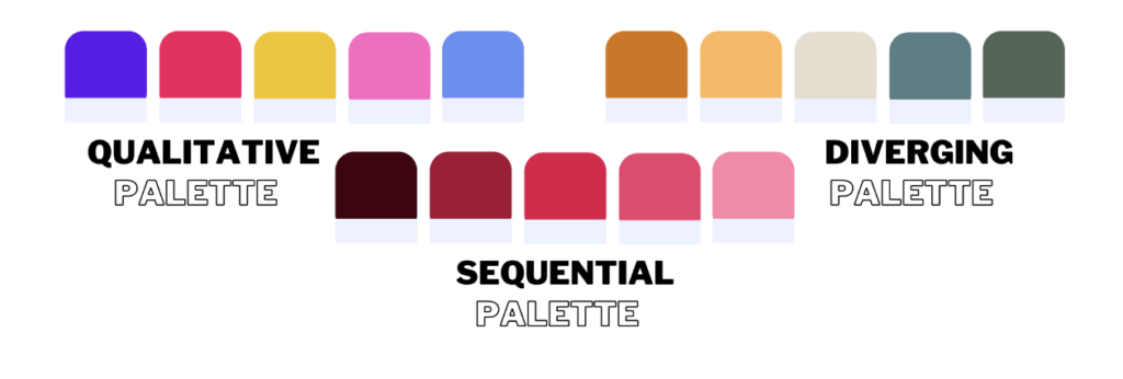
Types of color palettes
Before getting started with visualization design, you must first determine the type of data you have. This guarantees that you choose the best color palette for your dataset. There are 3 main types.
Qualitative palette: Every color is unique and distinct from the others.
Sequential palette: A single color presented in various saturations or a gradient.
Diverging palette: Color variables span a spectrum, like from cold to hot.
When to Use
The issue arises when the application of color lacks a clear explanation as to why use it or when. Consider the chart—why the multitude of colors?
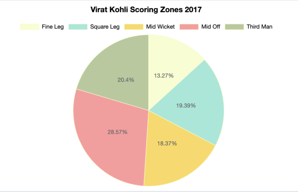
Made with Ninja Charts
While much has been discussed on this topic over time, there’s a niche in highlighting the practical use of color in data visualization.
In dull data graphs, color creates a pattern for immediate recognition and connection with viewers. It’s the ‘breaking down monotony, highlighting crucial messages’ for us.
Effective color application in visualizations demands thoughtful consideration for clarity and relevance. Use color to create associations between variables or signify numerical correlations. Leverage color to emphasize critical information and make it stand out.
Apply branded colors to visualization if possible. Aligning these with great design principles increases brand recognition.
What to Avoid
- Inconsistent or excessive color use.
- Faint or clashing colors to prevent viewer discomfort.
- Colors that are difficult to separate.
- Too many colors; only use them when you must.
- Bold backgrounds that cause distraction.
- Contradictory or discomforting colors on a dark background.
Data visualization color palette best practices
- Contextual data in shades of gray for visibility without distraction.
- Uniform color selection across visualizations.
- A consistent color scheme.
- Easily distinguishable colors for comparison charts.
- Consider the interaction of colors; for example, yellow appears differently when surrounded by red than blue.
- Pay attention to the visualization background to improve data color.
- White or dark backgrounds can enhance information if infused with proper color contrast.
- Guide the viewer’s focus, don’t create visual chaos.
* For more tips and tricks like this, subscribe to our regular newsletter.

Get Exclusive Tips, Updates, and Inspirations in Your Inbox!
Importance of Color in Data Visualization
Data visualization converts information into graphs or charts, making it easier for humans to comprehend and extract insights. It helps to find patterns, trends, and outliers in massive datasets.
In this visual transverse, color sets the tone, conveys a message, and transforms simple grids into a compelling data story. The proper use of color choices and contrasts, coupled with visualization, increases overall effectiveness.
Selecting colors requires insights into color theories and associations to enhance relevance. The choice of colors holds the power to influence viewers’ perceptions, evoking positive or negative emotions.
Color palette generator
Time for the hands-on trial! With the theory and insights in your toolkit, finding the right color palette generator should now be a breeze.
We’re going to assist you all the way in your color journey.
Coolors
Coolors is as simple and intuitive a platform as it gets for designers and business owners exploring brand color schemes.
It allows users to extract color schemes directly from uploaded images. It’s available as a handy app, making it one of the most useful tools for designers on the go.
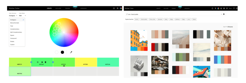
Adobe Color CC
Adobe Color stands out as an advanced tool, perfect for professionals aiming for precise hues. For a productive visit, explore the site’s section, you can find user-crafted color palettes randomly or based on recent/popular queries.
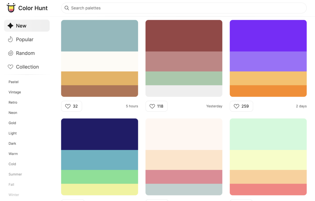
Color Hunt
Color Hunt, a free palette library, provides new, trendy, or random options, with various user-created palettes for inspiration. Updated daily, it’s a go-to for designers seeking color schemes.
ColorBrewer
ColorBrewer, a top tool for mapmakers, provides diverse color schemes. With a user-friendly interface, there’s an eye icon above the color codes pane to check to easily check for potential perception difficulties.
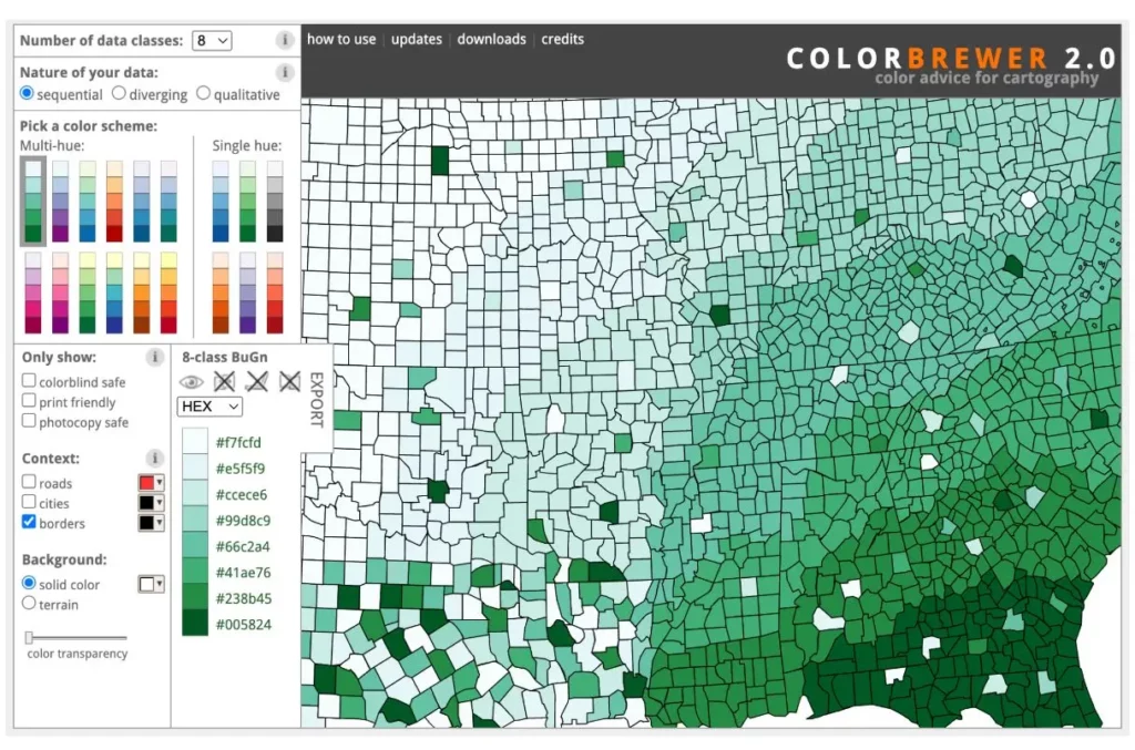
Aside from its convenience and accessibility, ColorBrewer shines in offering colors thoughtfully designed to accommodate color blindness.
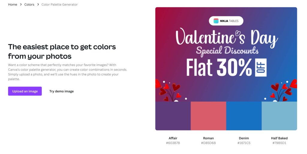
Canva
If you’re an old-school type of person, then you opt to go with Canva and it’s a multitude of options for color palette design. For example, Canva Color Palette Generator goes hand in hand with your requirements far more easily than you think.
Or talk about convenience, the Canva Color Wheel generator takes you to the very beginning where insights and resources go hand in hand.
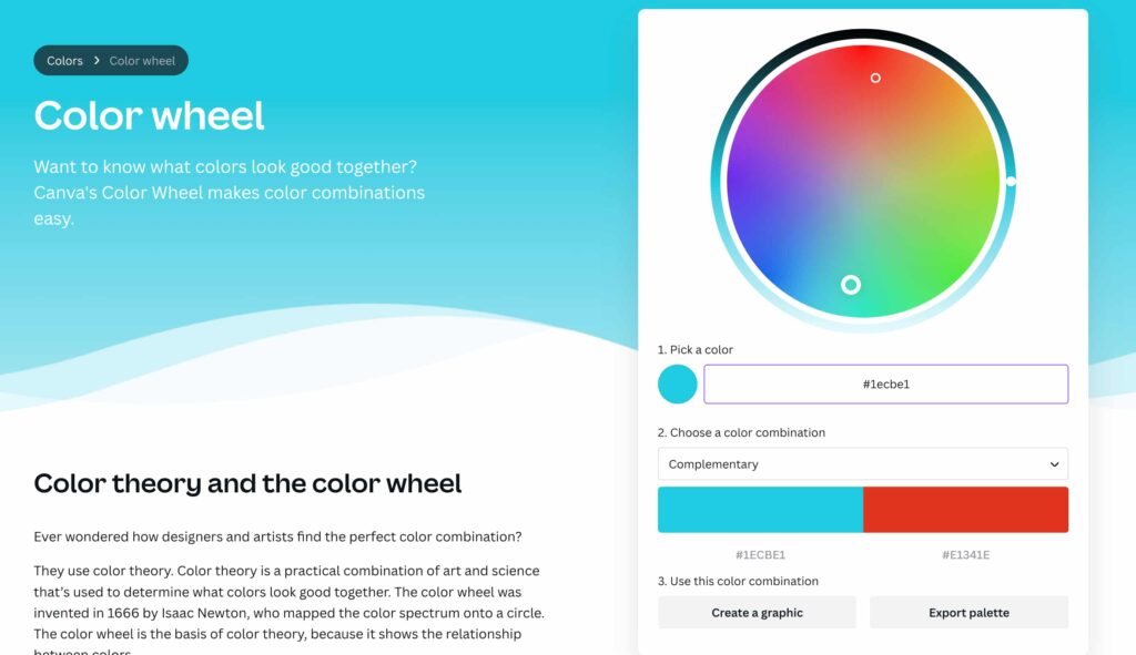
Here they’ll show you a variety of options such as color combinations- complementary, monochromatic, triadic, etc. It also gives all the insights on color theory and the color wheel.
Bonus tip: Wouldn’t you love having all the visualization style, text pattern, and most importantly Color variation with a wide range of palettes under a single plugin? That’s where Ninja Table and its stand-alone plugin Ninja Charts come in handy. Try it out and tell us what you think.
Color Tells a Story
In our journey into the world of color in data visualization, it’s clear that color is more than just a visual accent or aesthetic—it’s a powerful storyteller.
In addition to improving aesthetics, explicit and purposeful use of color conveys the core ideas and communicates the essence of the data.
Whether you’re designing a B2B products dashboard, a small business digital layout, or even a personal branding website, the key lies in grasping how the human brain perceives visuals, how it evokes emotion, and embracing fundamental principles of visualization.
Ninja Tables– Easiest Table Plugin in WordPress


Add your first comment to this post