
Simplifying Data Presentations & Common Mistakes
“Simple,” “readable,” and “easy to grasp.” That’s how everything should be on your website. The audience should easily understand what you’re trying to visualize without much effort. Simplifying data presentations is just something you can’t overlook.
In this era of data and information overload, there’s only one way you can convey your message- Presenting the data in an organized and well-described format that doesn’t look overwhelming.
You can do so with stylized data tables, charts, or graphs.
What is meant by data presentation?
In straightforward terms, data presentation means showing important information visually. This includes numbers, texts, trends, stats, descriptions, or any sort of detail that might make a paragraph a bit chunkier.
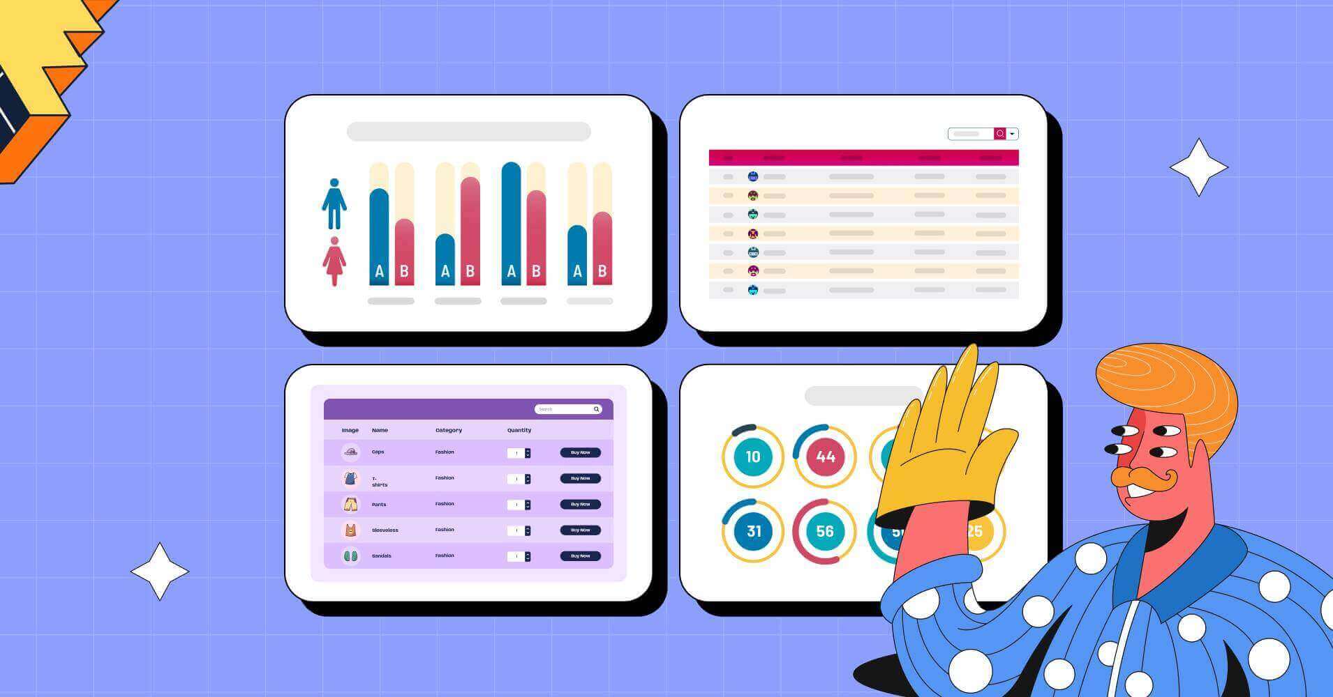
Visual elements, like graphs, charts, tables, infographics, and illustrations carry dynamic data for the audience to comprehend easily.
A good data visualization makes massive data digestible and simpler to grasp.
Simplifying data presentations: Tricks
How do you present data simply?
Outline the story you want to tell and use the least data needed.
More numbers and big sentences do not make anything look smarter. Rather, people will lose interest faster.
Utilize charts, tables, graphs, and other simple ways to visualize the information. Bright graphics help a lot.
- Use the correct units
- Simplify big numbers like thousands or millions with “K” or “M”
- Add calculated numbers so people don’t have to do math in their head
- An appendix to explain any data further
- Engaging media in tables
- Interactive buttons or links
- Suitable header text in tables
- Design the chart or table in a way it comforts their eyes
- Proper tool (chart or table depending on the need)
A quick look at Tables Vs Charts might help.
Avoid these mistakes in presenting data

What are the common mistakes in presenting data using graphs, charts, or tables?
- Confusing or misleading placement
- Too many colors or wrong colors
- Wrong scaling or visualizing
- Missing labels or tooltip
- Data clutter
- Hard to compare grouping
- Unclear or blurry texts
- Going overboard with data in a small area
- Label swapping
- Not specifying axis in charts
- No headers in tables
- Wrong units in comparison
Data presentation examples and mistakes might make it clearer for you.
Chart and table data visualization mistakes
Presenting data graphically with tables or charts is neither easy nor difficult. You just need to avoid some silly mistakes.
Unfortunately, bad data visualization is still a thing in the data-driven world.
Here’s how the wrong scale and wrong colors can affect chart data visualization.
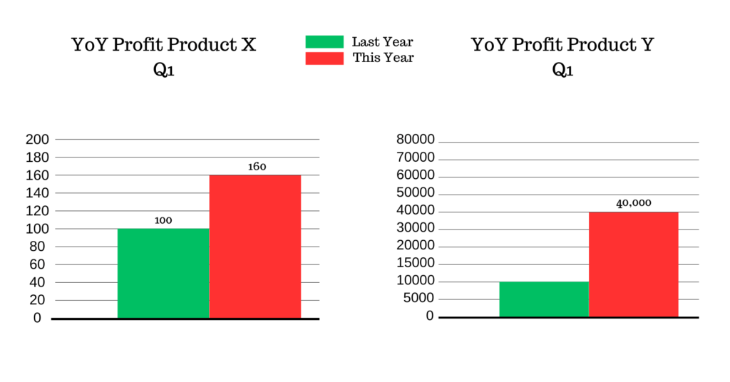
If these charts are shown side by side, the YoY profit of product X this year shows it has increased way more than the YoY profit of product Y this year.
Here’s our problem.
- The scale difference makes it look like the profit is more in the first chart than in the second chart. When in reality, Y got 30,000 units more profit this year and X got only 60 units more.
- The colors may also send a wrong message to some individuals. Usually, red is used to present “low” or “negative” results, whereas green is to show “high” or “positive” results. But both charts show the red bar as the highest.
In short, these charts have a misleading visual presentation.
Some data don’t even require presentation in charts. And for some other data, choosing the wrong chart can harm the purpose.
If we move on to a bad table data visualization, we can show you how a numeric data table with a huge number of cells and columns confuses people.
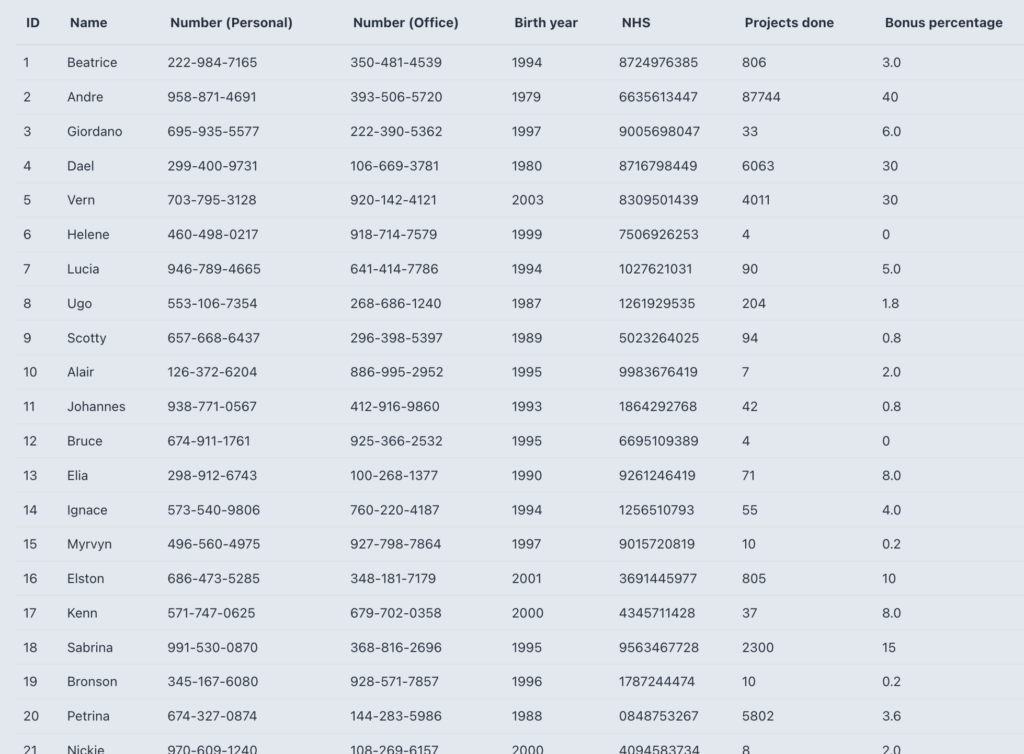
The problems here are:
- Originally, it has 50 different data rows. But you can only see upto 20 on one page and have to scroll below for 30 more.
- The data aren’t filterable or center aligned in the table.
- Not designed in stylized rows/columns.
- So many numbers without borders to separate also look like a mess.
- Not visually appealing for attention.
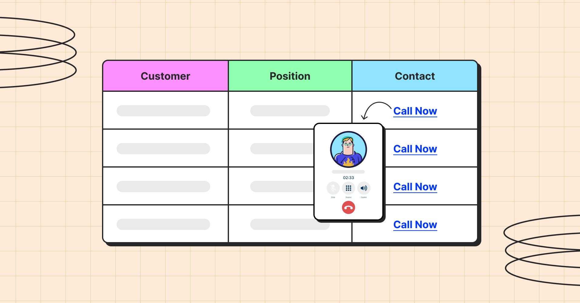
Now, if you want people to grasp what the data table wants to show, present the table with a nice design, filters, and pagination.
| ID | Name | Number (Personal) | Number (Office) | Birth year | NHS | Projects done | Bonus |
|---|---|---|---|---|---|---|---|
| 1 | Beatrice | 222-984-7165 | 350-481-4539 | 1994 | 8724976385 | 806 | 3.0% |
| 2 | Andre | 958-871-4691 | 393-506-5720 | 1979 | 6635613447 | 87744 | 40% |
| 3 | Giordano | 695-935-5577 | 222-390-5362 | 1997 | 9005698047 | 33 | 6.0% |
| 4 | Dael | 299-400-9731 | 106-669-3781 | 1980 | 8716798449 | 6063 | 30% |
| 5 | Vern | 703-795-3128 | 920-142-4121 | 2003 | 8309501439 | 4011 | 30% |
| 6 | Helene | 460-498-0217 | 918-714-7579 | 1999 | 7506926253 | 4 | 0% |
| 7 | Lucia | 946-789-4665 | 641-414-7786 | 1994 | 1027621031 | 90 | 5.0% |
| 8 | Ugo | 553-106-7354 | 268-686-1240 | 1987 | 1261929535 | 204 | 1.8% |
| 9 | Scotty | 657-668-6437 | 296-398-5397 | 1989 | 5023264025 | 94 | 0.8% |
| 10 | Alair | 126-372-6204 | 886-995-2952 | 1995 | 9983676419 | 7 | 2.0% |
| 11 | Johannes | 938-771-0567 | 412-916-9860 | 1993 | 1864292768 | 42 | 0.8% |
| 12 | Bruce | 674-911-1761 | 925-366-2532 | 1995 | 6695109389 | 4 | 0% |
| 13 | Elia | 298-912-6743 | 100-268-1377 | 1990 | 9261246419 | 71 | 8.0% |
| 14 | Ignace | 573-540-9806 | 760-220-4187 | 1994 | 1256510793 | 55 | 4.0% |
| 15 | Myrvyn | 496-560-4975 | 927-798-7864 | 1997 | 9015720819 | 10 | 0.2% |
| 16 | Elston | 686-473-5285 | 348-181-7179 | 2001 | 3691445977 | 805 | 10% |
| 17 | Kenn | 571-747-0625 | 679-702-0358 | 2000 | 4345711428 | 37 | 8.0% |
| 18 | Sabrina | 991-530-0870 | 368-816-2696 | 1995 | 9563467728 | 2300 | 15% |
| 19 | Bronson | 345-167-6080 | 928-571-7857 | 1996 | 1787244474 | 10 | 0.2% |
| 20 | Petrina | 674-327-0874 | 144-283-5986 | 1988 | 0848753267 | 5802 | 3.6% |
| 21 | Nickie | 970-609-1240 | 108-269-6157 | 2000 | 4094583734 | 8 | 2.0% |
| 22 | Kaylyn | 281-428-1555 | 651-962-1812 | 1998 | 3689903572 | 744 | 2.8% |
| 23 | Nelia | 967-783-6333 | 658-583-5248 | 1993 | 7780982475 | 78 | 1.2% |
| 24 | Allyn | 583-134-1481 | 526-296-0892 | 2000 | 8751312069 | 13 | 2.3% |
| 25 | Hayward | 662-368-9704 | 969-953-6369 | 1993 | 1100190953 | 27795 | 40% |
| 26 | Crissie | 696-796-9017 | 207-163-1746 | 1997 | 2553851790 | 6 | 0% |
| 27 | Fanny | 546-829-9919 | 136-330-9291 | 1987 | 5247856554 | 563 | 12% |
| 28 | Mandi | 214-577-4644 | 772-880-7709 | 1985 | 5411587573 | 9 | 0% |
| 29 | Cathee | 478-404-8228 | 558-591-2483 | 1999 | 4722167869 | 44 | 4.0% |
| 30 | Kalindi | 356-370-4271 | 471-257-0890 | 2000 | 0855275332 | 59 | 3.0% |
| 31 | Francoise | 288-244-1531 | 666-150-4967 | 1982 | 4877880917 | 1694 | 20% |
| 32 | Shalna | 124-679-9097 | 693-587-3539 | 1983 | 1452833184 | 3421 | 3.5% |
| 33 | Merrill | 953-378-4277 | 540-500-6082 | 2001 | 6255846261 | 5 | 0% |
| 34 | Payton | 411-432-7436 | 273-650-7372 | 1976 | 3392006106 | 606 | 2% |
| 35 | Ashlee | 545-650-5950 | 564-180-3220 | 1984 | 8545344015 | 4499 | 17% |
| 36 | Alyss | 104-890-1094 | 591-734-6851 | 1993 | 7762752323 | 71735 | 40% |
| 37 | Gallagher | 544-488-8367 | 583-202-0350 | 1975 | 1168647444 | 88 | 6% |
| 38 | Dianna | 807-366-5104 | 334-710-1273 | 1999 | 3242978242 | 1780 | 12% |
| 39 | Lyda | 831-528-9518 | 675-748-9769 | 1994 | 4982261601 | 14304 | 11% |
| 40 | Morganica | 838-972-9693 | 398-696-8212 | 1987 | 6599532802 | 67 | 5% |
| 41 | Yale | 235-401-6007 | 630-671-0236 | 1970 | 3137203554 | 479 | 8% |
| 42 | Pippa | 815-431-1056 | 469-329-3556 | 1989 | 9181582935 | 920 | 2.2% |
| 43 | Garvin | 580-119-9495 | 218-260-9724 | 1978 | 8986574357 | 97132 | 50% |
| 44 | Andriette | 303-551-6756 | 149-348-3346 | 2000 | 0992279313 | 170 | 1.2% |
| 45 | Packston | 781-506-2277 | 713-979-4625 | 1974 | 3800107295 | 59260 | 45% |
| 46 | Kathleen | 972-276-5666 | 369-917-0865 | 1995 | 8625834566 | 8044 | 40% |
| 47 | Spence | 457-920-0216 | 714-765-5985 | 1967 | 3613144174 | 971 | 15% |
| 48 | Katrina | 140-981-8063 | 183-501-0244 | 1993 | 4343927180 | 51 | 3.0% |
| 49 | Charmain | 820-402-0486 | 674-231-4636 | 1995 | 0284197556 | 24 | 4.3% |
| 50 | Ibbie | 596-981-4326 | 539-207-0163 | 2001 | 4779267080 | 3 | 0% |
Courtesy of Ninja Tables
Here are the fixes in this example of data presentation:
- Audiences can find the data they want from the custom filters.
- The hover animation looks fun.
- Data are center-aligned with equal white space around for better focus.
- The table looks much less messy with borders and colors.
- 2 columns are initially hidden on desktop. Click the + icon for the hidden data to appear.
Now, the biggest question is, “How to present data?”
Charts and graphs are the most widely used forms of presenting data. But data tables are another game-changer you need to look into. And Ninja Tables is right beside you with hundreds of variations of table desgins!
Why is presenting data in tables necessary?
Simple and readable- The 2 best aspects of data tables are the main reasons you need to present data in tabular formats!
Picture this: You’re looking at an overly designed page with unlimited data and information and long paragraphs with long sentences.
Isn’t that overwhelming? You’re confused about what to focus on and the page is fumbling to showcase the info they want you to see.
But the case is different when data is organized in tabular formats. A data table with dynamic data input that allows the audience to filter, sort, search, and take action with proper CTA increases user experience a lot better.
Here’s why table data visualization is important for complex or even simple data presentation:
- Unlimited data is overwhelming to your audience
- People might not understand or comprehend
- Comparing data is much more difficult
- Any bonus information could be distracting
- Engagement drops if your audience doesn’t like what they see
- It’s hard to find specific data among dozens or hundreds of other data
- Dynamic data with multimedia elements are only comprehensible in tables
- Numerics, statistics, comparisons, etc. aren’t readable if not in tables
You’re spending hours trying to put the info together in content, but your audience sees it for a few seconds! So, tables will condense the info and make it easier.
Tell them a story in perfectly styled and organized data tables rather than in long and boring paragraphs. They’ll follow the row, column, and cells, to get the point at a glance.
Final words
Being distracted is bad enough, but you don’t want your target audience walking away completely without paying any attention to the data you presented.
A proper data visualization, be it charts or tables; doesn’t mean going overboard with colors, coding, unnecessary info, or unlimited entries without any filter option.
Simplifying data presentation means keeping it as readable and comprehensible as possible.
So, you must choose your tools and presentation wisely. Whatever methods of data presentation you select, just don’t forget to keep it simple!
FAQs
What is the simplest method of presenting data?
Organizing texts, numbers, media, links, and all other dynamic data in an engaging data table is the simplest way. Or you can use smart charts for data display. And Ninja Tables + Ninja Charts as a duo help you with all that.
How do you simplify presentation of information?
Simplifying information showcase is easier with charts, tables, graphs, infopgraphics.
How do you present data simply?
Use tables or charts to present data simply.
How do you simplify data visualization?
Tables can simplify data visualization in your website. And Ninja Tables is the best tool for that in WordPress.
Ninja Tables– Easiest Table Plugin in WordPress


Great Intro article, thanks! Would love to see more tips & tricks articles on how to do fun things with Ninja Tables – for instance: Multiple charts on a single page, or from a single table – how would we do this? is this even possible? Setting up a dashboard from multiple tables (ie: multiple charts on a single page using multiple data sets to produce different charts and graphs). Would love these kinds of hints and tips.
Hi Dan. I’m glad you liked this article. And thank you so much for reaching out about topics you want us to cover! Your requests are noted. We’ll be working on them soon. Thanks again!