
How to Make a Graph in Google Sheets

When numbers get boring, captivating visual stories are the key to unlocking the true potential of your data. Welcome to the realm of Google Sheets, where the art of chart creation is not just a skill but an enjoyable venture.
This article guides you to give life to your data through charts and graphs. From the fundamentals, you’ll discover the seamless process of chart creation that Google Sheets offers.
Additionally, you learn to insert various charts and graphs, and the art of customization. Let’s dive into the world of charts to transform your data into a visual spectacle to grab attention and spark curiosity and action.
The Basics- How to Make a Graph in Google Sheets
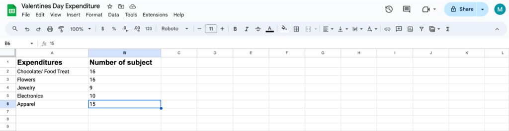
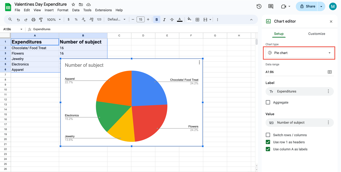
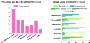
For example, let’s make a graph of the information on Valentine’s Day Spending in 2022. That was a study on 50 subjects. We’ll create a graph of their expenditures and see how we make the graph. Let’s break down the steps in more detail
Access Google Sheets
Open your web browser and go to Google Sheets. Log in to your Google account if you aren’t already logged in.
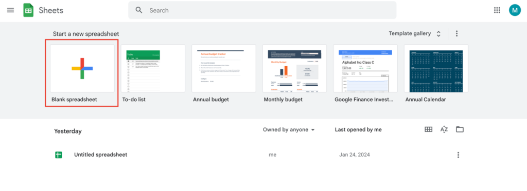
Create a New Spreadsheet
Click on the Blank option on the upper-left side of the page. This action will initiate a new, empty spreadsheet.
Header Setup
In cell A1, enter the label for the x-axis (e.g., Expenditure). In cell B1, enter the label for the y-axis (e.g., Number of subjects). If your data involves more sets, you can add additional headers in cells C1, D1, and so on.
Data Entry
Input your x-axis data into the cells in column A. Input your corresponding y-axis data into the cells in column B. If you have additional data sets, enter them into subsequent columns.
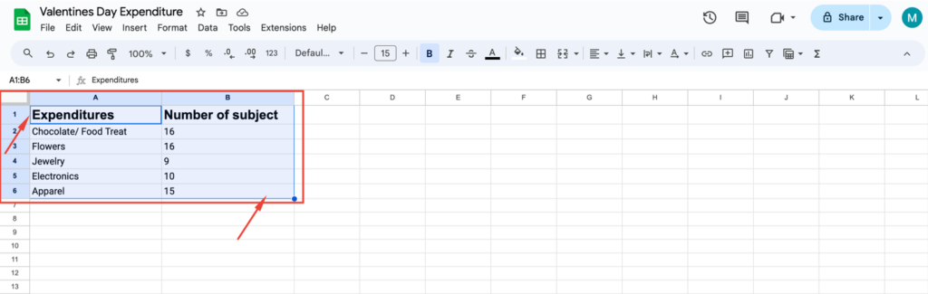
Select Data
Click on cell A1, then hold down the Shift key and click on the bottom-right cell of your data. This will highlight and select the entire dataset.
Insert Chart
Navigate to the Insert tab, usually located near the top-left of the page. Choose Chart from the drop-down menu.
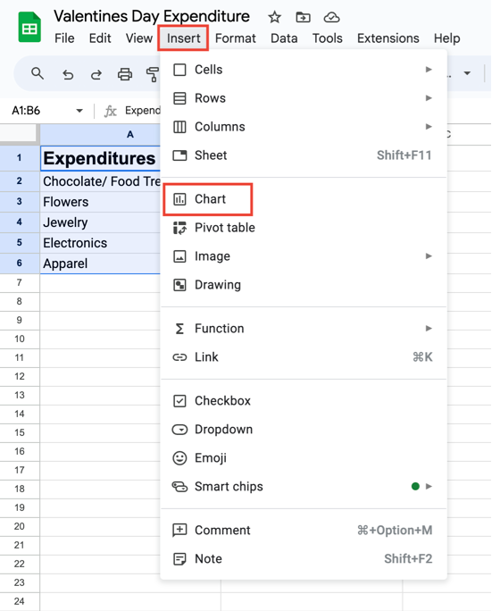
Chart Configuration
A new window, the Chart editor, will appear in the center of the page. Select a chart format by clicking the Chart type box and choosing from the options in the drop-down box. Optionally, customize your chart further by adjusting the data range, appearance, labels, etc.
Finalize and Customize
Choose the right chart for your data in Google Sheets. Google Sheets provides chart suggestions, but you have many options to consider. Think about the type of data you have and how you want it displayed.
For instance, use a pie chart for percentages that add up to 100%, or explore a histogram for time-related data. If unsure, Google Sheets allows you to preview the chart to see if it suits your data best.
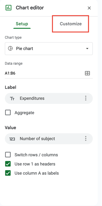
You can use the Customize tab at the top of the chart window to make detailed adjustments to the chart’s appearance and labels.
By following these steps, you’ll be able to efficiently create a chart in Google Sheets with your specified data and visual preferences.

Get Exclusive Tips, Updates, and Inspirations in Your Inbox!
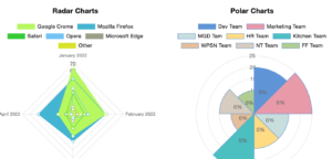
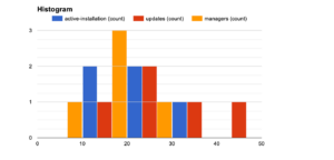
Different Types of Charts in Google Sheets
There are 21 chart and graph types available, each with its variations. Here are some examples:
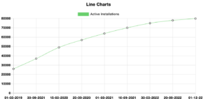
- Line Graph: Best for showing trends over time.
- Multi-Lined Graph: Compare multiple items over time.
- Curved Graph: Customize lines by making them smooth.
- Comparison Mode Line Chart: Show additional info when hovering over data values.
- Column Chart: Accentuates volume, suitable for product units or ticket sales.
- Stacked Column Chart: Simplifies visual representation of total values.
- Log Scale Graph: Useful for data with significant variations.
- Ranking Chart: Use a column chart to display ranking trends.
- Bar Chart: Rotated 90-degree version of a column chart.
- Stacked Bar Chart: Similar to stacked column charts.
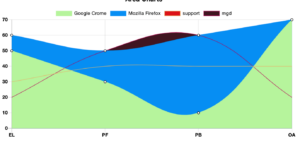
- Area Chart: Shows trends with shaded areas below lines.
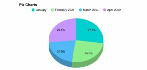
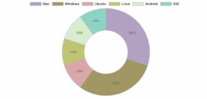
- Pie Chart: Depicts portions of a whole (best for values adding up to 100%).
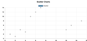
- Scatter Chart: Displays the relationship between two variables.
- Slope Graph: Adds a slope line to a scatter plot.
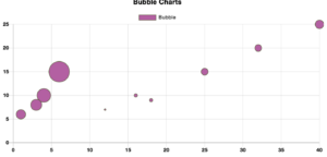
- Bubble Chart: Similar to a scatter chart with a third dimension (bubble size).
- Waterfall Chart: It is ideal for showing positive and negative data flow changes.
- Candlestick Chart: Shows low, high, open, and closing values.
- Organizational Chart: Represents relationships between employees and managers.
- Timeline Chart: Displays events chronologically.
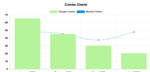
- Pareto Chart: Combines column and line charts to show sales and cumulative percentages.
- Histogram Graph: Distributes closely related data into groups.
| Chart 1 | Chart 2 | Chart 3 |
|---|---|---|
 |  |  |
 |  |  |
 |  |  |
 |  |  |
How to Showcase Your Graphs on Your Website
Google Spreadsheets allow you to create various charts and graphs, but embedding these interactive charts on your website requires some coding. However, Ninja Tables simplifies the process, enabling you to add diverse charts without any coding.
For effective data visualization on your website, a visually appealing data viewer is crucial. In this regard, Ninja Tables offers seamless integration with Ninja Charts. With this, you can effortlessly generate and customize charts and graphs to enhance the visual presentation.
| NAME | PHONE | POSITION | HIRING DATE | SALARY | |
|---|---|---|---|---|---|
| Steven King | [email protected] | 515.123.4567 | AD_VP | 17-Jun-03 | 24000 |
| Neena Kochhar | [email protected] | 515.123.4568 | AD_PRES | 21-Sep-05 | 4000 |
| Lex Dehann | [email protected] | 515.123.4569 | AC_ACCOUNT | 13-Jan-01 | 9000 |
| Alexander Hunold | [email protected] | 590.423.4567 | AD_VP | 03-Jan-06 | 6000 |
| Bruce ernst | [email protected] | 590.423.4568 | IT_PROG | 21-May-07 | 8300 |
| William Gietz | [email protected] | 515.123.8181 | IT_PROG | 07-Jun-02 | 5000 |
| Sidwart Shankar | [email protected] | 515.123.4567 | AD_PRES | 17-Jun-03 | 1000 |
| NAME | PHONE | POSITION | HIRING DATE | SALARY | |
| Steven King | [email protected] | 515.123.4567 | AD_VP | 17-Jun-03 | 24000 |
| Neena Kochhar | [email protected] | 515.123.4568 | AD_PRES | 21-Sep-05 | 4000 |
| Lex Dehann | [email protected] | 515.123.4569 | AC_ACCOUNT | 13-Jan-01 | 9000 |
| Alexander Hunold | [email protected] | 590.423.4567 | AD_VP | 03-Jan-06 | 6000 |
| Bruce ernst | [email protected] | 590.423.4568 | IT_PROG | 21-May-07 | 8300 |
| William Gietz | [email protected] | 515.123.8181 | IT_PROG | 07-Jun-02 | 5000 |
| Sidwart Shankar | [email protected] | 515.123.4567 | AD_PRES | 17-Jun-03 | 1000 |
📌 Check our article on, Create Charts in WordPress With a Free Charts Plugin.
Wrap Up
Mastering the art of crafting graphs in Google Sheets not only boosts your presentation skills in company meetings but also opens the door to an engaging experience by embedding them on your website.
Yet, if you seek a seamless solution for this, turn to Ninja Tables. It stands by you, ensuring your product shines with top-notch data visualization, steering clear of any pitfalls.
Ninja Tables– Easiest Table Plugin in WordPress
Get in touch with Ninja Tables
That’s a wrap for today. Share your challenges and ideas in the comments below.


Add your first comment to this post