
Data Visualization Basics, Skills & Techniques

Business analytics and data knowledge are increasing in demand. Nevertheless, you don’t have to be a certified analyst to reap the rewards of data-related abilities.
You can benefit from data-driven decision-making, including boosted confidence and significant cost savings, by developing your skills in standard data visualization techniques.
The first step is learning how to visualize data efficiently by using data analytics and data science to your advantage and benefit your firm. You can improve your effectiveness in your role by using a variety of data visualization strategies.
Today, here we show several fundamental data visualization skills and techniques that every professional should be familiar with, along with some advice on how to showcase your data beautifully.
What is Data Visualization?
Making graphical representations of data is known as data visualization. This procedure helps the presenter in conveying information in a way that makes it simple for the audience to understand and develop conclusions.
You can visualize data using a variety of approaches and tools, so you need to know which ones to use and when. Here are a few of the most crucial data visualization methods that every professional should be familiar with.
The advantages and disadvantages of data visualization?
It may appear like there are no drawbacks to something as simple as presenting data as graphics. Yet, bad data visualization can cause misconstrue or misleading. The best course of action is to consider both the advantage and disadvantages before deciding on a data visualization strategy.
Advantages
Colors and patterns catch our attention. Everything in our culture is visual, from TV and movies to ads and art. Another sort of visual art that captures our attention and keeps it fixed on the message is data visualization.
We can immediately see trends and outliers when we look at a chart. It’s a narrative with a goal. If you’ve ever tried to see a trend in a huge spreadsheet of data, you know how much more powerful visualization can be.
The following are additional benefits of data visualization:
- Information sharing is simple and eye-catchy.
- Investigate possibilities in conversation.
- Easy to visualize relationships and patterns.
Disadvantages
Even while there are many benefits, there are some less obvious disadvantages. For instance, there are more chances to get the wrong conclusion while looking at a visualization containing numerous different data points.
Or, perhaps, the visualization is poorly constructed, which can make it unfair or obscure.
So the disadvantages can be queued as,
- Biased or erroneous information is one of the prior disadvantages.
- Not all correlations indicate cause and effect.
- Some important points can be lost when translating.
Data Visualization Skills for Data Analysts

Data visualization is nothing but storytelling in a different format. You have to change your reader’s thoughts with it. If nothing changes, all your effort has been for naught.
The smart folks at MIT agree:
“The skill of data storytelling is removing the noise and focusing people’s attention on the key insights.”
Be a good communicator and storyteller with some skills that a data analyst must have. Here are some expert-earned skills I think are most important:
1. Consider your data visualization as a storytelling
Storytelling with data can be a powerful and engaging factor for audiences. Don’t make it tough and calculative to understand. Keep it as simple as possible by writing a guided narrative, avoiding misleading statistics, and structuring your data stories.
2. Know your audience persona
Take on the perspective of your audience as a data analyst. What are their top concerns? What can they do to fulfill their role? You’ll be able to shape your insights in a way that is useful the more you understand about the people who will use them.
3. Basic design principles and skills
If you use some fundamental design principles when presenting your analysis, many people will be impressed.
Learn how to use color and contrast effectively in your charts. Use a simple font framework to make your text look great, and get rid of any distracting visuals. In many organizations, you’ll be known as the “data artist.”
4. Practice rapid prototyping
A report, dashboard, or data presentation will inevitably have some critical questions unanswered when it is first created. Your message and data visualizations won’t be fully understood, but that’s ok.
It’s part of the process to present data solutions to customers and then gauge their responses. Make sure to listen intently and react quickly.
5. Feedbacks are important
It may feel like the last step when delivering a presentation, analysis, or report. Usually, it is not. As mentioned above, you might need to go through more cycles of improvement to make sure your efforts are having the desired impact.
Ask for opinions. Did they comprehend the charts you used or your definitions of metrics? Did they adopt the same analysis of the data as you did? The more you ask, the more you will develop your learning.
Data visualization techniques and examples
The data visualization technique will vary depending on the kind of data you’re working with and the story you’re trying to tell. You can call them data visualization best practices.
Here are some effective data visualization techniques to know:
| Chart 1 | Chart 2 | Chart 3 |
|---|---|---|
 |  |  |
 |  |  |
 |  |  |
 |  |  |
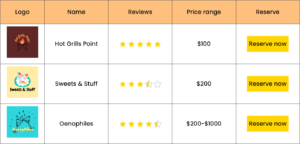
Tabular data visualization
Tabular data visualization is the graphical representation of data structured in a tabular format. Here, data is organized in rows and columns. There are ways to visualize tabular data, depending on the data and the story you want to present.
Data tables are often used in all kinds of websites as pricing tables, comparison tables, feature tables, and many other kinds of tables. They can be useful in many ways.
Logo | Name | Reviews | Price range | Reserve |
 | Hot Grills Point | $100 | ||
 | Sweets & Stuff | $200 | ||
 | Oenophiles | $200-$1000 |
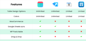
Comparative data visualization
Comparative data visualization is the graphical representation of data that is used to compare two or more sets of data. Comparison tables are comparative data visualization best practices.
The goal of comparative data visualization is to highlight similarities and differences between different sets of data and to help viewers gain insights into the relationships between those data sets.
| Features |  | |||
|---|---|---|---|---|
| Table Design Options | Unlimited | Limited | Unlimited | Limited |
| Colors | Unlimited | Limited | Unlimited | Limited |
| WooCommerce | ||||
| FluentCart table | ||||
| Google Sheets sync | ||||
| WP Posts table | ||||
| Drag & Drop | ||||
| Pre-built templates | ||||
| Custom filter | ||||
| Export-Import Table | ||||
| One-click Migrate from TablePress | ||||
| Fluent Forms integration | ||||
| Advanced Styling | ||||
| ACF Field Mapping | ||||
| Charts | ||||
| Conditional formatting | ||||
| Value transformation | ||||
| Custom CSS | ||||
| Trash/restore |
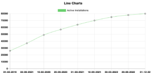
Line chart
A line chart is a type of graph that displays data points connected by straight-line segments. It is commonly used to show trends or patterns over time, as well as to compare different data series. In a line chart, the x-axis usually represents time or another continuous variable, while the y-axis represents the numerical values of the data being plotted.
Line charts are often used in business, economics, and social sciences to visualize data such as stock prices, sales figures, or survey results. They can be useful for identifying trends, detecting changes over time, and making predictions based on historical data.
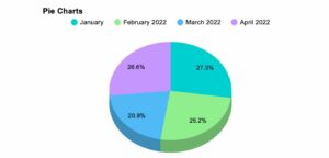
Pie chart
Pie charts are one of the common data visualization techniques and are used across a lot of workarounds. they are ideal for part-to-whole comparisons or illustrating proportions.
These kinds of charts are relatively easy to read and best suited to audiences who are interested in the key takeaways. For viewers needing a more thorough explanation of the data, pie charts fall short in their ability to display complex information.
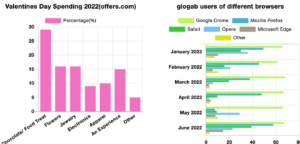
Bar charts & Horizontal bar charts
Bar charts are the type of graph that represents data as rectangular bars of equal width, with weights proportional to the values being represented. It is a useful way to visualize and compare the relative sizes of different categories or data points.
In those charts, the x-axis usually represents the categories being compared, while the y-axis represents the values of the data being plotted. Each category is represented by a separate bar, which can be colored or patterned for better visual differentiation.
These charts are particularly useful for displaying discrete data, such as categorical data or data that can be divided into groups. They are often used to show the frequency or distribution of data, as well as to compare different sets of data.
Horizontal bar charts are one of the variations of bar charts. There are a lot more including stacked bar charts, which show the total value of each category by stacking the values on top of each other and grouped bar charts, which show multiple sets of data side-by-side within each category.
Overall, it is a simple and effective way to visualize and compare data, making them a popular choice for data analysts, researchers, and business professionals.
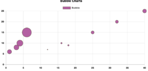
Bubble Chart
A bubble chart displays data as a set of bubbles, representing a data point. The bubble sizes represent the value of a third variable, while the position of the bubble on the x and y axes represents the values of two other variables.
They are useful for displaying and comparing data sets that have three variables. They are often used to show the relationship between two variables, such as price and quantity, and a third variable, such as profit or market share.
The bubbles can be color-coded or labeled to represent additional variables, such as product categories or geographic regions. Overall, bubble charts are a powerful way to visualize and compare data sets with three variables, allowing viewers to quickly identify patterns, relationships, and outliers within the data.
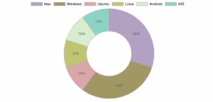
Doughnut chart
It is a pie chart alike with a hole in the center. The doughnut chart looks like a doughnut split into segments, where each segment represents a portion of the total value and the total size equals the full.
Doughnut charts are useful for showing data for comparing different values within a single set. They are often useful when there is a small number of categories, as they can become difficult to understand when there are many segments.
Doughnut charts can also be used to show the relationship between multiple data sets. For that, multiple doughnut charts can be showcased side-by-side. Overall, doughnut charts are a useful tool for displaying and comparing proportions of data and can be a visually appealing way.
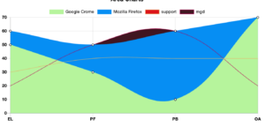
Area Chart
An area chart displays data as a series of data points connected by a line, with the area below the line filled with color or shading. It is a variation of a line chart and is often used to display data over time, such as stock prices or changes in temperature.
In an area chart, the x-axis represents time or another continuous variable, while the y-axis represents the values of the data being plotted. Each data point is connected by a line, and the area below the line is filled with color or shading to indicate the range of values.
Area charts are useful for showing trends and changes in data over time or across different variables. They can be particularly effective for displaying multiple data sets on a single chart, as the shaded areas make it easy to see where the data sets overlap or diverge.
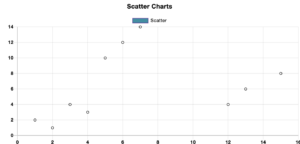
Scatter plot chart
A scatter plot chart displays data as a set of points on a two-dimensional coordinate system, where each point represents a data point. The x and y-axis represent two different variables, and the position of each point on the chart represents the values.
Scatter plot charts can help show the relationship between two variables, like the correlation between height and weight or the relationship between sales and marketing costs. By plotting the data points on a coordinate system, viewers can quickly see any patterns or trends in the data and identify any outliers or unusual data points.
Plot your own scatter chart with Ninja Charts and embed. Or, you may also try using a scatter plot maker, which simplifies the process of plotting.
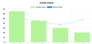
Combo Chart
A combo chart combines two or more different chart types on a single chart, like combining a line chart and a bar chart or a scatter plot chart and a line chart.
Combo charts are useful when you want to display multiple types of data or data with different scales on a single chart. For example, if you want to display sales revenue and sales volume over time, you might use a combo chart with a line chart for revenue and a bar chart for volume.
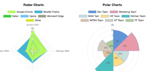
Polar chart & Radar chart
A polar chart, also known as a radar chart or spider chart, is a type of chart that displays data on a circular grid with multiple axes extending from the center.
Each axis represents a different variable, and the value of each variable for a given data point is plotted as a point on the corresponding axis, with the points connected by a line to form a polygon.
Polar charts are useful for displaying data with multiple variables or dimensions, such as the performance of different products or the skills of different team members.
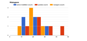
Histogram
A histogram shows how numerical data is distributed by dividing the data into intervals or bins. The intervals or bins are represented by the chart’s x-axis, and the frequency or number of data points in each bin is represented by the y-axis.
Histogram charts are useful for displaying the shape of a distribution as well as identifying any outliers or unusual data points. They are particularly useful for data sets with large numbers of data points or continuous data, such as heights, weights, or test scores.
Overall, histogram charts are a powerful tool for visualizing the distribution of numerical data, and can be a valuable part of any data analysis or visualization toolkit. They are widely used in fields such as statistics, data science, and economics.
Improve your data visualization skills with data visualization best practices
In the conclusion of the blog, the only statement can be to improve your data visualization skills. For visualization, you need some tools. There are many data visualization tools available, each with advantages and disadvantages. To find the most effective tool for helping to visualize data, try becoming familiar with the majority of them.
Practice makes progress
Consistent practice will help you get better at data visualization, just like with any other skill. Make time to complete as many data visualization projects as you can in order to get familiar with a variety of tools.
Collect feedback
Present your visualizations to others and solicit helpful criticism. An unbiased assessment will show you where you’re succeeding and where you can do better.
Read books, blogs, and forums
On data visualization, there are a ton of books, blogs, and specialist forums. Reading through such material will aid in your understanding of the components of data visualization and how to use them successfully in your projects.

Get Exclusive Tips, Updates, and Inspirations in Your Inbox!
Our contribution
Here, we present the best table builder plugin in the market, an all-in-one solution for all data visualization techniques. Make almost any kind of table for your websites from the easiest table builder interface of this robust table builder, Ninja Tables.
Ninja Tables comes with the free and open-source chart builder Ninja Charts. All the above charts are made with Ninja Charts.
And if you’re thinking about the ease, It’s really easy to do something like this:
- Install Ninja Tables
- Provide table data and customize it
- Render charts from the built tables
- Copy and paste the shortcode to publish it in a post or page
And it’s not just attractive; it’s also useful. Large tables with up to a billion rows are one option, as are sophisticated filters and searches, or you can go crazy and make it editable.
It is one of the most feature-rich table builder plugins with Google Sheets integration, WooCommerce integration, Drag, and drop builder, and whatnot!
Ninja Tables– Easiest Table Plugin in WordPress
FAQ
1. _______ can show trends and cycles and make the information easier to visualize.
A. graphs and charts
B. pictograms and maps
C. surface diagrams and tables
D. captioned graphics and diagrams
The answer is A. Graphs and charts.
Graphs and charts visualizations are valuable tools for revealing trends and patterns and enhancing the understanding of data. Whether you need to analyze sales figures or emphasize a particular trend, a well-designed graph or chart can increase the clarity and credibility of your report or presentation.
Wrap-up
So, That was all? No, that can’t be. Data visualization is a big book to read. We’ll be back with other factors soon. Just be aware of bad data visualization and try to gain skills.
“If data is the king, data visualization is the ultimate kingmaker.”
Your beautiful data deserves to be online, and we are here to help you with that.
That’s all for today. Browse some of the top data visualization tools in WordPress and decide what your website needs.
Follow us on Twitter and Facebook to stay updated. Comment below to share your thoughts with us.


Add your first comment to this post