What Makes a Good Website: Checklist for Business Owners

In a cluster of millions of websites, how can you stand out in this competitive landscape? Hence comes the term good website in full action. There is so much you can do to cut through the noise, it’s become even harder to think which one to choose/follow.
Some may say it’s SEO that makes a good website, or design and aesthetic, or user experience, or responsiveness. Hold your horses, it’s not just a single attribute, mixing it all up is what results in a great website.
We’ll talk about the website launch checklist and prerequisites in this article.
Factors to consider before building a good website
How to make a good website?
Don’t be anxious about where to start, whether you’re a small business owner, personal blog publisher, want to market your online course, or even a market giant; first, just think of your end goal, and eventually, everything comes together.
In this article, we’ll help you comprehend what it takes to make a good website.
Design
Say you enter a Japanese Izakaya restaurant and you expect Japanese delicacies. As you entered you saw a misguided visual representation of an Italian bistro. Won’t the appearance confuse you?
Similarly, an overwhelming number of online users (94%) base their initial judgment of a website on its appearance. Users make decisions about your website in roughly 0.05 seconds, which affects whether they like it or not and if they’ll stay on it or not.
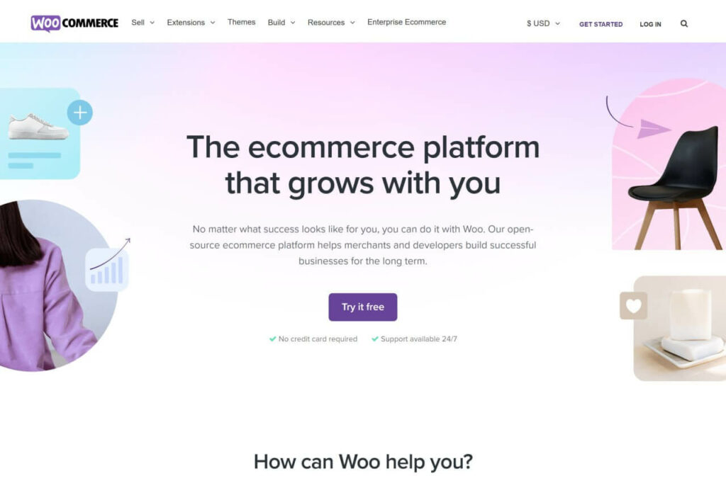
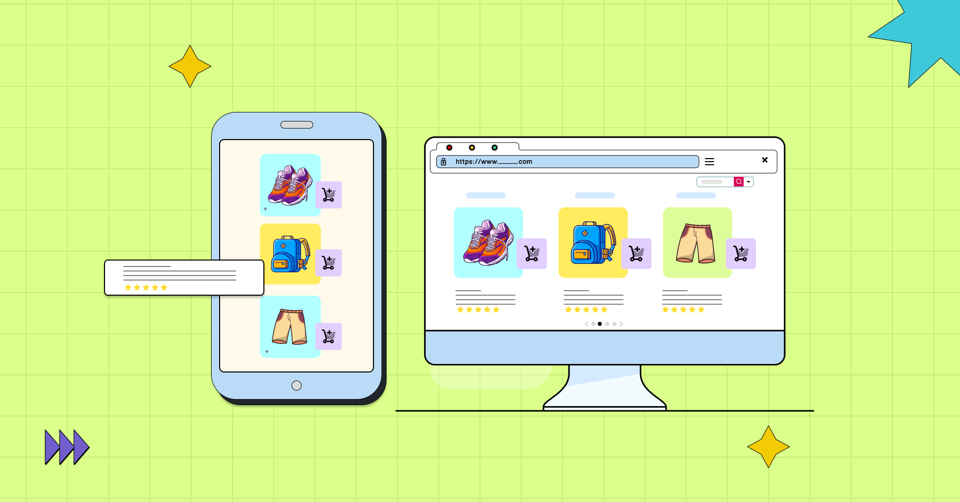
For instance, one of the best features of WooCommerce’s website design is its user-friendly interface that allows for easy navigation and product search.
Users can easily locate what they’re looking for quickly thanks to the homepage’s clean, modern design and large search bar at the top.
- Your landing page and product display page should be a digital representation of your business.
- Direct and relevant information should grab a positive first impression with a single click.
- Build awareness at a first impression with proper information sorting tools, and data display plugins available in your CMS. Alongside visual aesthetics, a well-coordinated pillar page, relevant sitemap, displaying product pricing, ratings, etc.
- Consistency should be the guiding principle of your web design system, and while putting it into practice, you must take great care to constantly adhere to the business’s intent.
- Credible web design helps to increase usability, faster load time, and better user experience.
- Every element on the page should be mobile responsive, including any chart or animation you add.
- HQ images or videos for visual aid.
- Choose the right font.
Functionality
You need to start thinking like a noob audience- What am I looking for in this website? And the website, with all its elements, should be able to answer that right on the webpage.
- For instance, E-commerce websites are crafted to deliver a smooth and hassle-free online shopping experience to their visitors.
- The primary objective of a business website is to professionally showcase relevant information about the company’s products or services in an intuitive and user-centric manner, with the ultimate aim of driving sales and boosting revenue.
- If you make users work too hard to get the information they’ve come to the site to find, they’ll have a negative experience with your brand – and most likely they won’t return.
- Functionality should be the emphasis because there is a thin line between a responsive menu and one that is overbearing.
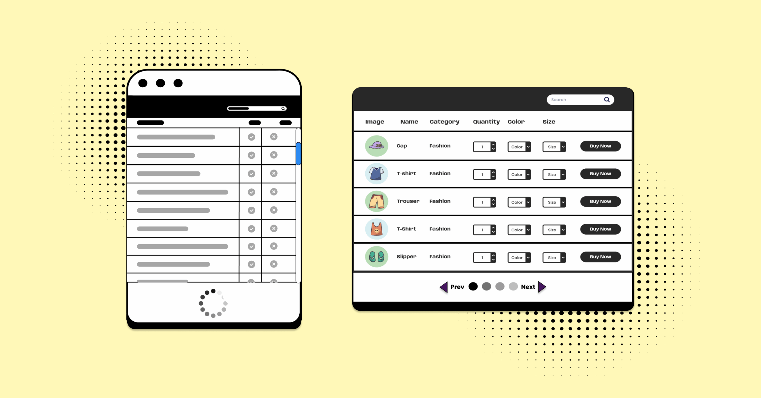
Ensure a better product assortment that appeals to your customers’ aesthetics and preferences. If yours is a WooCommerce website, use a responsive product table to show all the product details in one place. It will create a seamless shopping experience and great UX/CX.
| Image | Name | Category | Price | Choose | |
|---|---|---|---|---|---|
 | Blue Hoodie (Zipper) | Hoodies | Original price was: $40.00.$35.00Current price is: $35.00. | | |
 | Hat | Hat | Original price was: $20.00.$15.00Current price is: $15.00. | | |
 | T Shirt | Half sleeve | $45.00 | | |
 | T-Shirt with Logo | Tshirts | Original price was: $10.00.$8.00Current price is: $8.00. | | |
 | Beanie with Logo | Accessories | Original price was: $20.00.$18.00Current price is: $18.00. | | |
 | T-Shirt | Tshirts | $18.00 | | |
 | Long Sleeve Tee | Tshirts | $25.00 | | |
 | Polo | Tshirts | $20.00 | | |
 | Hoodie with Logo | Hoodies | $45.00 | | |
 | Hoodie with Pocket | Hoodies | Original price was: $45.00.$35.00Current price is: $35.00. | | |
 | Hoodie with Zipper | Hoodies | $45.00 | | |
 | Beanie | Accessories | Original price was: $20.00.$18.00Current price is: $18.00. | | |
 | Belt | Accessories | Original price was: $65.00.$55.00Current price is: $55.00. | | |
 | Cap | Accessories | Original price was: $18.00.$16.00Current price is: $16.00. | | |
 | Sunglasses | Accessories | $90.00 | | |
 | Tank Top | Tanktop | Original price was: $45.00.$40.00Current price is: $40.00. | |
SEO
Now, “How to get noticed by search engines and get organic traffic?”
Ranking on the top search engine result page that matches the customer search intent is the backbone of any website. It concludes many aspects such as content, copy writings, blogs, etc.
In addition to keeping your target audience captivated, great content is a key component of any effective SEO plan. Guide the customer’s with your content on how they can best leverage your product features, and how your product and services can help them solve their problem.
- Optimizing keywords on headings even throughout the website can help stay on the radar of Google crawlers.
- Image optimization can help your website’s content rank higher for Google to crawl, including in Google image search results.
- To get in the big picture you can focus on specific search queries to get more passive traffic transferring it into conversion rate.
- Google algorithm changes dramatically, but it’s nothing more than you can handle. So keep an eye on recent trends, and leverage those in your SEO strategy to get noticed by both Google and customers.
- Outdated content and information on the website drive the customer’s away. So keeping up-to-date information is crucial.
- Find customer queries and answer them accordingly.
- Say NO to keyword stuffing.
- Page loading time and responsiveness also affect SEO.
- Add your sitemap to Google to better ensure the crawlers.
- Classify webpage content with structured data.
User experience
It is exactly what it sounds like: the overall experience a person has with a place, product, or digital asset such as a website. A positive and enjoyable UX leads to the state overall goodness of a website.
The fact that 39% of internet users claim they will leave a website if the graphics take too long to load or don’t load at all.
- Modern website designs must prioritize simplicity and functionality to ensure that users can easily navigate and understand your website.
- People now have shorter attention spans than ever before, so it’s crucial to have a smooth, uninterrupted, clean, and engaging user experience.
- Your website should have fast page load times, incorporate white space to reduce clutter, relevant SEO content, and include multimedia content that adds value to the user’s experience.
- Your website design should be intuitive to the user, which may include features such as image captions, minimal distractions, and a balanced view of motion design.
- A live customer support or chat button can make the audience understand you care about them.
- You can’t ignore personalization if you want a good UX. It’s also a handy trick to increase revenue in eCommerce since personalization affects average order value.
- We may not have mentioned “responsiveness” here, but it’s one of the most important parts!
Don’t be fooled because there are also some popular websites with bad design and planning. So, we got a checklist for you.
Checklist to make a good website
What would make a good website?
There’s no “one” answer.
If you’re a designer, web developer, or client in need of a top-notch website, or if you’re just starting and feeling unsure about where to begin, you need a checklist outlining the key elements of a great website.
So, what are the qualities of a good website?
As we delve into the technical aspects of a good website checklist, we’ve got you covered.
Here are 8 qualities of a good website and a website launch checklist.
SMART goal
A good website consists of a conceivable, comprehensive, and accurate vision of what the website represents itself.
- What would you like to accomplish? That’s the primary stage to creating a brand persona and establishing your purpose which later reflects on your website. It’ll help your visitor to fully understand what they can get from your website.
- Measurable KPIs also help you to track and survey customers before and after their experience to think about how your website is performing.
- Set attainable, realistic, relevant, and timely achievable parameters for your website to meet customer satisfaction.
- Avoid setting goals and concentrating on measures that aren’t always predictive of business success.
Relevancy
It’s the “R” in the SMART. The key to convincing visitors to stay on your website is to convey a distinct, compact message that is simple to pick up. Speak with the customer profile you want most.
- Each web page must have a concise objective to encourage customers to interact with the products you have to offer. Steer clear of vanity objectives once more.
- Don’t make your users guess or work to find what they need.
- Use visible buttons on your landing page, and guide them toward the relevant areas they might need.
- Use images, other graphics, and headings that are relevant.
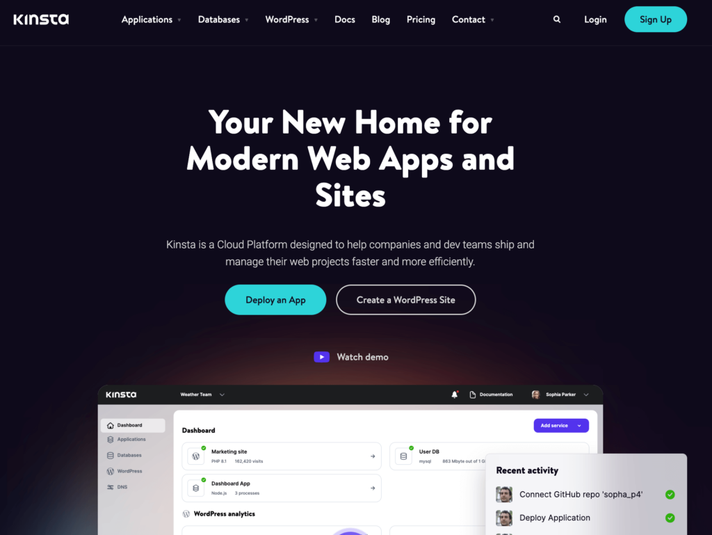
For example, Kinsta’s branding is consistent across all pages of the site, creating a cohesive experience for visitors.
Once you convince them to stay, you need to provide them with only the information they may be looking for – high-quality content.
Tip: Again, personalization is your friend!
Quality content
You must ensure your content addresses your customers’ pain points and provides them with useful, helpful, and relevant information. A big part of making your brand stand out is providing valuable information that matters to your audience—for free.
- This can be done on both pages and in blog articles. It also often comes in the form of providing insider information and tips, tools like comparison tables and checklists, helpful resources, and tips.
- Offering something of value at no cost is an integral part of an SEO content marketing plan.
- It works to bring in web traffic and builds your business’ trust and credibility with site visitors.
- Also to give ideas of what differentiates you from thousands of other websites/businesses/products, you can provide comparison content and tables.
Here are some examples of comparison table templates.

Most of the websites can offer free templates if that’s relevant to the business. It keeps the audience engaged and helps them save their time.
If you use data tables, check out some templates here.
Website responsiveness
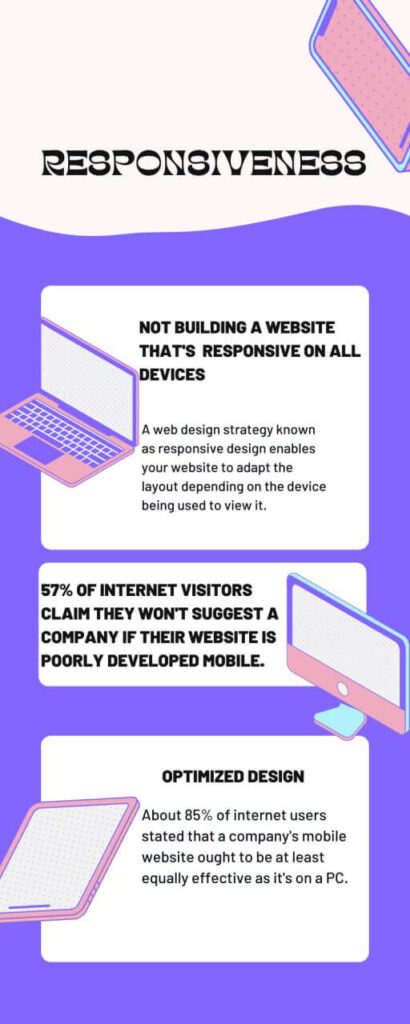
Since 52% of visitors come from mobile devices, it’s important to ensure your website is mobile-friendly. Adjust the website layout based on different devices and make it responsive.
This ensures that the website works well and looks great on all platforms, including desktops, laptops, and mobile devices. Since users may easily interact with the information on any device, responsive and adaptable design can improve the user experience.
Easy navigation
A user-friendly interface is what characterizes a good website user experience. Create a layout outlining the path that site visitors will take across your website, from their starting point to their final spot.
Include internal links in the material and pages to help readers access further details, notions, and resources.
We have the Ninja Tables website as an example. All the tabs are organized and every page, including single feature pages, serves as a landing page.
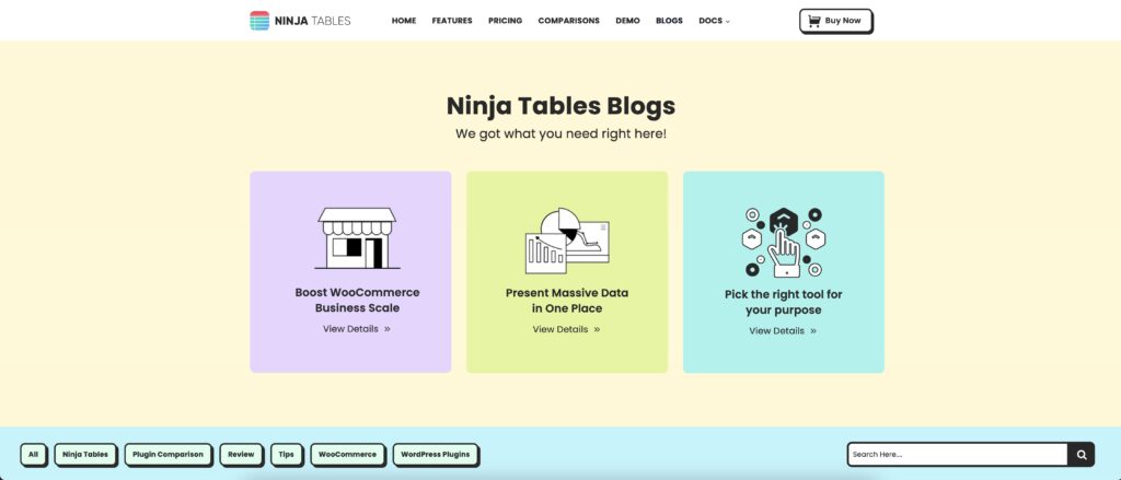
If the interface of a website is complex, visitors will give up and search somewhere else for the information they are looking for. Each page’s interface and navigation should be intuitive and easy to use.
Structured data
Search engines may leverage the use of structured data to comprehend the contents of your website if it is implemented appropriately. This could lead to a better presentation of your website in search results, such as rich snippets.
There’s no guarantee that you will receive rich results, as the search engines control that. But it’s better to be ready than sorry.
CTA
While having high-quality, interesting, and SEO-friendly material is great, you also need to direct the reader’s next steps. Every page should have a call to action. It serves as a great customer navigation system.
A call-to-action (CTA), often known as an image, text, or button, intends to lead the reader through each sales funnel step.
This encourages visitors to take immediate action and seize the opportunity to save money on their purchases, thus increasing the conversion rate.
SSL
It can be excruciating to invest time and money in a website just to lose customer inflow due to a website hack or bad security reputation. A decent website must maintain industry-standard security protocols and have strong security.
- Pick a reputable web host that offers enhanced protection and does so automatically for the hosting websites.
- Websites that use HTTPS are more reliable and can safeguard sensitive data. If your website is safe, HTTPS will be visible in the URL.
- It can be challenging to provide a website that can gain the users’ trust in the internet world of fraud, and cybercrime.
What are some good website examples? Any website that has all of the above points.
Are you a dropshipper? Check out some examples of best dropshipping websites. We also have 8 WooCommerce store examples ready for you to check. Design your own website and show us what you loved doing.
Signing off
Your business needs a website, but not just any website. It acts as the center of gravity for all of your digital marketing initiatives and frequently acts as the customer’s first point of contact with your company.
What is the key to a successful website?
Describe the why, how, and why on the landing page so your target audience gets all the answers they’re looking for. Build a connection on a personal level and offer them value.
We’ve discussed some of the most crucial components to concentrate on as you build or update your website. You probably have some input that we haven’t added to our website launch checklist.
So, what is your top priority while creating a quality website?

Ninja Tables– Easiest Table Plugin in WordPress
Get special discount on the best table plugin made for you!



Add your first comment to this post