8 WooCommerce Store Design Examples
Ever had that moment when you’re scrolling online, and you see a WooCommerce store design so cool, you can practically hear your inner Tony Stark saying, “I can build something better”? Well, now’s your chance! Whether you’re just launching your WooCommerce store or looking for a fresh start, sometimes all you need is a spark of inspiration- kind of like when Mariah Carey’s Christmas classic starts playing, and you know the festive season is here. Suddenly, you’re in the zone, ready to bring your vision to life!
In this blog, we’re diving into standout WooCommerce stores, breaking down what makes them great, and showing you how to take your shop from “Meh” to “Wow.”
Ready to start browsing your next design muse? Let’s go!
An Overview of WooCommerce
Before we dive into our lineup of stunning WooCommerce store designs, let’s break down what a WooCommerce store really is.
WooCommerce is more than just a WordPress plugin—it’s your all-access pass to the world of e-commerce. It transforms your website into a complete online store where you can add products, set up payments, manage shipping, and more, all with the flexibility and customization of WordPress. Its open-source nature means endless possibilities for tweaking and optimizing your store with compatible extensions and plugins.
Now, here’s the deal- with so many brands already using WooCommerce, carving out a unique spot can be overwhelming. That’s why we’re zoning in on the designs and features that make some WooCommerce storefronts true rockstars.
Unlike most articles that focus solely on products or business features, we’re all about the digital storefront itself. We’ll spotlight the layouts, visuals, and functionalities that turn these stores into conversion machines.
Let’s see how it’s done!
8 WooCommerce Store Examples to Inspire Your Own
From modern to colorful, minimalist to quirky—whatever your aesthetic—we have something for every vision.
Check out these 8 WooCommerce stores that are totally nailing the game – your backstage pass to all the inspiration you need for an online store that stands out!
Sodashi
Sodashi is the epitome of high-end, holistic skincare from Australia. Rooted in pure ingredients and a commitment to natural beauty, this WooCommerce store exudes sophistication while promoting self-care and wellness.
Standout design features
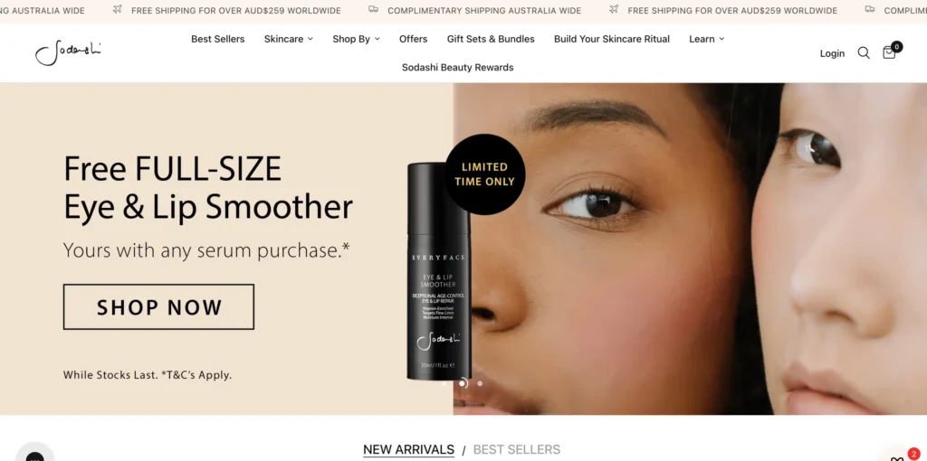
Sodashi’s homepage is built around simple hero images that move on a carousel, focusing on giving visitors a sense of their unique style. Also what gives it a strong head start is its homepage doesn’t distract the visitors from the products they sell at its woocommerce store.
- Minimalist luxury: A clean, neutral color palette with soft gold accents.
- Ample white space: The open white space lets products take center stage without overwhelming the visitor.
- High-quality, polished images: Its spa-like visuals exude calm and sophistication which serves the purpose and answers the ‘Why should I buy’ question right off the bat.
Functionality
Their floating chatbox for talking to customer support agents is what makes this website worth mentioning. Also, the visible gift box icon gives easy access to free items or discounted products. New customers can easily see gifts and free products which is a great opportunity to create FOMO and initiate the ‘Let’s give it a try’ phase.
- Seamless navigation: Easy to browse collections and learn about ingredients.
- Personalized touch: Detailed product descriptions with “skin rituals” guide customers.
- Seamless integration: With payment and subscription options for repeat customers.
Key takeaways from Sodashi
Its streamlined user experience is another reason we started the list with Sodashi.
The challenge with this type of minimalist design with a light background is balancing the main image carousel without overshadowing other elements. Sodashi effectively highlights the carousel while keeping the logo and navigation bar clear and aligned with the minimalist aesthetic. The well-organized drop-down menu allows easy access to product details before making a purchase.
The standout feature of this shop? Their product displays! A responsive layout with lightning-fast load times is every shopper’s dream.
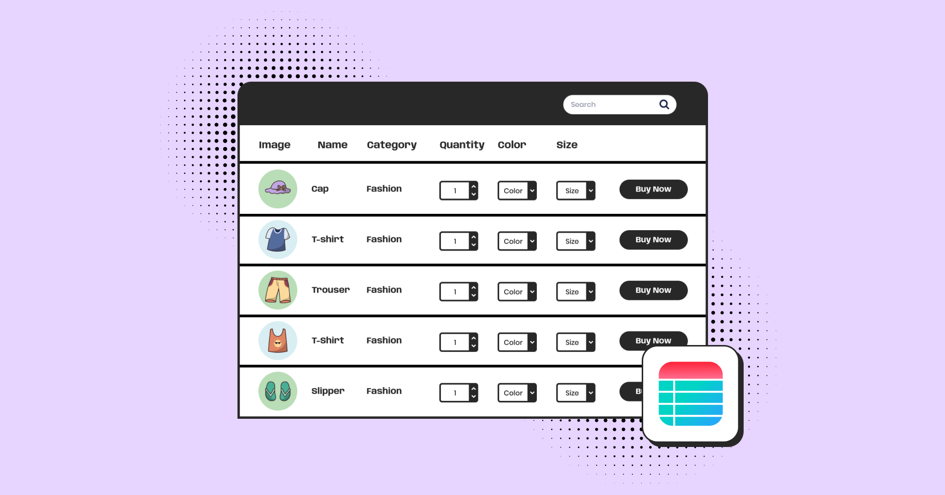
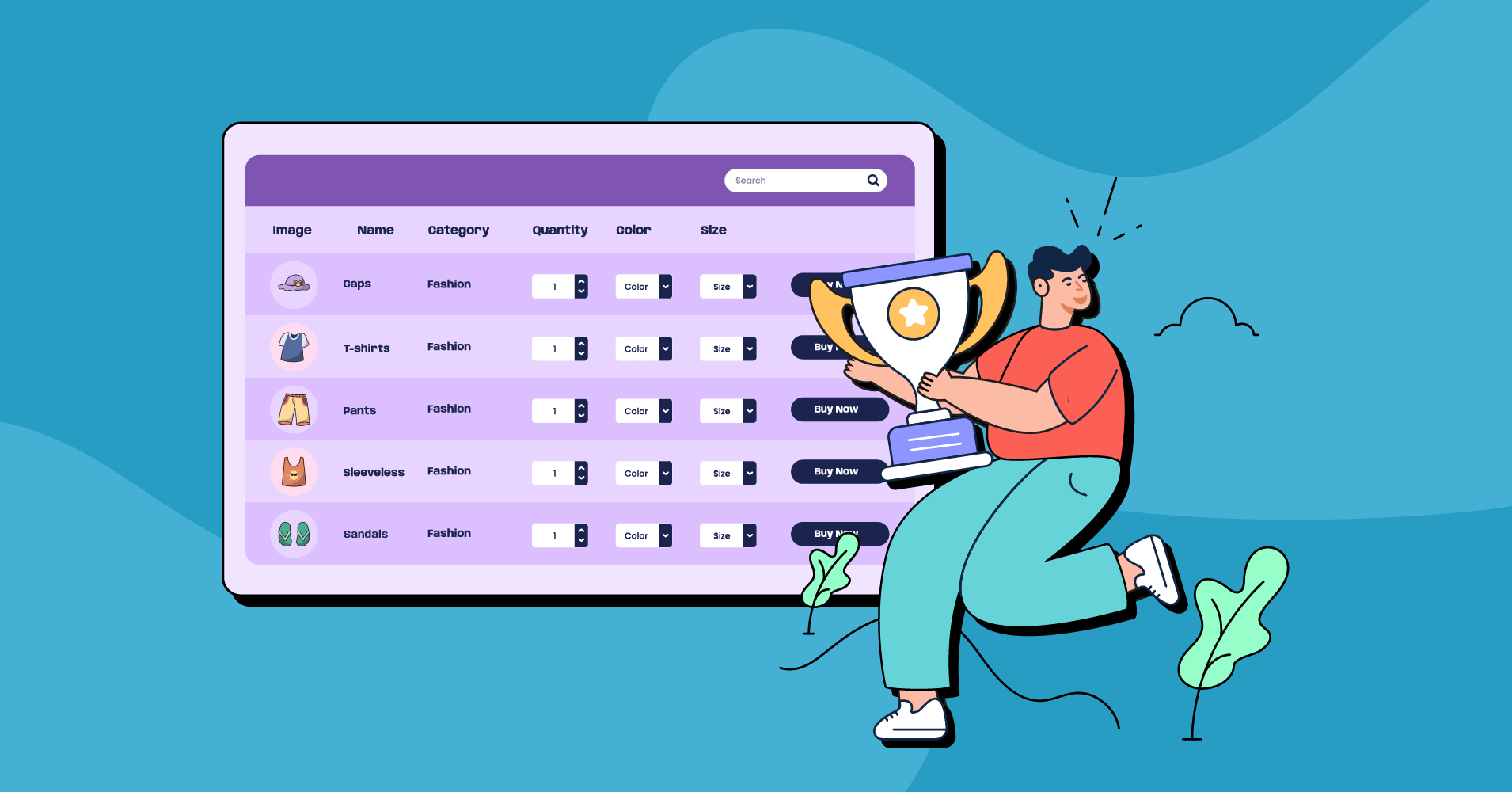
Pro Tips: If you’re looking to elevate your WooCommerce store, consider using a dynamic WordPress plugin for product display tables. Give Ninja Tables a spin!
With it, you can effortlessly create customized, lightweight, and responsive tables to showcase your products. Plus, it fits seamlessly with any color scheme, category, or service you offer. Transform your display without compromising on style or functionality!
The multistep form starts with a few quick questions about skin type and, based on the answers, guides customers to a personalized product page. It’s a clever way to ‘know your customers’.
- Minimalism sells: Luxury can be subtle yet powerful.
Joco Cups
JOCO Cups offers a range of reusable glass drinkware designed for eco-focused consumers who value aesthetics and sustainability.
Standout design features
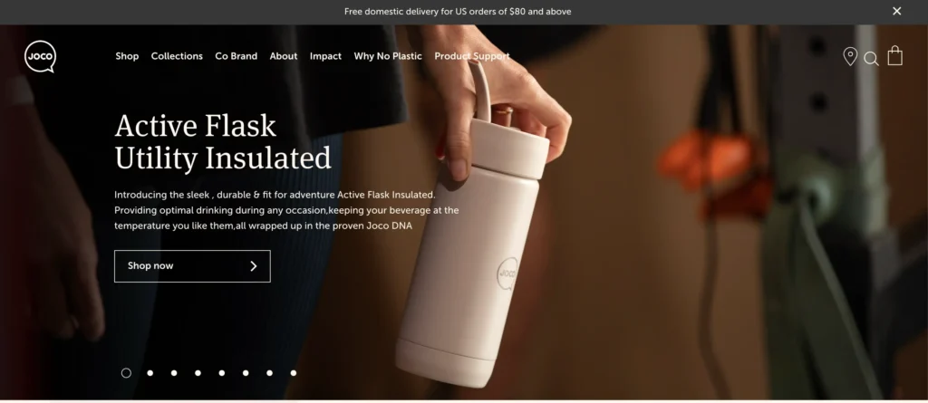
The JOCO Cups homepage slowly scrolls through hero images of some of their most popular products. Each item is displayed in a high-resolution image that fits the brand aesthetic, with a matching call to action that takes visitors to the related category page.
- Sleek Visuals: Maintaining a monochromatic design can be tricky, especially when your products share the same theme. This site, however, pulls it off effortlessly! Its sleek layout and stunning high-quality images create a captivating visual experience that uplifts the entire brand.
- Consistent Branding: Cohesive typography and branding reflect JOCO’s commitment to sustainability on all pages.
Functionality
- Interactive Elements: Dynamic product galleries with hover effects improve user engagement.
- Intuitive Navigation: A well-organized mega menu allows quick browsing without overwhelming.
Key takeaways from JOCO Cups
Its minimalist mega menu, sticky header, and simple footer combine exceptional functionality with an engaging site structure, creating a seamless shopping experience for customers.
- User Experience Matters: Intuitive design encourages longer browsing and satisfaction.
R.E.D.D Superfood Energy Bars
R.E.D.D Superfood Energy Bars combine plant-based ingredients with superfoods, providing a nutrient-dense snack for health-conscious consumers. It’s not surprising that you’re seeing a healthy vegan snacks WooCommerce site on this list. Their WooCommerce store reflects their commitment to clean energy and natural nutrition with a vibrant, functional design we all must admire.
Standout design features
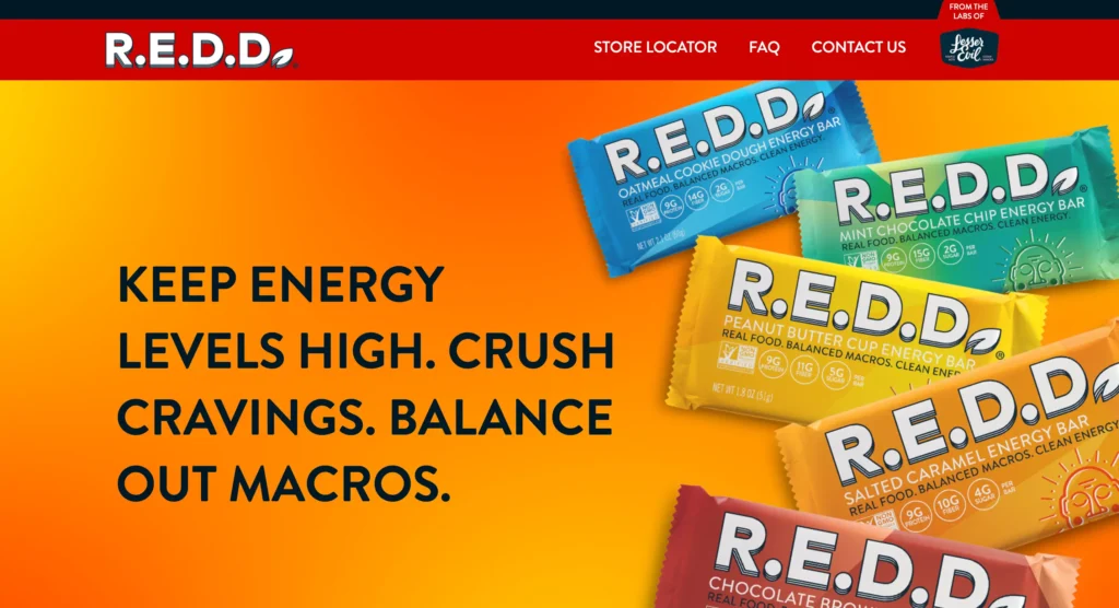
R.E.D.D.’s photo highlights its sleek branding and gives visitors a clear look at the bars. Their homepage features key labels—vegan, non-GMO, and gluten-free.
- Bold Color Palette: The website’s vibrant color palette reflects its energy-focused brand, creating a fun, retro vibe with rainbow gradients and a pixelated touch. Yet, the clean grid and responsive design keep it modern and easy to navigate.
- Product-Focused Layout: The homepage emphasizes the bars themselves with high-quality product images, clearly showcasing the ingredients and benefits of each flavor.
- Interactive Nutrition Breakdown: All the nutrient information about their products is available the moment you enter the site, so that’s also pretty convenient.
Functionality
As you scroll down, you’ll see how the site cleverly uses the distinct package colors of its five energy bars to create smooth sections. This isn’t just a cool visual trick—it makes navigation much easier while also maintaining the brand’s identity with every scroll.
- Quick Add-to-Cart: A quick-add option allows users to add products to their cart directly from the product listing, simplifying the shopping process.
- Optimized Checkout: A streamlined checkout process with multiple payment options like Apple Pay, PayPal, and credit card integrations, ensuring easy and fast transactions.
Key takeaways from R.E.D.D Superfood Energy Bars
Why is it on our list? Their transparency! Ingredient details are showcased right after the hero image and on every page, ensuring visitors can’t miss what makes them special—an inviting reason to buy those delicious bars!
- Bold Branding Works: Strong colors and energetic design elements can effectively communicate the brand’s message.
Root Science
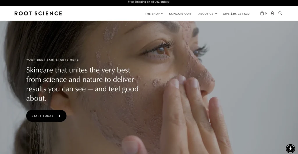
Root Science offers a line of organic skincare products focused on natural, high-performance ingredients. Their WooCommerce store embodies simplicity and elegance, with a clean design that reflects the brand’s commitment to natural resources and efficacy in skincare.
Standout design features
At first glance, the site draws you in with an engaging slider and product video that shows everything you need to know. Soft, clean, and earthy tones mirror the brand’s commitment to natural, organic products, creating a soothing vibe. Right after, the featured section takes center stage, reinforcing trust before leading seamlessly into the brand’s mission.
- Clean Color Palette: Soft, earthy tones mirror the brand’s natural and organic resources, creating a soothing visual experience that complements the product line.
Functionality
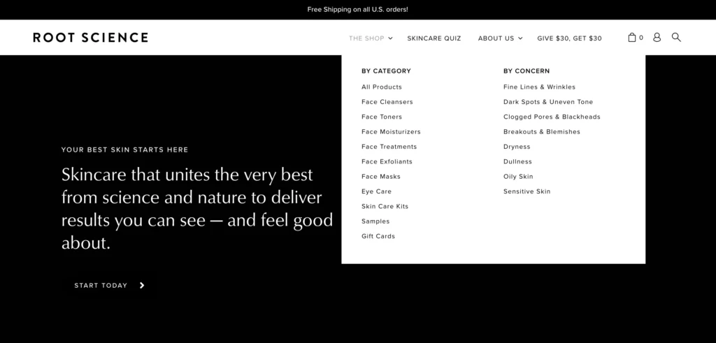
All products are neatly organized by category, and the clear CTA button directs shoppers to the best-suited product according to the search query. To top it off, they add a playful touch with a quiz that engages users and adds a fun, interactive element to the experience.
- Filter by Skin Concern: A smart filtering system allows users to find products tailored to their specific skincare concerns, such as acne, aging, or sensitivity.
Key takeaways from Root Science
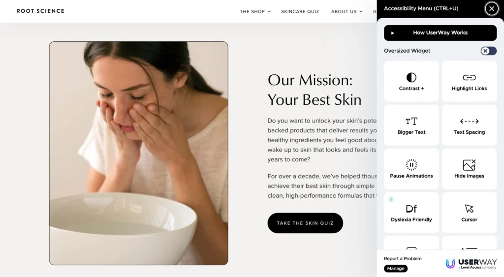
What sets it apart is the floating accessible bar. It’s packed with every viewing option, allowing you to tailor your browsing experience to your preferences with just a click. Simple, intuitive, and designed for convenience!
- Simplicity Drives Focus: A minimalist design can effectively draw attention to product quality and benefits, keeping customers engaged with the essentials.
- Transparency Builds Trust: Clear ingredient information builds trust, especially for customers seeking natural and organic products, and it’s a must for you to establish credibility.
It’s such a pleasant experience to explore a store that offers so many adaptable options for visitor’s comfort.
While we weren’t going to focus on the products or packaging, the beautifully contrasted packaging and label designs on the website are hard to ignore. The color grid and sleek layout create a modern, luxurious feel without being flashy. From the name to the packaging, everything ties into the site’s curated, exclusive vibe. It’s ‘quiet luxury’ at its best!
Daelmans Stroopwafels
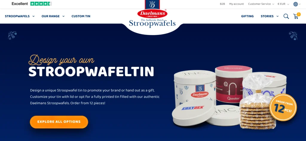
Daelmans Stroopwafels brings the authentic taste of Dutch stroopwafels to the global stage with their WooCommerce store. Known for their caramel-filled waffles, the brand focuses on delivering both tradition and quality to their customers through a simple, product-centered website.
Standout design features
- Warm, Inviting Visuals: The site’s color palette mirrors the caramel tones of the stroopwafels, creating a warm, inviting atmosphere that aligns with the brand’s traditional heritage.
- Interactive Product Display: Users can hover over product images to reveal different angles, providing a more immersive browsing experience.
- Nostalgic Theme: The use of traditional Dutch visuals and lifestyle shots evokes a sense of authenticity, connecting customers to the brand’s origins.
Functionality
- Recipe Integration: The site offers a dedicated section for recipes, allowing customers to explore creative ways to enjoy stroopwafels in desserts and beverages.
- Multi-Language Support: With global reach, the website features multi-language support to cater to an international audience.
- Gift Box Options: The website features customizable gift boxes, making it easy for users to send stroopwafels as gifts for special occasions.
- Quick View Feature: A quick view functionality allows customers to explore product details without leaving the page, streamlining the shopping experience.
Key takeaways from Daelmans Stroopwafels
Daelmans Stroopwafels’ WooCommerce site is highly functional, with dynamic filtering for easy product sorting. Product pages are detailed yet streamlined, offering reviews and flexible pack sizes, all within a fast, user-friendly interface.
- Highlighting Product Versatility: Offering recipes enhances product value and inspires customers to find new uses for their purchase.
- Global Accessibility Boosts Reach: Multi-language support ensures the brand appeals to an international audience, expanding its customer base.
- Gift-Friendly Features Encourage Sales: Easy-to-customize gift options help drive additional sales, especially during holidays or special occasions.
Godin Guitars
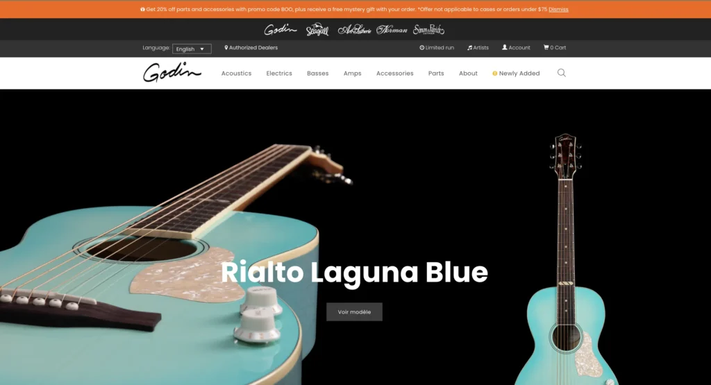
Godin Guitars, renowned for their high-quality craftsmanship, offers a wide range of guitars that cater to both professionals and enthusiasts. Their WooCommerce site reflects the brand’s attention to detail and premium quality, presenting a seamless shopping experience for music lovers.
Standout design features
- Elegant and Sleek Layout: The site features a sleek, minimalist design with high-quality images of each guitar, emphasizing the craftsmanship and beauty of the instruments.
- Interactive 360° Guitar View: Customers can explore each guitar in detail with an interactive 360° view, allowing them to examine the intricate craftsmanship from every angle.
- Rich, Visual Storytelling: Through a combination of professional product images and artist collaborations, the website tells the story behind each guitar model, adding depth to the shopping experience.
Functionality
- Comparison feature: Letting customers see and compare products they’re unsure about is a total win! This feature simplifies decision-making and helps you sell a lot faster without jumping through hoops!
- Detailed Product Specs: Each product page provides a detailed breakdown of the guitar’s specifications, including tonewood, pickups, and neck profiles.
- Enhanced Search Functionality: A robust search filter lets users find specific models based on body shape, tone, or material, tailoring the experience to each musician’s preference.
- Artist Endorsements: The website includes a dedicated section for artist endorsements, showcasing musicians who use Godin guitars, and enhancing brand credibility.
Key takeaways from Godin Guitars
Another nice touch is the inclusion of customer testimonials on each page. As you scroll down the homepage, you’ll find social media links for Facebook, Twitter, and YouTube and links to contact them via email or phone.
- Interactive Features Engage Customers: Tools like the 360° view and custom guitar builder keep users engaged, making their online experience more dynamic and personal.
- Highlighting Technical Specs Adds Value: Providing detailed product specifications helps users make informed decisions, especially for high-investment purchases like guitars.
Porter and York
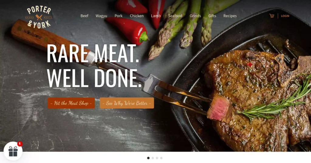
Porter and York is an online butcher shop offering premium, fresh, never-frozen meats. Porter and York’s website is all about mouth-watering visuals and sleek design.
Standout design features
- High-Definition Product Images: The website’s polished, high-resolution photos showcase each piece of meat, triggering you to nearly taste its quality and freshness. The neutral tones and minimalist design keep things fresh, letting the product speak for itself.
- Product Grid with Dynamic Filters: The product grid includes dynamic filters for quickly accessing cut types, meat, seafood, gifts, and recipes. The sticky navigation bar makes everything easily accessible as you scroll down!
Functionality
- Optimized Speed and Performance: The website has a powerful backend that optimizes loading times with clever picture compression and CDNs. This ensures a smooth user experience, even with a vast library of high-quality pictures.
- Smart Search with Autocomplete: The smart search bar uses autocomplete functionality, allowing users to quickly find specific cuts or meats as they type.
- Secure, Fast Checkout: Porter and York’s WooCommerce integration ensures a secure checkout process with PCI compliance, multiple payment options, and a one-click reorder feature for repeat customers.
Fun design theme: Keep scrolling, and you’ll spot an animated video showcasing individually cut meat packs and recipe cards all neatly packed in a cardboard box. It’s a fun watch!
Key takeaways from Porter and York
The adaptable grid-style allows for simple browsing on any device, while high-resolution images highlight those exquisite cuts. Micro-interactions, such as hover effects, provide real-time feedback, enhancing engagement without disrupting the seamless flow of the interface.
- Efficient Navigation is Key: Their mobile navigation is more detailed than the desktop, smartly saving users from endless scrolling. Every menu item fits neatly above the fold, making browsing quick and easy. It’s this clean organization that makes their site a standout in e-commerce design!
Amundsen Sports
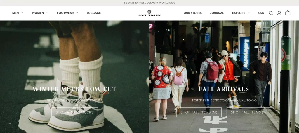
Amundsen Sports, known for its performance-driven outdoor sportswear inspired by Norwegian heritage, merges tradition with cutting-edge technology. Their clothing store using WooCommerce combines user-friendly design with workmanship, displaying the delicate nuances of their products.
Standout design features
- Custom Category Grid: The site uses a flexible grid layout to showcase gear and apparel, adapting based on screen size while maintaining image quality.
- Parallax Scrolling: The homepage employs subtle parallax effects, creating depth and visual interest without overwhelming the user.
Functionality
- Product Filtering: Advanced filtering options allow customers to quickly refine choices by activity, fabric, and sustainability credentials.
- Store Locator Integration: An easy-to-access map locates retail stores, bridging online to in-store shopping.
Key takeaways from Amundsen Sports
The site is a feast for the eyes and a spark for your adventurous soul! It beautifully blends marketing with smart design, inspiring you to explore the great outdoors and ready to feel that wanderlust!
- Categorization for Outdoor Spirit: Just like them you can categorize your products based on use cases, making it easy for customers to find what they need. This approach not only embodies your brand’s spirit but also creates a lasting impression and boosts brand awareness.
Final Thoughts
And there you have it! Whether dreaming big or starting small, WooCommerce offers all the tools you need to bring your e-commerce vision to life. With its endless customization options and features, you can build a stunning WooCommerce store that’s uniquely yours.
From seamless integration with WordPress to thousands of plugins and extensions, WooCommerce helps you tailor every aspect of your store. Fancy a sleek, modern design? Or perhaps a quirky, retro look? The choice is yours, and the possibilities are endless. With WooCommerce, you’re in control.
And remember, you’re not just building a store– you’re creating an experience. The sky’s the limit with WooCommerce. Happy designing!

Ninja Tables– Easiest Table Plugin in WordPress

Add your first comment to this post