Why Most Product Comparison Pages Don’t Convert

You built a comparison page, listed features fairly, and called it a day. This is not how people are convinced and converted. Most product comparison pages fail because they only show “comparisons” to visitors instead of giving them what they need – a decision.
A common assumption is that comparison pages should convert by default with simple lists of feature comparisons and price analysis. You have targeted high-intent visitors, you are displaying clear product differences, and the page has a logical layout.
What could go wrong? Everything.
Listing differences is not the same as helping someone decide. High-intent buyers are not exploring, they are validating. When comparison tables increase cognitive load, conversion rates decline.
What Is a Product Comparison Page?
A product comparison page helps buyers evaluate two or more options to make a purchase decision. It typically includes feature tables, pricing comparisons, or custom comparison blocks.
In eCommerce and SaaS, this page is often designed to help high-intent buyers decide between similar solutions and improve comparison page conversion rates.
The purpose of a comparison page is not just to list specifications, but to help visitors understand how each option fits their specific use cases. Well-designed comparison pages highlight meaningful differences, provide context around why those differences matter, and reduce uncertainty at the moment of decision. When done right, they act as decision-support pages rather than simple feature checklists.
Why Comparison Pages Fail to Convert
Comparison is not decision support. There’s a difference between listing differences and helping someone choose.
Most comparison pages do the first thing well. They show features in neat columns and compare side-by-side, sometimes with price comparisons and even multimedia. They check all the right boxes. They clearly show what feature one option has and the other doesn’t.
But listing features isn’t guiding.
When you present three or four options with roughly similar capabilities and with some crosses and check marks, you’re not exactly helping. And not categorizing the features or mentioning the best pricing plan? You’re creating decision paralysis for your visitors without realizing.
The “feature parity” problem
When everything looks similar at one glance, nothing stands out.
Visitors scan the comparison table. They see that Option A has 30 features and Option B has 40 features but slightly different, and think: “So… they’re basically the same?”
That’s not a comparison. That’s a stalemate and stalemates don’t convert.
In many feature comparison tables, this parity lowers conversion rates because buyers can’t identify meaningful differentiation.
And the frustrating thing is, the more comprehensive your comparisons are, the worse this gets! You’re essentially proving that all options are viable, which is the opposite of helping someone pick one single option.
Neutral layouts feel overwhelming
There’s a design philosophy that says comparison pages or tables should have identical formatting with no visual hierarchy that can reveal the page is favouring one specific option.
When every cell has equal visual weight, visitors have to process everything. There’s no signal telling them what matters.
So they either bounce because they don’t want to waste their time cherry picking or they check price comparisons and sometimes focus on the one with better ratings.
Your detailed and smartly designed comparison page just failed.
The fix isn’t to remove comparison tables. It’s to design them in a way that ensures faster and easier decision-making and not just a list of differences.
What High-intent Buyers are Actually Doing
High-intent buyers want reassurance, context, and clear reasons to rule options out. They’re not waiting to read an entire page full of feature lists.
Validation, not exploration
Marketers and landing page designers assume people are exploring options.
But most often, they’re not. They’re validating a choice they’ve already half-made.
By the time someone lands on a comparison page, they’ve already done their research and narrowed their options.
They’re looking for one of 2 things:
- Confirmation that their instinct is right
- A red flag that makes them reconsider
Explorers want details. Validators want reassurance.
If your comparison page treats validators like explorers, drowning them in options, numbers, icons; you’re not doing it right.
Reassurance over completeness
Validators don’t want to know everything. They know enough and now they want to feel confident about it.
A validator looking at project management tools doesn’t need to compare 50 features. They need to know: “Will this work for my specific situation? Is there anything that should make me reconsider?”
Elimination signals
High-intent buyers are looking for reasons to say no.
This sounds counterintuitive, but it’s how real purchase decisions work. People narrow down by eliminating options that don’t fit.
Your comparison page should help them eliminate confidently. Instead, most pages make elimination harder by presenting everything as viable.
Research → Shortlist → Validate → Eliminate → Decide → Convert
3 Comparison Page Mistakes That Kill Conversions
You want to make your audience confident enough to make the final decision. The comparison page (or table) should:
- Follow visual hierarchy for features
- Focus on benefits, not features
- Avoid vague specifications
- Be clear and transparent to build trust
Let’s learn 3 mistakes that directly lower product comparison page conversion rates by increasing uncertainty.
Equal visual weight for unequal factors
Not all features matter equally.
In comparison tables, “integrations” get the same cell size as admin settings nobody uses or cares about. Price gets the same row height as “AI chat.”
This creates cognitive load.
Visitors have to figure out what’s important on their own, which means they either miss what matters or are forced to spend too much time on what doesn’t.
Missing context around why differences matter
“Option A has 10GB storage. Option B has 25GB storage.”
So what?
Without context, differences are just numbers.
Is 10GB enough? When would you need 25GB? What happens if you exceed the limit?
Most comparison pages list the specs without explaining the implications. This forces visitors to do interpretive work they shouldn’t have to do.
Overloading with specs without interpretation
There’s a temptation to be thorough.
If a comparison page has 40+ rows of features, it’s very thorough but the average buyer will never use most of the features and probably doesn’t even care about them.
The comparison table only lists features plainly and doesn’t even categorize or highlights what’s important.
It’s hard to make a purchasing decision this way.
Session recordings often show people scrolling for minutes without acting. It’s a common sign of decision paralysis on comparison pages. They’re obviously bombarded with information and can’t decide.
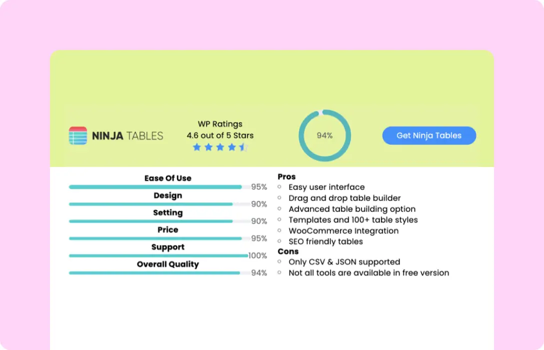
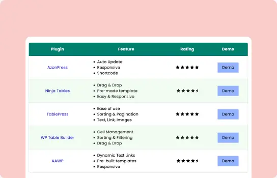
Building comparison pages that convert? Start by auditing your current page. You can also add smart comparison tables using Ninja Tables.
What High-Converting Comparison Pages Do Better
So what does a high-converting comparison page actually look like?
Let’s discuss a few points that a good comparison page should pay attention to.
State outcomes, not feature lists
Instead of “Option A has X feature,” try “Option A is better for [specific outcome].”
Anybody can do a quick Google/AI search and find out the features. You need to show outcomes and say how it helps if you want to stand out.
Frame comparisons around what visitors are trying to accomplish.
“Best for teams under 10 people” is more useful than “Supports up to 50 users.” One tells you whether it fits your situation. The other makes you do math!
Explore 15 comparison page examples for design inspiration and real-world layouts.
List and highlight smartly
Not every feature difference deserves a row in your table.
Focus on the factors that actually influence decisions: pricing, core capabilities, integrations, support quality.
Ruthlessly cut the features that don’t differentiate in ways that matter. A shorter comparison table that highlights real differences converts better than a table that includes everything. For example, comparison tables often perform especially well during seasonal campaigns when buying urgency increases.
And if you’re confident about your product and know for a fact that it’s ahead of its competitors, highlight its column boldly. Visitors already know what your page is about. Show them what you do differently by highlighting.
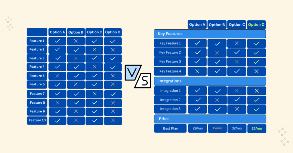
Here’s what structured, decision-focused comparison looks like in practice.
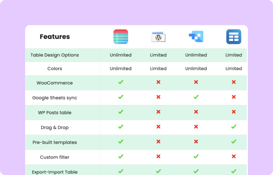
Ninja Tables Vs wpDataTables | ||
Features | Ninja Tables | wpDataTables |
Unlimited data |  | |
Multimedia | | |
WooCommerce product table | | (Not in Starter or Standard packs) |
FluentCart table | |  |
Google Sheets | | |
Drag & Drop | | |
Custom color scheme | | |
Fluent Forms integration | | |
WooCommerce reviews table | | |
Custom filter | | |
Charts | | |
Conditional formatting | | |
Transform value | | |
WP Posts | | (Not in Starter or Standard packs) |
Gravity Forms | | |
Pre-built templates | | |
Cell merge | | |
Ribbon/badge | | |
Button/Star rating/List | | |
Guide attention
You know your audience. You know what matters to them. Use visual hierarchy, callout boxes, and editorial guidance to point them toward the factors that should influence their decision.
This isn’t manipulation. It’s actually helping.
The highest-converting comparison pages say:
- “Best for teams under 10 people”
- “Choose this if you need advanced reporting”
- “Not ideal if you’re on a tight budget”
Your visitors will thank you for not making them figure it out alone.
Pricing, features, review tables
Categorizing is a good idea if product’s price plans, features, and user reviews vary. You don’t have to cram them all in one table.
Embed a separate table for price comparison because some products/services have multiple price tiers. And adding all the price details in one comparison table with the features is going to bloat that one table row.
If you want to show real user reviews or ratings, use custom tables.
So, in one comparison page, you’re displaying feature comparisons in one table, price plans in another, and ratings/reviews in another. This simple categorization allows visitors to find what they need.
12 Comparison Table Ideas
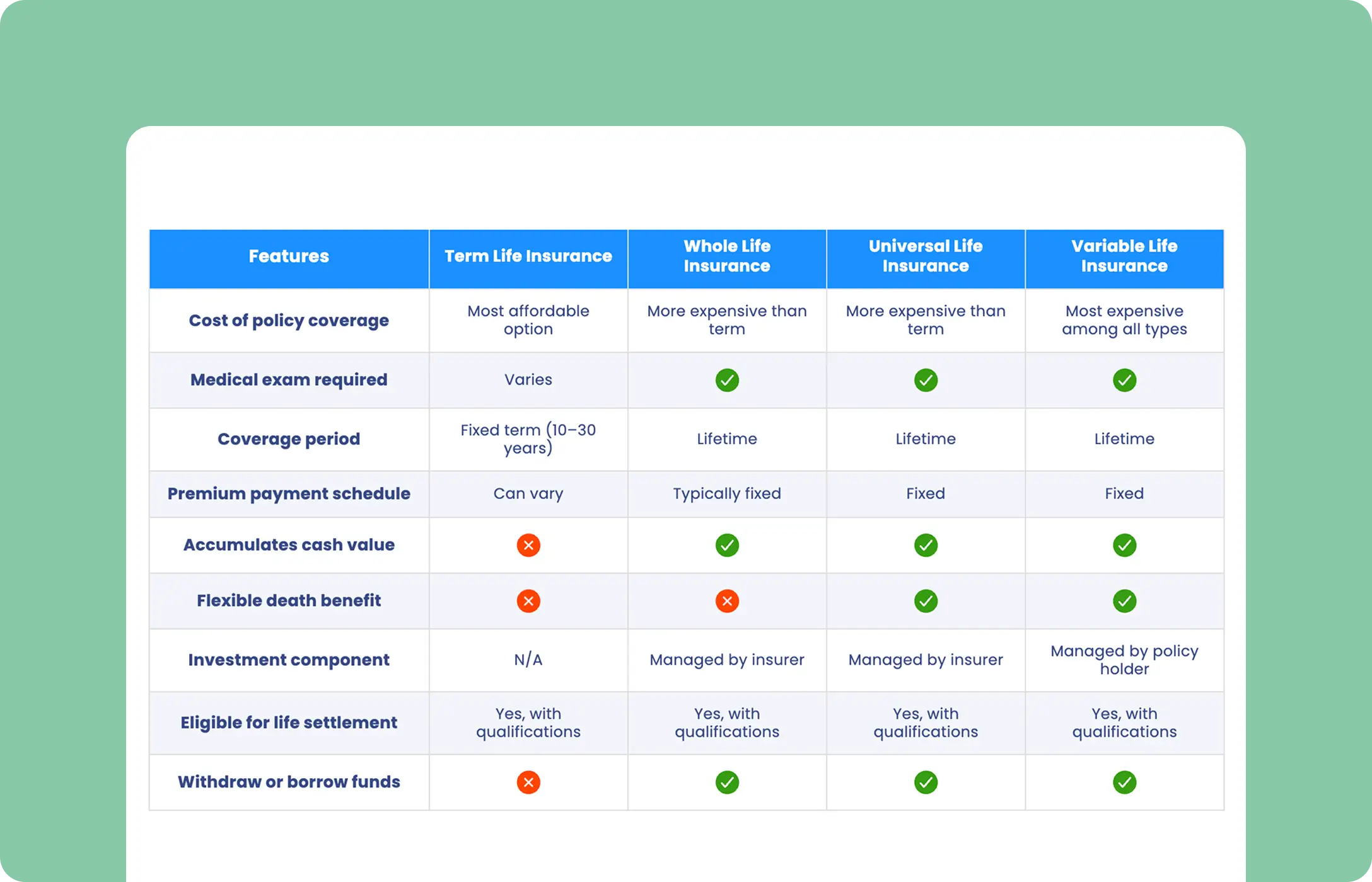
Insurance Comparison

3-column Comparison
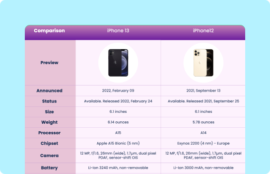
Products Comparison
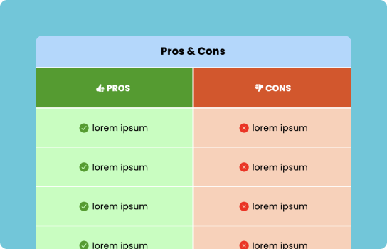
Pros and Cons Comparison
Feature Comparison
Features Compare with Icons
Pricing Comparison
Website Review Comparison
Product Review Comparison
Product Roundup Comparison
As you can see, all of these tables can be easily created with Ninja Tables. Separating pricing comparison tables from feature comparison tables reduces cognitive load and improves clarity.
If you’re building comparison tables in WordPress, try Ninja Tables and see your comparison page convert without overwhelming your audience.
Explore our WordPress table plugin comparison page to see how categories are separated and key differences are easy to scan.
A Tested Framework for Comparison Pages
When building or auditing comparison pages, ask 3 questions:
- Does this reduce uncertainty or create it? If it raises more questions than it answers, remove it.
- Can visitors immediately see how this applies to them? If they have to do math to understand numbers or spend time translating, rewrite it.
- Does this move them toward a decision or just inform them? Information without direction doesn’t convert.
What This Looks Like in Practice
Example: A comparison page rebuild for a software tool.
Before: 38 features listed in alphabetical order, equal visual weight, specs without context.
After:
- 3 “Best For” sections at the top (startups, growing companies, enterprises)
- 10-12 key differentiators with clear implications
- Visual emphasis on the factors that mattered most (pricing model, integration ecosystem, support level)
- Elimination signals (“Not the right fit if you need X”)
The result? Conversion rate improvement.
Where to Start
For teams looking at their comparison page wondering where to begin, here’s the recommended approach:
Audit what you have:
- How many features are you comparing? (If it’s over 20, you’re overwhelming people)
- Do you explain why differences matter, or just list them?
- Can visitors quickly identify which option fits their situation?
- Are you highlighting the right things?
- Does the page/table look identical for all competitors?
Test one change: Start with “Best For” labels. They’re simple to add and consistently improve clarity.
Watch what happens: Track conversion rates, time on page, and scroll depth. The goal is people spending less time making better decisions.
Get in touch with Ninja Tables
The Real Goal of Comparison Pages
Comparison pages are definitely good for SEO, but they should convince your visitors to convert. If they’re on this page, they know what you do. All there’s left to do is guide them and help them make the buying decision. Not overwhelm them with hundreds of features.
Every element on the page should answer one question: “Does this help make a confident choice?”
If a feature comparison doesn’t help with that, cut it. If it creates more questions than it answers, rewrite it. If the page feels neutral and too fair, you’re not helping enough.
Increase conversion by replacing neutrality with clarity. Be decisive and transparent.
The best comparison pages don’t just show differences. They tell visitors what those differences mean for them.
That’s not bias. That’s actually useful content.
| High-Converting Comparison Pages | Low-Converting Comparison Pages | Why It Matters |
|---|---|---|
| Reduce uncertainty | List everything equally | Reducing uncertainty builds confidence, while equal listing increases hesitation. |
| Highlight meaningful differences | Avoid visual hierarchy | Clear differentiation helps buyers see what truly matters for their use case. |
| Guide elimination | Overload features without context | Guided elimination simplifies decisions and prevents decision paralysis. |
| Frame decisions around outcomes | Force visitors to interpret data themselves | Outcome framing connects features to real-world benefits, reducing cognitive load. |
| Build purchase confidence | Increase cognitive load | Confidence drives conversions; cognitive overload leads to abandonment. |
| Prioritize key factors | Present all features with equal weight | Prioritization directs attention to what influences buying decisions. |
Key takeaways
Comparison pages convert when they reduce uncertainty, guide attention, and help buyers decide. Listing everything fairly does the opposite.
Ninja Tables– Easiest Table Plugin in WordPress


Add your first comment to this post