
Mapping Tomorrow: Emerging Data Trends for 2026

We’re stepping into 2026 and if you’re still confident with your data visualization trends knowledge, it’s time to reassess!
There is an overwhelming change in everything this year. IT alone can win an Oscar. The Open AI drama, rebranding of Twitter to ‘X’, WordPress dropping releases like confetti, charts and graphs salsa into a dynamic choreograph, nothing is missing. We got the scoop on all the fun.
As though it couldn’t get any better; new year preparations are already underway, adding another layer of excitement to the mix!
Now we look ahead to the future exploring the data visualization trends. We’re not just predicting; we’re flipping the script on how you can groove with data. Let’s break it down for you.
What are the latest trends in data visualization? Jump to-
Data Visualization Trends
We are not very good at instantly analyzing numbers and figuring out their meaning. It may come as a shock to you but, 90% of information transmitted to our brains is visual and takes about 13 milliseconds to transmit to the brain.
So, welcome to our review of the top trends that are expected to impact the data visualization landscape in 2026 and in the coming years.
Quick guide on data visualization basics.
Data visualization trends, current and future, take it all in.
AI integration in complex datasets
The first one that pops in mind is trending high. Yes as most of us guessed it, it pretty much goes without saying that AI-powered data visualizations are the next frontier.
Last year we saw generative artificial intelligence (AI) take the world by storm, leaving governments and organizations grappling with complex questions about how to adapt to the challenges and opportunities.
- Table builders with AI integration automate data parsing, making dynamic updates easier.
- The usual classification, segmentation by syntactic analysis but for numbers, will make it easier to populate and update tables dynamically.
- Many companies have access to troves of data that they may wish to extract and use every bit of numbers in action using AI.
Interactive visualization becomes integral
Advance 2026 trends underscore the evolution of data visualization, setting the stage for a future where data is not just seen but experienced and understood at a profound level.
And that exactly brings us to the second point, perfect interactive visualization mode. Straightforward static charts or graphs are no longer compatible enough. So analyzing the numbers is just one step of the process then viewers actually have to make a decision based on that.
- Features like hover actions, click highlights, and detailed data insights enhance the user experience.
- For example, showing details when clicking over a slope, scatter points showing information when moving the cursor over it.
- Industry experts emphasize the value of allowing users to interact directly with data—zooming, filtering, and manipulating visualizations for personalized insights.
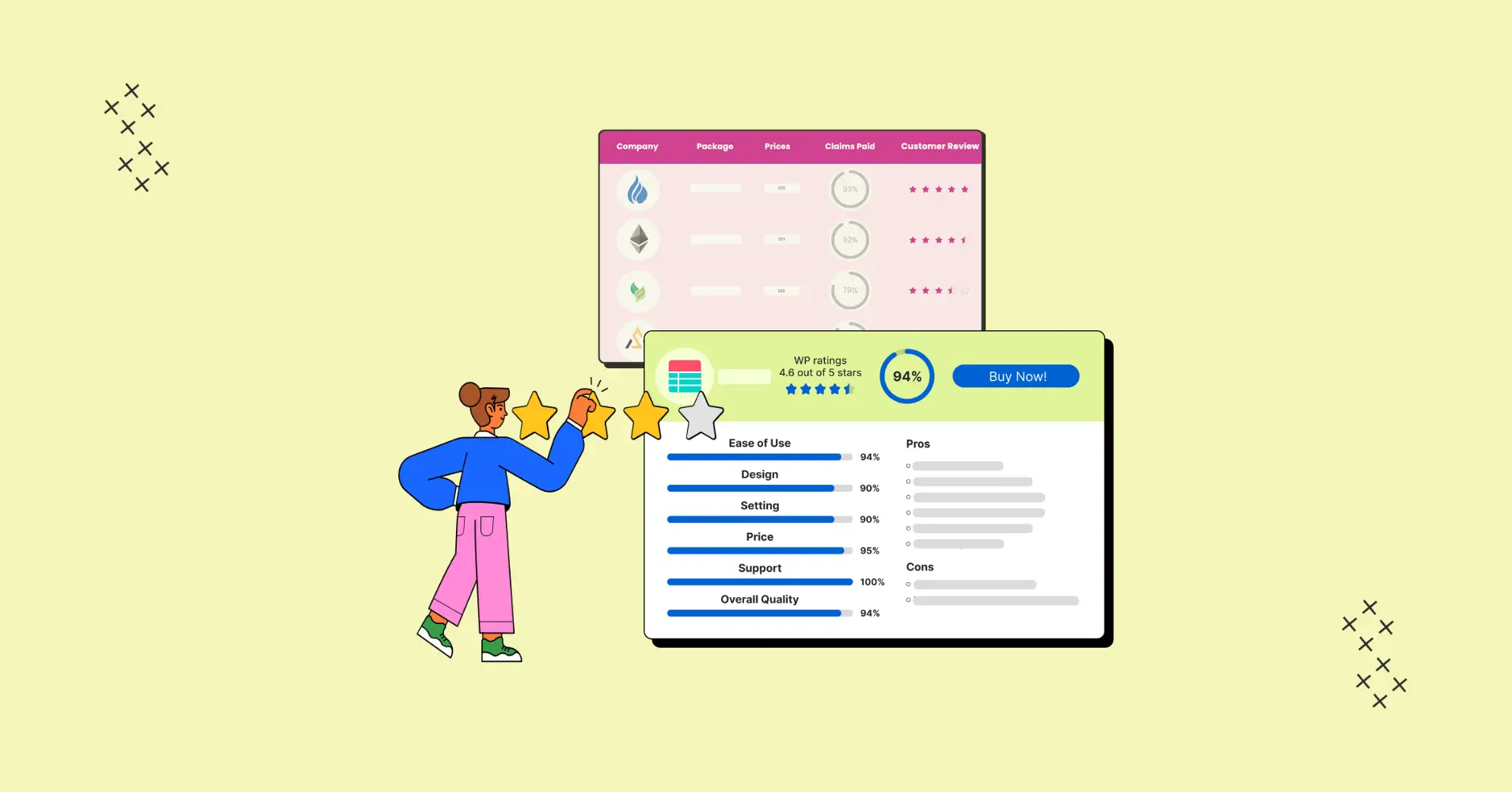
View it in the visualization here, and luckily a lot of these interactive tools will show you.
Crafted with Ninja Tables
Data storytelling is irreplaceable
Effective data storytelling transcends mere number; it’s much more to knitting a narrative that engages and captivates the audience.
This involves contextualizing data, emphasizing trends, and offering insights. Where attention spans are fleeting, it not only informs but also inspires action.
Mastery of the art of data storytelling becomes pivotal in the expanding landscape of data visualization, whether you’re a data analyst, marketer, or executive.
Real time data visualization
The name speaks for itself. Dynamic dashboards are quickly replacing traditional static reports, offering up-to-the-minute data visualization insights. This agility is vital in the fast-paced world of today.
Consider the financial institutions, they use dashboards, graphs, and charts updated in real time to track stock prices, evaluate market patterns, and decide on the best trades.
Data-driven personalization is key
Whether used for improving consumer engagement or as part of marketing efforts, standardized data visualizations policy ‘one-size-fits-all’ are becoming outdated. The future hinges on personalization for delivering meaningful displays. The key is to customize data visualizations based on your audience’s unique requirements, tastes, and expectations.
This includes leveraging insights and patterns discovered through data visualization to modify your website that cater to the unique needs of your customers.
Valuing the type of content most relevant to each individual, a more tailored experience can be designed to generate leads, fostering sustained engagement and retention.
Mobile-friendly data visualization
In this rapidly evolving e-commerce landscape, staying ahead of the game cannot be overstated. Mobile makes up 57.8% of global internet traffic. Making the most of mobile-friendly data visualizations. Nearly three quarters of the world will use just their smartphones to access the internet by 2025.
In response, major data visualization tool providers now allow users to build custom layouts focusing on mobile devices, and many more.
Integration with other tools and processes
As the diversity of data volume, usage, and insights continues to grow, the integration of tools with other resources becomes increasingly crucial. A prime example is the integration of Ninja Tables with Fluent Forms.
Ninja Tables can help when presenting financial data from Excel in a more comprehensible manner. Or when conducting surveys with Fluent Forms and you need to transfer and view data in an easy-to-understand, filtered, and organized manner with this plugin.

Automation in data wrangling and visualization
Data wrangling, like refining gold dust, extracts valuable insights from raw data by addressing issues like missing values and inconsistency. Data visualization trends in 2026 will be heavily contingent on this approach.
Modern data wrangling prioritizes automation to substantially decrease manual effort. Tools and machine learning are used to detect patterns and improve data quality in real-time. Clean, structured data will ensure the best possible analysis and presentation through the synergy between visualization trends and data wrangling.
Data ethics and security
In 2023, technology discussions took the spotlight. With all the commotion settling down a bit, people are addressing how generative AI, data usage, corporate practice may affect laws and corporate morality. Especially when processing personal data, privacy principles are essential. Preserving your website’s transparency and giving mobile and accessibility solutions a priority are additional legal considerations. Ethical data governance is crucial now more than ever.
Other matters to look ahead:
- Being Transparent
- Data and analysis validity
- Data privacy concerns and integrity practice
Future Outlook
Some additional pro tips:
- Keep track of the most recent industry research.
- Always solicit feedback.
- Keep up to date with consumer trends.
- Convey your ideas without tiring the audience.
- Prioritize mobile-friendliness first, and the rest will seamlessly fall into place.
Using the Right Tools for Data Visualization
Spreadsheet programs with charting features, such as Microsoft Excel and Google Sheets, can be used for simple data visualization tasks.
- For example, visualizations that generally take hours in spreadsheets, will only take a few minutes using concentrated plugins.
- Once you connect your data source manually or by drag-and-drop, turning those numbers into sleek visuals is just a matter of a few clicks.
- Not only will you blow away your audience with a professional-looking storefront, but they’ll be able to understand the numbers regardless of how data-savvy they are.
- Aim for a way to convey a message that doesn’t overwhelm or bore your listeners.
- That’s why you need to find a data visualization process that’s both efficient and time-friendly.
For more advanced and customized visualizations, turn to specialized data visualization plugins such as Ninja Tables, Visualizer, and wpDataTables.
Our market experts have projected how these plugins would be employed and integrated. We’re here to help you on the quest for wordpress data visualization plugins you can’t overlook!
So, put on your tech goggles, embrace the trends, and perhaps consider a new WordPress plugin that aligns with your adventurous spirit.
Get Prepared With Ninja Tables
As we gaze into WordPress’ future in 2026, we can’t help but feel a sense of excitement. From accelerated WordPress plugin advancements, the growth of WooCommerce, to the integration of AI, there’s a world of possibilities waiting to be explored.
Some tools could make it easier to quickly set up tables or charts, but the data might not be very clear. On the flip side, creating a fantastic visualization can be tricky and tedious.
Ninja Tables makes data visualization simple and quick, combining the best qualities of both worlds.
You can import, or use pre-built templates and modify them to suit your needs, or you can create a table from scratch using several integrations and customization options.
So, as we uncovered the top 9 data visualization trends, what additional predictions have you got after reading so far?
Ninja Tables– Easiest Table Plugin in WordPress


Add your first comment to this post