What Makes a Comparison Page Feel Trustworthy?
A comparison page is one of the most influential assets in the decision stage of the buyer journey. It presents one or more tools side by side, sometimes as a comparison table and sometimes as a detailed breakdown page. Users land here to evaluate options before committing.
This is where you are supposed to gain their trust. And trust isn’t something you declare yourself by sticking a badge on your page. You have to build it through dozens of signals visitors pick up on, often subconsciously.
People are skeptical of comparison content. They don’t expect neutrality. Most “helpful” comparisons aren’t neutral. They’re marketing disguised as guidance. Visitors know this, even when they can’t articulate exactly why something feels off.
Trust gets broken by small signals: hidden bias, exaggerated claims, and structural manipulation. And it’s usually broken unintentionally – by teams trying to be helpful but optimizing for the wrong things.
A trustworthy product comparison page feels genuinely helpful, transparent, and verifiable. It guides decisions without forcing them.
Core Signals of a Trustworthy Product Comparison Page
Trust isn’t built through disclaimers, badges, or credentials. It’s built through patterns readers detect in language, structure, evidence, and design without consciously analyzing them.
When those patterns align, the comparison feels credible.
Clear evaluation criteria
Every trustworthy comparison page starts with defined criteria.
Instead of saying:
“We compared the best WordPress table plugins.”
Clarify:
“We evaluated these plugins based on ease of setup, integrations, Google Sheets syncing, performance with large datasets, customization control, and pricing.”
When users see this, they understand conclusions are formed after analyzing the tools fairly. That transparency reduces skepticism.
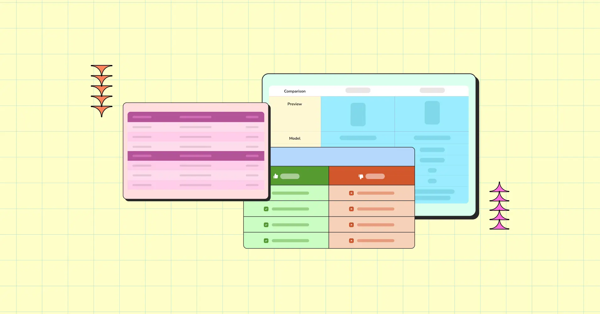
Here’s a high-level feature comparison table example.
Criteria | Your Product | Alternative A | Alternative B |
Ease of Setup | Beginner-friendly | Moderate setup | Beginner-friendly |
Drag-and-Drop | Yes | Yes | No |
Google Sheets Sync | Yes | No | Yes |
WooCommerce Integration | Yes | Limited | No |
Large Dataset Handling | Optimized with AJAX | Moderate | Limited |
Pricing Transparency | Clear tier breakdown | Add-ons | Tier-based |
As you can see, one product’s column is highlighted because when this product’s website creates a comparison page, it wants to make its own product stand out. It’s not unethical if the information and comparison are accurate and unbiased.
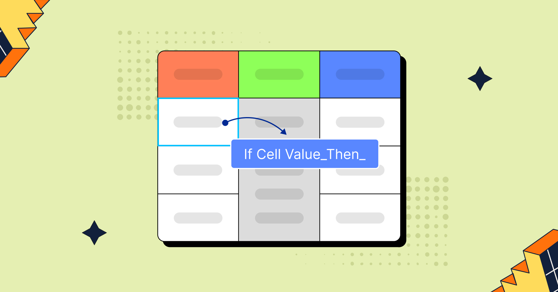
Structural consistency
On a product comparison page, uneven treatment weakens credibility.
If one product receives detailed explanations while others get surface-level summaries, readers notice. This inconsistency leads to “is it biased?” questions.
High-trust comparison pages ensure:
- Equal depth per product
- Same criteria order
- Same plan tiers being compared
- Consistent formatting
Consistency prevents the perception of cherry-picking.
Honest tradeoffs
No product is perfect. Visitors know this.
When a comparison page openly acknowledges tradeoffs, it strengthens its authority. If your product doesn’t have a feature your competitors have, show it.
An honest product comparison table will show differences like:
- A plugin for product tables may not be ideal for static pricing tables
- A lightweight solution may be easier to use but lacks advanced integrations
This sort of comparison doesn’t highlight own product. Rather it compares fairly and shows what the competitors have.
For example, here’s a use-case comparison table. This table lists the feature comparisons of 3 products but shifts focus from “who wins” to “who fits.”
Use Case | Best Fit | Why This Fit Makes Sense |
Dynamic WooCommerce tables | Your Product | Designed for live product data syncing and dynamic updates |
Static pricing comparison tables | Alternative A | Lightweight structure optimized for static layout presentation |
Spreadsheet-style inline editing | Alternative B | Focused on spreadsheet-style interaction and inline edits |
Large datasets (5,000+ rows) | Your Product | Optimized with AJAX handling for higher row volumes |
Simple feature comparison lists | Alternative A | Simpler setup without advanced configuration requirements |
Advanced filtering with custom logic | Your Product | Supports rule-based filters and conditional logic |
 | ||
Specific, verifiable details
Vague claims undermine a comparison page.
Avoid: “Advanced integrations.”
Use: “Syncs directly with Google Sheets and integrates with WooCommerce.”
Avoid: “Better customer support”
Use: “24/7 hands-on customer support for all your queries”
Let visitors decide what “better” means for their situation.
Specificity lets visitors interpret reality themselves.
Feature | What It Does | Your Product | Alternative A | Alternative B |
Max Rows | Affects performance at scale | Optimized for 10,000+ rows with AJAX support | Stable up to 3,000 rows | Stable up to 5,000 rows |
AJAX Loading | Prevents full page reloads during interaction | Enabled for sorting, filtering, and pagination | Not supported | Supported for filtering only |
Conditional Formatting | Enables rule-based visual emphasis | Custom rules with color and logic conditions | Basic color highlight only | Not available |
Frontend Editing | Allows live updates without backend access | Logged-in user editing with role control | Not supported | Not supported |
Role-Based Access | Controls editing and visibility permissions | Granular role-based visibility and edit rules | Admin-only control | Not available |
Update Frequency | Signals product maintenance and reliability | Monthly release cycle with public changelog | Quarterly releases | Irregular updates |
With tables like this one, your audience will decide which product suits them better. It doesn’t just list features, it also shows what the feature does. And the “Visit Site” button is convenient as well.
Ninja Tables can help you create more tables for comparison.
Evidence carries more weight
High-performing SaaS comparison pages rely on evidence rather than marketing language. And this evidence shouldn’t come from you. The evidence that matters is what real customers say about you.
“We’re the fastest solution” → Company claim
“4.6/5 user rating across 500+ reviews” → Customer evidence
Credible signals for a tool include:
- Real user ratings
- Release history
- Update frequency
- Documentation/tutorial depth
- Verified response times
Instead of just claiming “We offer excellent support,” you need to show regularly updated documentation, release notes, changelogs, and active support forums.
Evidence reduces doubt and strengthens authority.
Visual neutrality
Something as simple as visuals can be a smart manipulation tactic. Design choices influence how a comparison page feels.
A trustworthy comparison table avoids:
- Highlighting only one column (own)
- Using check marks inconsistently
- Visually downplaying competitors
A useful rule:
If the column order were reversed, would the layout still feel fair? If not, the design introduces bias.
Neutral structure strengthens credibility without weakening persuasion.
Freshness signals for accuracy
Stop cramming your comparison page or comparison table with unnecessary features to show how your product is better than the competition. Your focus should be keeping the page fresh with real, important info.
Outdated comparison pages lose trust quickly.
For page freshness, include:
- A visible “Last updated” date
- Version references
- Notes when features are newly added
- Clarification of pricing tiers
- Acknowledgment of recent changes
- Indication of beta mode or features coming soon
Comparison pages require maintenance.
Respectful tone
Visitors do not want to be convinced. They want to be guided and decide. Comparison pages often talk down to visitors with terms like “Simply put” or “Obviously.”
Avoid dismissive or exaggerated language and use guidance-based framing:
- “If your priority is…”
- “For teams that need…”
- “This option may suit users who…”
The tone matters as much as the content. Writing that treats visitors as capable decision-makers builds trust.
Why Trust Drives High-Converting Comparison Pages
Trust is not something a comparison page can claim and the audience believes. A comparison page that respects its reader does more than convert.
When evaluation criteria are clear, tradeoffs are acknowledged, and details are specific enough to be checked, comparison content feels legit rather than persuasive. Readers stay in decision mode instead of shifting into skepticism. That shift matters more than any individual design choice or copy tweak.
This is why trustworthy comparison pages tend to perform better over time. They don’t rush visitors toward a conclusion. They give them enough clarity to arrive there on their own.
Comparison Page Trust FAQs
What makes a comparison page credible?
A credible comparison page includes clear evaluation criteria, consistent structure, honest tradeoffs, verifiable details, and visible update signals. It avoids exaggerated claims and manipulative design.
Should a product comparison page be neutral?
It does not need to be neutral, but it must be transparent. A comparison page can present its own product while clearly defining evaluation criteria and acknowledging tradeoffs.
Do comparison tables improve trust?
Yes, when structured fairly. Side-by-side comparison tables reinforce transparency, especially when all products are evaluated using the same criteria and plan tiers.
How often should a comparison page be updated?
Comparison pages should be reviewed regularly, especially in fast-moving markets like SaaS and WordPress plugins. Visible “last updated” dates increase credibility.
Ninja Tables– Easiest Table Plugin in WordPress


Add your first comment to this post