
Misleading Statistics: Learn, Spot, Avoid, and Get Rid of them

To tackle market uncertainties and make evidence-based decisions, statistical analysis is the cornerstone in the high-tech and business sectors. Businesses in complex markets benefit from statistical methods for strategic planning.
While statistics are powerful, they can be deceptive if misused, leading to misleading or incorrect data interpretations. Understanding misleading statistics is the first step in avoiding such pitfalls.
Welcome to our statistical adventure! In this blog, we’ll unravel the enigma of numbers, charts, and percentages. Those slippery digits can either illuminate the truth or lead us down a rabbit hole of deception.
What Are Misleading Statistics?
Misleading statistics are figures or data that have been presented in a way that twists the truth or creates an incorrect impression. They can arise from errors in data analysis, or interpretation. Or they can be the result of intentional manipulation.
Misleading statistics can lead to false conclusions, influencing public opinion, policy decisions, and business strategies based on inaccurate information. Even experts can get it wrong.
About a third of scientists have said they’ve used numbers in ways they shouldn’t have.
Recognizing and understanding misleading statistics is crucial to making informed decisions and fostering a more truthful and transparent discourse in various fields. To avoid being fooled by numbers, watch out how statistics can be misleading.
Examples of Misleading Statistics
Misleading statistics occur when numerical data is used improperly, leading to deceptive information that skews the understanding of a subject. This misuse can be intentional or accidental and is often seen in areas like advertising, politics, and media.
In our data-driven world, it’s important to know the concept of misleading statistics to ensure accurate interpretation and responsible spreading of information. To practice vigilance, let’s see some common misuses of statistics.
Cherry-picking data
This involves selecting specific data points that support a desired conclusion while disregarding data that may contradict it. It’s like telling only part of the story to make a point seem stronger than it is.
Example of Cherry-picking data: A Brief Insight
Scientific integrity is crucial, yet some researchers submit cherry-picking data, presenting only successful results from multiple trials.
Researcher Glenn Begley’s attempt to replicate a tumor growth study. The original paper reported success, but Begley’s replication efforts failed. Upon consulting the original researcher, he learned that only one of the 12 trials was successful, which was misleadingly published as the entire study’s result.
This unethical practice misleads the scientific community and hampers progress. Begley’s experience reminds us that honesty is essential for true scientific advancement.
Overgeneralization
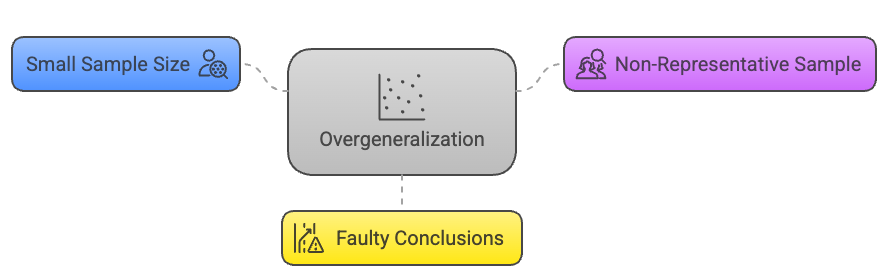
This occurs when conclusions are drawn from a sample that is too small or not representative of the whole group. It’s like meeting a few friendly cats and deciding all cats in the world are friendly.
Example of Generational Overgeneralization: A Snapshot
Overgeneralization is a cognitive shortcut where we apply broad statements to large groups without considering individual differences. It’s a trait that seems to permeate every generation’s view of those who come before and after them.
Every generation tends to make sweeping statements about others. For example, a Gen Z might view a baby boomer as unsympathetic to modern struggles, while a boomer could see Gen Z as too sensitive. This overgeneralization overlooks individual nuances.
Belief bias also plays a role, leading us to agree with stereotypes like ‘Gen Z are poor workers’ without proper scrutiny. Recognizing this pattern in ourselves is the first step towards a more nuanced understanding across generations.
Faulty causality
Also known as a post hoc fallacy, this is the assumption that if one event happens after another, the first must have caused the second. It’s like saying the rooster crowing causes the sun to rise.
Example of Faulty Causality: The Pirate Paradox
When examining trends, it’s easy to fall into the trap of faulty causality—assuming that because two things occur together, one must cause the other. A classic, humorous example of this is the relationship between global temperatures and pirates.
Over the past 150 years, global temperatures have risen, while the number of pirates has decreased. It would be absurd to claim that the decline in pirates caused global warming or that recruiting more pirates could cool the Earth.
That illustrates how easily we can be misled by correlation.
In reality, correlations can be coincidental, or they may be the result of a third, unseen factor. In the case of pirates and global warming, the true culprit is industrialization, which has influenced both the decrease in piracy and the increase in global temperatures.
The lesson here is clear, correlation does not imply causation. It’s essential to investigate further and gather more evidence before concluding cause and effect.
Biased sampling

This happens when the sample used in a study or survey isn’t randomly selected and doesn’t accurately reflect the larger population. It’s like only asking your friends who love horror movies whether horror is the best movie genre.
Example of Sampling Bias: The Ventura Election Surprise
In political polling, sampling bias can lead to startling surprises, as in the 1998 Minnesota gubernatorial election.
Jesse “The Body” Ventura, a former professional wrestler, defied the odds and won the governorship, despite most polls predicting little chance of victory. This outcome serves as a textbook example of how sampling bias can skew poll results.
Why Polls Missed the Mark:
- Third-Party Candidacy: Ventura ran on a third-party ticket, and traditional polling methods are typically designed for two candidate races.
- Voter Embarrassment: Some voters may have been reluctant to admit their support for a candidate with Ventura’s unconventional background.
- Protest Votes: The perception of Ventura as an underdog may have galvanized protest votes against the major-party candidates.
However, a significant factor was Ventura’s appeal to young voters, especially college students who were first-time voters. These individuals registered specifically for this election, driven by Ventura’s campaign.
Pollsters, operating under the assumption that young people are less likely to vote, did not consider them “likely voters.” This oversight led to a sampling bias, as a crucial segment of Ventura’s support base was ignored.
The lesson learned is The Ventura election underscores the importance of accounting for all demographics in polling samples. It’s a reminder that assumptions about voter behavior can lead to inaccurate predictions and that every vote has the power to defy expectations.
Sample Bias: Misrepresenting Sample Sizes
When it comes to data in advertising, numbers can be deceiving, especially when companies use tiny sample sizes. Imagine a brand boasting that “90% of users are satisfied” with their product.
Impressive, right?
But what if that “90%” actually represents only 10 people surveyed? This small group is unlikely to capture the diverse views of the whole customer base, making the claim much less reliable.
This tactic also shows up in product testing. When companies send small samples of a product to a lab for testing, the results may not reflect real-world use.
For example, a lab test might only examine a tiny amount of product over a short period, while in reality, consumers use the product for months. Testing such a small sample can paint an unrealistic picture of the product’s true effectiveness.
In these cases, numbers can give us a false sense of confidence in a product, when the reality may be quite different. It’s always worth looking a bit closer to see how a company arrived at its claims.
Misleading Graphs
This refers to presenting data in a way that visually misrepresents the underlying information, such as altering scales or omitting context. It’s like a graph showing a dramatic increase in temperature when the actual change is only a fraction of a degree.
Misleading Graphs Examples: A Florida Case Study
Data visualization is a powerful tool for storytelling, but when manipulated, it can convey a misleading narrative. A prime example of this is a graph depicting gun deaths in Florida before and after the enactment of the ‘stand your ground’ law.
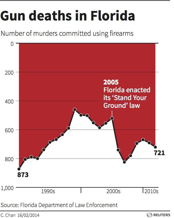
The Deceptive Graph: At first glance, the graph suggests a significant drop in gun deaths post-2005, which coincides with the new law. This initial impression stems from our instinct to expect the y-axis to start at zero. However, the truth is starkly different. Gun deaths rose from around 550 to 850 between 2005 and 2007.
The Devil in the Details: Upon closer inspection, one notices the y-axis is inverted, with higher numbers at the bottom, creating an illusion of decline. Additionally, the graph is filled with a red area, likely intended to evoke a dramatic, ‘bloody’ effect.
While the creator’s goal might have been artistic, the result was confusion, leading many to erroneously conclude that Florida became safer after the law’s implementation.
The Takeaway: This case highlights the importance of scrutinizing data visualizations. While artistic freedom can enhance a graph’s impact, it should not come at the expense of clarity and truth.
As consumers of information, we must remain vigilant and critical of the data presented to us.
It’s very important to avoid bad data visualization and use the best option to showcase your data. There are a lot of options for best data visualization.
| Chart 1 | Chart 2 | Chart 3 |
|---|---|---|
 |  |  |
 |  |  |
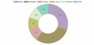 | 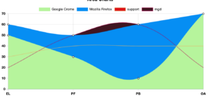 |  |
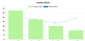 | 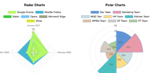 | 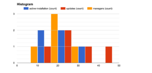 |
What is Misleading About this Visualization?
So, if you are confused about your data visualization, we have your back. Get our expert suggestions.
Subscribe to our newsletter and upload a screenshot
Truncated Axis in Statistics
Truncating an axis is a statistical technique that can mislead by altering the perception of a graph. Typically, one expects the X and Y axes of a graph to start at zero.
However, truncating an axis involves starting at a non-zero value, which can dramatically change the graph’s visual impact and lead to exaggerated conclusions.
By being aware of these tactics, we can better scrutinize statistics presented in public discourse and avoid being misled by false narratives. It’s a key part of due diligence in our interconnected, digital society.
Example of Truncated Axis: Global warming data from the National Review
Consider a graph from the National Review presenting global warming data. The graph’s temperatures range from -10 to 110 degrees, flattening the trend line and suggesting that global warming is not a significant concern.
Data integrity advocates promptly called out this intentional misrepresentation.
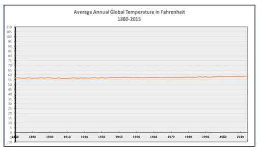
In response, the team at Quartz corrected the graph, presenting a more accurate depiction of the data. Their version highlighted the true trend of rising global temperatures, countering the false narrative pushed by the original graph.
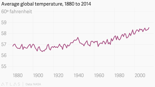
Here, both of the organizations used a truncated axis but one of them decided to present it in a trustworthy manner.
The most disconcerting aspect of this practice is that these organizations are aware of their manipulative tactics. Misusing statistical graphs is not just a technical error; it’s an ethical breach that can mislead the public and hinder informed decision-making.
Seven Signs of Potentially Misleading Statistics
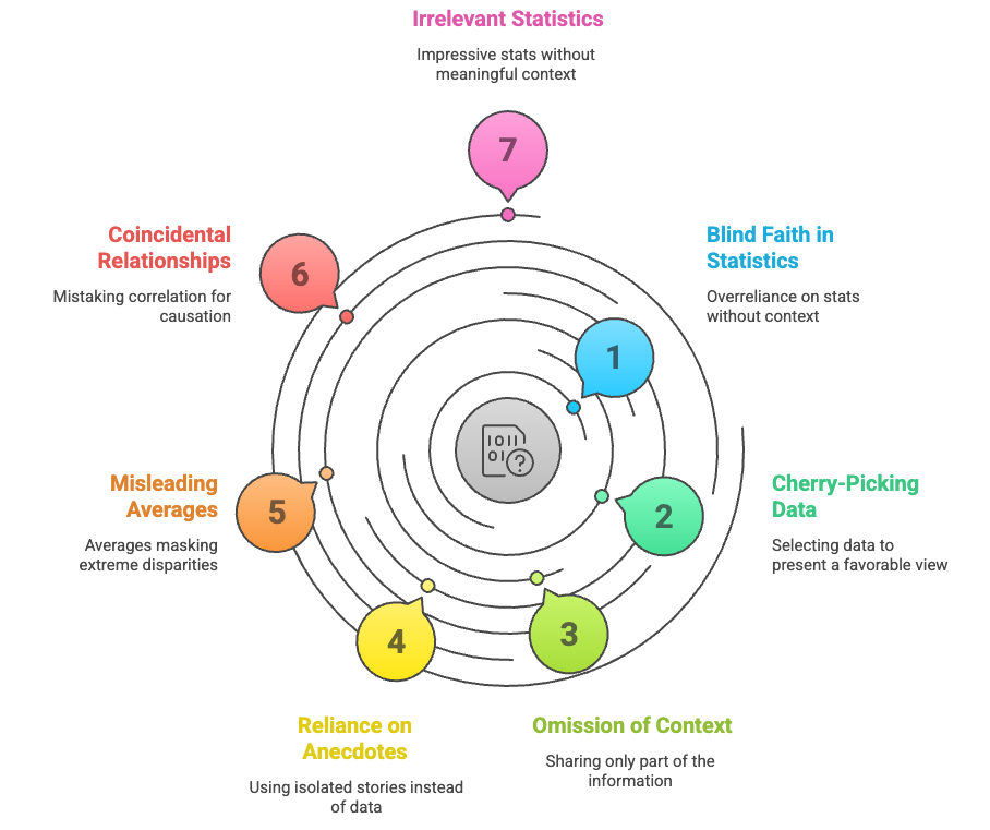
Statistics can be like cryptic riddles—revealing the truth or weaving illusions. But fear not! By recognizing these seven telltale signs, you’ll sharpen your statistical instincts and emerge unscathed. Let’s unravel the mystery together!
- Everything is Up to Statistics: Sometimes, people place blind faith in statistics, assuming they hold all the answers. However, stats alone don’t provide the full context.
Imagine relying solely on weather forecasts without considering other factors like local topography or microclimates. Stats are essential, but they’re just one piece of the puzzle. - Best Foot Statistic: This deceptive technique involves cherry-picking data points that paint a flattering picture. It’s like showcasing your best vacation photos while conveniently leaving out the sunburns and missed flights.
Remember, a single positive data point doesn’t reveal the whole truth. - Half-Truth Statistic: Here, only part of the information is shared, conveniently omitting crucial context. Imagine a car advertisement boasting “50 miles per gallon!” without mentioning it’s downhill with a tailwind. Always seek the full story—context matters.
- Anecdotal Statistic: Instead of comprehensive data, some rely on isolated anecdotes. It’s like claiming a new diet works because Aunt Mildred lost weight, ignoring the other 99 people who gained. Anecdotes can mislead; look for broader evidence.
- Everything is an Average Statistic: Averages can be misleading. Consider a town where the average income is $100,000. But if half the residents are billionaires and the other half are broke, that average masks extreme disparities.
Don’t be fooled by the middle ground.
- Coincidence Statistic: Correlation doesn’t always imply causation. Just because ice cream sales and drowning deaths rise together in summer doesn’t mean one causes the other. Beware of coincidental relationships—dig deeper.
- Meaningless Statistic: Stats can dazzle us with big numbers, but ask: “So what?” If a study claims “10,000 people prefer our shampoo,” consider the context. Is that out of a million surveyed? Or just ten? Impressive stats can still be irrelevant.
How to Avoid Misleading Statistics
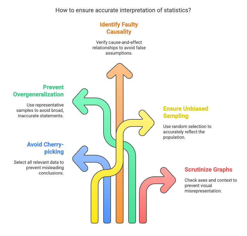
As data guides many decisions today, it’s common to see it misused. But with proper knowledge and alertness, you can reduce the harm from wrong data. This part of this blog will help you by showing the tactics of how to avoid misleading statistics.
1. Who’s Doing the Research?
When navigating the statistical jungle, consider the source like a seasoned explorer. Biased researchers can wield data like a magician’s wand, conjuring illusions.
Scrutinize their motives, affiliations, and funding. Are they selling a product, pushing an agenda, or genuinely seeking truth? A critical eye keeps deception at bay.
2. Sample Size: The Goldilocks Principle
Remember Goldilocks and her quest for the perfectly sized porridge? Well, statistical samples follow a similar rule. Too small, and you’re sipping from a thimble—hardly representative. Too large, and you drown in data soup.
Seek the sweet spot—a sample size that whispers meaningful conclusions without shouting noise.
3. Objective Language: The Sherlock Test
Holmes would approve: “Elementary, my dear Watson!” When dissecting stats, look for neutral, factual wording. Beware of loaded language—the kind that nudges you toward a particular conclusion.
If a study claims “miraculous results,” raise an eyebrow. Objective language is your Watson against deception.
4. Visual Clarity: The Art of Graph Sleuthing
Graphs and charts can be enchanting or treacherous. Imagine a bar chart with a y-axis that starts at 10,000 instead of zero. Suddenly, a tiny bump looks like Everest.
Check those axes! Are they honest guides or sly tricksters? Seek clarity, and you’ll unmask statistical masquerades.
Frequently Asked Questions about Misleading Graphs
Question 01: What Makes a Graph Misleading?
Answer 01: A graph becomes misleading when it distorts the underlying statistical data, leading to incorrect conclusions. Here are some common pitfalls:
- Improper Scaling: If the scale is too large or too small, it can exaggerate or minimize differences.
- Inadequate Interval Size: Uneven intervals on axes can misrepresent trends.
- Missing Data: Omitting crucial data points can skew the overall picture.
- Wrong Graph Type: Choosing an inappropriate graph (e.g., using a pie chart for continuous data) can confuse viewers.
Question 02: When Is a Graph Considered Misleading?
Answer 02: A graph is misleading if it fails to convey accurate information or if viewers struggle to understand it. Imagine a bar chart with no labels—viewers would be lost at sea. Misleading graphs can pop up anywhere, especially when someone wants to manipulate data for their benefit.
Question 03: Where Can We Find Misleading Graphs?
Answer 03: Misleading graphs lurk in advertisements, news articles, presentations, and social media. They’re like chameleons, blending into any context where data is wielded. Be vigilant, especially when someone has an agenda.
Question 04: How Can a Graph Be Created to Mislead?
Answer 04: The art of deception lies in crafting a graph that misleads without raising suspicion. Here are some tricks:
- Alteration of Scaling: Adjusting the axes to emphasize or downplay certain aspects.
- Missing Data: Leaving out critical points to create a false narrative.
- Omitting Baseline: Starting the y-axis above zero to exaggerate differences.
Misleading Statistics are a Scope of Learning
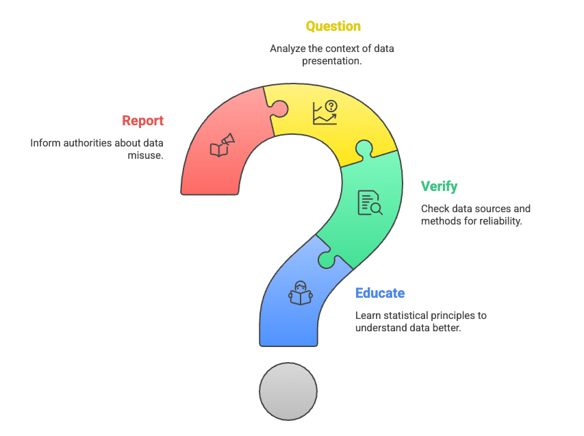
Remember, statistical literacy is your secret weapon. Armed with these strategies, you’ll emerge unscathed from the labyrinth of numbers. So go forth, fellow truth-seeker, and may your statistical compass always point north!
Data is indeed the king, and data visualization is the kingmaker. In that context, misleading statistics act as the mole within, undermining the integrity of information.
Therefore, it is imperative to study diligently, identify the misleading elements, steer clear of them, and report any discrepancies to combat the dark side of information breaches.
- Educate oneself on the principles of sound statistical analysis.
- Verify the sources and methods behind the data.
- Question the context in which data is presented.
- Report any instances of data misuse to maintain the integrity of information.
By doing so, we can strive to ensure that data remains a force for good, illuminating truths rather than casting shadows of doubt. The common examples I discussed in this article will hopefully help you learn, spot, and avoid being fooled by misleading statistics.
Get special discount on the best table plugin made for you!


thanks for info.