Sticky Headers vs Fixed Columns in Product Table: What’s Better on Mobile?

You’re comparing five different food processors on your phone during your commute in the BFCM sale rush. The table loads, you start scrolling, and within seconds, you’ve completely lost track of which column corresponds to which brand. You scroll back up. Then down. Then sideways. Now you’re not even sure which row you’re on.
This isn’t a user or device problem. It’s a design problem.
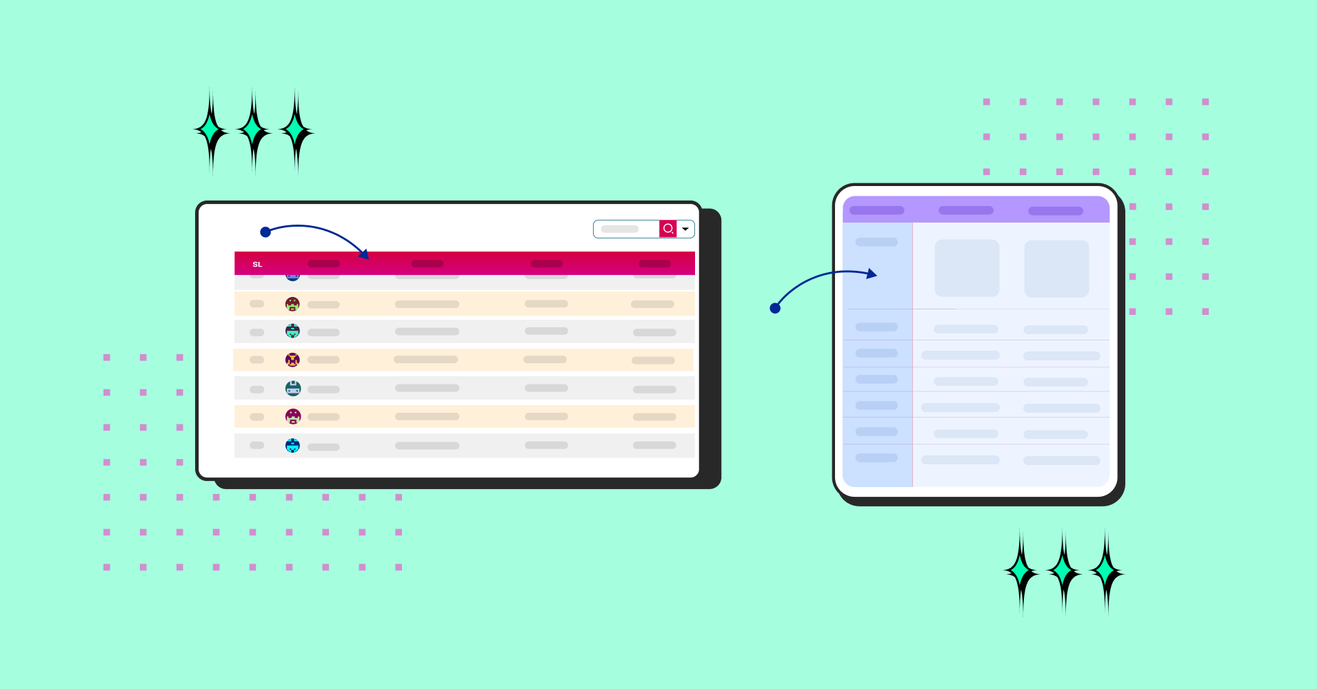
Product tables on mobile are notoriously difficult to navigate, and the solution usually boils down to two approaches: sticky headers that follow you as you scroll down, or fixed columns that anchor in place while everything else moves horizontally.
For WordPress users building these tables, plugins like Ninja Tables offer both options right out of the box, making implementation straightforward. But which approach actually delivers a better experience for mobile users?
Let’s dig into the mechanics, the tradeoffs, and what actually works in practice of responsive table mobile view.
What Are Sticky Headers Anyway?
Sticky headers are column labels that remain visible at the top of your screen as you scroll vertically through table data. The header row essentially “sticks” to the viewport while content flows underneath.
The mechanics: As users scroll down through rows, the header stays pinned at the top. So whether you’re looking at row 5 or row 50, you always see “Product Name,” “Price,” “Rating,” or whatever your columns represent.
Why this matters on mobile: Vertical scrolling is second nature on smartphones. It’s the fundamental interaction pattern for basically everything- feeds, articles, product listings. Sticky headers work with this ingrained behavior rather than fighting against it.
Here’s one of many sticky header examples made with Ninja Tables.
Factor | Pagination | Infinite Scroll |
User Orientation |
|
|
Info Processing |
|
|
Navigation |
|
|
SEO |
|
|
Accessibility |
|
|
Mobile UX |
|
|
Performance |
|
|
Analytics |
|
|
Best Fit |
|
|
Fixed Columns: The Anchor Approach
Fixed columns lock specific columns (typically the leftmost one) in place while the rest of the table scrolls horizontally. The anchored column provides constant context as users explore additional data.
How it functions: Your first column (usually product names or feature categories) remains stationary. Other columns slide left and right as users swipe horizontally. The fixed column acts as a reference point that prevents complete disorientation.
The ideal scenario: Fixed columns excel in comparison contexts. When evaluating multiple products side-by-side, having the feature list or product names constantly visible means users always know what they’re comparing, even as they scroll through specifications.
Here’s a perfect example of a fixed column datatable fully in action.
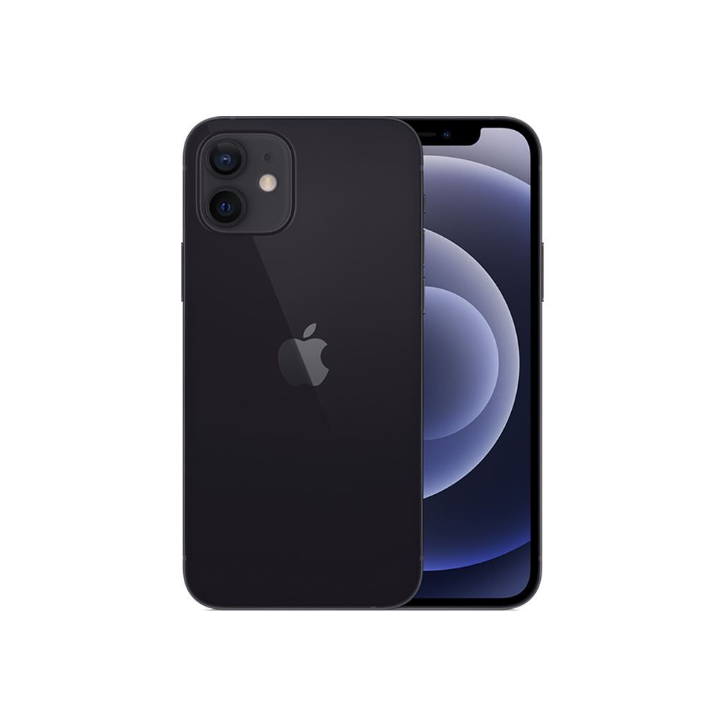
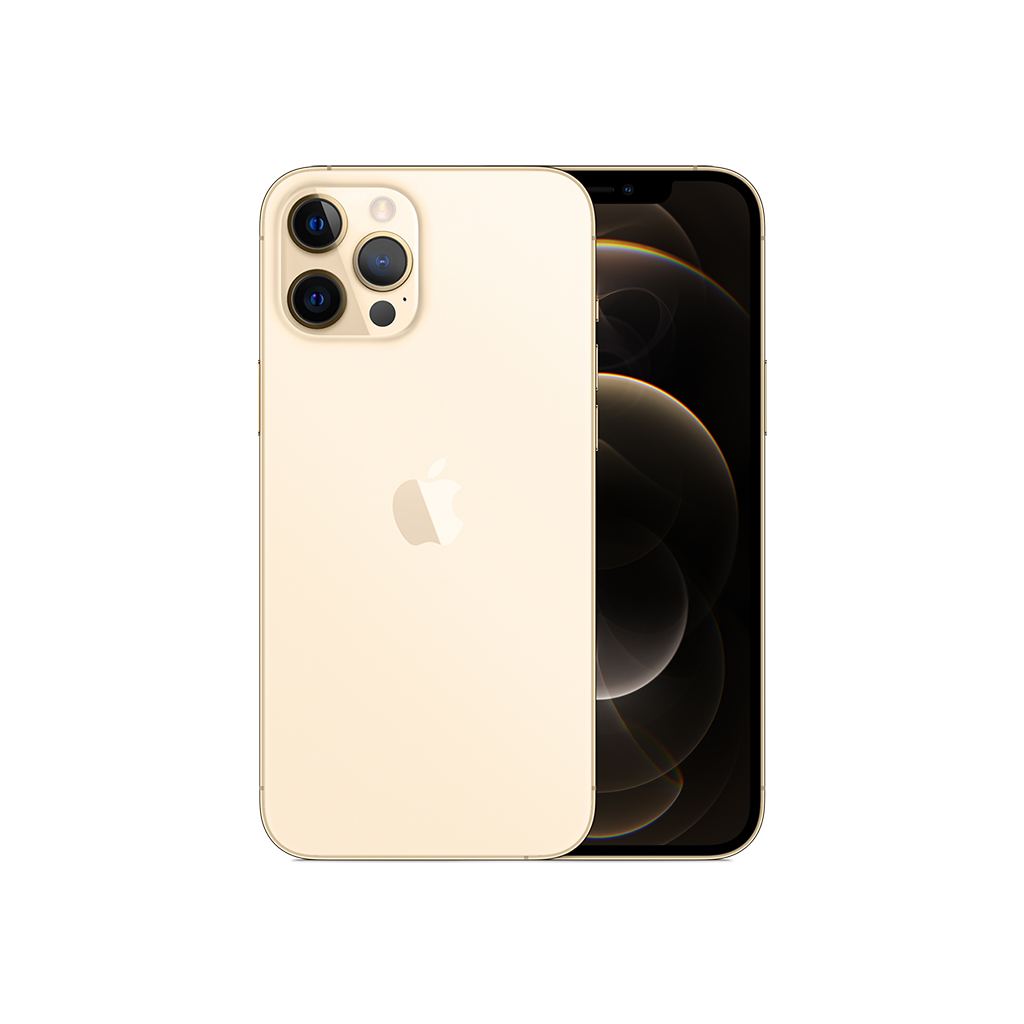
Comparison | Product X | Product Y |
Preview | ||
Announced | 2022, February 09 | 2021, September 13 |
Status | Available. Released 2022, February 24 | Available. Released 2021, September 25 |
Size | 6.1 inches | 6.1 inches |
Weight | 6.14 ounces | 5.78 ounces |
Processor | A15 | A14 |
Chipset | Apple A15 Bionic (5 nm) | Exynos 2200 (4 nm) - Europe |
Camera | 12 MP, f/1.6, 26mm (wide), 1.7µm, dual pixel PDAF, sensor-shift OIS | 12 MP, f/1.6, 26mm (wide), 1.7µm, dual pixel PDAF, sensor-shift OIS |
Battery | Li-Ion 3240 mAh, non-removable | Li-Ion 3000 mAh, non-removable |
Resolution | 2532x1170 | 2532x1170 |
Buy |
Comparison table courtesy: Ninja Tables.
The Mobile Screen Reality Check
Let’s talk constraints.
Modern smartphones typically have screens between 6 and 6.7 inches diagonally. That’s roughly 360 to 430 pixels of usable width in portrait mode. When your product table has five columns and fifteen rows, something has to give.
Vertical scrolling: Essentially unlimited. Users will scroll down through hundreds of items without hesitation.
Horizontal scrolling: Limited and problematic. Swiping sideways feels unnatural on mobile. There’s also the persistent issue of accidentally triggering back-navigation gestures (particularly frustrating on iOS, where edge swipes are system-level gestures).
There’s been an ongoing debate around infinite scroll vs. pagination, and much like today’s topic of fixed columns vs. sticky headers, both approaches serve very different purposes.
This fundamental difference in scrolling shapes the entire mobile table design ui conversation.
Sticky Headers: Advantages
Aligned with natural behavior: Users already scroll vertically for everything. Sticky headers don’t introduce friction or require learning new interaction patterns.
Reduced mental overhead: When headers remain visible, users don’t need to remember what each column represents or constantly scroll back up for reference. The context persists throughout the browsing experience.
Optimal for content-heavy tables: If your table contains numerous rows but relatively few columns (2-4 columns), sticky headers are the straightforward choice. Feature comparisons, pricing breakdowns, and specification sheets all benefit from this approach as it’s ideal for table mobile view ui.
Accessibility benefits: Screen readers handle vertical navigation more predictably than horizontal scrolling. Sticky headers maintain proper semantic structure while improving overall navigability for assistive technologies.
Sticky Headers: Limitations
Column density issues: With six or more columns, sticky headers alone won’t solve your problems. Columns get compressed, text wraps awkwardly, or users still face horizontal scrolling regardless table responsive mobile experience.
Interaction conflicts: Poorly implemented sticky headers can interfere with scrolling mechanics. (Ever tried to scroll past a header but accidentally triggered a sort function instead? That’s an implementation failure creating user frustration using table mobile view design.)
Horizontal context loss: While vertical context remains intact, users can still lose track of which column they’re viewing if the table is particularly wide. This is where fixed columns enter the conversation.
Fixed Columns: Advantages
Comparison clarity: For side-by-side product evaluation, fixed columns are transformative. Product names or feature labels stay visible, eliminating the “wait, which option was that?” confusion.
Handles wider tables: With five, six, or seven columns, fixed columns make horizontal navigation manageable by providing a stable reference point.
Clear visual hierarchy: Fixing the most important column (typically the leftmost) signals to users: “this is your anchor.” It establishes structure in otherwise potentially chaotic data presentation.
Fixed Columns: Limitations
Horizontal scrolling friction: There’s no elegant way to phrase this—swiping sideways on mobile creates unnecessary friction. It’s counterintuitive, often accidental, and frequently avoided by users entirely.
Gesture interference: Horizontal swipes compete with navigation gestures, browser controls, and carousel interactions. The potential for conflicting actions creates a minefield of usability issues.
Screen space tradeoffs: The fixed column consumes valuable horizontal real estate. On narrow mobile screens, this compression makes scrollable columns harder to read and interact with.
Discoverability problems: Users often don’t realize tables scroll horizontally. Without clear visual indicators (truncated column edges, scroll hints, shadows), they may miss significant portions of your data entirely.
So Which One Actually Works Better?
Here’s the practical breakdown…
Choose sticky headers when:
- Your table contains three columns or fewer
- Users primarily browse or scan through rows
- Column headers are concise and descriptive
- You’re presenting lists rather than comparisons (catalogs, feature inventories, pricing tables)
Choose fixed columns when:
- Building explicit comparison tables (Product A vs Product B vs Product C)
- The leftmost column provides essential context (feature names, specification categories)
- You have four or more columns requiring comparison
- Your data structure is inherently wide and can’t be simplified without losing meaning
The hybrid solution: Here’s the interesting part- you can combine both approaches. Sticky headers plus one fixed column deliver comprehensive context for complex tables. Headers remain visible during vertical scrolling, and the first column stays anchored during horizontal navigation.
Design Implementation Guidelines
If you’re already using a table and want to gauge its ability, our UX checklist helps you take a step back and get a clear picture of how well your setup actually performs.
For sticky headers:
- Keep header text concise. Use “Price” rather than “Monthly Subscription Price.” Every character matters on mobile.
- Create a visual distinction. Use contrasting background colors or subtle shadows so users immediately recognize these headers as persistent elements.
- Test scroll behavior extensively. Both Android and iPhone implementations can behave differently with CSS position: sticky properties.
For fixed columns:
- Add visual cues indicating that additional columns exist. A gradient fade-out effect on the right edge provides an effective indication.
- Consider temporary “swipe to see more” prompts for first-time users. These should be dismissed after initial interaction.
- Size the fixed column to allow at least 1.5 additional columns visible. Users need to see that more data exists beyond the anchor.
For the hybrid approach:
Manage Z-index layering carefully. The sticky header must layer above scrolling content, while the fixed column requires proper stacking order relative to both.
Test on actual devices, not just browser developer tools. Scroll behavior can vary significantly between emulation and real hardware.
Implement responsive transformations where the table structure adapts to screen width. Perhaps card layouts for small phones, sticky headers for standard phones, and a full hybrid implementation for tablets.
Read this guide on ways to create responsive tables in WordPress for a better understanding of user experience.
The “Avoid Tables Entirely” Argument
Sometimes the real fix isn’t avoiding tables- it’s avoiding boring tables. Breaking out of rigid row-and-cell layouts with fresh grids or custom structures can create a standout UX and make your brand more memorable.
Alternative approaches:
Card layouts: Each product becomes a self-contained card with complete specifications. Users swipe or scroll through cards instead of navigating table rows. Particularly effective for e-commerce applications.
| 1 | 2 | 3 |
|---|---|---|
Winter Starter Pack - Cozy Picks A budget-friendly bundle!
Ships by: 1 Week Price: $29.99 Sale Ends: Tomorrow | Holiday Essentials - Most Popular The all-rounder bundle!
Ships by: 4 Days Price: $59.99 Sale Ends: Monday | Festive Luxury - Premium Choice Gift that leaves impression!
Ships by: 2 Days Price: $149.99 Sale Ends: Tonight |
Accordion tables: Users tap rows to expand and reveal full details. Maintains information density while keeping the interface clean and scannable.
Click "+" to Expand and Compare
| Model | Image | Capacity | Cooking Modes | Display | Special Features | Dimensions | Warranty | Price | Discount |
|---|---|---|---|---|---|---|---|---|---|
| Compact Series |  | 20L | Basic heating, defrost | LED display | Child lock | 45cm x 35cm x 25cm | 1 year | $129 | 20% |
| Standard Series |  | 28L | Heating, defrost, grill | LED display | Auto cook menus | 52cm x 40cm x 30cm | 2 years | $199 | 30% |
| Premium Series |  | 32L | Heating, defrost, grill, convection bake | Touch control with LCD | Smart sensor cooking, voice assistant compatible | 55cm x 42cm x 32cm | 3 years | $349 | 40% |
Comparison sliders: Users select two or three products to compare directly, hiding everything else. Reduces cognitive overload while maintaining comparison functionality.
The examples are created with Ninja Tables. Create your own and customize sticky header/column as you want.
What Major Platforms Do
Looking at how established companies handle mobile product tables reveals patterns…
Amazon: Abandons traditional tables on mobile entirely, using card-based layouts for product listings. Pragmatic decision for their use case.
Google Sheets mobile: Implements a hybrid approach with frozen rows and columns. Makes sense for a spreadsheet application where data structure is the core product.
Apple comparison pages: Use fixed product columns at the top with vertical scrolling through features. Essentially, a rotated hybrid approach.
Notion: Defaults to sticky headers with optional column freezing. Gives users control over their preferred interaction model.
The pattern emerges clearly: Companies with sophisticated mobile UX either avoid traditional tables completely or implement nuanced hybrid solutions. The simple binary choice between sticky headers and fixed columns often proves insufficient for real-world complexity.
The Practical Recommendation
After extensive testing and implementation across various mobile interfaces, here’s the strategic approach:
Start with sticky headers. They work effectively for approximately 80% of mobile table scenarios, they’re simpler to implement correctly, and they deliver better performance.
Add fixed columns only when comparison is the primary user objective. If users need to actively evaluate “Product A vs Product B vs Product C” while scrolling through specifications, invest in a proper fixed column implementation.
Explore alternatives before defaulting to tables. Before committing to any table structure, ask whether this information genuinely needs tabular presentation on mobile. Cards, accordions, or progressive disclosure might better serve your users.
Test with actual users on representative devices. Not your device. Not your team’s devices. Real users with their actual phones, including those still using older models or budget Android devices.
Get in touch with Ninja Tables
The Bottom Line
Sticky headers win for general-purpose mobile tables. They align with natural mobile interaction patterns, perform better technically, and require less cognitive effort from users.
Fixed columns serve specific needs in comparison-heavy scenarios but require careful implementation and come with inherent UX tradeoffs.
The hybrid approach offers a superior user experience but demands additional development effort and thorough testing.
Whatever you choose, remember this: mobile tables are inherently challenging. The best mobile table solution might not be a table at all. But when you need a traditional tabular presentation, sticky headers provide the most reliable foundation for mobile usability.

Ninja Tables– Easiest Table Plugin in WordPress


Add your first comment to this post