
How Buyers Compare Products Before They Choose (And What You Need to Show)


Research from Gartner shows that B2B buyers complete 57% of their purchase decision before ever contacting a vendor. For consumer products, the number is even higher. By the time someone reaches your comparison page, they are not researching. They are deciding. Whether that decision goes in your favor depends almost entirely on what they find when they get there.
Most businesses optimize for the moment of purchase. What actually decides whether a purchase happens is the moment before it – the comparison stage, where a buyer has narrowed their options to two or three and is working out which one to commit to. That stage is not random. Buyers follow predictable patterns, ask predictable questions, and respond to specific types of clarity. Understanding that process changes how a comparison page should be built.
TL;DR
- Most buyers have shortlisted their options and are nearly decided before any vendor interaction
- The comparison stage is a risk-reduction exercise, not a feature evaluation
- Three psychological forces drive comparison decisions: anchoring, loss aversion, and social validation
- Feature overload at the comparison stage increases hesitation rather than confidence
- A well-structured product comparison table matches the buyer’s mental model and reduces the cognitive work of deciding
- Ninja Tables lets small businesses build these comparison experiences in WordPress without custom development
What Is the Product Comparison Stage (And Why It Decides Most Purchases)
The product comparison stage is the phase in a buyer’s journey where they have identified what they need and are evaluating specific options against each other. It sits between initial research and the final purchase decision, and it is where most decisions are actually made.
This stage has a distinct psychological profile. The buyer is no longer asking “what exists.” They are asking “which of these is right for me.” That is a narrower, higher-stakes question, and it requires a different kind of information than the awareness stage. Buyers at this stage want specific, comparable, and trustworthy data – fast. Pages that deliver that close sales. Pages that do not send buyers back to Google.
Understanding what buyers need here, and why they need it in a specific format, is the foundation of any comparison page that actually converts.
What Buyers Are Really Comparing When They Evaluate Products
Most product pages are built around features. Most buyers are not comparing features. They are comparing risk.
A buyer at the comparison stage has already accepted that multiple options could work. Their primary question has shifted from “does this solve my problem” to “which of these is least likely to disappoint me.” The attributes they compare are a function of where they perceive the risk to be.
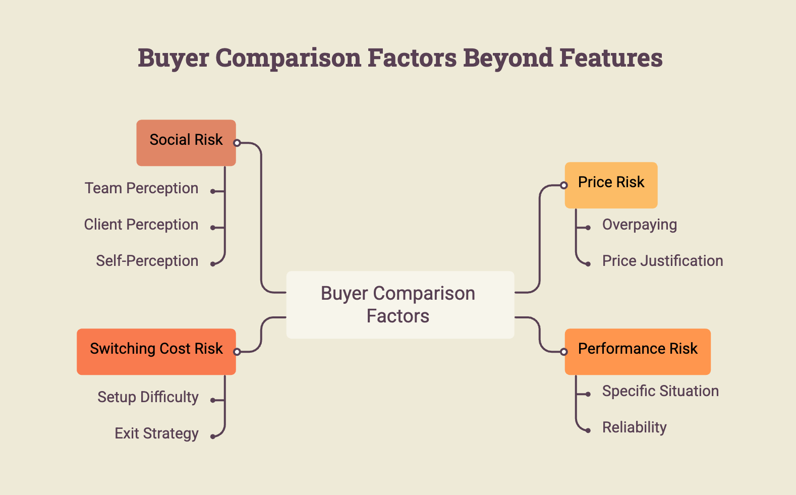
Sellers who build comparison pages around their own features are answering a question buyers stopped asking two steps earlier. Sellers who build comparison pages around these risk categories are answering what buyers are actually trying to resolve. The structure of the comparison table is not just a design decision. It is a statement about whose question the page is trying to answer, and ultimately, what makes a comparison page feel trustworthy.
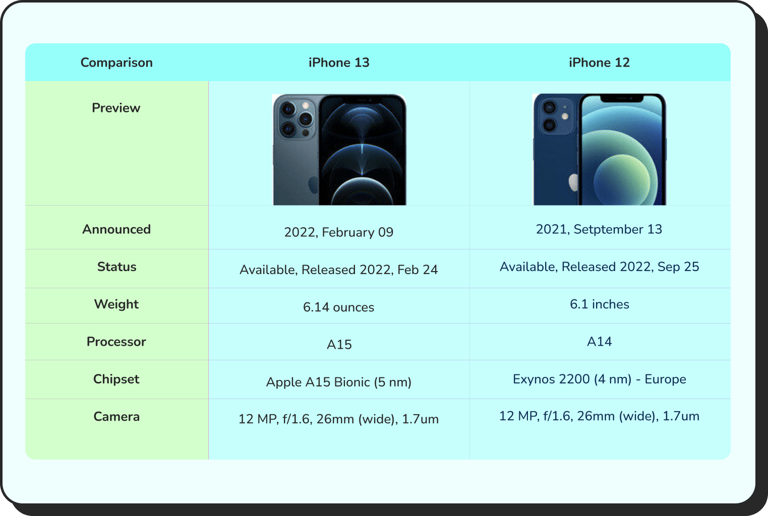
Comparison | Product X | Product Y |
Preview |  |  |
Announced | 2022, February 09 | 2021, September 13 |
Status | Available. Released 2022, February 24 | Available. Released 2021, September 25 |
Size | 6.1 inches | 6.1 inches |
Weight | 6.14 ounces | 5.78 ounces |
Processor | A15 | A14 |
Chipset | Apple A15 Bionic (5 nm) | Exynos 2200 (4 nm) - Europe |
Camera | 12 MP, f/1.6, 26mm (wide), 1.7µm, dual pixel PDAF, sensor-shift OIS | 12 MP, f/1.6, 26mm (wide), 1.7µm, dual pixel PDAF, sensor-shift OIS |
Battery | Li-Ion 3240 mAh, non-removable | Li-Ion 3000 mAh, non-removable |
Resolution | 2532x1170 | 2532x1170 |
Buy |
Get table templates for free
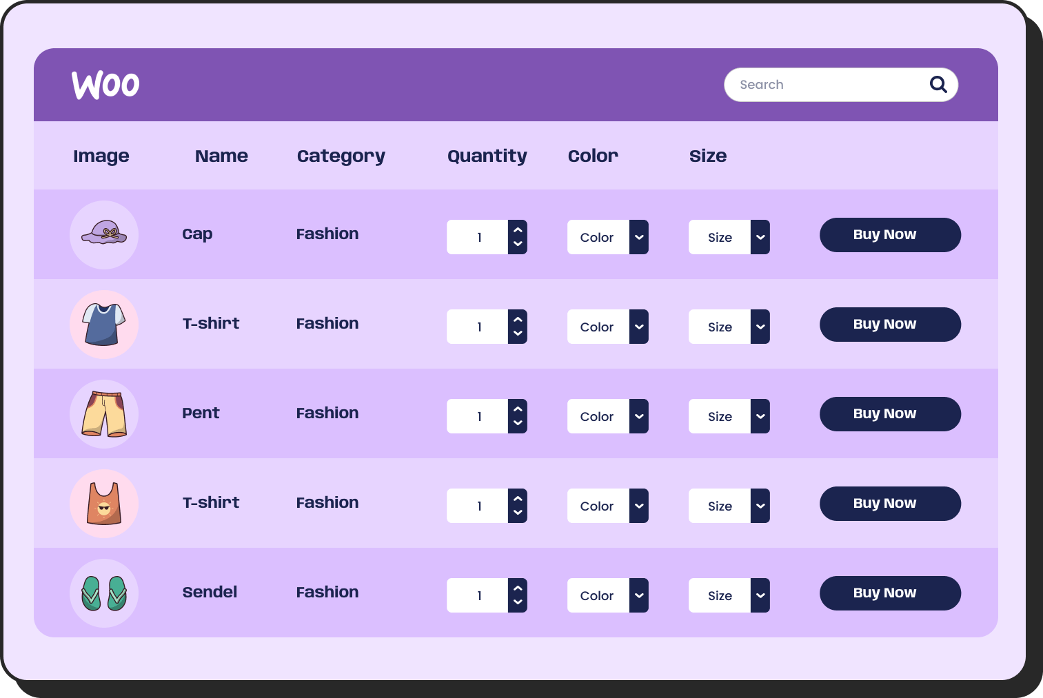
WooCommerce
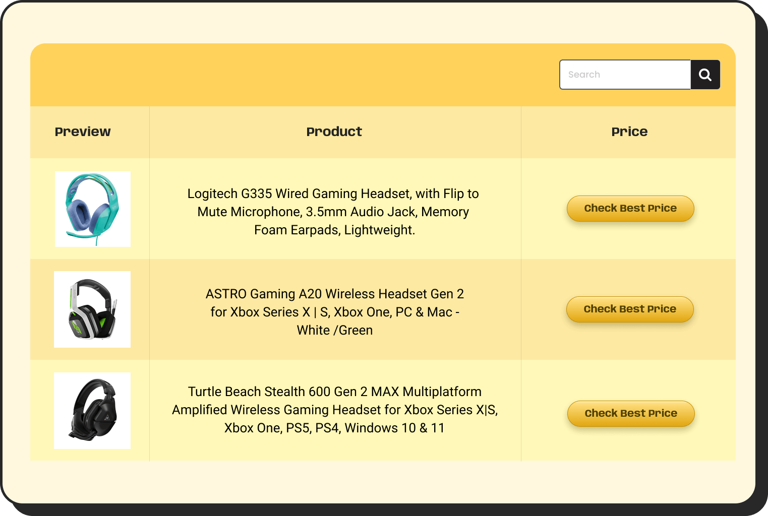
Amazon Products
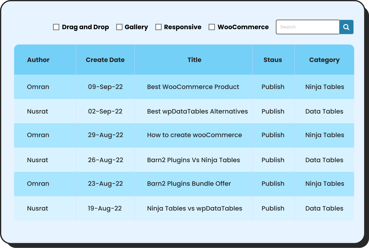
WP Posts
Products Comparison
Pricing Table
Features Comparison
Why Buyers Anchor on the First Credible Option They Find
Anchoring is one of the most consistent findings in behavioral economics: people rely heavily on the first piece of information they encounter when making a decision. In product comparison, this means the first credible option a buyer evaluates becomes the standard against which everything else is measured.
If a buyer finds your competitor first and forms a positive impression, they will evaluate your product through the lens of how it compares to that first option. You are no longer being evaluated on your own terms. You are being evaluated on how well you solve the problems the competitor did not.
This has two practical implications for comparison pages. First, if you cannot control whether your product is the anchor, you can control the criteria. A comparison page that defines what should be compared puts you in the position of setting the evaluation frame. Buyers accept the rows of a comparison table as the relevant dimensions almost automatically. Choosing those rows thoughtfully is a strategic decision, not just a design one.
Second, anchoring means that the order of information on a comparison page matters. The attribute presented first gets disproportionate weight. If price is listed first in a table where your price is higher than a competitor’s, the buyer anchors on that disadvantage before they ever reach the column where your product wins. Leading with the dimension where the case is greatest changes what the buyer anchors to.
The 3 Psychological Factors That Determine Which Product Wins the Comparison
Understanding how buyers actually make comparison decisions means understanding three mechanisms that operate below the level of conscious evaluation.
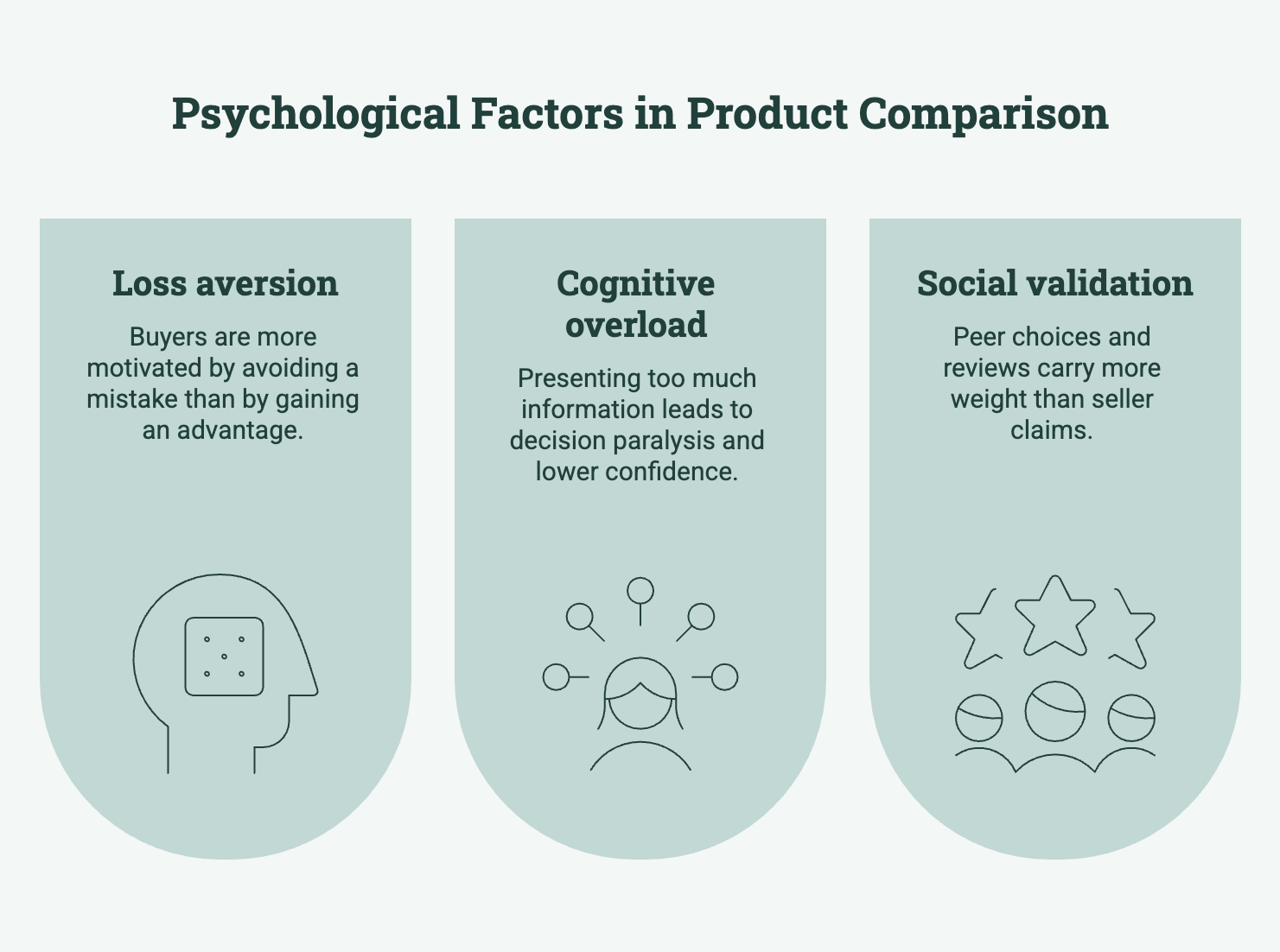
Loss aversion psychology and why buyers focus on what they might miss
Loss aversion, identified in Kahneman and Tversky’s foundational research, describes the tendency for people to feel losses more acutely than equivalent gains. In product comparison, this means buyers are more motivated by avoiding a mistake than by gaining an advantage.
A buyer choosing between two products is not primarily asking “which one is better.” They are asking “which one is less likely to be wrong.” This asymmetry explains why comparison pages that lead with risk-reduction messaging – “no lock-in contract,” “30-day money back,” “free migration support” – often outperform pages that lead with feature superiority. The buyer’s psychological priority is to minimize downside, not maximize upside.
Comparison tables that include a row for cancellation terms, money-back guarantees, or trial availability are not burying the lead. They are answering the question the buyer is most urgently asking.
 Pricing: Product X
Released: July 2025
Seller: ElectroMag
| Plan | Monthly | Annually | You save | USP | Action |
|---|---|---|---|---|---|
Agency | $159 | $1590 | 10% | 24/7 support | Buy |
Professional | $79 | $790 | 20% | AI infusion | Buy |
Starter | $29 | $290 | 17% | Drag-and-drop | Buy |
Cognitive overload and why more information increases hesitation
Choice overload research, most associated with the work of Barry Schwartz, shows that presenting buyers with more options or more information does not lead to better decisions. It leads to decision paralysis, lower confidence in the decision made, and greater regret afterward.
In product comparison pages, this manifests as feature dumping. A comparison table with 40 rows forces the buyer to do the cognitive work of deciding which 40 rows matter. Most buyers will not do that work. They will either pick the familiar brand, pick the cheapest option, or leave without deciding.
A comparison table with six to eight rows covering the highest-priority decision criteria produces better outcomes than a comprehensive table, not despite its brevity but because of it. Reducing the cognitive load of the comparison is itself a conversion action.
Popular Pro Photographer For Aspiring Professionals $29.99 per month Take your photography to the next level with advanced training and feedback All Features of Photo Enthusiast Advanced Photography Courses Live Workshops (Monthly) Expert Photo Reviews Lightroom Presets & Templates Exclusive Content Priority Support | Studio Pro For Professionals & Creators $79.99 per month Get full access to premium resources, one-on-one support, and grow your photography business Everything in Pro Photographer 1-on-1 Mentorship Calls Business & Branding Courses Portfolio Guidance and Reviews Early Access to New Courses VIP Community Access | |
All plans include a 7-day-money-back guarantee. Cancel Anytime! | ||
Social validation and why peer choices outweigh seller claims
Research cited by the Nielsen Consumer Trust Index shows that 98% of consumers read reviews before making a purchase, and 93% say those reviews directly influence their final decision. At the comparison stage, social proof is not supplementary information. It is often the deciding factor.
This is because buyers at the comparison stage have already filtered out what sellers say about their own products. What remains credible is what other buyers say. A star rating, a verified review count, a case study from a similar buyer, or a recognizable brand logo in a “trusted by” row carries more weight at this stage than any feature claim.
Comparison tables that include a social proof element – a review score, a user count, a trust indicator – close the credibility gap between what the seller says and what the buyer believes. For small businesses without established brand recognition, this row in the comparison table often does more work than any other.
Top!  | User Votes | ||
Design 88% Usability 95% Price 100% Quality 98% | |||
Lorem ipsum dolor sit amet, consectetur adipiscing elit. Ut pulvinar metus lacus, sollicitudin molestie ligula viverra vitae. Donec mattis, sem non luctus rhoncus, sapien ante malesuada | |||

What a High-Converting Product Comparison Page Actually Needs
The psychological principles above translate directly into structural decisions for a product comparison page. A page designed around buyer psychology looks different from one designed around product features, and it performs differently.
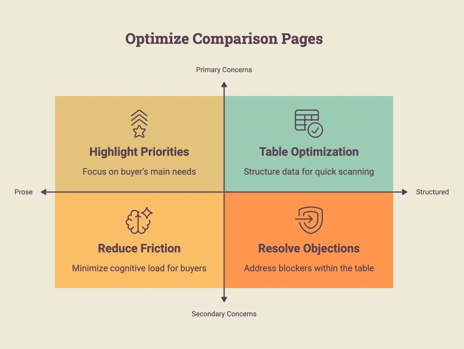
Lead with the buyer’s primary concern, not your strongest feature
The most important row in a comparison table should be the one that addresses the buyer’s dominant concern for that product category. For subscription products, that is often cancellation terms. For tools requiring setup, it is implementation time. For products requiring team adoption, it is ease of learning. Identifying the primary concern for your specific buyer type and placing it at the top of the comparison table is the single most impactful structural decision a comparison page can make.
Resolve the blocking objection visually
Every buyer has at least one concern that, if unresolved, will prevent them from deciding regardless of how well everything else compares. On a comparison page, the most effective place to resolve this concern is in the table itself, not in a paragraph of supporting text. A row that directly addresses the concern – with a checkmark, a specific data point, or a direct answer – does more than a paragraph of explanation because it is encountered in the scanning pattern the buyer is already in.
Use structured tables, not prose comparisons
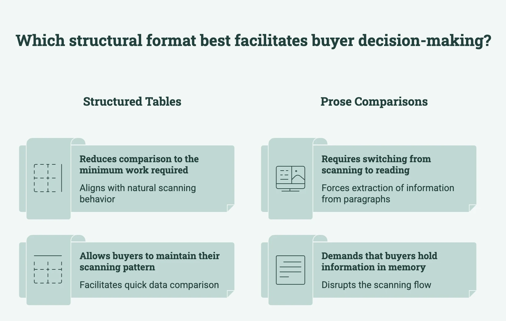
Buyers at the comparison stage scan before they read. A structured comparison table matches the scanning behavior buyers are already using. As we explored in our guide on why most product comparison pages don’t convert, the biggest problem is often not a lack of information, but how difficult that information is to compare. Prose comparisons require buyers to switch from scanning to reading, extract comparable information from different positions in different paragraphs, and hold that information in working memory long enough to compare. Most buyers will not make that effort. A table reduces the comparison to the minimum cognitive work required, which is what the buyer wants.
Types of Comparison Tables That Match Each Buyer Decision Point
The structure above describes what a comparison page should do. The tables below demonstrate what it should look like. Each table type maps to a specific decision point in the buyer’s comparison process and can be built and embedded in WordPress using Ninja Tables.
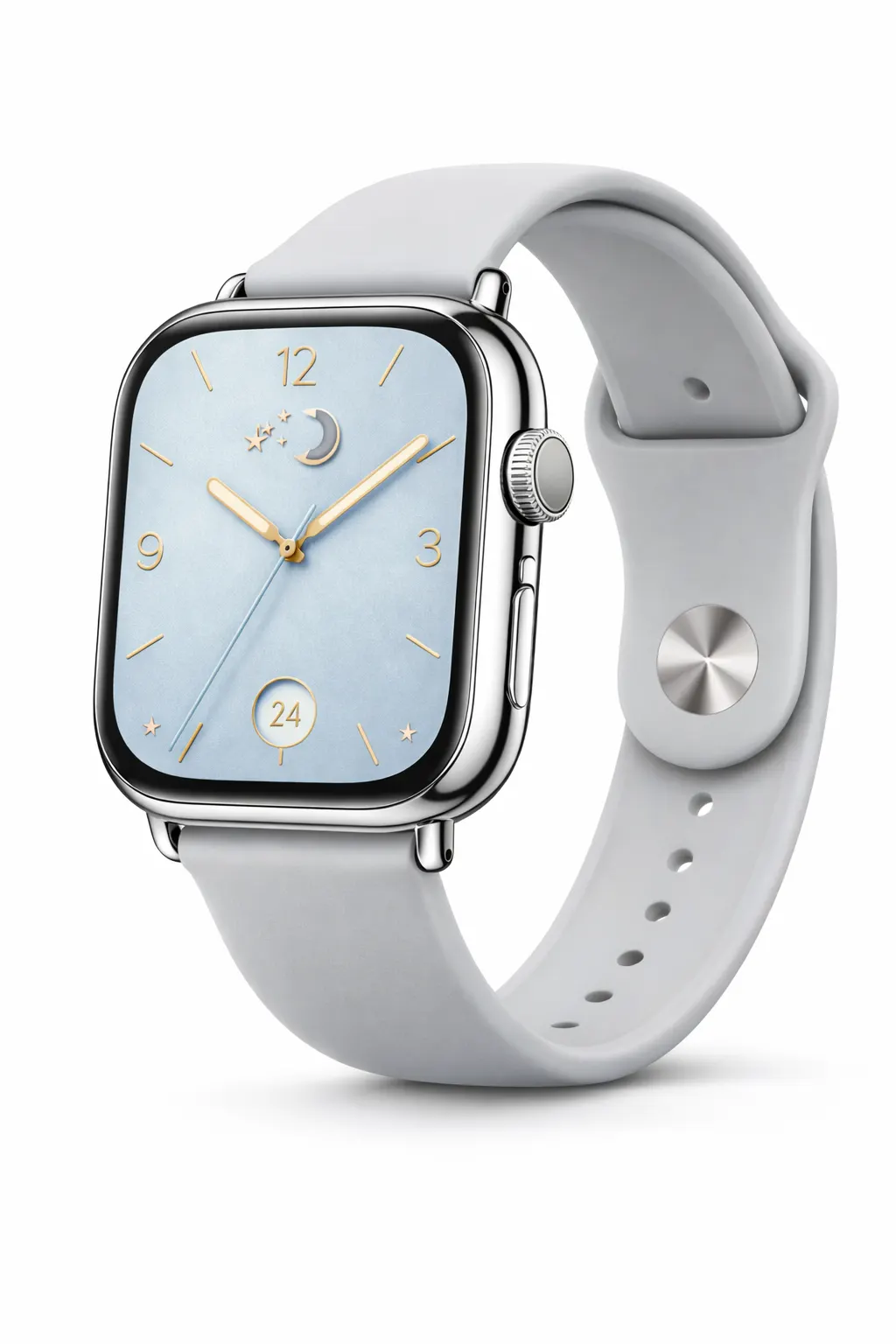
Feature comparison table – Addresses performance risk
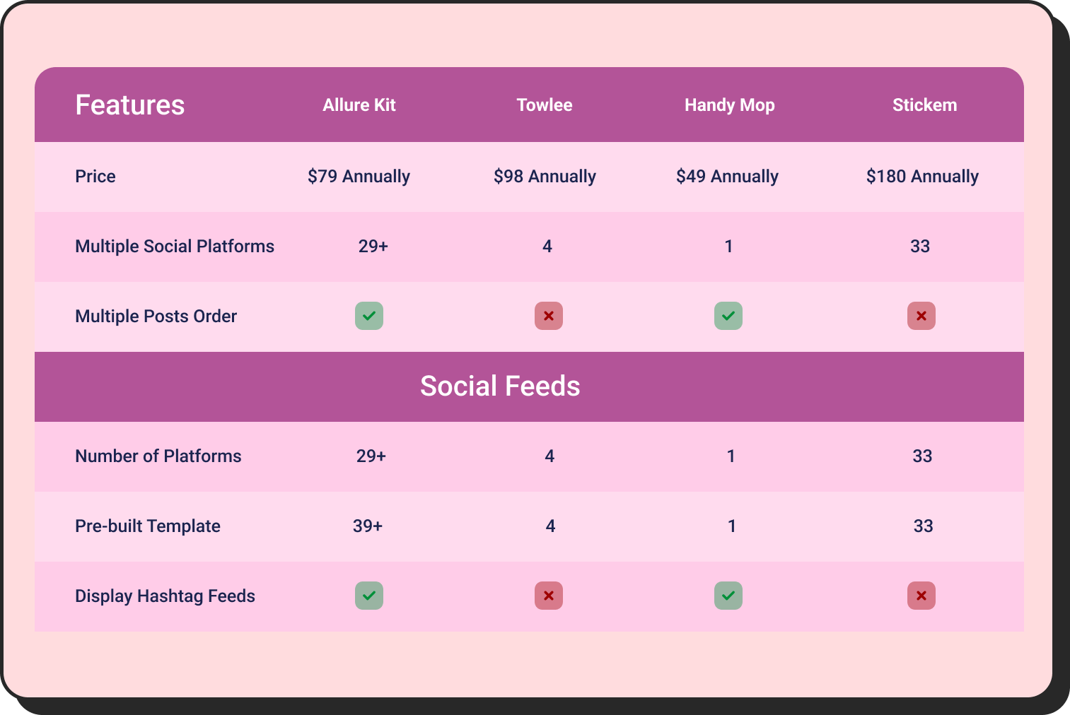
A feature comparison table answers “will this product do what I need it to do?” It should cover seven to eight attributes maximum, ordered by decision relevance to the buyer type, with conditional formatting that visually surfaces where the differentiating answer sits. Buyers scan this table for the one or two attributes they know matter most. Every additional row past what is genuinely decision-relevant adds cognitive load without adding purchase confidence.
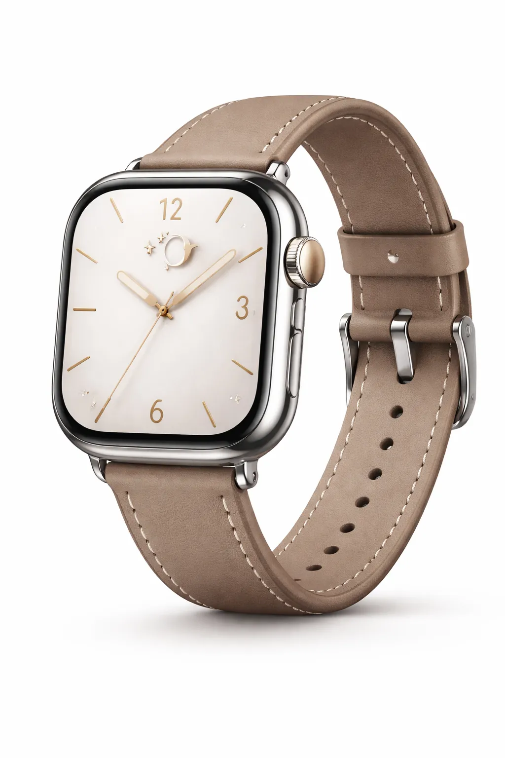 | 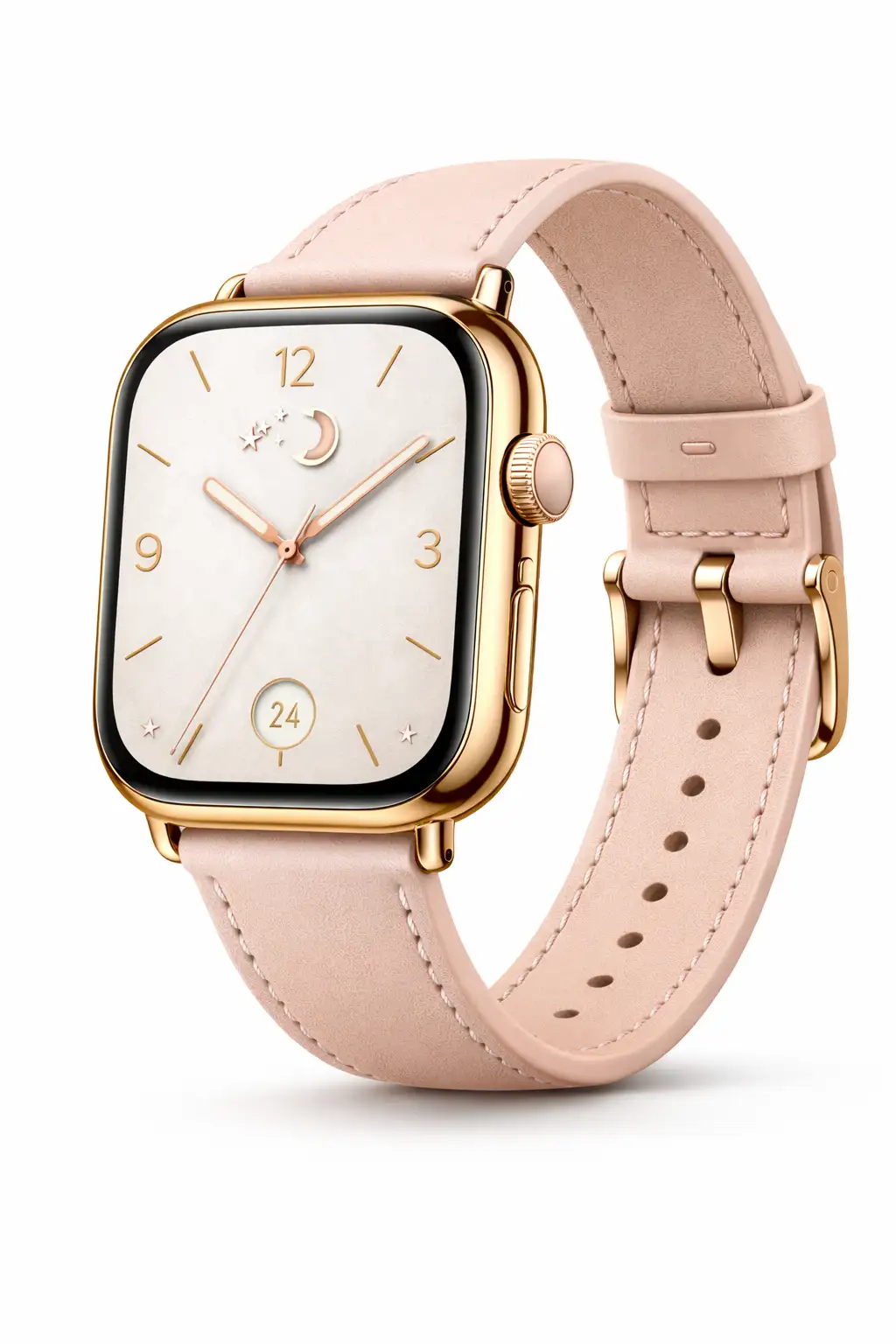 |  |
A smartwatch with a polished silver case paired with a classic brown leather strap. | An elegant rose-gold smartwatch with a soft blush strap and delicate dial details. | A fresh and modern smartwatch with a cool silver case and soft sky-blue dial. |
Classic brown | Blush pink | Sky blue |
$199 | $179 | $219 |
Details | ||
Display | ||
Always-On square display | Slim square display | Wide square display |
Classic analog dial | Elegant minimal dial | Modern numeric dial |
Case & Size | ||
42mm case size | 40mm case size | 44mm case size |
Stainless steel case | Rose gold aluminum case | Polished silver aluminum case |
Reinforced glass display | Scratch resistant glass | Edge-to-edge glass display |
Strap | ||
Premium leather strap | Soft leather strap | Silicone sport band |
Breathable stitched design | Lightweight and flexible | Soft-touch sport fit |
Pricing comparison table – Addresses price risk
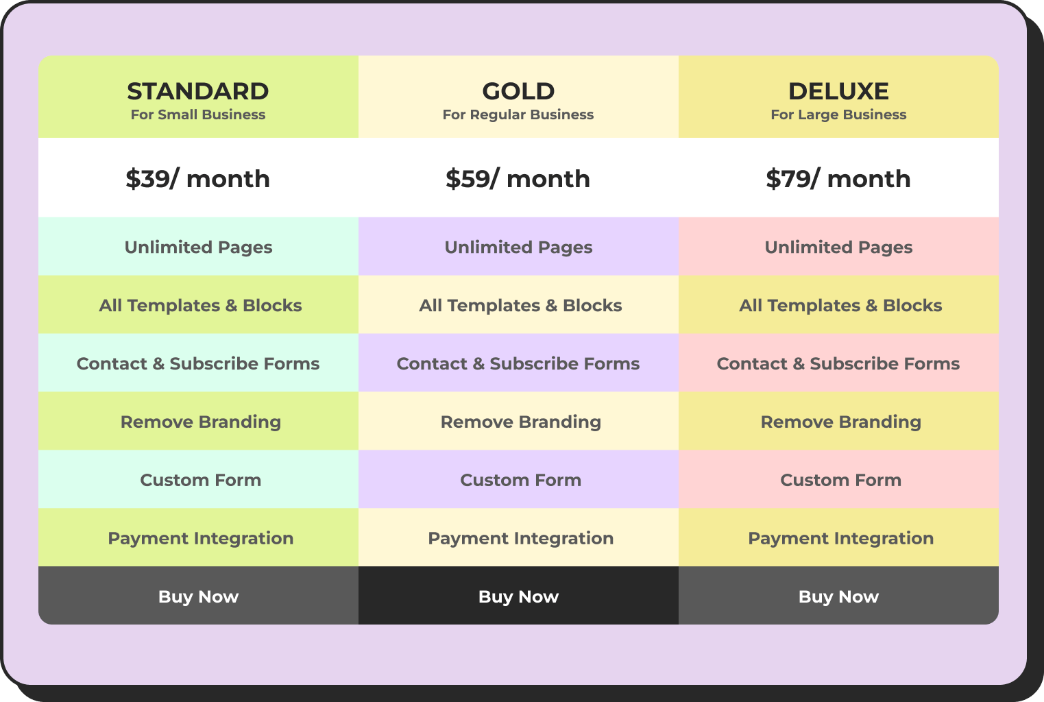
A pricing comparison table should show more than the headline price. Buyers comparing prices are also comparing value at that price – what is included, what costs extra, and what the total cost of ownership looks like over time. A table that breaks out plan tiers, included features, and any additional costs converts better than a simple price list because it answers the real question: is the difference in price worth the difference in what I get?
Form Plugin | Basic | Pro | Elite |
 | $109/ Per year | $169/ Per year | $369/ Per year |
Ninja Tables | $79/ Per year | $129/ Per year | $299/ Per year |
 | $49/ Per year | $79/ Per year | $399/ Per year |
Social proof and ratings table – Addresses social risk
A ratings table that aggregates verified scores from multiple review sources resolves the social proof step of the buyer’s comparison in a single view. Rather than asking the buyer to open separate tabs and compare scores mentally, the table presents that comparison in the format the buyer was already using.
Wired keyboard
| |
Mechanical Keyboard
| |
Compact Wireless Keyboard
|
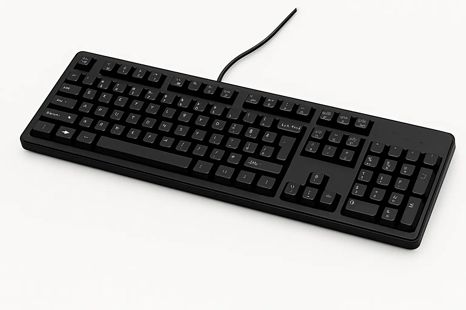
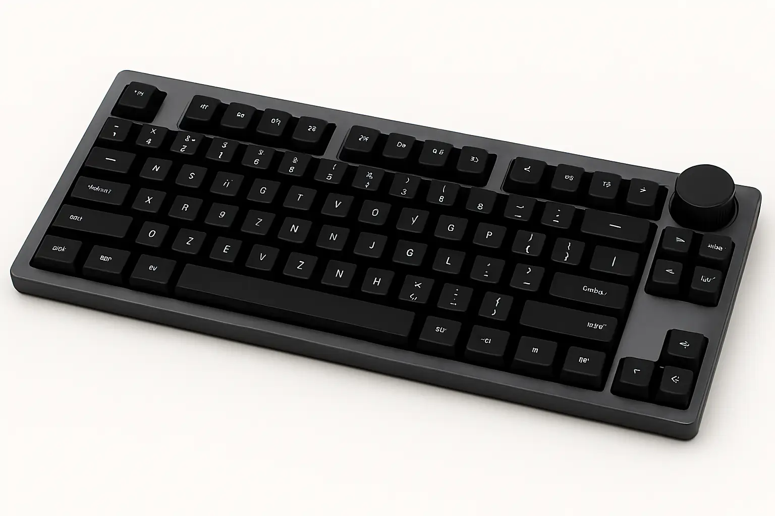
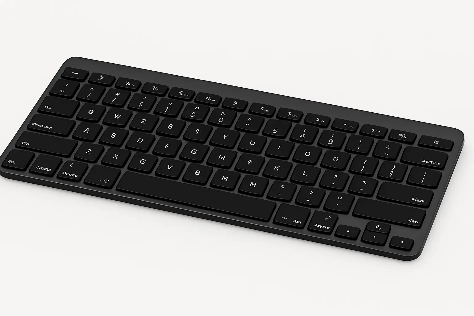
Verified scores from recognized platforms carry more credibility than seller-curated testimonials, and presenting them in a structured table signals the transparency that buyers at this stage respond to.
GSMArena | Product Review I phone 15 The iPhone 15 boasts a Super Retina XDR display, an A16 Bionic chip for powerful performance, and an advanced dual-camera system with a 48MP main sensor for super-high-resolution photos | Jane  Very smooth and fast performance,super camera, but heating | John  Heating issue while charging. It heats up like anything, it will |
AT & T | |||
Trustpilot | Juan  Awesome phone with awesome features. Specifically in love with | Pablo  Overall very good product, specially long lasting battery, | |
Techradar | |||
Pros
| Cons
| ||
Compatibility or integration table – Addresses switching cost risk
For products where integrations determine fit, a compatibility table resolves the blocking concern that no amount of feature description addresses. Buyers who need to know “does this work with the tools I already use” will either find that information on your page or leave to find it elsewhere. A structured table covering the most common integration questions – organized by the tools buyers in this category most often use – answers that question in the format buyers are scanning in.
| Features | |  |  |  |
|---|---|---|---|---|
| Table Design Options | Unlimited | Limited | Unlimited | Limited |
| Colors | Unlimited | Limited | Unlimited | Limited |
| WooCommerce | ||||
| FluentCart table | ||||
| Google Sheets sync | ||||
| WP Posts table | ||||
| Drag & Drop | ||||
| Pre-built templates | ||||
| Custom filter | ||||
| Export-Import Table | ||||
| One-click Migrate from TablePress | ||||
| Fluent Forms integration | ||||
| Advanced Styling | ||||
| ACF Field Mapping | ||||
| Charts | ||||
| Conditional formatting | ||||
| Value transformation | ||||
| Custom CSS | ||||
| Trash/restore |
Explore more free table templates
Wrapping Up
The comparison stage is where purchases are decided, and most businesses treat it as a place to display their product rather than a place to serve the buyer’s decision-making process. Those two things require different pages.
Buyers at this stage are managing risk, working through cognitive shortcuts, and looking for the clarity that lets them commit with confidence. A comparison table built around their actual decision criteria – not around the seller’s preferred narrative – does that job better than any amount of marketing copy.
Ninja Tables gives small business owners and WordPress site operators the tools to build these comparison experiences without custom development. The templates and table types above are a starting point. What each business puts in the rows and how they structure the visual hierarchy is what makes the difference between a comparison page that closes and one that sends buyers back to search results.

Ninja Tables– Easiest Table Plugin in WordPress




Add your first comment to this post