
Line Graph vs Bar Graph: The Right One to Visualize Your Data?

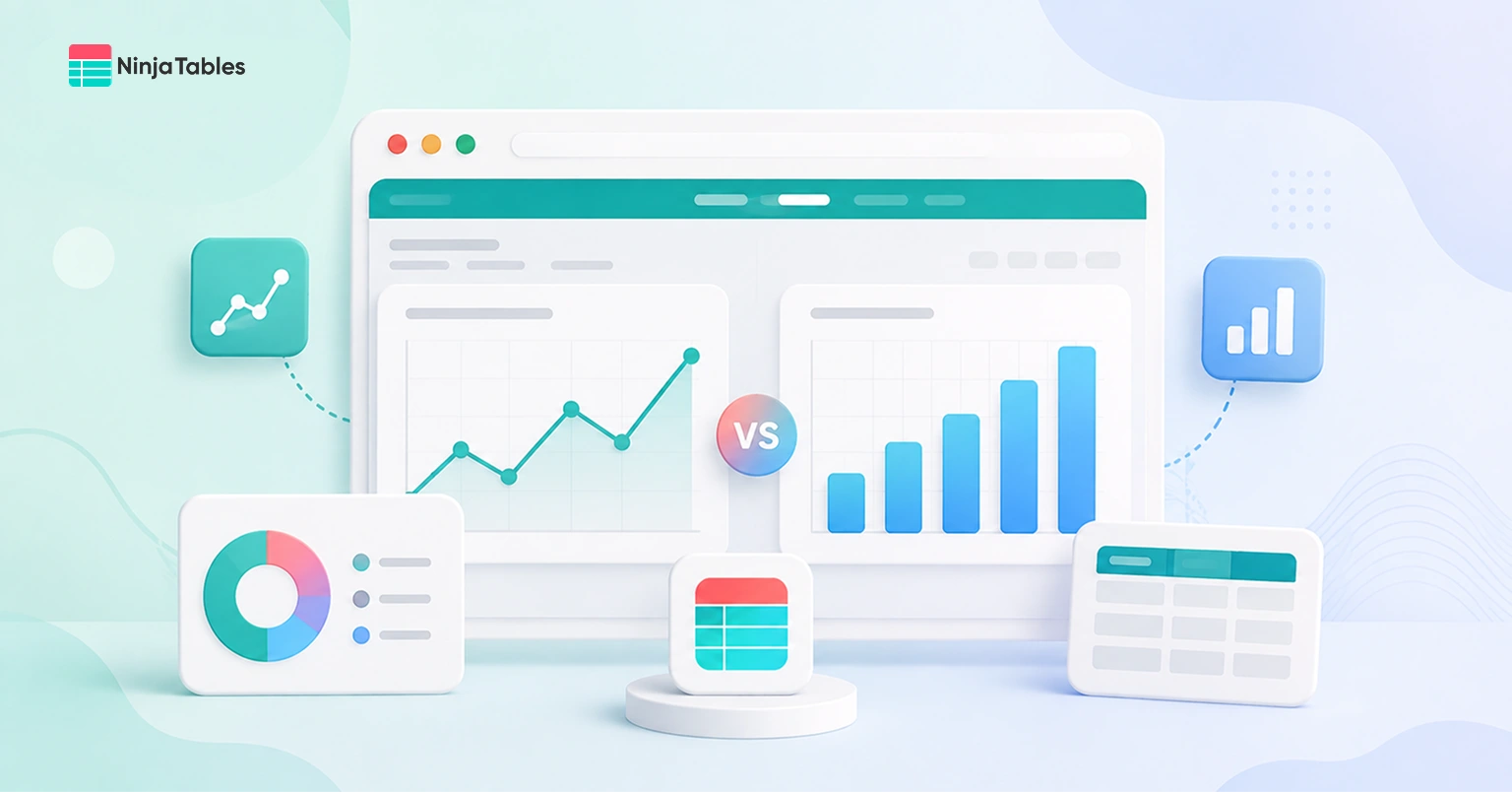
You’ve got a spreadsheet full of numbers and a decision to make. Line graph or bar graph? It feels like a small choice, but pick wrong and your data ends up confusing instead of clarifying.
Here’s the short version. Bar graphs are for comparing separate categories. Line graphs are for showing how something changes over time. That’s the core of the line graph vs bar graph debate, but there’s more nuance worth knowing before you build your next chart, so stick around.
In this article, we’ll break down bar graph vs line graph properly, the key differences between them, when to use which one, and how to actually create them effortlessly. By the end, you’ll be able to look at any dataset and know exactly which chart tells your story best.
Key takeaways
The Quick Way to Decide
If you want quick answers, here’s the fastest way to settle line vs bar graph for your dataset.
Ask yourself one question: Does my data have a natural order that flows into the next point, like days, months, or years? If yes, go with a line graph. If your data is made up of separate, standalone groups like products, regions, or survey answers, a bar graph is your answer.
A simple way to remember it:
- Comparing things side by side → bar graph
- Tracking something as it moves → line graph
- Both categories and change over time → you might need both (more on that later)
Let’s get to the details now.
What Is a Line Graph
A line graph plots data points and connects them with a continuous line, and it’s built specifically to show how a value changes over a period of time or across a sequence.
Unlike a bar graph, a line graph assumes there’s a relationship between one point and the next. The line itself carries meaning. It shows direction, speed of change, and pattern, not just individual values sitting side by side.
The line graph definition really comes down to this: it’s a chart type for continuous data, where the connection between points actually means something.
Daily temperatures, monthly website traffic, quarterly revenue growth. All of these have a natural sequence, and a line graph captures that flow in a way a bar graph simply can’t.
This distinction is really the heart of the line graph vs bar graph decision, and it’s worth keeping front of mind as you look at your own data.
Here’s a line chart example worth picturing: monthly active users over the past year. As the line moves up, down, or flattens out, you immediately understand the trend without needing to read every single number.
What Is a Bar Graph
A bar graph uses rectangular bars to represent values, with the height or length of each bar indicating the value’s size. Each bar stands on its own and represents a separate, distinct category.
Think about comparing monthly revenue across five different product lines or looking at how many people picked each option in a survey. Nothing here is meant to blend into the next bar.
Every bar tells its own story, and you’re mainly interested in comparing them against each other.
So what does a bar graph look like in practice? Picture a set of vertical or horizontal blocks lined up next to each other, each one a different height depending on its value.
Simple to read, easy to compare, and there’s a reason it’s one of the most used chart types out there.
Keep this in mind as we go deeper into the full bar graph vs line graph comparison below.
Here’s a quick bar chart example you’ll recognize instantly: a chart showing website traffic by source (organic, paid, social, referral, direct). Each source gets its own bar, and you can tell at a glance which one is bringing in the most visitors. That’s the whole point of a bar graph: instant visual comparison.
Difference Between Bar Graph And Line Graph
Sometimes the easiest way to settle the bar graph vs line graph debate is to see both laid out directly next to each other. Here are the key differences between line graph and bar graph:
| Feature | Bar graph | Line graph |
| Best for | Comparing separate categories | Showing change over time |
| Data type | Discrete/categorical | Continuous/sequential |
| Visual style | Individual bars | Connected points |
| What it highlights | Differences in size | Trends and direction |
| Common mistake | Too many bars, cluttered axis | Connecting unrelated categories |
| Good for time series? | Sometimes, if changes are big | Yes, especially for smooth trends |
This table pretty much sums up the whole bar chart vs line graph conversation. Everything else in this guide is just filling in the details around it.
Read more: 7 Types of Comparison Charts for Effective Data Visualization
When to Use a Line Graph vs Bar Graph
Line graphs are the go-to on the other side of the line graph vs bar graph debate, especially for anything trend-related, but they come with their own set of trade-offs.
Tracking trends over time
Daily website visits, monthly recurring revenue, weekly email open rates. Anything where you’re watching a number move over a stretch of time belongs on a line graph. The eye naturally follows the line and picks up on the trend without extra effort.
Forecasting or spotting patterns
Line graphs are great at revealing seasonality, spikes, and dips that would get lost in a wall of bars. If you’re trying to answer “is this growing or shrinking,” a line graph answers that question in about two seconds.
Comparing multiple trends at once
Want to see how organic traffic stacks up against paid traffic over the same six months? Multiple lines on the same chart let you compare trajectories directly, something that gets messy fast with grouped bars.
Continuous data with a lot of points
When you’ve got dozens or hundreds of data points, like daily numbers over a full year, a bar graph turns into a cluttered wall of rectangles. A line graph smooths that same data into something actually readable.
Advantages and Limitations of a Line Graph
Line graphs are the go-to for anything trend-related, but they come with their own set of trade-offs.
Advantages:
- Shows trends, direction, and rate of change clearly, even with subtle shifts
- Handles a large number of data points without becoming unreadable
- Great for comparing multiple trends on the same chart, like organic vs paid traffic
- Makes patterns like seasonality or spikes easy to spot at a glance
- Works well for forecasting and answering “is this going up or down” type questions
- Clean, minimal visual style that reads well on dashboards and reports
Limitations:
- Not suitable for categorical data since the connecting line implies a relationship that isn’t there
- Gets messy and hard to follow with more than four or five lines on one chart
- Doesn’t highlight standalone comparisons as clearly as a bar graph does
- Can visually exaggerate small fluctuations if the y-axis scale isn’t set carefully
- Less intuitive for readers who aren’t used to interpreting trend lines

Get Exclusive Tips, Updates, and Inspirations in Your Inbox!
When to Use a Bar Graph vs Line Graph
Bar graphs are one of the most reached-for chart types in the bar graph vs line graph conversation, and for good reason, but they’re not perfect for everything.
Let’s see when you should use a bar chart to visualize your data instead of using a line chart.
Comparing distinct groups
If you’re comparing sales across different products, page views across different blog posts, or scores across different students, you’re comparing groups that don’t flow into each other. A bar graph is the right call here.
Ranking or highlighting differences
Want to show which team performed best, or which region brought in the most revenue? Bar graphs make ranking painfully obvious. The tallest bar wins, and everyone in the room can see it instantly.
Showing frequency or survey results
If you asked 500 people to pick their favorite feature and wanted to show how the votes stacked up, that’s a textbook bar graph situation. Each answer option is its own category, no natural order needed.
Comparing a small number of time periods
Sometimes even time-based data works better as a bar graph, especially when you’re only comparing a handful of points, like this year’s Q1 versus last year’s Q1. When the changes are big, and there aren’t too many data points, bars can actually communicate the difference more clearly than a line.
Get table templates for free
WooCommerce
Amazon Products
WP Posts
Products Comparison
Pricing Table
Features Comparison
Advantages and Limitations of a Bar Graph
Bar graphs are one of the most reached-for chart types out there, and for good reason, but they’re not perfect for everything.
Here are some of the advantages and limitations of a bar chart.
Advantages:
- Makes side-by-side comparisons instantly clear, even for people who aren’t used to reading charts
- Works well with both small and fairly large datasets without losing readability
- Handles categorical, ordinal, and numerical data equally well
- Easy to read at a glance, no need to trace a line or track direction
- Great for highlighting rankings, like which product sold the most or which team scored highest
- Flexible layout options (vertical, horizontal, grouped, stacked) depending on how much detail you need to show
Limitations:
- Gets cluttered fast once you’re past 12 to 15 categories
- Not built for showing subtle changes over time, especially gradual or small shifts
- Truncated axes can distort comparisons more easily than people expect
- Doesn’t handle continuous data as naturally as a line graph does
- Grouped or stacked bars can get harder to interpret the more series you add
Can You Combine a Bar Graph and Line Graph?
Sometimes the honest answer to bar chart vs line graph is “both, actually.”
Combo charts overlay a line on top of a bar chart, and they’re incredibly useful when you’re tracking two related metrics with different scales.
A classic example is monthly revenue as bars, with profit margin as a line running across the same chart. You get the category-by-category comparison and the overall trend, all in one view.
This works especially well for dashboards and reports where stakeholders want the full picture without flipping between two separate charts.
Common Mistakes to Avoid
A few habits quietly wreck good charts, no matter which type you’re using.
Truncated axes: Starting your y-axis at 80 instead of 0 makes a tiny difference look massive. It’s one of the most common ways charts unintentionally mislead people.
Too many lines on one graph: More than four or five lines on a single line graph turns into a tangle nobody can follow. If you’ve got more series than that, consider small multiples instead: separate mini charts side by side.
Connecting categories with a line: As covered above, this implies a relationship that doesn’t exist. Keep line graphs for genuinely sequential data.
Inconsistent scaling: If your intervals aren’t even, whether that’s time gaps or value jumps, the visual comparison stops being honest.
Overcrowded bar graphs: Cramming in fifteen or twenty bars makes it hard to tell one from the next, especially on mobile. If you’ve got that many categories, consider grouping the smaller ones into “other,” or switch to a horizontal bar layout so labels have more room to breathe.
How to Create A Bar Graph Or Line Graph
Once you’ve settled the line graph vs bar graph question for your data, actually building the chart is the easy part.
You don’t need to be a designer or a data analyst to build either one properly. Once you know what story your data is telling- comparison or trend- the actual build is mostly about clean data, a consistent scale, and keeping the design simple enough that the numbers do the talking.
If you’d rather skip the manual setup, a good bar chart maker or table plugin for WordPress handles the scaling, labeling, and formatting for you, and lets you create a bar graph or create a line graph straight from your existing data without touching code.
Ninja Tables has got you covered here. Including line graphs and bar charts, this plugin lets you create almost all types of charts to visualize your data properly.
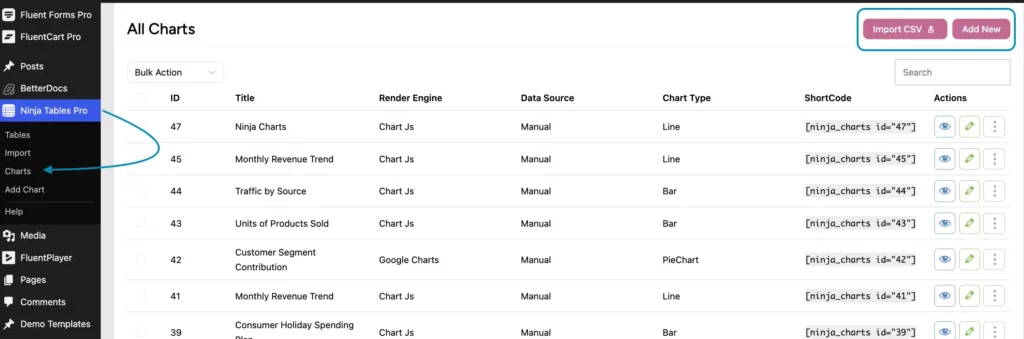
Here’s the 3-step process in Ninja Tables Pro, from a blank dashboard to a finished, embeddable chart.
Step 1: Install Ninja Tables Pro
- Head to your Ninja Tables dashboard > “Charts.”
- Click on “Add New” or import a CSV file to skip the manual setup entirely.
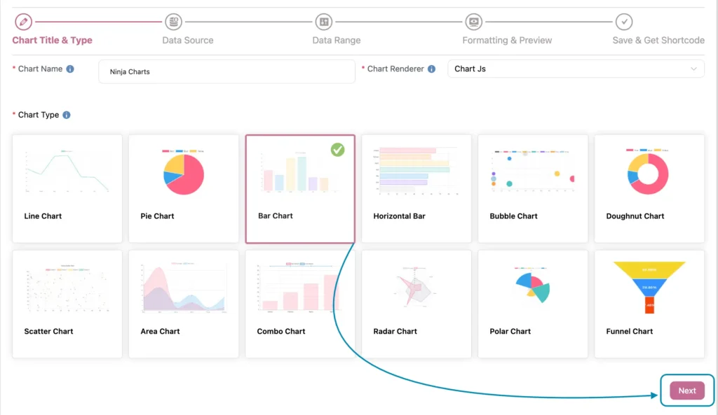
Step 2: Pick your chart type
- Give your chart a name, then set the Chart Renderer to “Chart.js.”
- Choose your Chart type and click Next.
- Select your source of data > Next.
If you go with Manual, you’ll get a simple input screen where you can type or paste your numbers directly in.
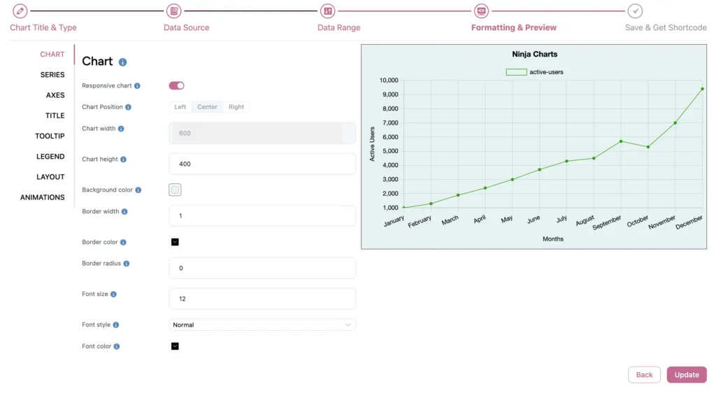
Step 3: Formatting and review
This is where Ninja Tables’ customization options come in.
- Set a consistent scale and label your axes clearly.
- Keep the color palette simple so the data does the talking, not the design.
- Every change updates in a live preview, so you can see exactly how it’ll look before it goes live.
- After you’re done with the customization, click on “Update,” and you’ll get the “Shortcode.”
That’s all!
You’re done with creating a bar graph or line chart. Just paste the shortcode straight onto any page or post.
Wrapping Up
At the end of the day, the line graph vs bar graph decision comes down to one simple question: are you comparing separate things or watching one thing change?
Everything else in this guide – the examples, the mistakes to avoid, and the combo chart option, just builds on that one idea.
Get that first call right, and your chart does the heavy lifting for you. Get it wrong, and even the cleanest-looking chart ends up confusing the people you’re trying to inform.
FAQs on line graph vs bar graph
Ques. What is the main difference between a line graph and a bar graph?
Ans. Bar graphs compare separate categories using individual bars. Line graphs show how a value changes over time using a connected line. The core difference comes down to whether your data has a meaningful sequence or not.
Ques. When should I use a bar graph?
Ans. Use a bar graph when comparing distinct categories like products, regions, or survey answers.
Ques. When should I use a line graph?
Ans. Use a line graph when tracking a value’s change over time, like monthly traffic or daily revenue.
Ques. Can a line graph be used for categorical data?
Ans. Not really. Connecting categories with a line implies a relationship or progression between them that usually doesn’t exist, which can mislead anyone reading the chart.
Ques. Is it okay to combine a bar graph and line graph in one chart?
Ans. Yes, this is called a combo chart, and it works well when you’re comparing two related metrics with different scales, like sales volume and profit margin, in a single view.
Ques. What’s the best tool to create a bar graph or line graph?
Ans. Any solid chart or table plugin will get the job done, but for simplicity and tons of customization options, Ninja Tables can be the key plugin. It includes all types of charts, including line graphs and bar charts.

Ninja Tables– Easiest Table Plugin in WordPress





Add your first comment to this post