Visuals, Charts, and Tables for Your SEO Report

Your data is an onion. It has many layers of contexts. And SEO data is the same. As an SEO specialist or a marketer, you need to visualize SEO data in a way that highlights your work and makes sense for others. That’s where SEO reporting comes in.
But you know it’s not always easy to make sense of the ups and downs of those numbers! You might have fun decoding complex data. But it can be boring or even completely meaningless for others.
So, it helps when your report uses visual elements to turn flat and plain numbers into something engaging and easy to understand.
In short, SEO data visualization.
What is SEO Visualization?
SEO visualization is basically turning raw, complex SEO data into visuals (charts, tables, graphs, etc.) to help people understand easier.
Think about all those metrics and rankings you track in a nice, colorful dashboard.
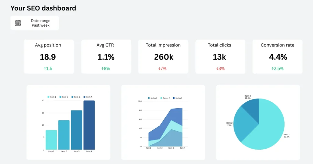
This is a great way to update your team or your clients on what has been done and what still requires improvement.
The visual format makes it easier for people to pick up the patterns quickly and see the full picture.
Clean graphs simplify the whole reporting process. Unlike the typical SEO spreadsheets full of numbers, which doesn’t look interesting at all!
How Data Disualization Helps SEO Reporting?
“A picture is worth a 1000 words.”
This is why data visualization is such a big deal for marketers across all niches.
You can find many use cases where data presented in a chart or table helps people understand better and make decisions quicker.
Why? Because our brain processes visuals faster than text.
SEO charts or tables that bring your report to life also tell stories worth thousands of words.
Visualizing SEO data in tables or charts helps you:
- Break down complex insights into simple, bite-sized facts
- Grab attention and help the information stick longer
- Highlight important trends like growth, fluctuations, or declines
- Add a professional layer to your report to improve your credibility
And you know what?
This works for any SEO or marketing-related cases.
If you or your clients are interested in getting new prospects, improving traffic, or ranking for a particular keyword, a visual report plays a big role. You can break down any optimization process over a given timeline using a chart or a table.
Tools for SEO Data Visualization
Most modern SEO tools (Ahrefs, Semrush, Moz, etc.) actually give you results in both visual and text-based formats.
You want keyword reports, link-building reports, or just track trends? Try their built-in visualization. And there’s Looker Studio as well.
But here’s the catch.
Not everyone is fluent in data!
Some people need the “explain to me like I’m 5” approach.
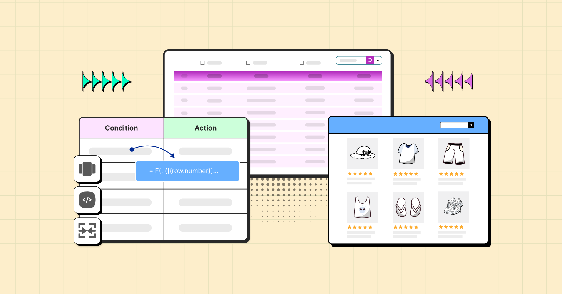
And if you can’t understand raw data, numbers, or instructions in your SEO tool, you have Ninja Tables to help you.
Any data you don’t understand, can be transformed into a comprehensive data table in your WordPress dashboard.
| Metric | Value | Change % | Meaning / Insight |
|---|---|---|---|
| Avg Position | 21.8 | ↑ 20% | Rankings improved — site is appearing higher in search results. |
| Avg CTR | 1.2% | ↑ 9% | More users are clicking when they see your site. |
| Total Impressions | 4.61M | ↑ 31% | Big jump in visibility — your site showed up much more often. |
| Total Clicks | 7.6k | ↓ 10% | Despite higher impressions, fewer people clicked. Possible mismatch in content relevance or competition. |
| Total Conversions | 460 | No change | Conversions are stable, not growing with impressions. |
| Conversion Rate | 4.4% | ↓ 9% | Lower percentage of clicks are converting — maybe due to weaker landing pages, offers, or targeting. |
You also get some sample tables as templates from Ninja Tables. Try the marketing report templates.
Tips to Make Your SEO Reports More Impactful
Now that you know how useful a visual SEO report presentation can be, let’s talk about how you can make yours more impactful.
Decide what metrics deserve a spot on your report
This is basic, but it’s worth mentioning. There is only so much you can fit into any presentation.
So, think of your SEO report as more of a highlight reel than a place to create a visual for every single data point.
Focus on the key metrics and KPIs that show you are clearly nailing your client’s objectives.
- Organic traffic from users who land on your site from unpaid sources
- Conversion rates, aka the percentage of those users who went on to complete the desired action
- Backlinks gained, which clearly show that you’ve won the respect of other website editors
- Your ranking position for target keywords
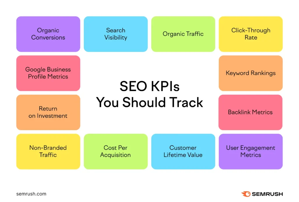
Image source: Semrush
The KPIs you choose to track will depend on your own goals.
Here’s an example of a KPI reporting table for you. It may or may not align with your business goals. But you can download the template and customize it your way.
| KPI Category | Metric | Target | Current | % Achieved | Status | Notes |
|---|---|---|---|---|---|---|
| Traffic & SEO | Total Website Visitors | 100,000 | 78,560 | 78.60% | Below | Needs stronger SEO/content push |
| Organic Traffic Share | 60% | 52% | 86.70% | At Risk | Optimize blog & backlinks | |
| Bounce Rate | ≤ 45% | 50.20% | N/A | Below | Improve landing UX | |
| Leads & Conversions | Lead Conversion Rate | 4.50% | 3.80% | 84.40% | At Risk | Test better CTAs/forms |
| Total Leads Captured | 1,500 | 1,320 | 88% | At Risk | Promote lead magnets | |
| Sales Metrics | Qualified Leads | 1,000 | 900 | 90% | At Risk | Better CRM follow-up |
| Closed Deals | 300 | 265 | 88.30% | At Risk | Deal stage review needed | |
| Monthly Recurring Revenue (MRR) | $30,000 | $33,200 | 110.70% | On Track | Great! Expand client pipeline | |
| Customer Success | Customer Satisfaction Score (CSAT) | 90% | 94.20% | 104.60% | On Track | Strong account management |
| Net Promoter Score (NPS) | 70 | 66 | 94.30% | At Risk | Follow up on detractors | |
| Operations | Average Response Time (support) | ≤ 2 hrs | 1.8 hrs | N/A | On Track | Efficient support |
| Project Delivery Rate (on-time %) | 95% | 91% | 95.80% | On Track | Just keep tracking |
Tip: You will also have to ditch the vanity metrics – social media followers, views, impressions, etc. Sometimes likes are vanity metrics too. But it depends on your goal.
And you want to match the right visuals to the right metrics. So, you may choose charts to show changes that happened on a given biweekly, monthly, or yearly period.
Doughnut or pie charts can show all your lead generation sources that your successful SEO efforts are bringing. The portion size difference tells you which source is working best.
Courtesy of Ninja Charts
Or, use tables to show how different metrics add up to bring your clients closer to their business goals.
Tables have columns, rows, header, and cells to show dynamic data. Ninja Tables is a customizable WordPress table plugin that you can use to plot your SEO data.
If you get Ninja Tables, you get Ninja Charts as well!
Make it interactive
A plain visual is no match to an interactive visual.
Your SEO project report helps you hold people’s attention even better and encourages your team to take their time to understand the report.
This is why you can find numerous reporting software that allows you to play around with the data a bit.
Normally, the creation process is also quite straightforward. It comes down to selecting your data sources and picking a template (or creating one from scratch if you prefer that).
Most platforms are designed to be comprehensive. You can have all this “fun” functionality inside one visualization tool.
For interactive visualization, Ninja Charts and Ninja Tables can:
- Create any type of dynamic data visualization to show your progress
- Ninja Charts has 12 chart types, Google Charts, and Chart Js
- Add any visuals you like to your tables – images, icons, videos, or music
- Ninja Tables gives you 11+ table creation options and unlimited table variations
- Create charts using Ninja Tables or Fluent Forms data
- Interactive charts with tooltips and hover animations
- Media lightbox for a clear view
- Buttons, links, dropdown, and more
- Sortable, filterable, and searchable tables
- Custom desgined tables and charts
Bring your reports to a whole new level and make your presentations more professional.
Follow the best design practices
In SEO, marketing, or project management – it’s important to follow best design practices.
You design a visual once, you leave your impressions forever.
- Make sure you’re using the right scale, size, color, shape, and layout in your reports. For example, green can show growth while red is better suited for declines.
- Decide whether charts, graphs, or tables work best to present your marketing report data.
- Label correctly (prioritize descriptive titles).
- Use a reasonable amount of white space.
- Add media where appropriate.
- Use arrows, annotations, or whatever you prefer to highlight specific parts that you want to draw attention to.
- You can create different sections for different types of reports. But don’t forget to pull all these different visuals into one dashboard for the bigger picture.
- Include recommendations.
It’s easy to make mistakes in data visualization. You need to focus on simplifying your data rather than making it more complex.
Don’t forget the story
Even though you are dealing with numbers, you are still telling a story.
So don’t forget to add content that explains what’s performing well and why.
SEO can get real technical real fast. If your team or client isn’t a pro, your reports might sound like gibberish to them.
Instead of going all nerdy on them, focus on the following:
- Your goals and your progress for each of them
- Explain what you did to achieve that progress
- If you had any specific wins or spikes, share them and explain why it was possible
- If anything went sideways, or if you had a hypothesis that didn’t hold up, mention that as well
- When you feel like you need more information or collaboration, it’s also better to mention that
- Always include your plans for the next month, week, quarter, etc.
- Show how you’ve adjusted your current strategy based on the data you’ve got
All of this tells a story that is easy to understand and work with. And it’s a good sign that all your charts and tables are paying off and doing exactly what’s intended.
Conclusion
It takes some patience and skills to create SEO reports that are informative and polished, but it’s worth the effort.
We have shared some useful tips that you can try out.
The more you create visual reports, the better you get at it. Start from the one that feels the easiest to you and work your way up.
But if you really want to take your visualization to a more professional level, you will need a reliable tool that allows you to bring your ideas to reality.
Tables and charts might help you dumb down all the different types of data.
Ninja Tables is always ready for you. And so is Ninja Charts.
Ninja Tables– Easiest Table Plugin in WordPress


Add your first comment to this post