The Moment a Visitor Decides to Buy (It’s Earlier Than You Think)
Most assume that the conversion decision happens at the CTA. But that’s not it.
The CTA button, checkout, and the final form, these are just parts of the conversion process. Clicking the button doesn’t mean it’s the decision point.
When a customer clicks the “Buy Now” button, it’s the consequence of a decision they already made several steps ago, sometimes even in the first few seconds of a page load. The button at the end just makes it official and actionable.
Understanding conversion decision points changes how you approach CRO.
When Do Customers Actually Decide to Buy?
By the time a user reaches your CTA, one of two things is true:
- They already decided, and they move forward smoothly
- They never decided, and they hesitate or abandon
The gap between deciding and acting is larger than you realize.
The real conversion window is the evaluation stage when users compare, interpret, and decide whether your solution fits.
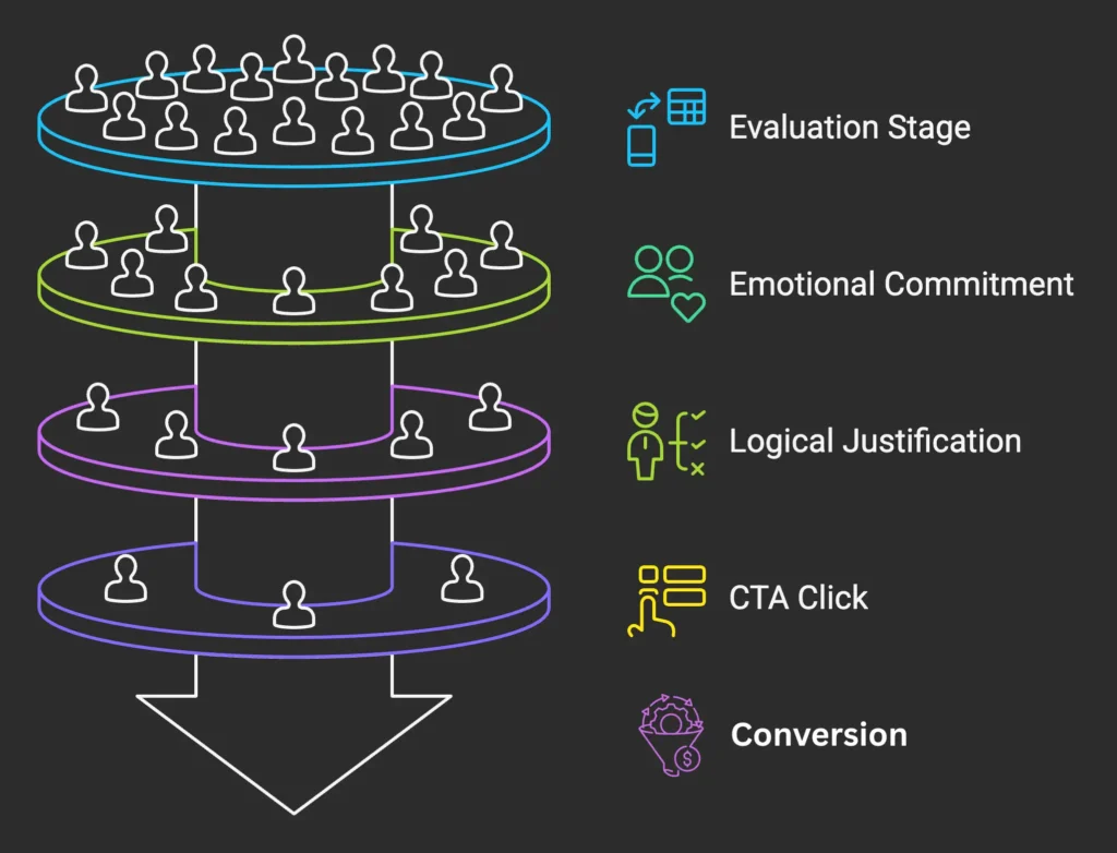
Emotional commitment vs mechanical action
The button is mechanical. The commitment is emotional
When a visitor clicks “Buy Now,” they’re acting on a mental shift from “maybe” to “yes.”
The shift happens because they understand how the product solves their problem. Or maybe they saw the price and felt it was reasonable. And the decision was “this is what I need.”
Research in buyer psychology consistently shows that people decide emotionally first, then justify logically. The CTA simply gives the decision a place to land.
If you’re optimizing the button, you’re not influencing the decision. Your customers have already judged you during the preceding steps of the “Buy” button.
Users click “Buy” after deciding
Watch user behavior closely and you’ll see the pattern:
Users who convert are the ones who move through the purchase flow with minimal hesitation. They’ve already made up their minds.
Users who hesitate at the CTA – hovering, clicking away, abandoning – they haven’t decided yet. No amount of button color testing will change that.
Here’s a customer journey guide while we’re on the topic.
Early Signals That Shape Buying Decisions
If decisions happen before actions, what triggers them?
Let’s see the signals that affect buying decision.
- First impressions
- Information framing
- Perceived effort and risk
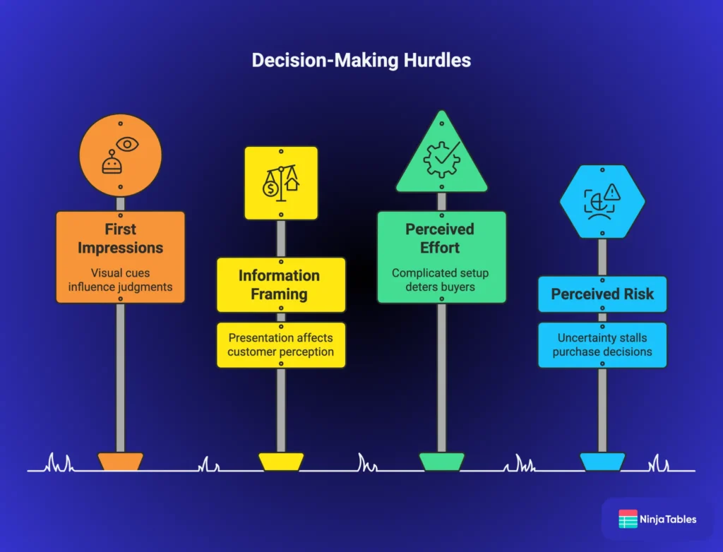
First impressions
Visitors judge within seconds of landing on a page. These judgments are pattern-matching based on visual cues, messaging, and perceived relevance.
Meanwhile their brain is going: “Does this look reliable? Is it relevant to my situation? Does it help me?”
A positive first impression often influences the purchase decision process more than the checkout flow ever will. You’ll also need a trustworthy comparison page so your potential customers can evaluate your worth.
Information framing
How you present information affects how fast customers see you.
Consider the following.
Category | Product A Framing | Product B Framing | Product A simply frames better by using positive spin unlike Product B |
Storage | Includes 10GB storage | Limited to 10GB storage | |
Pricing | $49 per month | Less than $2 per day | |
Contacts | Store up to 500 contacts | Limited to 500 contacts | |
Projects | Includes 50 projects | Only 50 projects allowed | |
Setup Time | Setup takes just 10 minutes | Requires 10 minutes to set up | |
Free Trial | Free for 14 days | Trial expires after 14 days | |
Support | Response within 24 hours | Response may take up to 24 hours | |
Backups | Your data is backed up daily | Backups occur once per day | |
Templates | Customize layouts with 20 templates | Choose from just 20 templates | |
 | |||
The same feature described differently creates different reactions and triggers different evaluations. User automatically leans toward Product A for the positive framing.
Most product pages present information neutrally, ignoring how framing affects decision-making.
Structured presentation reduces mental strain.
For example, when features, pricing tiers, or plan differences are presented in clear comparison tables, users can evaluate options faster and with more confidence.
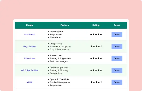
Table Examples

3 Column Comparison
Compare Side-by-side
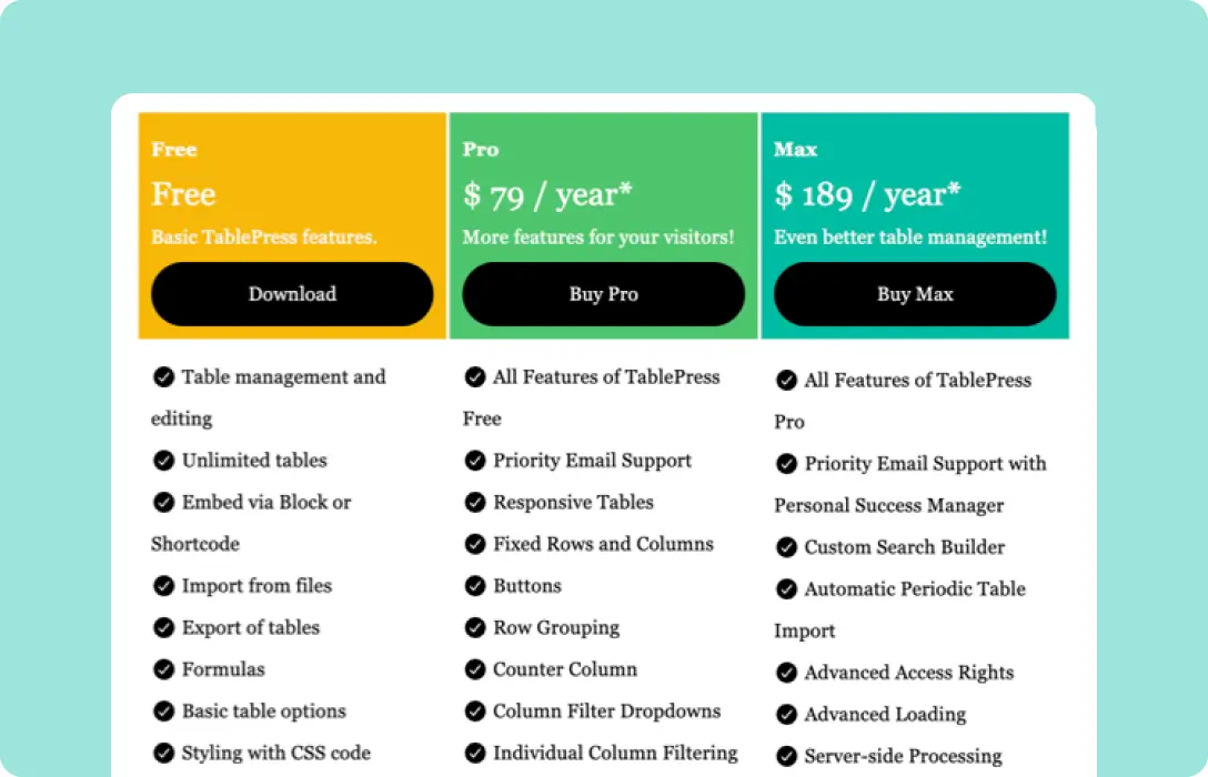
Pricing Tier with Features
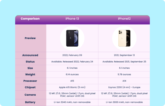
Products Comparison
Feature Comparison
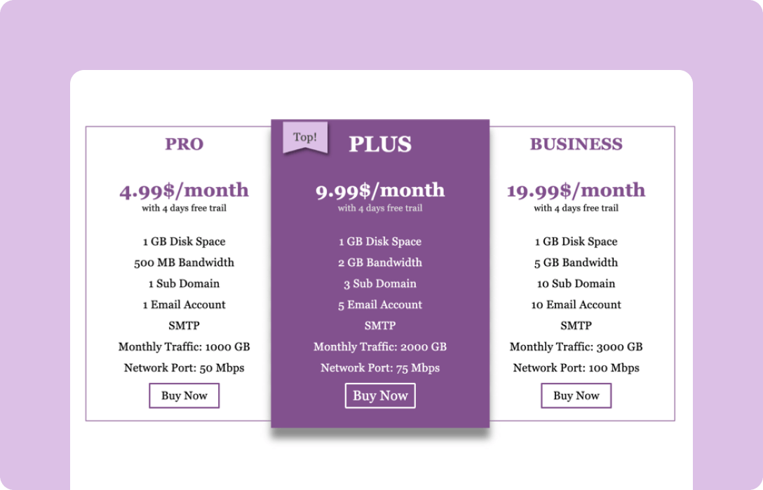
Pricing Table (Simple)
Don’t just dump data that users have to interpret themselves. Every data and info on your page should be scannable, quick and easy to grasp.
Perceived effort and risk
Two silent forces shape whether customers decide to buy:
Perceived effort
- How complicated is the setup?
- How long will it take?
- Can I cancel easily?
Perceived risk
- What if this doesn’t solve my problem?
- What if there’s a better alternative?
- What if I regret this purchase?
Pages that reduce these early uncertainties trigger purchase decisions faster. This happens through clear explanations, honest limitations, and visible safety nets (free trials, money-back guarantees, easy cancellation).
If effort feels high or risk feels unclear, the decision stalls.
Have you noticed any changes in your customers’ buying decision? If yes, what was the signal that stood out? We’re all ears.
Get in touch with Ninja Tables
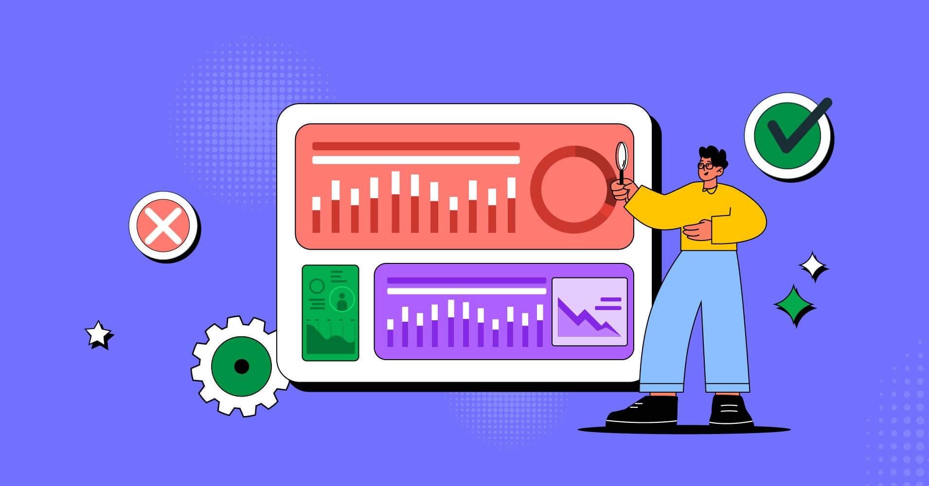
Why Late-Stage Optimization Often Fails
Many CRO efforts underperform because they target the wrong stage of the decision process.
Here’s why.
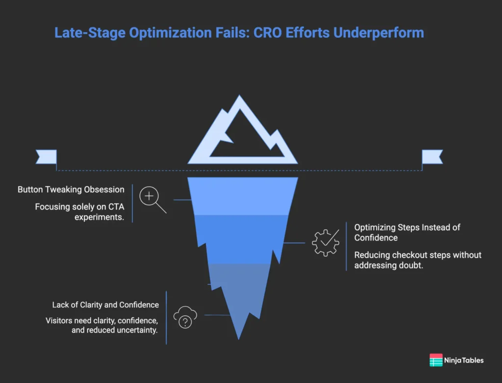
Button Tweaking Obsession
Color tests. Copy tests. Size tests. Placement tests.
These CTA experiments assume the decision-making is complete and the user just needs a clearer path to action.
For visitors who have already decided, that’s true. For visitors who haven’t, no button will help.
If 80% of your non-converters haven’t made a decision yet, optimizing the CTA only addresses 20% of the opportunity at best. The 80% need something entirely different – clarity, confidence, and reduced uncertainty.
Don’t fall into the A/B testing trap. Headline clarity, value proposition, information framing, and early trust signals matter the most.
Optimizing steps instead of confidence
Checkout optimization typically focuses on reducing steps. It’s good practice.
They also assume the visitor wants to complete the flow and is being stopped by friction.
But many checkout abandoners aren’t stopped by friction. They’re stopped by doubt. They reach the final step and realize they’re not actually sure. They haven’t decided.
For these users, a simpler checkout doesn’t help. They need earlier intervention – better explanation, clearer fit signals, more confidence before they ever reach checkout.
Checkout abandonment may look like a checkout problem. But often it’s a pre-checkout problem that only becomes visible at checkout.
How to Influence Decision-making Before CTA
If decisions happen early, design should support early decision-making.
There are a few things to take care of:
- Early clarity
- Honest positioning
- Removing uncertainty early
- Use structured clarity
- Personalize where possible
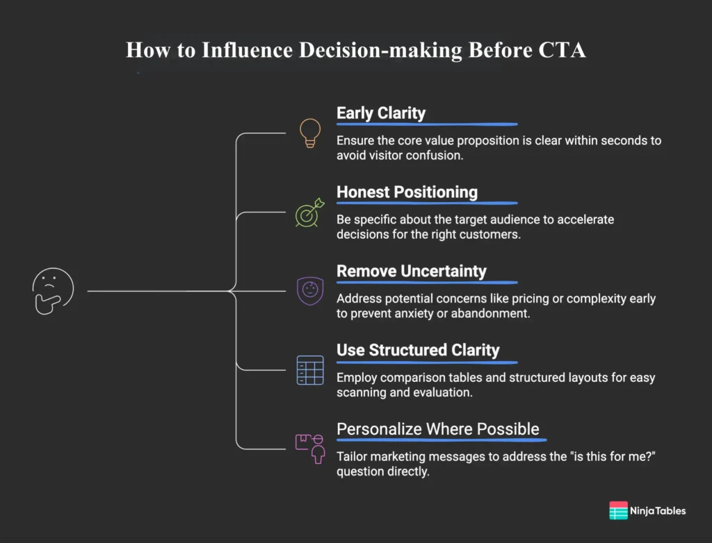
Early clarity
Don’t make visitors work to understand what you offer.
The core value proposition should be clear within seconds. Not buried in paragraphs or hidden behind tabs and buttons.
Early clarity means: visitors know what this is, who it’s for, and why it might matter to them – before they scroll.
Ask yourself this: “Can a visitor explain your product to someone else after 10 seconds on the page?” If not, there’s a clarity problem.
Honest positioning
Trying to appeal to everyone creates decision paralysis.
When positioning is vague (“the best solution for modern teams”), visitors have to figure out if it actually fits their situation.
Honest positioning means being specific about who this is for and who it isn’t for.
This feels risky – you might exclude potential customers. In practice, it accelerates decisions for the right customers.
Removing uncertainty before it forms
Anxiety is easier to prevent than to resolve.
If a visitor will worry about pricing, address pricing early. If the implementation is complex, explain it before they wonder, or wander off!
This isn’t about burying objections. It’s about acknowledging them proactively – before they have reasons to delay.
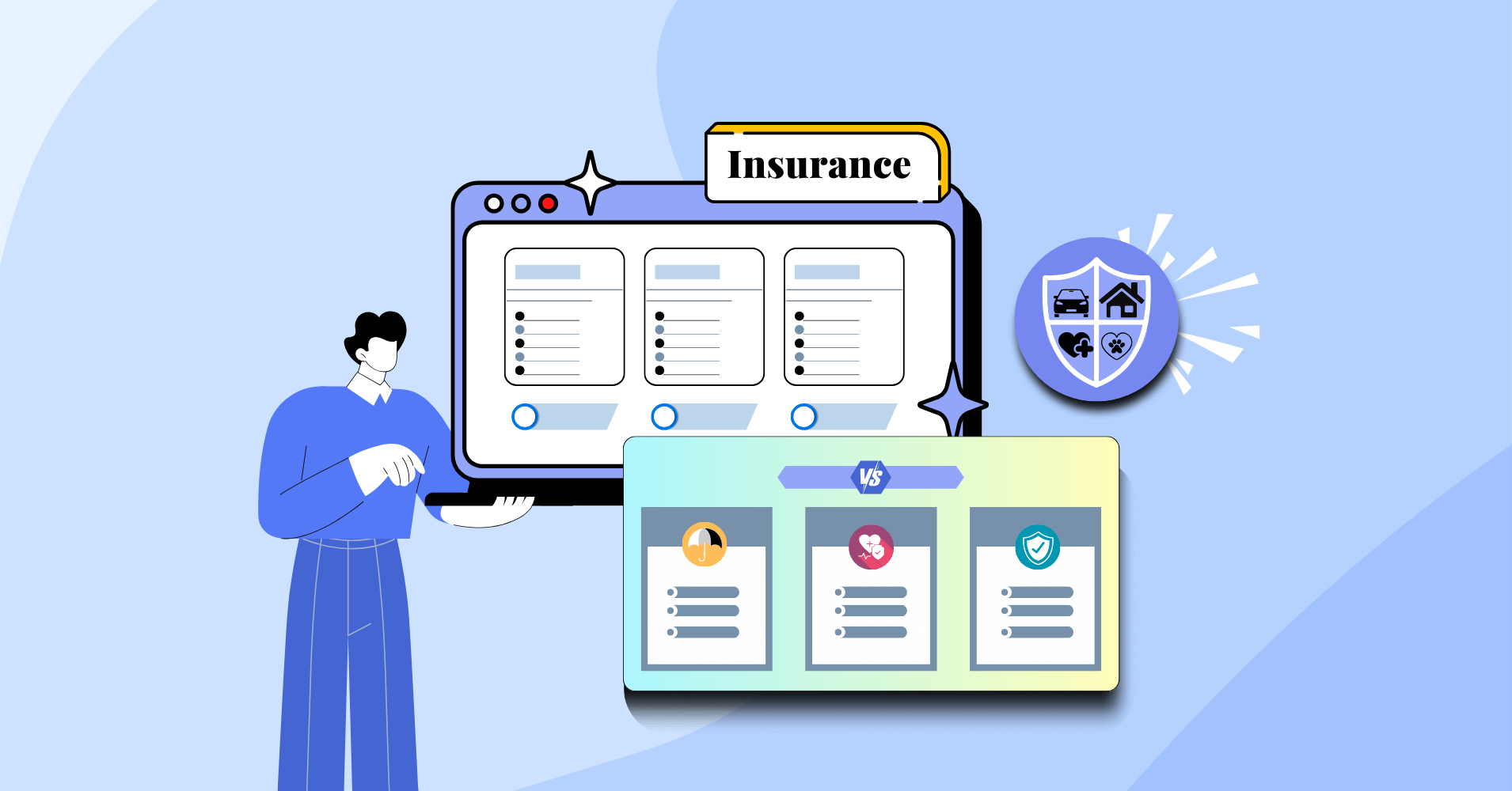
Use structured clarity
Instead of listing product features in dense paragraphs, use structured layouts that allow scanning.
Comparison tables are especially effective when:
- You offer multiple pricing tiers
- You have feature differences between plans
- Users need to evaluate tradeoffs quickly
When visitors can see differences clearly, decision-making accelerates.
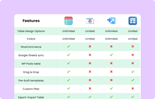
For WordPress businesses, tools like Ninja Tables make it easier to present complex product data in structured, interactive formats that reduce confusion rather than create it.
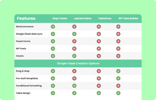
Tables for Data Clarity
Compare Side-by-side
3-column Comparison
Products Comparison
Feature Comparison
Pricing Table
Quick Roundup List
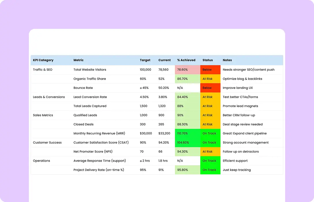
KPI Reporting
Employee Directory
Product Table
Personalize where possible
Personalized marketing addresses the “is this for me?” question before the visitor even has to ask it.
Segment your messaging, highlight relevant use cases, and speak to the specific buyer — not a generic audience.
Conversion Is a Consequence, Not a Trigger
The CTA doesn’t cause conversion. Conversion causes the CTA click.
When customers have:
- Clarity about fit
- Confidence in value
- Reduced perception of risk
They click the “Buy” button.
When visitors lack any of those elements, they either don’t click or click and then abandon. Or they convert and then churn. The button can’t fix what the earlier experience broke.
If conversions are low, trace backward from the CTA.
Look at:
- First impressions
- Positioning clarity
- Information structure
- Honest tradeoffs
- Risk signals
You may find the decision never formed in the first place.
Early-stage optimization | Late-stage optimization |
Fixes uncertainty about fit | Fixes friction in execution |
Fixes doubt about value | Handles confusion about next steps |
Minimizes anxiety about risk | Fixes mechanical barriers to action |
Helps make purchase decision | |
| |
Design for the decision.
The clicks will follow.
What This Means for Your Site Right Now
Here’s a practical audit you can do today:
Trace backward from your CTA, walk through your product or landing page and ask “does this help someone decide, or does it just inform them?”
Information structured around the buyer’s actual question is conversion work.
Look at where your visitors spend the most time. That’s where the decision is being made. Is that section pulling its weight?
If you have pricing, features, or plan comparisons on your page — are they scannable in under 10 seconds? If not, that’s your conversion decision point, and it’s leaking.
Takeaway
You spent weeks fine-tuning your checkout flow. You A/B tested button colors. You rewrote your CTA five times. And still — people leave without buying.
It’s not something you want to experience.
Your job is to own the earlier moments, every step that comes before the CTA button or banner. Make the evaluation stage clear, honest, and easy to navigate. Structure your information around the questions buyers actually ask. Remove uncertainty before it forms a doubt.
Ninja Tables– Easiest Table Plugin in WordPress
Add your first comment to this post