How to Create Stackable Tables with Ninja Tables
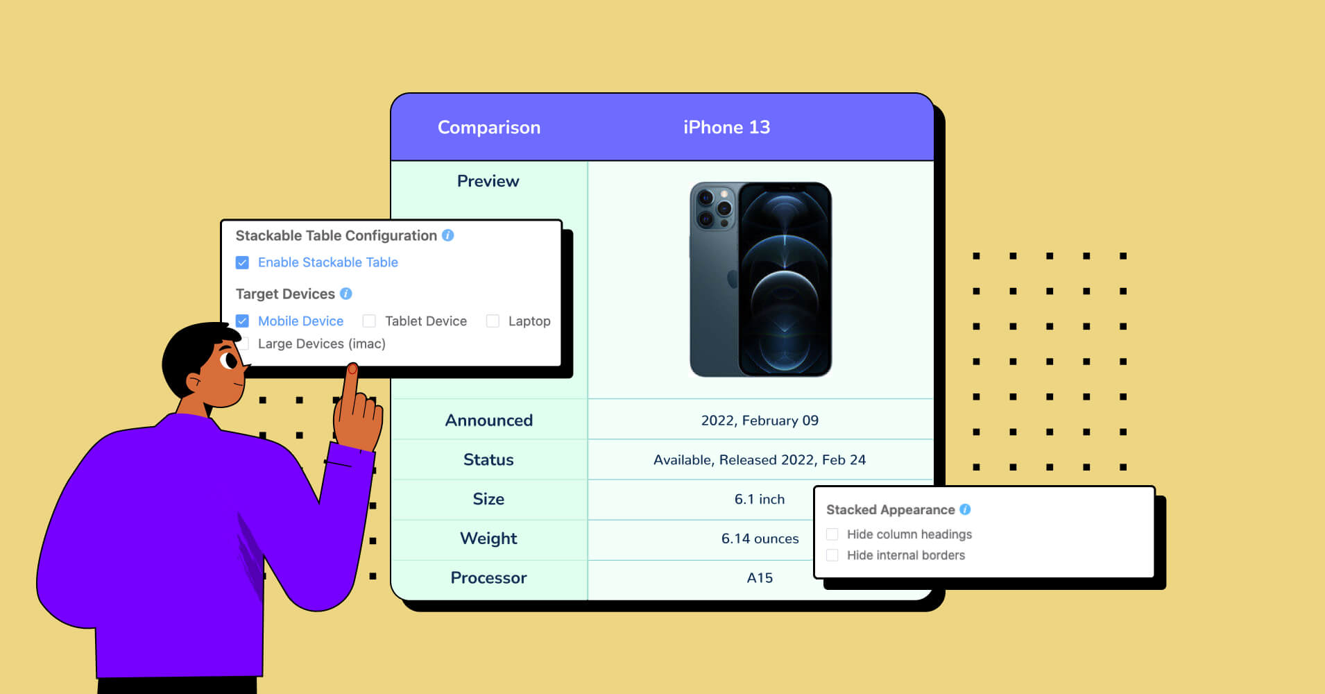
Say goodbye to static, mundane tables, and get ready to jump ahead in the game with Ninja Tables’ responsive stackable table feature.
Imagine having the power to create dynamic, interactive, and responsive stackable tables in WordPress effortlessly. Ninja Tables offers you just that! Here, you’ll learn how to make tables stackable for smaller devices.
With the stackable layout, you can tweak data tables around your preferences. This is convenient, flexible, and easy to maintain while avoiding the compromise of dynamic data tables.
What is a stackable table?
Using Ninja Tables’ stackable table feature, you can seamlessly break down complex datasets into bite-sized portions for inspection.
A stackable table refers to a design or UI element that is responsive and adapts to different screen sizes. Elements that are stackable will rearrange themselves vertically on smaller screens to ensure better readability.
Stackable table displays the total amount, broken down into multiple sub-amount. For example, in Ninja Tables, a stackable table will stack the rows and create a separate table for a clearer view on mobile screens.
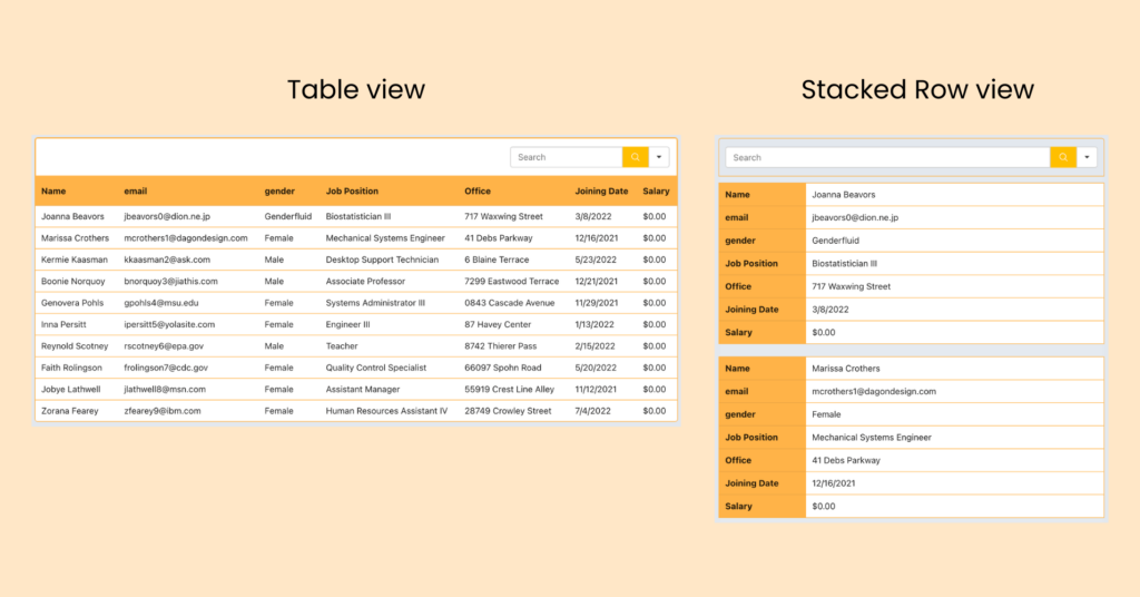
Let’s dive into creating an unparalleled user experience together!
How to create stackable tables in WordPress with Ninja Tables
Making your tables stackable for mobile devices is much simpler with Ninja Tables.
Using this design, you can drive the features including enough visual pleasantries to reduce some redundant issues.
Note: You can’t enable Stackable Table and Responsive Breakpoint together. Either tap into its responsive breakpoint or stackable feature.
This simple 3-step tutorial shows you how to quickly and easily create stackable tables.
Step 1
First, create a data table in Ninja Tables with lots of data, rows, and columns. Let’s say this table looks perfect on bigger screens but on smaller screens, for instance, a mobile, you need to swipe left/right.
Step 2
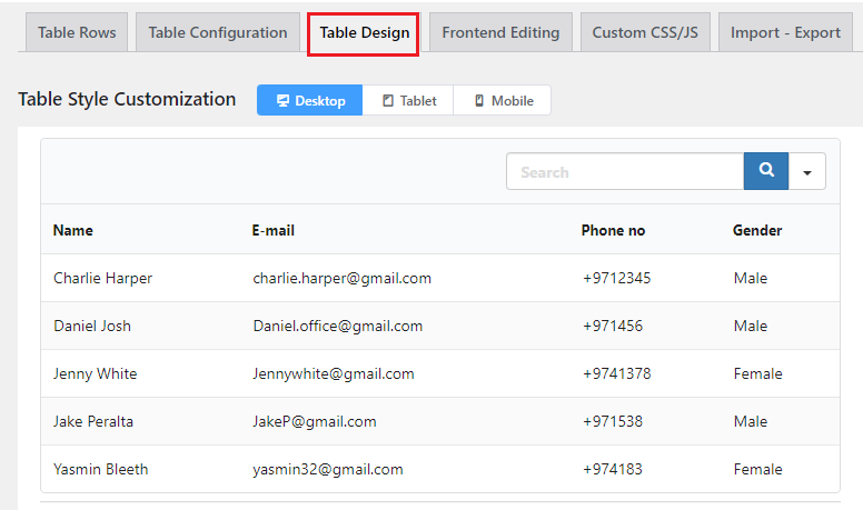
Now that you have a table, select the Table Design option at the top of the plugin’s dashboard.
Step 3
Navigate to the right sidebar panel, where you’ll find the “Stackable Table Configuration” option. Just below this, you’ll find a convenient checkbox that allows you to make any table stackable.
Once you activate this option, you’ll notice two additional sub-sections offering a variety of functionalities to enhance your table’s functionalities.
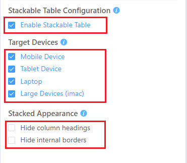
Now, you may ask how to make a table stack on mobile. Ensure all the options under the Target Device section are selected if you want the table to be responsive on all devices.
How to make table column stackable and responsive? Another fantastic feature of Stackable Tables is the ability to alter how your table appears when it is stacked. With this option, you have the ability to hide column headings and internal borders.
You’ll see that distinct tables have been created from individual rows and layered in the preview.
Result
The following big data table has “stackable on mobile” enabled. The rows of this table will appear as separate data tables on mobile phones.
| Name | Position | Office | Age | Start date | Salary |
|---|---|---|---|---|---|
| Zorita Serrano | Software Engineer | San Francisco | 56 | 2012/06/01 | $115,000 |
| Zenaida Frank | Software Engineer | New York | 63 | 2010/01/04 | $125,250 |
| Yuri Berry | Chief Marketing Officer (CMO) | New York | 40 | 2009/06/25 | $675,000 |
| Vivian Harrell | Financial Controller | San Francisco | 62 | 2009/02/14 | $452,500 |
| Unity Butler | Marketing Designer | San Francisco | 47 | 2009/12/09 | $85,675 |
| Timothy Mooney | Office Manager | London | 37 | 2008/12/11 | $136,200 |
| Tiger Nixon | System Architect | Edinburgh | 61 | 2011/04/25 | $320,800 |
| Thor Walton | Developer | New York | 61 | 2013/08/11 | $98,540 |
| Tatyana Fitzpatrick | Regional Director | London | 19 | 2010/03/17 | $385,750 |
| Suki Burks | Developer | London | 53 | 2009/10/22 | $114,500 |
| Sonya Frost | Software Engineer | Edinburgh | 23 | 2008/12/13 | $103,600 |
| Shou Itou | Regional Marketing | Tokyo | 20 | 2011/08/14 | $163,000 |
| Shad Decker | Regional Director | Edinburgh | 51 | 2008/11/13 | $183,000 |
| Serge Baldwin | Data Coordinator | Singapore | 64 | 2012/04/09 | $138,575 |
| Sakura Yamamoto | Support Engineer | Tokyo | 37 | 2009/08/19 | $139,575 |
| Rhona Davidson | Integration Specialist | Tokyo | 55 | 2010/10/14 | $327,900 |
| Quinn Flynn | Support Lead | Edinburgh | 22 | 2013/03/03 | $342,000 |
| Prescott Bartlett | Technical Author | London | 27 | 2011/05/07 | $145,000 |
| Paul Byrd | Chief Financial Officer (CFO) | New York | 64 | 2010/06/09 | $725,000 |
| Olivia Liang | Support Engineer | Singapore | 64 | 2011/02/03 | $234,500 |
| Michelle House | Integration Specialist | Sidney | 37 | 2011/06/02 | $95,400 |
| Michael Silva | Marketing Designer | London | 66 | 2012/11/27 | $198,500 |
| Michael Bruce | Javascript Developer | Singapore | 29 | 2011/06/27 | $183,000 |
| Martena Mccray | Post-Sales support | Edinburgh | 46 | 2011/03/09 | $324,050 |
| Lael Greer | Systems Administrator | London | 21 | 2009/02/27 | $103,500 |
| Jonas Alexander | Developer | San Francisco | 30 | 2010/07/14 | $86,500 |
| Jennifer Chang | Regional Director | Singapore | 28 | 2010/11/14 | $357,650 |
| Jennifer Acosta | Junior Javascript Developer | Edinburgh | 43 | 2013/02/01 | $75,650 |
| Jenette Caldwell | Development Lead | New York | 30 | 2011/09/03 | $345,000 |
| Jena Gaines | Office Manager | London | 30 | 2008/12/19 | $90,560 |
Create stackable tables in WordPress
The more content and rows you try to cram into a smaller view, the more likely it is to “break”.
Your tables won’t be as interesting or readable as they could be. Here, you might wonder how to make table column stackable and responsive.
We have proposed some fairly robust solutions to cluttered table views on different devices.
- You can create a responsive table in HTML and CSS
- Changing themes to make up stackable options or configurations.
- Change your theme to allow tables to scroll or stack their columns by default.
- Assign a class to your HTML table, such as “responsive,” and then add a CSS class to allow for manual table updates.
- Use plugins for building responsive stackable tables in WordPress.
If you don’t want to go to this extent, Ninja Tables will still provide you access to settings and allow you to generate responsive stackable tables without worrying about any changes to the HTML or CSS.
Conclusion
The responsive stackable table function by Ninja Tables improves the stability & adaptability of your data tables. Each row of any table can be separated into distinct sub-tables using the “stackable” function.
Using this feature, the table will be arranged in a stacked layout, ensuring compatibility across all devices.
The process of creating stackable tables can be significantly streamlined with the help of quality WordPress table plugins. And this is where Ninja Tables sounds better than all the other plugins!
We hope this tutorial helps you to optimize data display on different devices with Ninja Tables’ easy features, seamless responsiveness, and visual appeal. Give it a try and get rid of crammed website problems altogether.

Ninja Tables– Easiest Table Plugin in WordPress



Add your first comment to this post