Closer Look at Charts vs Tables: The Right Data Visualization
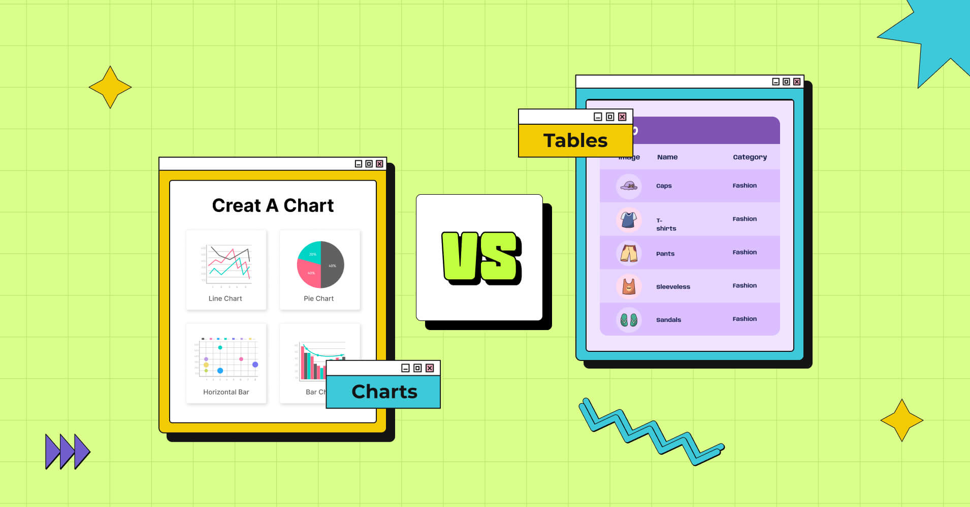
Charts and tables – A timeless rivalry! These two powerhouses of data visualization have long battled for supremacy. We set out on a quest here to investigate the conflict between them and shed light on Charts or Tables– When to use one over the other.
So, whether you’re a data analyst, a business owner, or just someone curious to learn about data visualization, you’re in the right place.
Tables
Have you ever thought about how data tables sneak their way into our lives without us even realizing it?
It’s true! Whether you’re browsing the web or flipping through a physical document, you’ve probably come across a data table without giving it a second thought.
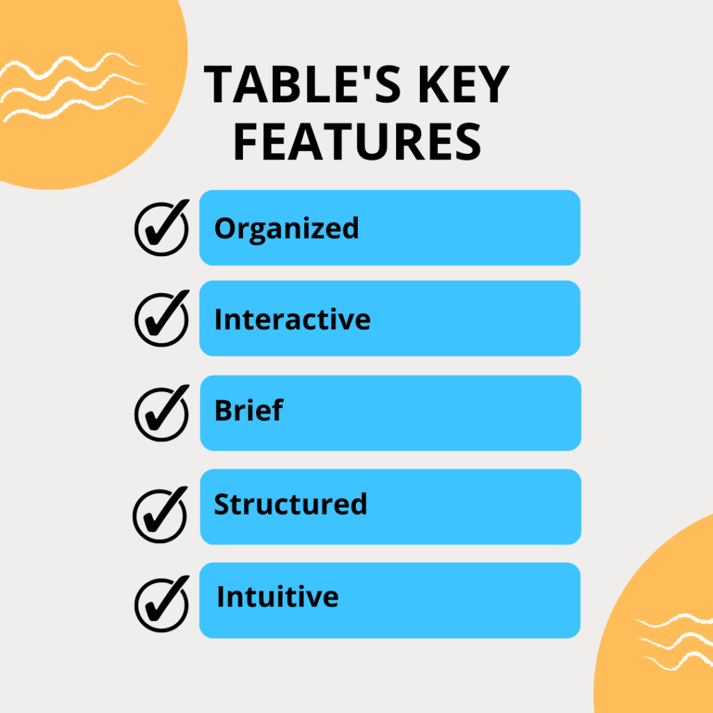
Now, let’s see what this is all about. In simple words, a table is a visual arrangement for brief and apprehensive information, data you can grasp at a glance.
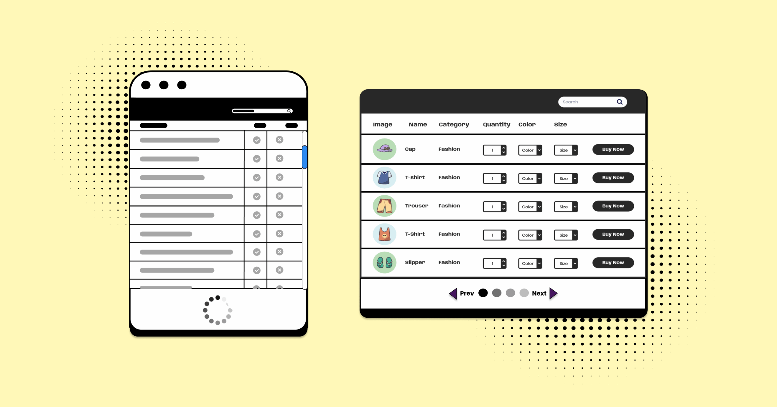
- Data tables use rows and columns to display information in a grid-like fashion.
- Tables frequently include numeric data but also contain text or even images.
- Components line buttons, links, or menus make the data display interactive.
- Non-interactive items such as badges highlight important data points.
- It contains tools to query, filter, and refine data.
- Information is usually organized in a hierarchy or alphabetical manner.
- Tables are intuitive, with a logical structure, and are organized.
- The table header and data cells clearly determine what the data is about.
Charts
Whether it’s a line graph tracking trends, a pie chart revealing proportions, or a bar chart comparing data, charts are the secret weapon for making complex information easy to understand and visually engaging.
Data is displayed graphically in charts. Here, any type of information can be displayed using symbols.
They are for faster data comprehension and a broad analysis range. Charts are simple to interpret because they provide a more concrete understanding of the proportions the data represents.
“Data visualization is the language of decision-making. Good charts effectively convey information. Good charts enable, inform, and improve decision-making.“
Dante Vitagliano
Founder at Trailmapper
- Charts showcase trends and patterns, complex data relationships at a glance.
- Charts use axis dimensions to display the data.
- The axis contains descriptions and labels for the parameters.
- Scales that depict the importance and interrelation of the data.
- Intuitive understanding and insightful analysis.
- In the shape of a graph, or diagram, a chart even incorporates tables.
- Charts provide a platform for comparison rather than simply presenting data.
- Charts visually display variability through distribution curves, bar charts, or best-fit lines, highlighting deviations from the norm.
Distinct Features of Charts and Tables
Parameters | Charts | Tables |
Definition | Displays facts using different shapes, symbols. | Columns and rows used to show brief summaries. |
Types | Pie, histogram, bar, flowchart, radar, line chart, etc. | Columns, rows, cells, header, dynamic data. |
Representation | Distributions, trends, and other statistical pattern. | Quantities, numbers, media, or texts in a row/column. |
Trends and patterns | ||
Data type | Raw and original | Filtered and organized |
Interactive Analysis |
What is the difference between charts and tables?
Tables concentrate on displaying data in a straightforward tabular format, but charts can take almost any form.
The Visual War- Charts vs Tables
Here is a guide to choosing the right data representation for your need.
Exact vs Approximate
Tables excel in presenting precise numerical values and are perfect for data requiring meticulous attention. On the other hand, charts are ideal when sacrificing exactness for visual representation is acceptable, allowing for approximate values to be portrayed effectively.
Charts are used when the exact zest of the data interpretation is relied on by the eyes of the beholder.
Data Comparison
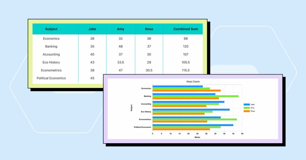
Tables are essential for performing thorough comparisons because they offer a standardized format that enables side-by-side comparisons of particular values and characteristics.
| Features |  | |||
|---|---|---|---|---|
| Table Design Options | Unlimited | Limited | Unlimited | Limited |
| Colors | Unlimited | Limited | Unlimited | Limited |
| WooCommerce | ||||
| FluentCart table | ||||
| Google Sheets sync | ||||
| WP Posts table | ||||
| Drag & Drop | ||||
| Pre-built templates | ||||
| Custom filter | ||||
| Export-Import Table | ||||
| One-click Migrate from TablePress | ||||
| Fluent Forms integration | ||||
| Advanced Styling | ||||
| ACF Field Mapping | ||||
| Charts | ||||
| Conditional formatting | ||||
| Value transformation | ||||
| Custom CSS | ||||
| Trash/restore |
Charts are excellent in showing relationships between variables more concisely and reasonably. When you want to emphasize broad trends and make data more comprehensive and interesting for a wider audience, charts are especially useful.
Raw vs Refined
Tables display the data in its most granular form and offer a raw, unfiltered perspective of it. They provide in-depth insights that let users go over the details and examine particular data points.
Charts provide a streamlined but meaningful perspective of the data by compressing complex data sets into visual representations. They allow consumers to quickly identify correlations and patterns.
User/Audience Need
Keep in mind that there are other options to represent data. The needs of the user should determine if a table is used.
Use charts rather than tables when you need to give a summary or overview. A chart is a more effective approach to understanding the stock price history of some equity for a year, for instance, than a large table.
Utilize tables if you need to enter a lot of text. Texts are a rarity in charts. They rely more on symbols, shapes, and figures.
Visual Interpretation: Charts or Tables?
When there are multiple distinct units of measurement, which might be challenging to display, tables come in helpful.
On the other hand, charts communicate with our visual system. When done effectively, the high bandwidth information flow from what our eyes observe to our brain’s interpretation can be very effective.
Charts help in illustrating how different elements (variables) connect.
When to Use Tables
When we interact with a table, our fingers and eyes run across rows and down columns, and we compare figures in our minds.
- When you require a concise and understandable depiction
- They arrange data in a scannable style so that users can seek patterns and draw conclusions from the data.
- To present precise numerical values.
- To compare data side-by-side.
- for displaying complex raw data sets in a simple format.
- Tables are essential when the demand for specifics, data is less abstract, and needs a thorough review of certain results.
- When you need to provide several data points for a big number of items, a data table is a fantastic solution.
- A table is perfect when you want to focus on a particular pattern to identify its underlying reasons.
When to Use Charts
The shapes and forms of charts are noticed by our visual system, which interprets them to draw out patterns and connections between the data.
If done effectively, our eyes easily observe the extensive range of transmitted data so our brain’s interpretation can be very effective.
- When you are presenting quantitative data with few unique axes to measure, charts are most helpful.
- For drawing attention to get more general patterns in a line graph or by displaying relationships between variables in a bar or pie graph.
- To shorten the length and complexity of comprehension, a chart can illustrate this and remove facts that can be used elsewhere.
- A study on different types of expenses, for instance, might utilize a chart to provide information about incidence by type, inflow, and accounts.
Choosing the Right Visualization
We advise you to weigh your options, charts, or tables the next time you check your data rather than just go with what you are most familiar with.
Consider the type of data you are working with, the audience you are targeting, and the goal of the display when selecting the ideal data visualization.
Pro Tip
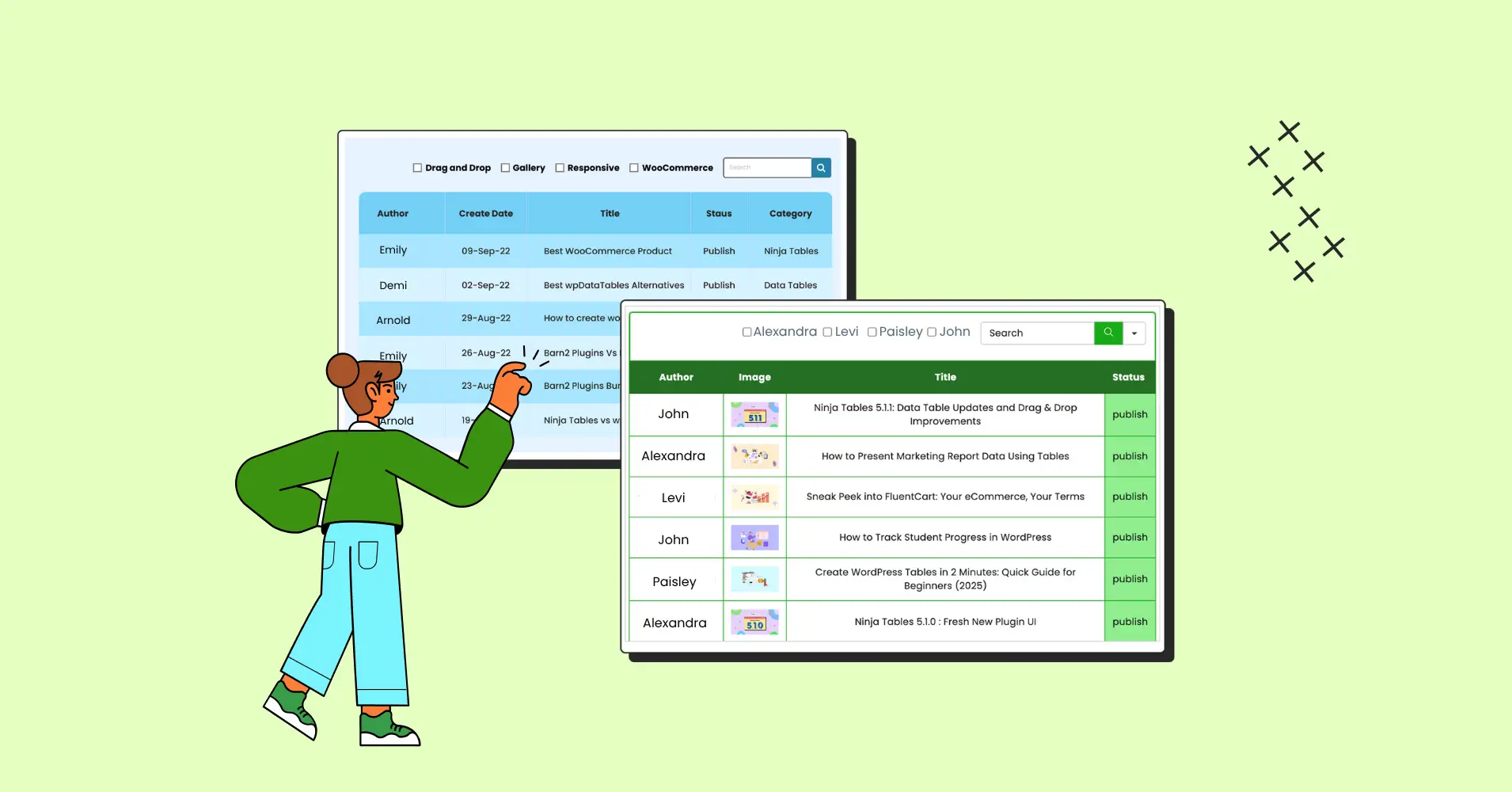
Ninja Tables and Ninja Charts are perfect for effective data visualization.
Create dynamic tables and charts with ease and customize all you want!
Take examination results for an example. Offline or online, this certainly requires a data table rather than a chart. Every student can find their results from an online table by following the cell that has their name/ID or simply by selecting the “filter by name” option.
But if the purpose is comparing the results, a chart is more helpful.
FAQ
Here are some answers to your questions.
What’s the difference between charts and tables?
We read the data across rows of numbers or down columns of numbers. This facilitates side-by-side data comparison. Makes it simpler for us to comprehend and draw conclusions.
Charts, as opposed to tables, reveal a more intricate relationship between the facts. They display more than simply plain statistics and figures.
When should I use tables instead of charts?
Tables have the benefit of interacting with our verbal system, which enables us to digest information sequentially. Tables are usually used instead of charts when we need broad comprehension of data.
When should I use charts instead of tables?
To gain a deeper knowledge and conduct a complete examination, you can analyze charts and draw conclusions from them. Charts provide a platform for comparison rather than simply presenting data.
Can I combine charts and tables?
Right away. If you want to give your user brief information along with a concise trend and pattern, a combination of both charts and tables can be a great idea for data visualization. Just don’t overdo it, we all know dense data display can ruin the appeal of your website/business page.
How do I choose the right chart type?
When selecting a data visualization, keep in mind the audience you’re aiming for. Use a complicated graphic if you’re aiming for a technical audience. Use a more straightforward graphic if your audience is not particularly technical.
What are the best practices for creating tables?
Consider the fundamental principles of a good table design– user interface (UI), including striped rows, sorting, filtering, pagination, visual aesthetic, table style, and table functionality.
What tools can I use to create charts and tables?
We’re sure many of us want to know what’s the ultimate tool for creating charts and tables. Here, Excel, Visualizer, wpDataTables, and WordPress chart builders can help you out. But if you’re looking for a 2 in 1 solution, we got you covered.
You can jazz up your data visualization with Ninja Tables and Ninja Charts. These two plugins integrate force to create responsive, concise data presentations.
Closing Remarks
Charts or tables? Which one will win the fight for data visualization?
It largely relies on the audience and the intended use of the data. It’s crucial to understand that individuals react to these two types of presentations quite differently. As businesses and individuals strive to make data-driven decisions, the choice between charts and tables becomes a critical one.
The key takeaway is to think about your audience while deciding between a table and a graph. Decide based on the usefulness of the required graphic.
After this quick review of how each works and some points of when they might be used, you can create data visualizations that are clear, concise, and effective.
Ninja Tables– Easiest Table Plugin in WordPress


Add your first comment to this post