Pricing Table Best Practices, Strategies, and Examples

Pricing tables are very important for any business that provides products or services in return for revenue. An efficient pricing table asks for a solid mix of design and versatility.
Designers and developers often struggle to make a high-converting pricing table. But doing it with a strategy can make your task easy.
This article will discuss pricing table strategies, examples, and best practices to help you make the website’s most converting pricing table.
Why is the pricing table important?
The pricing page is one of the vital pages of your website. If a user comes on this page, it means they’ve already decided and want to know what it will cost.
And that’s why pricing tables are the most important things on the pricing page. A beautiful pricing table helps them to understand your product, how you deliver it, and the cost.
The main target of a pricing table is to help the users to select their desired product at the most reasonable price with the highest potential.
Every unnecessary cell can increase the probability of losing potential customers because it’s difficult to compare various plans and select the best one.
How to create a pricing table in WordPress without coding
How to add a pricing table to the website?
When you run a WordPress website, there are two ways to make a stunning pricing table. To make one, you can simply use a table builder plugin or HTML or CSS codes. But for the non-techy person using a plugin is the most efficient way.
Using a table builder plugin like Ninja Tables, you can just drag and drop elements to make an awesome and eye-catchy pricing table. Even there are templates for beginners. You just need to know what a pricing page should include.
Pricing table best practices: what should a pricing page include?
It’s challenging to create a pricing table. When creating a pricing table, the designer must provide exact and easy-to-understand information, expose as many elements as feasible, and make it simple and intuitive for the users to choose what is best.
Be Concise: Neither so short nor over descriptive
If you think a feature-rich pricing table would make a good impression on the customers, then we are sorry for you. It’s not the way it works. However, the more you provide, the more they need to absorb.
It’s important that users get a good understanding of the differences between plans. So, don’t mention too much or not too short. Tell them what they want to hear from you, and they will be grateful.
Show off prices: Make the price stand out
Price is the first and foremost thing users want to see when they come to your pricing table. So, make sure you show it as quickly and clearly as possible.
Font selection Is one of the crucial facts for a pricing table. But it must be consistent with the overall design. As a designer, you must give appropriate weight visually and semantically.
VPS-01 $99/ month | Popular VPS-02 $199/ month | VPS-03 $299/ month |
RAM Guaranteed: 10 GB | RAM Guaranteed: 50 GB | RAM Guaranteed: 100 GB |
RAM Burstable: 1 GB | RAM Burstable: 2 GB | RAM Burstable: 3 GB |
CPU Cores: 1 | CPU Cores: 2 | CPU Cores: 3 |
Total CPU Power: 1.23 GHz | Total CPU Power: 2.46 GHz | Total CPU Power: 3.69 GHz |
Disk Space: 25 GB | Disk Space: 50 GB | Disk Space: 75 GB |
Monthly Traffic: 1000 GB | Monthly Traffic: 2000 GB | Monthly Traffic: 3000 GB |
Network Port: 100 Mbps | Network Port: 100 Mbps | Network Port: 100 Mbps |
A table powered by Ninja Tables
Attract the visitor: Use charm prices for pricing tables
Charm pricing is about the power of prices ending with 9. Most studies show that this type of pricing significantly outperforms round numbers. A recent study shows that in some cases, conversions double.
Of course, round numbers also have their places, but 9’s a charm. Try testing both of them to check which works for you.
Highlight: Common but effective strategy
It is a common yet effective idea to sort pricing plans by price, from highest to lowest or vice versa, and highlight a row with a ribbon writing ‘most popular, or ‘best value.’
Users scan the websites in F-shape, and the designers put the cheapest offer on the left so that users see it first. The designer’s best practice is to ensure users see the most attractive offer first—That’s why you can highlight the best plan with ribbons or add a drop shadow.
BASIC | Save $50!!! STANDARD | PREMIUM |
$79/Year | $129/Year with 4 days free trail | $299/Year with 4 days free trail |
1 GB Disk Space | 1 GB Disk Space | 1 GB Disk Space |
500 MB Bandwidth | 2 GB Bandwidth | 5 GB Bandwidth |
1 Sub Domain | 3 Sub Domain | 10 Sub Domain |
1 Email Account | 5 Email Account | 10 Email Account |
SMTP | SMTP | SMTP |
Monthly Traffic: 1000 GB | Monthly Traffic: 2000 GB | Monthly Traffic: 3000 GB |
A table powered by Ninja Tables
Features: Focus on the differences, mention similarities less
Displaying similar features of available plans can waste space on a pricing table. Focus on the differences between them. If you must show these features, place the distinctive features at the top of the table and leave the common features at the bottom.
Visuals: Not overly vibrant, not too simple
The aim of the Designers is to make pricing plans as attractive as possible. But using many overly vibrant colors is not the only way to make it happen. Numerous green check marks and red crosses can help.
But remember, if these icons are excessive on the table, it can be harder for the visitors to identify differences between plans. So, use visuals sparingly and avoid noise. And finally, icons and thumbnails must be extremely useful.
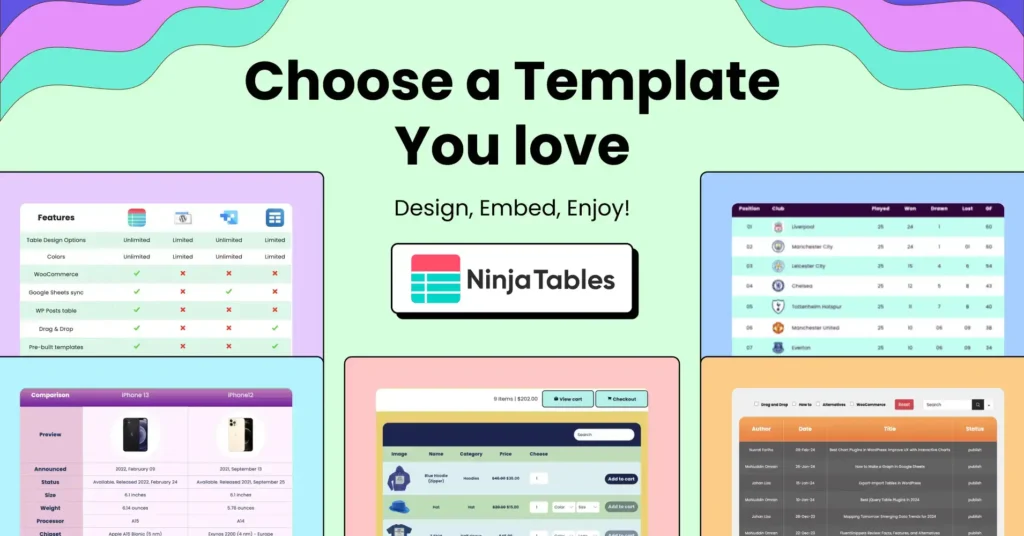
Pick your pricing table from templates.
Consistency: Be consistent with the overall design
Not only pricing tables but also all website elements should also be consistent with the overall design. A pricing table without consistency with the overall design can bore your users. And that can cost in a loss of potential customers.
A completely new block from nowhere can be a torcher for the user’s vision. So make the pricing table as consistent as possible with the overall design.
CTA: Accurate placement and color
CTA(call to action) is the button that you really want your users to click. That’s why the placement and color are big issues you don’t want to avoid. You must fix a unique color for your CTA button that attracts your customer.
A customized CTA button can be a very good move for your brand. Even sometimes, a CTA button can make your brand identity. So it’s a designer’s responsibility to create a unique CTA for the brand.
Think for your users: Leave room for customization
When designing a pricing page, Leave some room for flexibility. Leave customization options in the design. It allows customers to feel they are in control of their purchasing decisions.
The pricing table can include toggling between annual or lifetime billing. That allows the clients to compare billing options.
Support: Serve your users with live chat
Live chat is a great way to serve visitors and increase credibility. Research says that 38% of people became customers because they could ask pre-sales questions.
It will help you determine many pre-sales objections to improve your marketing and reassure customers that they are winning.
Testing is the key: Test, test, and test again
Not every pricing page is the same, nor are the companies. We listed some of the most important elements you can include in your pricing table design. But it is not like you have to follow all of them.
Just like metrics, trying to follow all of them is almost impossible. That’s why you should test pricing tables and page to find the suitable one for you.
Examples of various pricing tables
The above section discusses some of the most important elements a pricing table can implement. Now let’s see some of the examples with some explanations.
Designers can take inspiration from the other examples, but the irony is that what worked for others can cause your drowning. In that case, being original and up to mark is the best practice.
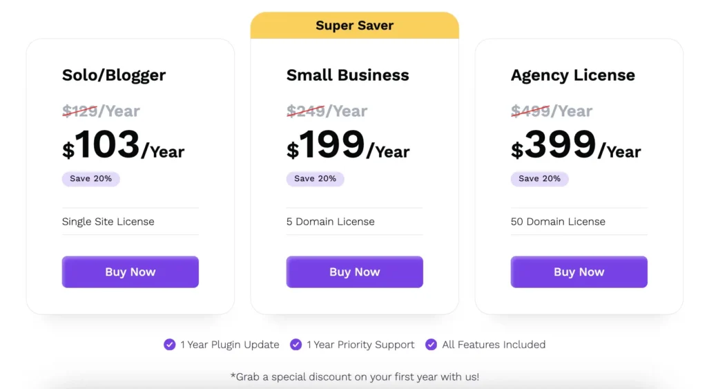
Example 01: FluentCRM pricing
FluentCRM has a simple yet successful pricing table. Here we didn’t mention all the features one by one, as those are all above the table on the feature page. It helped the plugin with 25k+ active installs within two years.
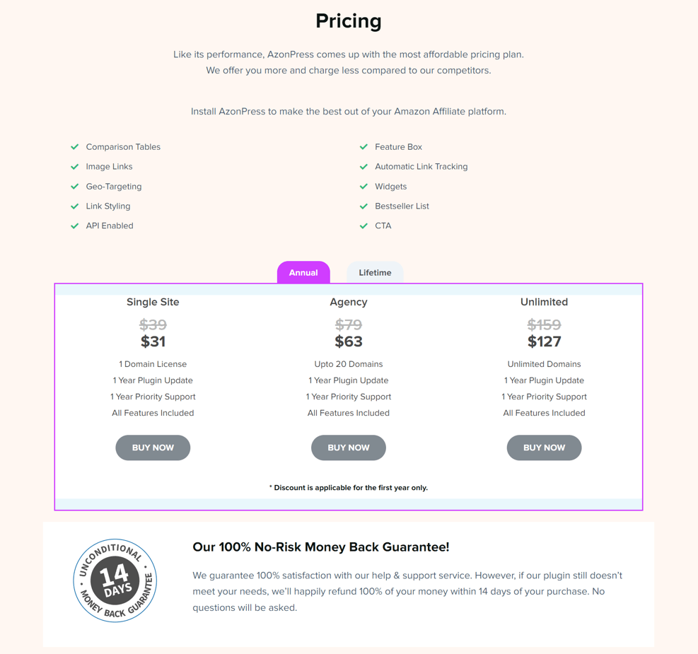
Example 02: AzonPress pricing
AzonPress is an Amazon affiliate plugin by WPManageNinja. If you see their pricing table, you can see a clear view of all the exclusive features and pricing plans on the simple user interface.
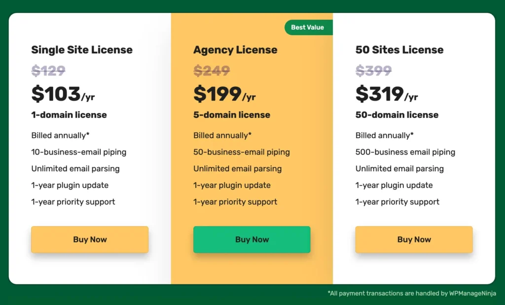
Example 03: Fluent Support pricing
The Fluent Support pricing page is another good example of pricing table best practices. They mention every important thing concisely and clearly define what they offer in return.
What’s your strategy for making a pricing table?
After all this discussion, what’s your strategy for making a pricing table?
Don’t worry; we got your back here. As a WordPress user, you need to use a robust table builder plugin to build your pricing table. You can go with HTML, CSS, or JS. But if you want ease with all the tables on your website, you have to use plugins.
If you go with the table builder plugin, check out which gives you more features and functionalities. And most importantly, when it’s about a pricing table, check if there are templates.
Here we introduce you to Ninja Tables, which is a robust table builder plugin with 80k+ happy users and 400+ 5-star reviews. It provides a lot of features and functionalities, along with many beautiful table templates.
Even with the free version of that, you can use the template to make a pricing table and responsive tables without compromising the UX of your website.
Single Site License | Agency License | Unlimited License |
79$/year (1 Domain) | Popular 199$/year (20 Domain) | 299$/year (Unlimited Domain) |
1 Year Plugin Update | 1 Year Plugin Update | 1 Year Plugin Update |
1 Year Priority Support | 1 Year Priority Support | 1 Year Priority Support |
All Features Included | All Features Included | All Features Included |
Check out: How to Design a Converting Pricing Table to Engage Customers
Explore more templates from our free template page!
Start making amazing pricing tables
We tried to make it detailed to make you understand the importance and effectiveness of a great pricing table. Hopefully, it will help you with every aspect of your pricing page.
A user goes a long way to become a customer, and the pricing page is one of the breaking points. Don’t lose any chance of potentiality and better revenue just because you missed the most recent trends influencing human psychology.
NB: All the tables here are made with Ninja Tables
Ninja Tables is a complete Table builder plugin that can help you make any table. You can create tables, even with the free version of this pricing table plugin. And the pro version enables you to use a lot of features.

Ninja Tables– Easiest Table Plugin in WordPress
Hopefully, this article will help you to make a stunning pricing table for your website. Check our blog on comparison table best practices to create highly converting comparison tables. Comment below to let us know your thoughts about this article.





Add your first comment to this post