Sales Data Visualization with Tables and Charts
TL;DR
Tables and charts can make your sales report look much easier to comprehend.
Showcase the numbers, predictions, and performances of your sales campaign using Ninja Charts and Ninja Tables.
Raw data is overwhelming. And after running a sales campaign, you want the results handed to you. Not the raw, scattered, and messy data sheet. Knowing the tricks to sales data visualization is like having a massive upper hand!
When you’re tracking revenue, product performance, or quarterly results, endless rows of data makes it hard to reach a conclusion.
But the picture is different if you turn those raw sales numbers into clear, actionable insights using tables and charts. With the right tools, you can transform complex data into visuals.
From tables or charts, you understand what’s working, what’s not, and spot the sales trends.
We’ll show you how tables and charts make sales data visualization simple, interactive, and effective.
Why Sales Data Visualization Matters
Sales data visualization isn’t about making numbers look pretty. It’s about comprehension.
When you visualize your sales data properly, you can:
- Spot trends faster. This is purely the best use of line charts or bar charts. Line charts show revenue growth or decline over months. Bar charts can compare your product performance. No need to scan through raw data to see what’s happening.
- Make quick decisions. You can find which product or marketing trick is underperforming and which ones are exceeding your target. You know exactly where to focus.
- Communicate better. Not everyone speaks “spreadsheet.” Charts and tables translate complex data into a language everyone understands, making meetings more productive and goals clearer.
- Find sales gap. You get to filter out the underperforming product or marketing trick and act on it at the right time.
- Track performance in real-time. With dynamic tables and charts that update automatically, you’re always looking at current data, not last week’s snapshot.
- Understand customers. From data tables or charts, you can find out customer buying patterns and personalize accordingly.
Who Uses Data Visualization for Sales?
Different departments of different organizations look for different insights from their sales data. Most of them want the bigger picture so they can strategize their next move.
And data visualization is the easiest way.
- Sales managers can track team performance with comparison tables showing individual achievements against targets. Charts visualize monthly trends and find issues.
- Marketing teams analyze with charts or tables to see which campaigns drive the most sales.
- Customer acquisition costs alongside revenue in tables can measure ROI and adjust strategies accordingly.
- Business owners see overall revenue and growth trends from charts. Or compare quarterly performance in tables.
- Financial projection, KPI reporting, annual income, marketing report, etc. can be visualized in custom tables.
- Analysts can use tables with filters and sorting functions to find the right data. Transform data from tables into charts to see how pricing and sales correlate.
Types of Sales Data You Should Visualize
Not every metric matters. Focus on the data that directly impact your sales goals.
Revenue metrics: Monthly or quarterly revenue, average deal, and revenue by product show your financial health in tables or charts.
| Quarter | Product | Total Revenue | AVG Deal Size | Revenue Growth | |||||
|---|---|---|---|---|---|---|---|---|---|
| Product A & B (Q2) | 4 | ||||||||
| Product A & B (Q1) | 1 | ||||||||
| Product A & B (Q4) | 10 | ||||||||
| Q1 2025 | Product A | $12500 | 625 | 8.5% | 2 | ||||
| Q1 2025 | Product B | $9300 | 465 | 5.2% | 3 | ||||
| Q2 2025 | Product A | $14200 | $710 | 13.6% | 5 | ||||
| Q2 2025 | Product B | $10500 | $525 | 12.9% | 6 | ||||
| Q4 2025 | Product A | $40200 | $670 | 10.3% | 11 | ||||
| Q4 2025 | Product B | $32000 | $500 | 9.3% | 12 | ||||
| Product A & B (Q3) | 7 | ||||||||
| Q3 2025 | Product A | $50457 | $400 | 8.9% | 8 | ||||
| Q3 2025 | Product B | $40500 | $400 | 5.67% | 9 | ||||
Performance indicators: Sales by rep, KPI, conversion rates, and win/loss ratios help you understand who’s succeeding and why.
| KPI Category | Metric | Target | Current | % Achieved | Status | Notes |
|---|---|---|---|---|---|---|
| Traffic & SEO | Total Website Visitors | 100,000 | 78,560 | 78.60% | Below | Needs stronger SEO/content push |
| Organic Traffic Share | 60% | 52% | 86.70% | At Risk | Optimize blog & backlinks | |
| Bounce Rate | ≤ 45% | 50.20% | N/A | Below | Improve landing UX | |
| Leads & Conversions | Lead Conversion Rate | 4.50% | 3.80% | 84.40% | At Risk | Test better CTAs/forms |
| Total Leads Captured | 1,500 | 1,320 | 88% | At Risk | Promote lead magnets | |
| Sales Metrics | Qualified Leads | 1,000 | 900 | 90% | At Risk | Better CRM follow-up |
| Closed Deals | 300 | 265 | 88.30% | At Risk | Deal stage review needed | |
| Monthly Recurring Revenue (MRR) | $30,000 | $33,200 | 110.70% | On Track | Great! Expand client pipeline | |
| Customer Success | Customer Satisfaction Score (CSAT) | 90% | 94.20% | 104.60% | On Track | Strong account management |
| Net Promoter Score (NPS) | 70 | 66 | 94.30% | At Risk | Follow up on detractors | |
| Operations | Average Response Time (support) | ≤ 2 hrs | 1.8 hrs | N/A | On Track | Efficient support |
| Project Delivery Rate (on-time %) | 95% | 91% | 95.80% | On Track | Just keep tracking |
Pipeline data: Deal performance by stage and forecasted revenue give you visibility into what’s coming.
| Deal ID | Discount | Stage | Close Date | Saves | Revenue Forecast | Details |
|---|---|---|---|---|---|---|
| SPOOKY30 | Up to 30% | Deployed | 2025-10-25 | $350 | $3500 | Visit |
| PUMPKIN40 | Up to 40% | Closed | -- | $500 | $4320 | Visit |
| BO(50) | Up to 50% | Closed | -- | $900 | $9800 | Visit |
| GHOSTLY40 | Up to 40% | Deployed | 2025-10-30 | $200 | $1800 | Visit |
| TrickOrTreat25 | Flat 25% | Scheduled | 2025-11-15 | $100 | $4000 | Visit |
Customer insights: Purchase frequency, customer lifetime value, and retention rates. Store these data in tables with filters, conditions, and sort/search.
| Customer ID | Name | Purchase Frequency | CLV | Retention Rate | Last Purchase | Custom Offer |
|---|---|---|---|---|---|---|
| C-001 | Sarah Lee | 8/year | $1250 | 90% | 2025-10-18 | No |
| C-002 | Tom Harris | 5/year | $900 | 80% | 2025-09-22 | Not yet |
| C-008 | Beth Joy | 2/year | $200 | 30% | 2025-09-22 | Yes |
| C-003 | Emma Davis | 12/year | $2300 | 95% | 2025-10-20 | No |
| C-004 | Noah Brown | 4/year | $750 | 70% | 2025-08-11 | Yes |
| C-005 | Ava Wilson | 10/year | $1800 | 88% | 2025-10-15 | No |
Product performance: Keep track of product sales, revenue by category, and inventory in tables.
| Product | Category | Units Sold | Revenue | Cost | Profit Margin | Stock Remaining | Back Order |
|---|---|---|---|---|---|---|---|
| SmartWatch X | Electronics | 420 | $25200 | $14800 | 41.3% | 180 | No |
| Panda mask | Sleep-wear | 180 | $200 | $1400 | 20.3% | 280 | No |
| Yoga Mat Pro | Fitness | 380 | $11400 | $6200 | 45.6% | 220 | No |
| Coffee Beans | Grocery | 520 | $8320 | $4500 | 45.9% | 300 | No |
| Happy Hair | Beauty, Hair care | 320 | $3420 | $4005 | 4.5% | 150 | No |
| Wireless Earbuds | Electronics | 600 | $30000 | $18000 | 40.0% | 150 | Yes |
| Avocados | Grocery | 200 | $3000 | $1800 | 50.0% | 270 | Yes |
| Happy Skin | Beauty, Serum | 340 | $13600 | $7000 | 48.5% | 260 | Yes |
Sales rep status: You can create a table to see the progress of your sales reps. Highlight if the revenue generated exceeds the target or needs more attention.
| Sales Rep | Revenue Generated | Units Sold | Conversion Rate | Target | Status |
|---|---|---|---|---|---|
| Alice Morgan | $24800 | 320 | 5.2% | 102% | Exceeded |
| Brian Kim | $18500 | 270 | 4.1% | 95% | On Track |
| Chloe Rivera | $14200 | 210 | 3.8% | 82% | Needs Attention |
| David Patel | $20600 | 290 | 4.5% | 98% | On Track |
| Emma Wright | $27300 | 340 | 5.6% | 109% | Exceeded |
| Felix Zhang | $15400 | 220 | 3.9% | 87% | Needs Attention |
| Grace O’Neill | $22100 | 310 | 4.9% | 100% | On Track |
| Henry Lee | $29000 | 360 | 6.1% | 115% | Exceeded |
Choose metrics that answer specific questions about your business and help you take the next step.
*** The tables above are courtesy of Ninja Tables.
Ninja Tables for Sales Data Visualization
Marketers or business owners based on WordPress have the best table data visualization tool.
Ninja Tables can easily bring your boring and static sales data into life with custom colors, hover animations, filters, sort/search, and many more features. Static spreadsheet or docs are no match!
Organized sales data tables
Build sales tables with unlimited rows and columns. Add product names, sales figures, percentages, and any other data you need to track.
| Product | Sales | Units Sold | Conversion Rate | Revenue Share | Refund Rate | Monthly Growth |
|---|---|---|---|---|---|---|
| Product A | $12500 | 200 | 4.5% | 28% | 1.2% | 8.5% |
| Product B | $9300 | 180 | 3.9% | 21% | 0.8% | 5.2% |
| Product C | $14700 | 240 | 5.1% | 33% | 1.5% | 10.3% |
| Product D | $7800 | 160 | 2.8% | 18% | 0.5% | 4.1% |
| Product E | $5900 | 120 | 2.3% | 14% | 0.6% | 3.8% |
Also, this table plugin’s drag-and-drop interface makes table creation a lot easier.
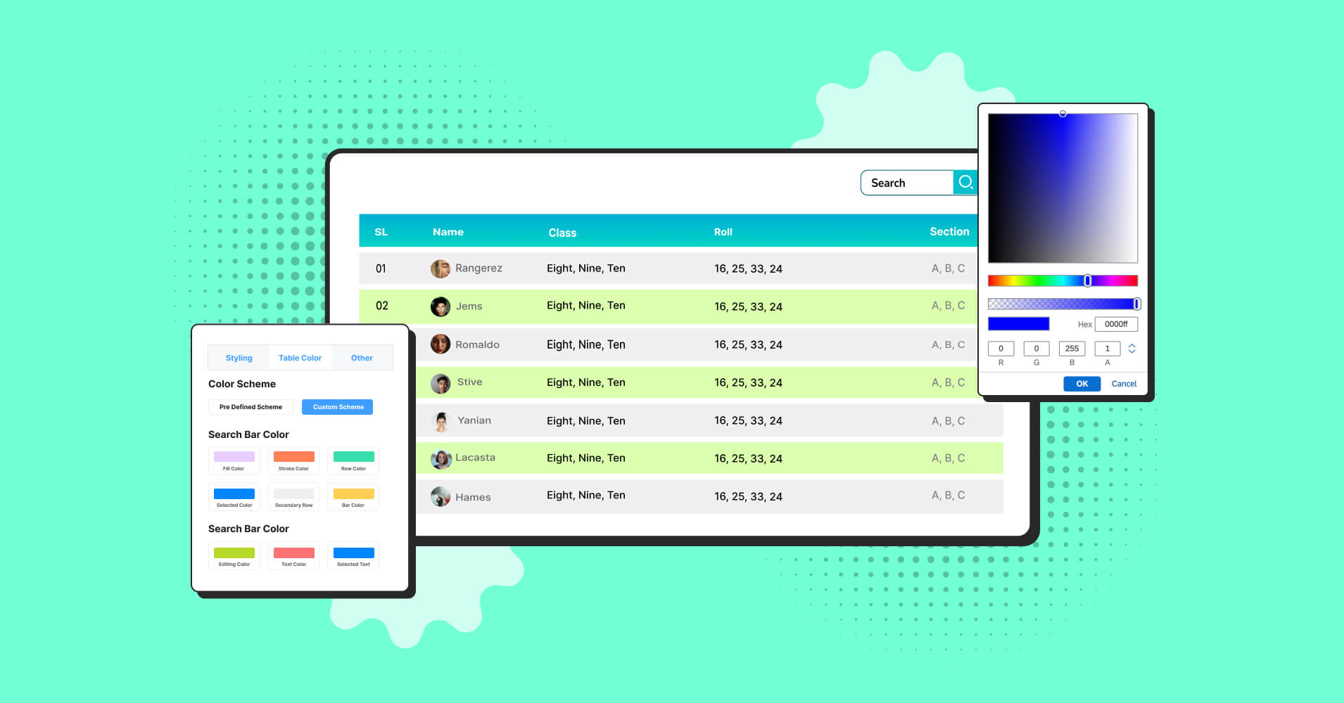
Table data sort and filter
Data tables work as an excellent visual aid. And an interactive data table stands out even more.
Let people interact with your data by adding table data sorting, filtering, or searching options.
With data sorting enabled, people can rank products by revenue. Custom filters or search bars can find specific items from a big data table.
| Product | Category | Units Sold | Revenue | Cost | Profit Margin | Stock Remaining | Back Order |
|---|---|---|---|---|---|---|---|
| SmartWatch X | Electronics | 420 | $25200 | $14800 | 41.3% | 180 | No |
| Panda mask | Sleep-wear | 180 | $200 | $1400 | 20.3% | 280 | No |
| Yoga Mat Pro | Fitness | 380 | $11400 | $6200 | 45.6% | 220 | No |
| Coffee Beans | Grocery | 520 | $8320 | $4500 | 45.9% | 300 | No |
| Happy Hair | Beauty, Hair care | 320 | $3420 | $4005 | 4.5% | 150 | No |
| Wireless Earbuds | Electronics | 600 | $30000 | $18000 | 40.0% | 150 | Yes |
| Avocados | Grocery | 200 | $3000 | $1800 | 50.0% | 270 | Yes |
| Happy Skin | Beauty, Serum | 340 | $13600 | $7000 | 48.5% | 260 | Yes |
This simple filter interactivity helps everyone find what they need and you don’t have to create multiple versions of the same report.
Conditions
Use Ninja Tables’ conditional formatting feature to highlight important values or change cell content according to set conditions.
Color-coding top products in green and underperforming products in red can make a big difference.
Your best-selling products stand out and you also know what product needs more of your attention.
| KPI Category | Metric | Target | Current | % Achieved | Status | Notes |
|---|---|---|---|---|---|---|
| Traffic & SEO | Total Website Visitors | 100,000 | 78,560 | 78.60% | Below | Needs stronger SEO/content push |
| Organic Traffic Share | 60% | 52% | 86.70% | At Risk | Optimize blog & backlinks | |
| Bounce Rate | ≤ 45% | 50.20% | N/A | Below | Improve landing UX | |
| Leads & Conversions | Lead Conversion Rate | 4.50% | 3.80% | 84.40% | At Risk | Test better CTAs/forms |
| Total Leads Captured | 1,500 | 1,320 | 88% | At Risk | Promote lead magnets | |
| Sales Metrics | Qualified Leads | 1,000 | 900 | 90% | At Risk | Better CRM follow-up |
| Closed Deals | 300 | 265 | 88.30% | At Risk | Deal stage review needed | |
| Monthly Recurring Revenue (MRR) | $30,000 | $33,200 | 110.70% | On Track | Great! Expand client pipeline | |
| Customer Success | Customer Satisfaction Score (CSAT) | 90% | 94.20% | 104.60% | On Track | Strong account management |
| Net Promoter Score (NPS) | 70 | 66 | 94.30% | At Risk | Follow up on detractors | |
| Operations | Average Response Time (support) | ≤ 2 hrs | 1.8 hrs | N/A | On Track | Efficient support |
| Project Delivery Rate (on-time %) | 95% | 91% | 95.80% | On Track | Just keep tracking |
And you can also highlight the best-selling product or the best price in the frontend so people can see.
Make tables responsive
You can’t always be in front of the big screen. And most of the time, your sales or marketing team is checking data from their phones. Not to mention your customers like to browse on their phone as well.
You need responsive data tables if you’re handling crucial marketing and sales metrics there.
Ninja Tables adjusts to any screen size, ensuring your data stays readable on phone, desktop, or tablets.
Use the “Stackable table configuration” or “Responsive breakpoints” features for it.
Add visual elements
Any sales report table or product sales table becomes more engaging with visual aids like product image, company logo, video, icons, and quick-action buttons.
Instead of boring people with big blocks of texts and plain numbers, try adding a mix of images, buttons, and numbers.
| Product | Category | Company | Units Sold | Revenue | Status | Visit |
|---|---|---|---|---|---|---|
 Yoga Set | Beauty | 420 | $25,300 | On track | Link | |
 Amethyst | Health | 420 | $25,300 | On track | Link | |
 Headset | Electronics | 380 | $11,400 | Target not achieved | Link | |
 Clay Pot | Crafts/Decor | 380 | $11,400 | Target not achieved | Link |
With Ninja Tables, users can use custom filters in the frontend or search for specific data. You present your sales report with tables like this, it stands out in the crowd of monotonous reports.
Your boring and static data will instantly become actionable!
Ninja Charts for Visual Sales Data
While tables organize data, charts tell the story.
And you don’t even have to switch between two different plugins for charts or tables if you’re using Ninja Tables!
Ninja Charts integrates with Ninja Tables and also works as a standalone charts plugin.
Learn all about Ninja Charts.
Choose the right chart type
Not all sales reports are comprehensible in tables. Sometimes you need charts. And you need to find out the right chart type.
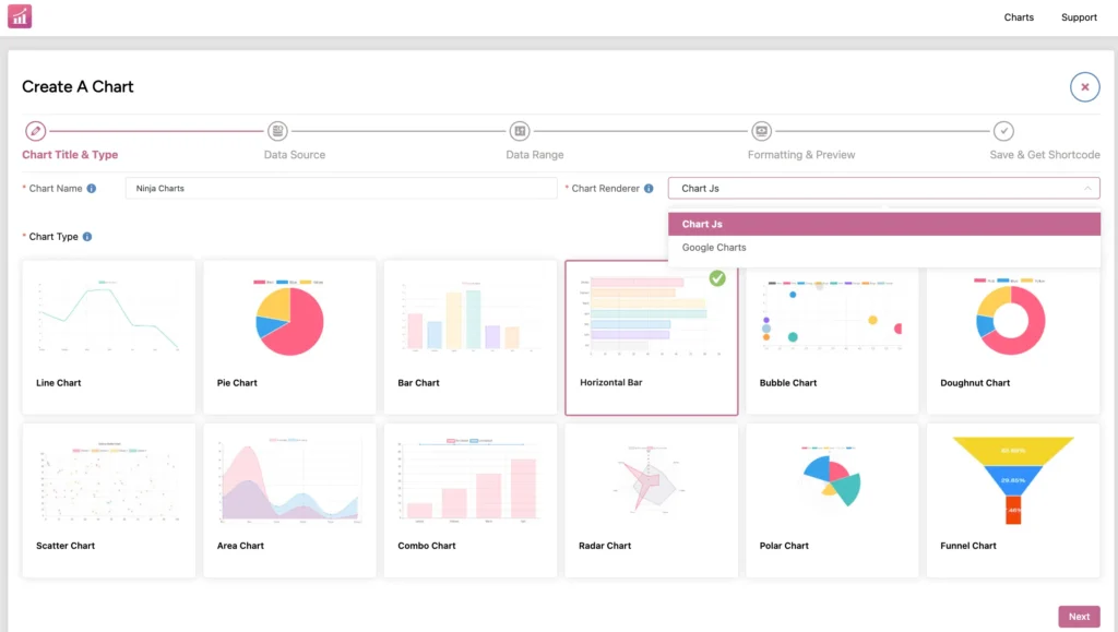
Line chart: Purely to track revenue or sales trends and to see how your monthly sales have grown from one quarter to another.
Horizontal bar chart: Compare many items, rank products by sales volume, etc.
Pie chart: Compare portions of total sales or revenue generated and find out what’s contributing the most.
Bar chart: Easy way to compare product performance, team achievements, or sales quarters.
Check out some types of comparison charts.
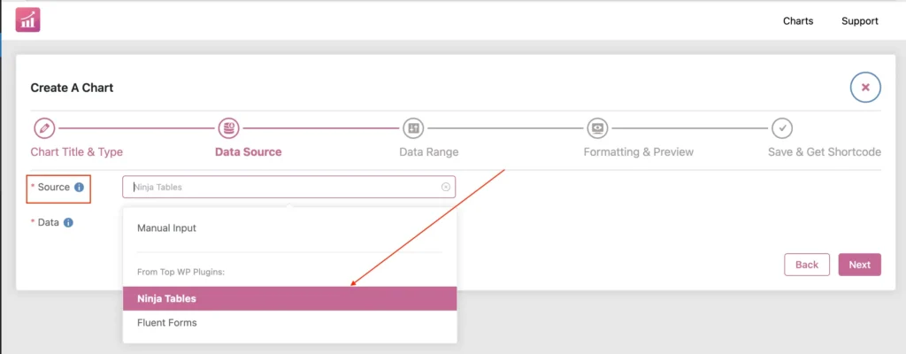
Create charts from 3 data sources
You can create charts manually or select Ninja Tables or Fluent Forms as data sources.
Ninja Charts connects to your Ninja Tables data directly. If you create a sales data table once, you can generate multiple charts from the same info.
Or create a form and turn the form data into visual charts.
Customize charts
Match your charts to your brand colors and styling. Add clear labels, tooltips, hover effects, legends so everyone understands what they’re seeing.
Setting Up Ninja Tables and Charts
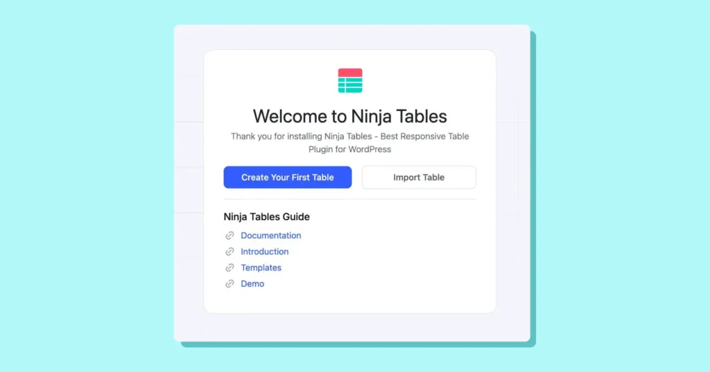
Getting started with either of these plugins is easy. You only need Ninja Tables and Ninja Charts comes for free!
Go to your WordPress dashboard>>Plugins>>Install & Activate Ninja Tables.
You’re ready!
For charts, see Ninja Tables’ sidebar menu and click “Charts.”
Activate Ninja Charts from there and get started.
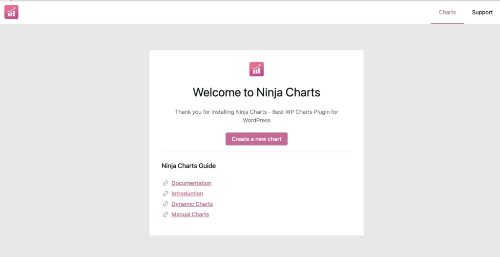
You can also download Ninja Charts without installing Ninja Tables. It’s a standalone plugin, after all.
Best Practices for Sales Data Visualization
Charts or tables, whichever tool you’re using to visualize your sales data, you need to follow a few rules.
- Keep the design and layout simple enough. Don’t overdo flashy colors or fonts. Answer the specific query with the display.
- Stick to a consistent color palette and font throughout table or chart design.
- Pick the correct format. Not all data is suitable for tables and not all data is suitable for charts.
- Select the right chart type.
- Use correct labelling and add tooltips where necessary.
- Update table data automatically by syncing Google Sheets.
- Tell your data story with a smooth flow and visually appealing table/chart.
- Highlight key insights only.
- Use buttons or links in tables to make them actionable.
- Check responsiveness of tables and charts.
- Ensure SEO-friendliness and accessibility.
- Generate PDF of CSV/JSON files of table data to import-export and create custom reports.
- Enable frontend editing in WordPress table.
Learn about simplifying data presentation in tables or charts.
Sales Data Table and Chart Examples
We’ll show you some examples using Ninja Tables and Ninja Charts.
Whether you’re an agency hired by a company or you’re a big corp, you can try these plugins to display your sales data.
Monthly revenue trend line chart
Revenue overview table
| Quarter | Product | Total Revenue | AVG Deal Size | Revenue Growth | |||||
|---|---|---|---|---|---|---|---|---|---|
| Product A & B (Q2) | 4 | ||||||||
| Product A & B (Q1) | 1 | ||||||||
| Product A & B (Q4) | 10 | ||||||||
| Q1 2025 | Product A | $12500 | 625 | 8.5% | 2 | ||||
| Q1 2025 | Product B | $9300 | 465 | 5.2% | 3 | ||||
| Q2 2025 | Product A | $14200 | $710 | 13.6% | 5 | ||||
| Q2 2025 | Product B | $10500 | $525 | 12.9% | 6 | ||||
| Q4 2025 | Product A | $40200 | $670 | 10.3% | 11 | ||||
| Q4 2025 | Product B | $32000 | $500 | 9.3% | 12 | ||||
| Product A & B (Q3) | 7 | ||||||||
| Q3 2025 | Product A | $50457 | $400 | 8.9% | 8 | ||||
| Q3 2025 | Product B | $40500 | $400 | 5.67% | 9 | ||||
Customer segment contribution pie chart
Sales rep performance table
| Sales Rep | Revenue Generated | Units Sold | Conversion Rate | Target | Status |
|---|---|---|---|---|---|
| Alice Morgan | $24800 | 320 | 5.2% | 102% | Exceeded |
| Brian Kim | $18500 | 270 | 4.1% | 95% | On Track |
| Chloe Rivera | $14200 | 210 | 3.8% | 82% | Needs Attention |
| David Patel | $20600 | 290 | 4.5% | 98% | On Track |
| Emma Wright | $27300 | 340 | 5.6% | 109% | Exceeded |
| Felix Zhang | $15400 | 220 | 3.9% | 87% | Needs Attention |
| Grace O’Neill | $22100 | 310 | 4.9% | 100% | On Track |
| Henry Lee | $29000 | 360 | 6.1% | 115% | Exceeded |
You have the freedom to choose from many more table templates from Ninja Tables. And for charts, simply grab the charts plugin for free!
Start Visualizing Sales Data in Tables or Charts
Data and description printed on papers or messy slideshows are out. Smart and interactive data visualizations are in!
If you’re a marketer, SEO, a business, or an entrepreneur, you need your sales data organized in one place. And that’s the job for tables or charts.
Whichever format suits your data and info, pick them and start displaying dynamic sales data in a more comprehensive and engaging way.
Understand and act on your business metrics with the right tools – Ninja Tables and Ninja Charts.
Ninja Tables– Easiest Table Plugin in WordPress


Add your first comment to this post