
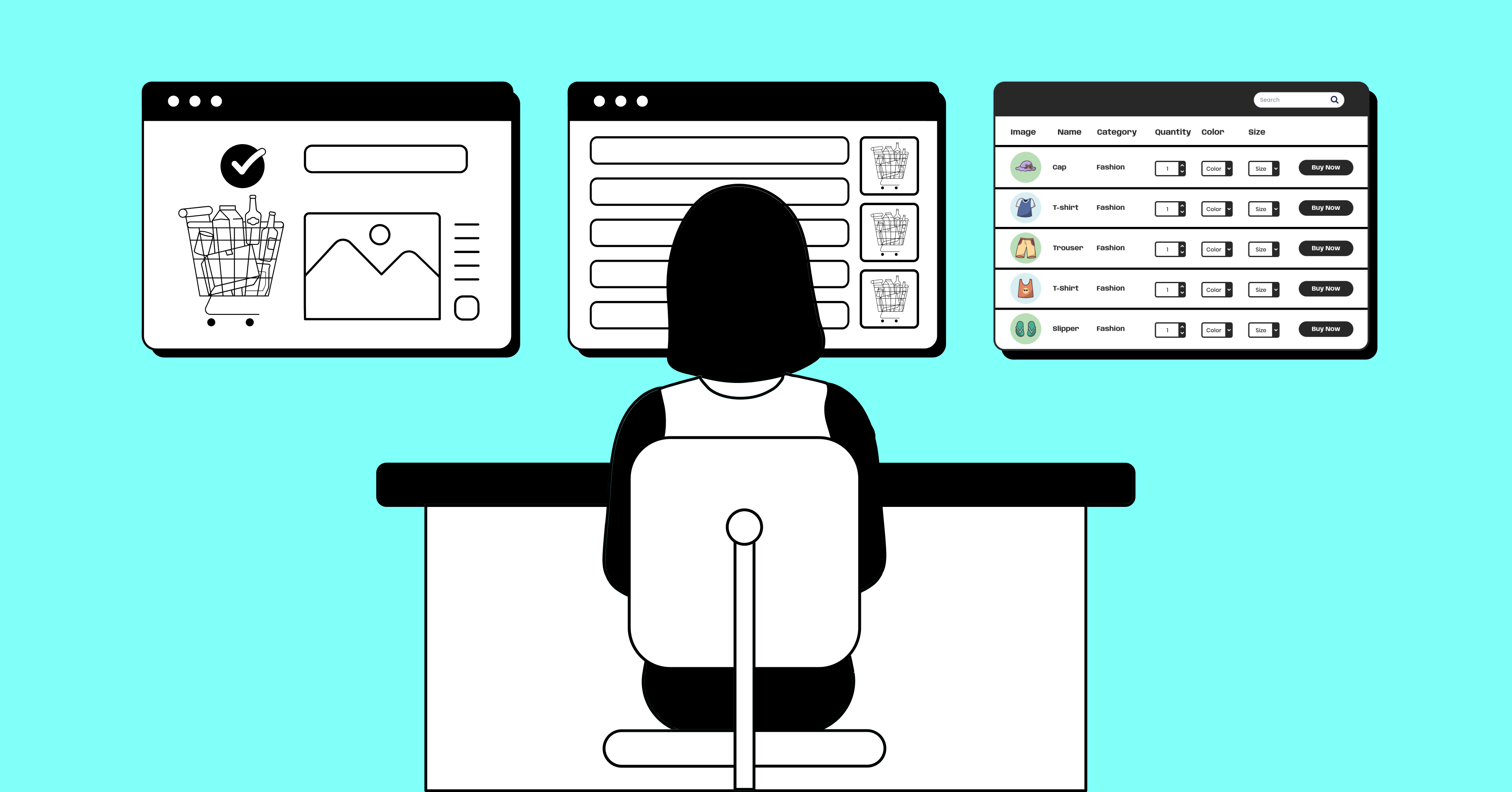
Guiding Data Table Examples for Great Website Visualization

Tables on website, how hard could it be! A few rows and columns here and there, off you go right? Not so fast.
Now, there are many data tables examples to get inspiration from. With confusing options, data presentation needs to do more than simply just show data on grids.
Even though the structure remained the same, the table UI style came a long way. The classic showdown of row and column isn’t enough now. It needs to be compatible with many more qualities.
Great data table design doesn’t just improve the user experience – it significantly boosts utility and value for your audience. It’s time to rethink your data presentation game and redirect your practices to provide better UX.
It’s important to consider good UI design elements that allow users to scan, filter, analyze, and take action easily that provide structure to loads of web data.
So, you need to carefully select the table plugin and take inspiration from websites with tables that excel in delivering exceptional user experience.
Look no further, in our article we will provide useful data table examples that’ll inspire you.
The Golden Rules of Data Visualization
The visual representation of data tables needs to support the inherent idea, and information in the data, and visualize the storytelling. When it comes to presenting data on different visuals and styles, we can plunge right in and show you what works the most for us. But you need to think about all the usefulness, purpose, and display modes before even considering what method you should utilize.
As you make data tables, remember that it takes people some effort to digest a complex chart or data table. Take the effort to spell out the story, and fundamentals via better table UI design so that it’s clear to someone who hasn’t been poring over that dataset from the beginning.
Avoid using complex designs, flashy fonts, or too many colors when telling a data-driven story. This distracts from seizing the opportunity to make a boring site better by backing it up with a dataset.
7 Data visualization best practices
The default styles on HTML or WordPress tables are not exactly the most aesthetically pleasing UI you’ve seen. Depending on the desired visual design, some effort is required to use WordPress plugins and add-ons to prettify those tables.
While determining how you’ll visualize your data, one of the first things you’ll want to do is keep the following best practices in mind.
- Align your visualization option with its purpose.
- Make sure your data is easily interpretable and credible.
- Provide a solution clearly to what they came for.
- Don’t cram everything on a single page. Break down the data.
- Context is the key, offer context in and around your visual.
- Don’t overdo it, keep your visual simple and straightforward.
- Be prepared for all types of viewports and screens.
7 Great Examples of Data Table UI Design
Those steps are frequently practiced in the wrong order. Some often think to themselves, ‘We need a big flashy table with a vibrant background here’ or even worse: ‘Every row with different colors is interesting, just push those in’.
Let’s rethink and ask this, ‘This is the data I need to present; let’s find the best way to show that.’ Aligning purpose with UI design is all that is needed to show beautifully designed data tables.
“In school we learn a lot about language and math. On the language side we learn how to put words together into sentences and stories. With math, we learn to make sense of numbers. But it’s rare that these two sides are paired. No one tells us how to tell stories with numbers … this leaves us poorly prepared for an important task that is increasingly in demand.”
– Cole Nussbaumer Knaflic
Now the question is, how can data table UI design stand out from the competition?
Let’s look at how great tables can be built on different websites in 2023 since tables don’t seem to be going out of style anytime soon.
Keep it simple
Let’s start with a simple yet effective scenario. If your data arranges itself nicely into a table with many rows and a few columns then the data table is effectively conveying the message or idea from the start. You can build it up from here when necessary. Occasionally, sticking to the basics can be more useful than any flashy UI design and styling. Although it’s a low-effort practice, a little extra effort goes a long way.
| First name | Last Name | Position | Office Branch | Age | Salary |
|---|---|---|---|---|---|
| Ashton | Brady | Accountant | London | 36 | 162,700 |
| Miles | Tenner | Integration Specialist | San Francisco | 41 | 372,000 |
| Harvey | Spencer | Regional Director | London | 42 | 470,600 |
| Mike | Sallanger | Personnel Lead | New York | 38 | 220,500 |
| Jaden | Hyatt | Team Lead | London | 35 | 240,700 |
| Donna | Hannigan | Senior Marketing Designer | San Francisco | 36 | 275,100 |
| Nile | Harris | Development Lead | New York | 37 | 345,200 |
| Allison | Kram | Integration Specialist | Sydney | 34 | 270,000 |
| Victor | Vincent | Accountant | Sydney | 40 | 170,500 |
| Bob | Randell | Accountant | New York | 41 | 190,750 |
| Hannah | Griffin | Senior Marketing Designer | London | 39 | 280,200 |
| Jennifer | Cowell | Regional Director | Sydney | 36 | 190,000 |
| Quinn | Basser | Regional Director | San Francisco | 37 | 360,500 |
| Hailey | Rogan | Integration Specialist | New York | 49 | 290,700 |
| Raphael | Kwan | Personnel Lead | San Francisco | 46 | 200,100 |
| Steven | Haider | Team Lead | New York | 35 | 270,000 |
| Bill | Conan | Regional Director | New York | 53 | 470,000 |
| Julia | Kingsley | Development Lead | San Francisco | 45 | 350,000 |
| Chris | Newman | Senior Marketing Designer | Sydney | 38 | 250,000 |
| John | Claude | Accountant | San Francisco | 50 | 135,000 |
Created with Ninja Tables
By using alignment, spacing, and size, you can easily achieve a user-friendly, comprehensive, and readable table. As for customized background, use it only when it makes sense. For example, in any festivity use a customized background to add a little flair to the table.
Simplify data table to avoid common mistakes following this table design inspiration.
Just consider if the data table is responsive on other screens without compromising the readability and credibility. Allow data on a narrow screen to shrink and resize as needed without losing its purpose.
Tip 1: Do nothing extra
Tip 2: Don’t stretch tables
Don’t make it wordy
Try to avoid using too much text in the table, it makes the table look cluttered and hard to keep track of. Shorten the texts, use separate columns if necessary. This pattern works best if your data itself isn’t full of text. If they are numeric, or short texts, you can probably get away with not doing much.
To create a clean and organized look in your web table design, it’s important to minimize the use of lengthy text entries. Too much text can clutter the table and make it hard to keep track. Instead, opt for concise words or numeric values. If you have information that requires more explanation, use separate columns to avoid overcrowding.
Subtext for best data table design
Incorporating subtext can be a game-changer when it comes to enhancing your tables storytelling. It enables you to provide relevant context and details without overcrowding the dashboard design table or forgoing its clarity.
Consider this: rather than maintaining different columns for both a user’s name and email, you can simply include the email address as a subtext under the name. This way you can simplify large datasets, making them more organized and easier to navigate.
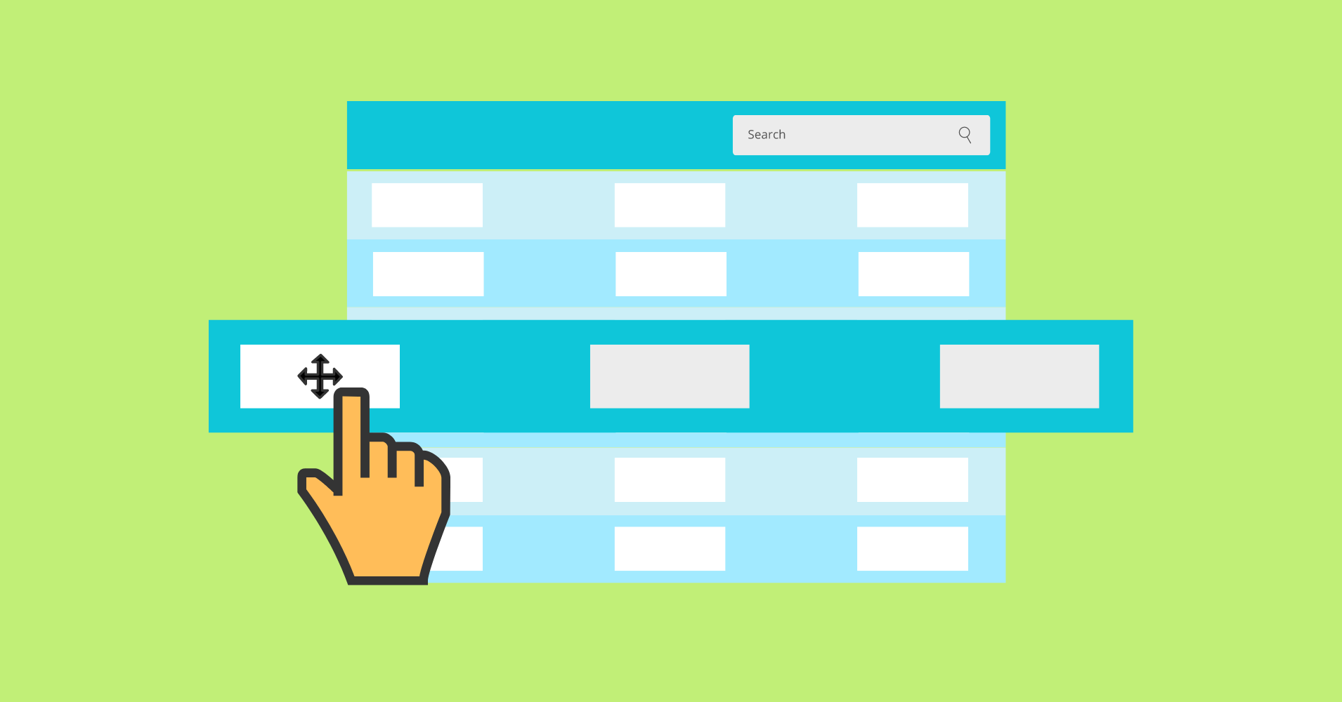
Fixed header table or sticky
Now, an interesting game-like feature- fixing the table header. A fixed header table is designed to increase the user experience when scrolling through rows of data. It keeps the column labels in view at all times, ensuring that the main context remains steady. This feature significantly improves accessibility and simplifies data interpretation for users.
To make this feature work, you can utilize sticky table headers. Just as the name suggests, these headers remain anchored at the top of the viewport, even when the columns scroll out of view. They serve to maintain a visual reference to the data in columns, making it easier for users to understand and navigate the information.
Pricing tables
When it comes to showcasing prices or included features, it’s ideal to utilize tables that present all the details together on a single screen. Using checkmarks, cross buttons or icons can be useful to display what customers can expect within various price ranges. Here’s a prime illustration of a pricing table that just got it right. It excels in both effectively providing information and improving the overall aesthetic of a website.
Single Site License 1 Domain License | Agency License 5 Domain License
| 50 Sites License 50 Domain License
|
$129 | $249 | $399 |
Annual License | Annual License | Annual License |
10 Business Email Piping | 50 Business Email Piping | 500 Business Email Piping |
Unlimited Email Parsing | Unlimited Email Parsing | Unlimited Email Parsing |
1 Year Plugin Update | 1 Year Plugin Update | 1 Year Plugin Update |
1 Year Priority Support | 1 Year Priority Support | 1 Year Priority Support |
All Features Included | All Features Included | All Features Included |
Created with Ninja Tables
Filtering, sorting, and pagination
Now to the fun part- enable quick, in-place actions without the need for navigating to new pages. This feature not only saves users time but also spares them the frustration of repetitive tasks. It helps manipulate and filter data to locate necessary information, gain fresh insights, and conduct data comparisons more effectively.
| Name | Position | Office | Age | Start date | Salary |
|---|---|---|---|---|---|
| Zorita Serrano | Software Engineer | San Francisco | 56 | 2012/06/01 | $115,000 |
| Zenaida Frank | Software Engineer | New York | 63 | 2010/01/04 | $125,250 |
| Yuri Berry | Chief Marketing Officer (CMO) | New York | 40 | 2009/06/25 | $675,000 |
| Vivian Harrell | Financial Controller | San Francisco | 62 | 2009/02/14 | $452,500 |
| Unity Butler | Marketing Designer | San Francisco | 47 | 2009/12/09 | $85,675 |
| Timothy Mooney | Office Manager | London | 37 | 2008/12/11 | $136,200 |
| Tiger Nixon | System Architect | Edinburgh | 61 | 2011/04/25 | $320,800 |
| Thor Walton | Developer | New York | 61 | 2013/08/11 | $98,540 |
| Tatyana Fitzpatrick | Regional Director | London | 19 | 2010/03/17 | $385,750 |
| Suki Burks | Developer | London | 53 | 2009/10/22 | $114,500 |
| Sonya Frost | Software Engineer | Edinburgh | 23 | 2008/12/13 | $103,600 |
| Shou Itou | Regional Marketing | Tokyo | 20 | 2011/08/14 | $163,000 |
| Shad Decker | Regional Director | Edinburgh | 51 | 2008/11/13 | $183,000 |
| Serge Baldwin | Data Coordinator | Singapore | 64 | 2012/04/09 | $138,575 |
| Sakura Yamamoto | Support Engineer | Tokyo | 37 | 2009/08/19 | $139,575 |
| Rhona Davidson | Integration Specialist | Tokyo | 55 | 2010/10/14 | $327,900 |
| Quinn Flynn | Support Lead | Edinburgh | 22 | 2013/03/03 | $342,000 |
| Prescott Bartlett | Technical Author | London | 27 | 2011/05/07 | $145,000 |
| Paul Byrd | Chief Financial Officer (CFO) | New York | 64 | 2010/06/09 | $725,000 |
| Olivia Liang | Support Engineer | Singapore | 64 | 2011/02/03 | $234,500 |
| Michelle House | Integration Specialist | Sidney | 37 | 2011/06/02 | $95,400 |
| Michael Silva | Marketing Designer | London | 66 | 2012/11/27 | $198,500 |
| Michael Bruce | Javascript Developer | Singapore | 29 | 2011/06/27 | $183,000 |
| Martena Mccray | Post-Sales support | Edinburgh | 46 | 2011/03/09 | $324,050 |
| Lael Greer | Systems Administrator | London | 21 | 2009/02/27 | $103,500 |
| Jonas Alexander | Developer | San Francisco | 30 | 2010/07/14 | $86,500 |
| Jennifer Chang | Regional Director | Singapore | 28 | 2010/11/14 | $357,650 |
| Jennifer Acosta | Junior Javascript Developer | Edinburgh | 43 | 2013/02/01 | $75,650 |
| Jenette Caldwell | Development Lead | New York | 30 | 2011/09/03 | $345,000 |
| Jena Gaines | Office Manager | London | 30 | 2008/12/19 | $90,560 |
Additionally, this design facilitates users to quickly scan and pinpoint specific records of interest. Furthermore, pagination comes into play to retain a separate and clear perspective of a vast dataset. It helps consumers maintain concentration by breaking up the contents into digestible portions on pages.
Combining these three components results in a more seamless and pleasurable user experience by enhancing the effectiveness of locating, comparing, and analyzing data.
Keep the following in mind to provide a more valuable user experience when designing effective data tables:
- Selecting individual column sorting will improve data lookup for users.
- To further streamline data exploration, include ordering choices and search queries.
Comparison table
Nevertheless, data scattered over separate pages leads to higher attention demands and association. It then becomes burden for viewers to take notes, switch across pages, absorb content, and toggle between tabs.
What can be done to make their experience a lot more easier and accessible? Using comparison tables to showcase all the necessary data to interpret those values and make decision.
Comparison | iPhone 13 | iPhone12 |
Preview |  |  |
Announced | 2022, February 09 | 2021, September 13 |
Status | Available. Released 2022, February 24 | Available. Released 2021, September 25 |
Size | 6.1 inches | 6.1 inches |
Weight | 6.14 ounces | 5.78 ounces |
Processor | A15 | A14 |
Chipset | Apple A15 Bionic (5 nm) | Exynos 2200 (4 nm) - Europe |
Camera | 12 MP, f/1.6, 26mm (wide), 1.7µm,
dual pixel PDAF, sensor-shift OIS | 12 MP, f/1.6, 26mm (wide), 1.7µm,
dual pixel PDAF, sensor-shift OIS |
Battery | Li-Ion 3240 mAh, non-removable | Li-Ion 3000 mAh, non-removable |
Resolution | 2532x1170 | 2532x1170 |
As users scan the table, the visual design needs to make
it easier for them to keep their context in mind, eyes on the table. Potential tools in this process include borders, alternate row colors, zebra stripes, or highlighting the data when clicked upon.
Multimedia integration
When your content is drowning in a sea of numbers and text, it’s likely to become boring, or lack vision. Why use media in data tables? It boosts the visualization appeal. It’s a quick way to keep your audience interested. You can showcase your products, features, usage, and even reviews in a visually appealing and captivating style by adding multimedia to your tables.
| Poster | Movie Title | Rating | Trailer | IMDB Link |
|---|---|---|---|---|
 | Minions: The Rise of Gru | 6.6 |  | Learn more |
 | 12 Angry Men | 8.9 |  | Learn more |
 | Pulp Fiction | 8.9 |  | Learn more |
 | The Dark Knight | 9.3 |  | Learn more |
It’s similar to adding a dynamic introduction to your statistics and making the story come to life.
Picture this: You’ve just given your data table some personality! Add interactive links to your data displays that take users directly to the landing page or social media.
Why consider data table examples before starting?
Surprisingly enough, tables are like the unsung heroes of data visualization. They have this incredible knack for laying out information so that it is both clear and simple to digest.
But here’s the kicker: even though most of us know how to read a table, there’s a whole world of untapped potential in making them even more user-friendly.
Here’s a piece of advice: When labeling titles and headlines, steer clear of generic ones and build them around the core message. It’s all about making every word count!
Every data table isn’t just there to help users quickly skim through info; it should also empower them to dig deeper, compare, and take action.
For example, here are some live sports tables and product tables for you as proper examples.
Adapting the appropriate table style for a greater purpose is the ultimate goal. After all, we’re all about making life easier for our users!
Putting it all into play
Now think about table design, you’ve got a myriad of options to choose from. There are unlimited WordPress data visualization plugins you can’t overlook. The approach you select should be tailored to fit the data you’re working with and the people who’ll be using it. It’s all about putting your users front and center in the data game. Understand the choice between charts vs tables or any other options worth considering.
After all, technology should make life easier, not more complicated, right? With that being said, we have to continue to consider design choices that do not compromise accessibility.
From this perspective, Ninja Tables comes with all the handy features that allow you to cater to these differences accordingly.
Conclusion
The beauty of data storytelling is that you don’t need a perfect dataset or fancy infographics to make it an intriguing part of your data visualization toolkit. It’s about breaking down the barriers that often separate the numbers in one part of the brain from interpretation and understanding in another. You see, effective visualization goes well beyond data; it hinges on how that data is presented.
There’s this golden rule, ‘Don’t just present data, weave a narrative with it’. Well, that’s precisely what Ninja Tables toolkit does, and the interactive features are what propels the story from start to end.
Get our dynamic table builder plugin for your story. It incorporates great data table examples that will spur your imagination.
Ninja Tables– Easiest Table Plugin in WordPress
Get special discount on the best table plugin made for you!


Add your first comment to this post