
Large Data Table Plugin Still Slow? The Problem Is Below the Plugin
You switched to a server-side rendering plugin. Page load improved. But sort still drags. Filtering still pauses. Something is still…
Unleash the power of Data Visualization! Explore techniques, tools, and insights to transform complex data into compelling visual stories. Enhance your understanding and communication.
You switched to a server-side rendering plugin. Page load improved. But sort still drags. Filtering still pauses. Something is still…

The default WordPress table block has no sorting, no filtering, no pagination, and no mechanism for handling data beyond what…

The original idea behind big data was simple: collect more, decide better. What nobody fully predicted was how differently every…

Data tables look simple until they scale. The moment a grid crosses a few hundred rows, spans a dozen columns,…

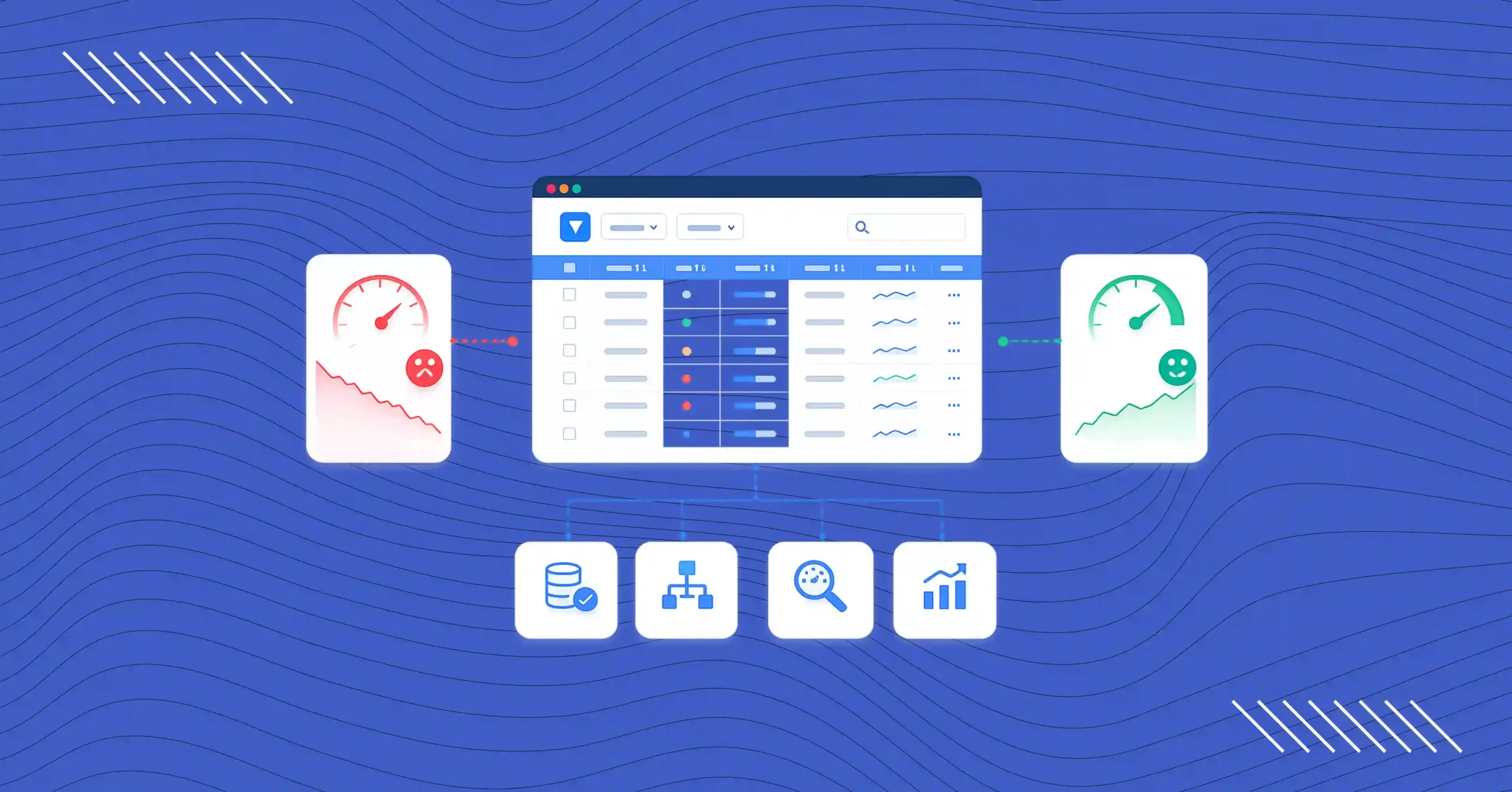
Most WordPress table plugins work beautifully until the data gets serious. Five hundred rows feel fine. Five thousand rows or…

TLDR: Searchable and sortable tables cut user frustration by 40%. Data-heavy applications need search bars, column sorting, and smart filtering….

TL;DR Tables and charts can make your sales report look much easier to comprehend.Showcase the numbers, predictions, and performances of…
Healthcare data management shouldn’t feel like digital paperwork chaos. Every patient intake form, every appointment request, and medical history data…

The success of your product, business, or service is determined by the customer reviews and testimonials. Their experience lets other…
Not all tables are created equal. Sure, they all have that familiar structure, but their purposes couldn’t be more different….