
Big Data Table Design: A UX Guide That Actually Works
Data tables look simple until they scale. The moment a grid crosses a few hundred rows, spans a dozen columns, or carries users who need to find something specific without knowing exactly what they are looking for, a standard table design stops working. Not visually, structurally.
What is interesting is that the failure pattern is almost always the same. The table renders correctly. The data is there. But users slow down, miss things, scroll past what matters, and either find the wrong answer or give up. No error message appears. The table just quietly fails the person using it.
Today, we will cover what makes designing large data tables fundamentally different from regular UI design, why common design instincts backfire at scale, and which specific structural decisions actually help users navigate, scan, and act on large datasets with confidence.
TL;DR
- A data table becomes “large” when users can no longer read it passively and need the interface to help them work through it
- A “large” data table is defined by cognitive load, not row count — structure breaks before volume does
- Generic UX rules like adding whitespace actively hurt usability when data density matters
- The five structural decisions that determine whether a large data table works or breaks
- Mobile strategy for large tables requires a deliberate choice about what the user should be able to do, not just how the table should shrink
- How performance choices at the technical level directly determine the UX
- Where Ninja Tables currently helps with big data volume in WordPress, and what is coming next
What makes a data table “large” in UX terms
The word large does not describe a row count. It describes a condition: the point at which a user can no longer orient themselves, compare records, or complete a task without the interface actively helping them.
That threshold is different for every table and every user. A clinical researcher scanning a 200-row trial dataset with 22 variables per row hits that wall faster than a supply chain analyst working a clean 5,000-row inventory list with six columns. Volume is one factor. Column density, data type variety, user familiarity, and task complexity are the others.
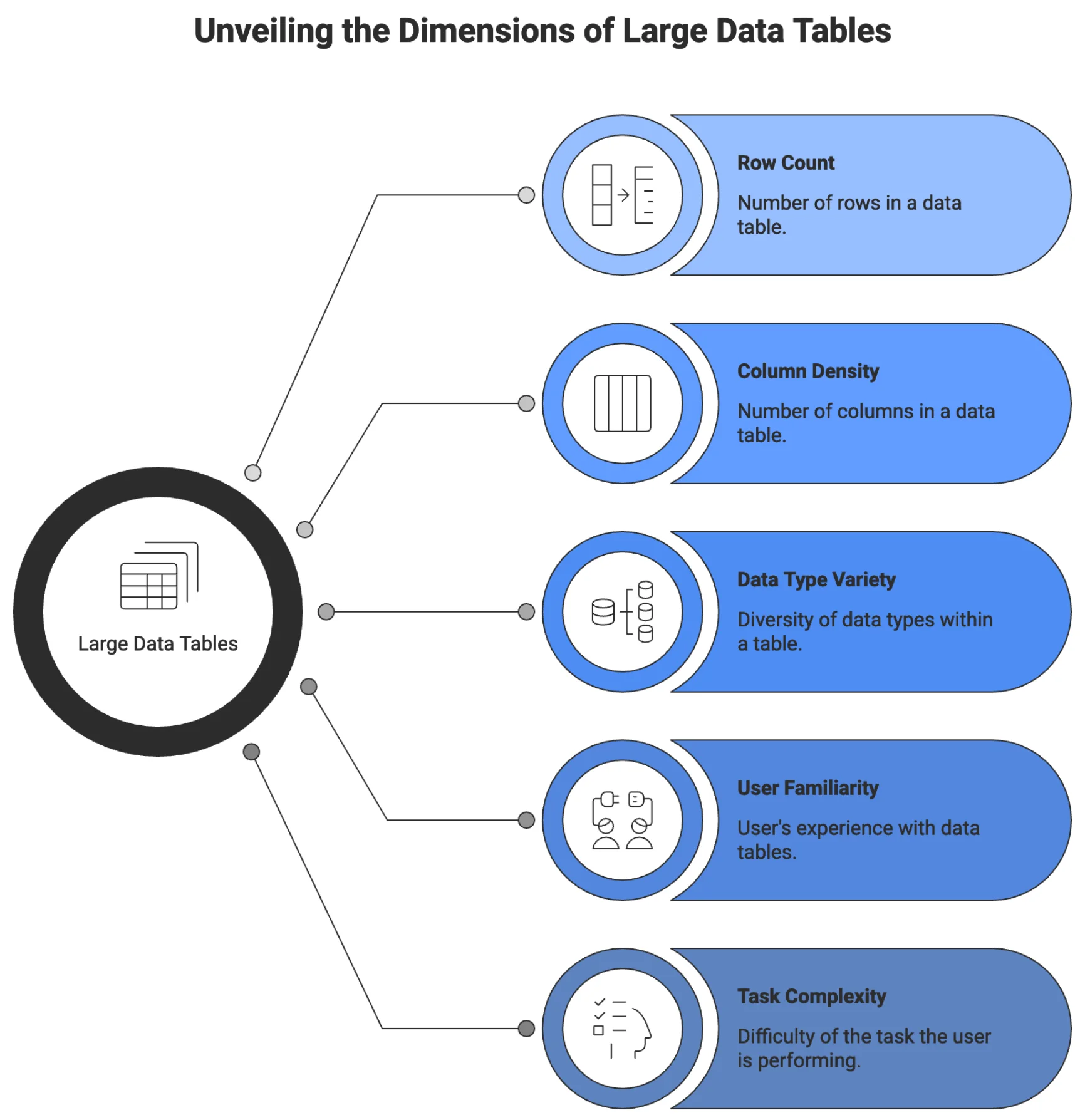
What changes at the “large” threshold is the user’s relationship to the table. Below it, users read. Above it, users work through it; they have a goal, the table either supports it or obstructs it, and that difference is entirely a design problem.
A data table designer’s job is not to make data look good. It is to make data workable for the specific person doing a specific task.
Big data tables show up far outside the industry most articles name. A university registrar manages course enrollment. A nonprofit tracking grant outcomes across five years. A journalist is working through thousands of public spending records. A quality control team is reviewing component failure logs. A developer previewing API response payloads. A teacher is tracking scores across 300 students.
The data differs in various use cases. The structural UX problem is identical across all of them, and in need of a better ux design for large data tables.
Why standard design instincts break at scale
Good UX instincts for most interfaces actively work against a large data table design. What works on a landing page, a form, or a content layout often breaks the moment you apply it to a dense, high-volume data grid. That gap is exactly why large data table UI design deserves its own set of rules.
Characteristic |  Whitespace and Alignment |  Progressive Disclosure |  Visual Consistency |
Standard Design Instincts | Generous | Works well | Makes patterns readable |
Large Data Tables | Compressed | Often fails | Hinders scanning |
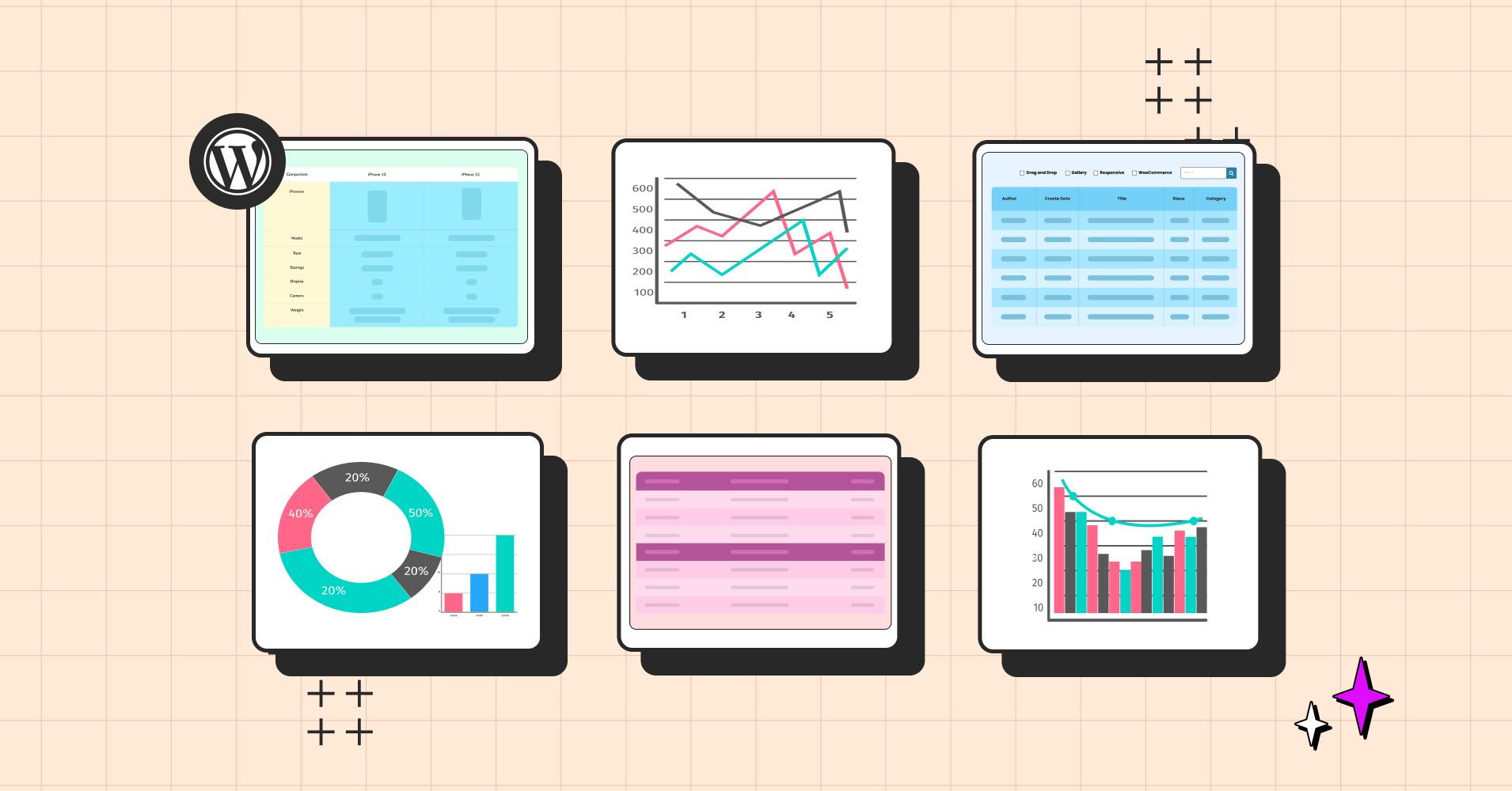
Built with Ninja Tables
Generous whitespace is correct for forms and content layouts. In a data table, it compresses how many records fit in a single viewport. A user trying to compare 30 rows has to scroll through what would otherwise fit on one screen. Whitespace without calibration turns a comparison task into a scrolling task.
Progressive disclosure works well in onboarding and complex forms. In a large data table, hiding controls behind interactions means users never discover that filter options exist, that columns are toggleable, or that actions are available on selected rows. The noise goes down. So does the user’s ability to do their job.
Visual consistency across elements makes patterns learnable. In a data table, it means every column carries the same visual weight regardless of importance. The anchor field users scan first looks identical to a low-priority metadata column. Users cannot scan. They read every column on every row.
The same failure runs through all three cases: design instincts built for browsing apply badly to interfaces built for working.
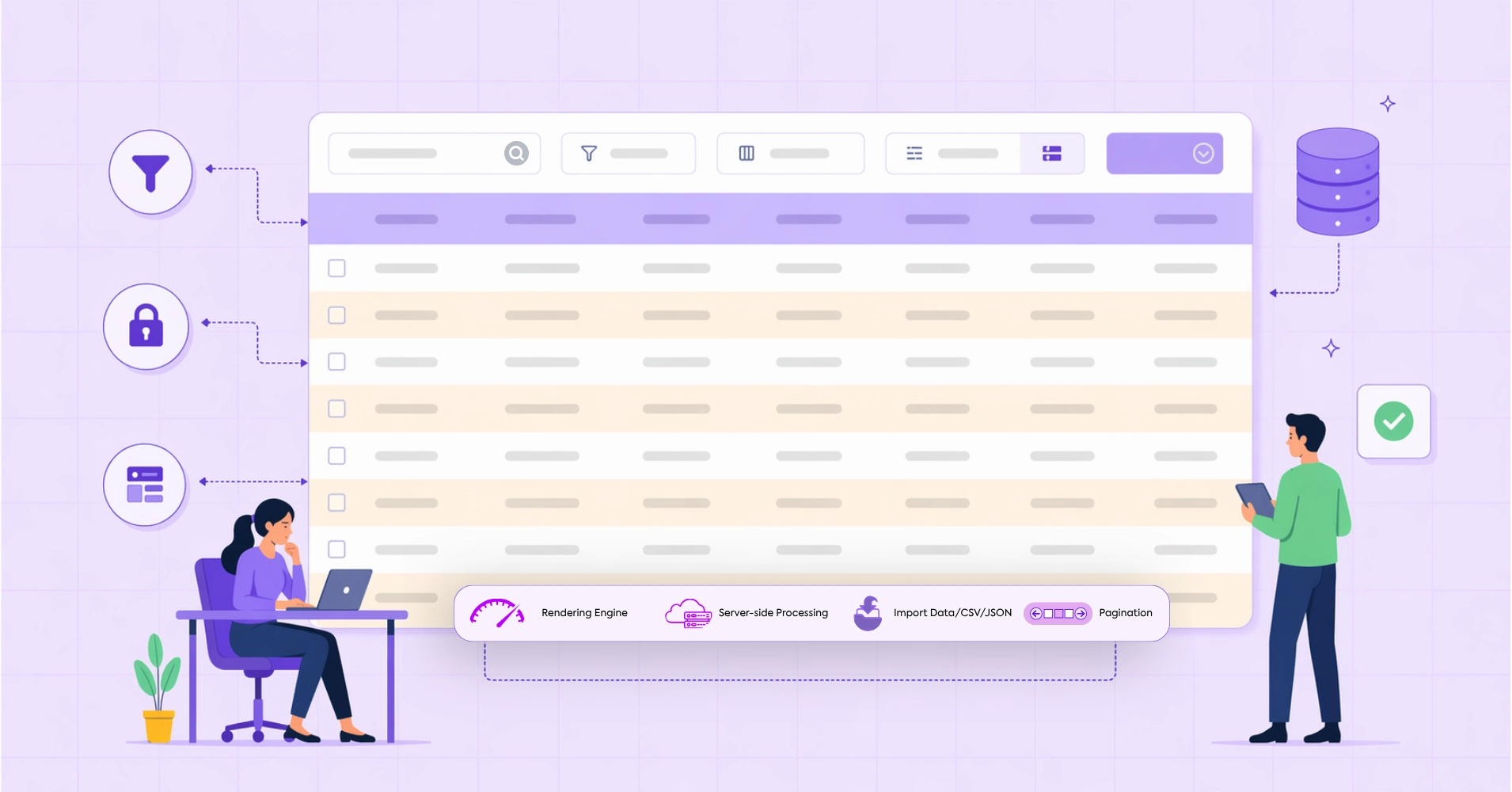
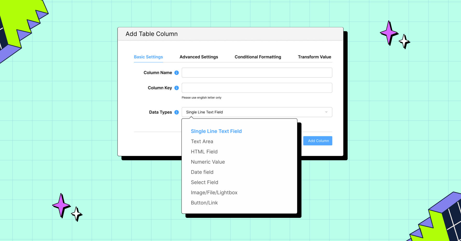
The five structural decisions for large data tables
The five structural decisions that determine whether a large data table actually works are column hierarchy, fixed headers and frozen columns, real filtering built around user workflows, density control, and mobile strategy designed with intent. Get those right, and most of what users complain about in data-heavy interfaces disappears.
1. Column order and visual hierarchy help navigation
The first column a user looks at is the anchor. It is the field that tells them they are looking at the right row. In the customer records table, it is the customer name. In an inventory table, it is the product SKU. In a financial ledger, it is the transaction ID or date. Whatever it is, it orients the entire scan.
When that anchor column is not positioned first, or when it looks identical to every other column, users lose efficiency immediately. They have to re-read before they can act. At 20 rows, that is inconvenient. At 2,000 rows, it becomes the reason users stop trusting the table.
The anchor column should be visually distinct. A heavier weight or slightly different treatment, like positioned first, and frozen when the table scrolls horizontally. Everything to its right should be ordered by decision relevance: the columns users consult most often when comparing or evaluating a row come next, and lower-priority metadata goes last.
This is not a layout preference. It is how humans scan structured information. A column order that matches the user decision flow reduces the number of eye movements per row. Across hundreds of rows, that difference accumulates into a usable versus unusable experience.
| Image | Name | Category | Price | Choose | |
|---|---|---|---|---|---|
 | Blue Hoodie (Zipper) | Hoodies | Original price was: $40.00.$35.00Current price is: $35.00. | | |
 | Hat | Hat | Original price was: $20.00.$15.00Current price is: $15.00. | | |
 | T Shirt | Half sleeve | $45.00 | | |
 | T-Shirt with Logo | Tshirts | Original price was: $10.00.$8.00Current price is: $8.00. | | |
 | Beanie with Logo | Accessories | Original price was: $20.00.$18.00Current price is: $18.00. | | |
 | T-Shirt | Tshirts | $18.00 | | |
 | Long Sleeve Tee | Tshirts | $25.00 | | |
 | Polo | Tshirts | $20.00 | | |
 | Hoodie with Logo | Hoodies | $45.00 | | |
 | Hoodie with Pocket | Hoodies | Original price was: $45.00.$35.00Current price is: $35.00. | | |
 | Hoodie with Zipper | Hoodies | $45.00 | | |
 | Beanie | Accessories | Original price was: $20.00.$18.00Current price is: $18.00. | | |
 | Belt | Accessories | Original price was: $65.00.$55.00Current price is: $55.00. | | |
 | Cap | Accessories | Original price was: $18.00.$16.00Current price is: $16.00. | | |
 | Sunglasses | Accessories | $90.00 | | |
 | Tank Top | Tanktop | Original price was: $45.00.$40.00Current price is: $40.00. | |
2. Fixed headers and frozen columns are not optional at scale
Sticky headers or fixed columns are the cheapest, highest-return investment in a large data table, depending on use cases and different scenarios. Without it, users who scroll past the first screen have to scroll back up every time they need to know what a column contains. On a 50-row table, this is slightly annoying. On a 500-row table being worked by a data analyst doing intake review, it is a repeated disruption that happens dozens of times per session.
Fixed table headers should be the default behavior for any table expected to exceed a single viewport of rows. There is no design trade-off here. There is a very limited reason not to do this.
Factor | Pagination | Infinite Scroll |
User Orientation |
|
|
Info Processing |
|
|
Navigation |
|
|
SEO |
|
|
Accessibility |
|
|
Mobile UX |
|
|
Performance |
|
|
Analytics |
|
|
Best Fit |
|
|
Frozen columns work the same way horizontally. When a table is wider than the screen, which is routine for any table covering more than six or seven fields on a standard laptop, horizontal scrolling causes the anchor column to disappear. Users lose their position. They scroll back left, re-orient, scroll right again. This is fixable entirely by freezing the first left column.
Comparison | Product X | Product Y |
Preview |  |  |
Announced | 2022, February 09 | 2021, September 13 |
Status | Available. Released 2022, February 24 | Available. Released 2021, September 25 |
Size | 6.1 inches | 6.1 inches |
Weight | 6.14 ounces | 5.78 ounces |
Processor | A15 | A14 |
Chipset | Apple A15 Bionic (5 nm) | Exynos 2200 (4 nm) - Europe |
Camera | 12 MP, f/1.6, 26mm (wide), 1.7µm, dual pixel PDAF, sensor-shift OIS | 12 MP, f/1.6, 26mm (wide), 1.7µm, dual pixel PDAF, sensor-shift OIS |
Battery | Li-Ion 3240 mAh, non-removable | Li-Ion 3000 mAh, non-removable |
Resolution | 2532x1170 | 2532x1170 |
Buy |
For tables with multiple identifying fields, freezing two or three columns is sometimes appropriate. The identifying cluster stays visible regardless of how far right the user scrolls.
3. Filtering is the real interface for large data
Search is the beginning. For small tables, it is sufficient. For large datasets, typing a keyword and scanning results is not a workflow. It is a guess.
Real filtering means users can narrow a dataset by conditions that match how they think about the data. A logistics manager does not search for “delayed.” They filter for shipments where status equals “In Transit,” and estimated delivery is before today’s date.
This requires column-level filters that accept specific values, range conditions for numerical and date fields, and the ability to combine multiple filters simultaneously. It also means filters should persist across page navigation so users do not lose their work when they click into a record and come back.
Saved filter presets extend this further. Power users who run the same query every morning should not have to rebuild it every time. The filter state should be savable and recallable, ideally by name.
Search, in a well-designed large data table, complements filtering rather than replacing it. Global search is fast for known values. Filtering is the tool for exploratory work, pattern detection, and comparative analysis.
4. Density control returns power to the user
There is no single correct row height for a large data table. The right density depends on who is using the table, for what task, and in what workflow context.
A compliance officer doing a line-by-line audit wants comfortable spacing, clear visual separation between rows, and enough breathing room to read each entry carefully before moving on. A data operations team member doing bulk review wants to see 40 rows at once with minimal padding, because their job is to scan for anomalies, not to read every value.
Both of these are valid. Both will be frustrated by a table locked into the other’s density.
The practical solution is a density toggle with two or three options: compact, default, and comfortable. Compact removes excess padding and tightens row height to maximize visible records. Comfortable adds vertical space and increases touch target size. Default sits between them as the starting point for the conventional way to solve the particular needs of the user.
5. Responsive behavior requires a deliberate strategy
A large data table on a desktop is a navigation problem. A large data table on a mobile screen is a different problem entirely, and solving the mobile case by shrinking the desktop case is not a solution.
The question to answer first is what users actually need to do with this table on a small screen. If they are checking a single record’s status, they do not need the full grid. If they are approving or rejecting items from a queue, they need specific fields and action controls, not column-level comparison.
Three patterns work in different contexts. The first is horizontal scroll, which preserves the full table structure and works when column order matters, and users need to compare across fields. The second is collapsed rows, where each row becomes an expandable card showing its key identifier and revealing all fields on tap. This works well when users navigate row by row rather than scanning across many rows. The third is priority column display, which shows only the two or three most important columns at small viewports and hides the rest behind a “show more” control. Or even responsive breakpoint options like ‘Initial hidden on desktop/phone’ can go a long way when it comes to a perfect viewport on any device.
Click "+" to Expand and Compare
| Model | Image | Capacity | Cooking Modes | Display | Special Features | Dimensions | Warranty | Price | Discount |
|---|---|---|---|---|---|---|---|---|---|
| Compact Series |  | 20L | Basic heating, defrost | LED display | Child lock | 45cm x 35cm x 25cm | 1 year | $129 | 20% |
| Standard Series |  | 28L | Heating, defrost, grill | LED display | Auto cook menus | 52cm x 40cm x 30cm | 2 years | $199 | 30% |
| Premium Series |  | 32L | Heating, defrost, grill, convection bake | Touch control with LCD | Smart sensor cooking, voice assistant compatible | 55cm x 42cm x 32cm | 3 years | $349 | 40% |
The wrong answer is to force any of these on a table where a different strategy fits better. Mobile responsiveness for large data tables should be a deliberate design decision made with knowledge of the task, not a default behavior that applies uniformly. For a structured look at how each responsive mode behaves across different content types, the mobile-first table design principles guide breaks down the trade-offs with practical context.
The performance layer: What UX cannot fix
Design decisions matter less than most designers realize if the technical architecture underneath a large data table is not built for volume.
A table that takes four seconds to render on page load has a UX problem that no sticky header or density control will fix. Users will not wait. They will assume the page is broken or slow and leave before any of the design is exposed or presented to them to think further.
The architectural decisions that determine performance for large data tables are straightforward, though not always simple to implement.
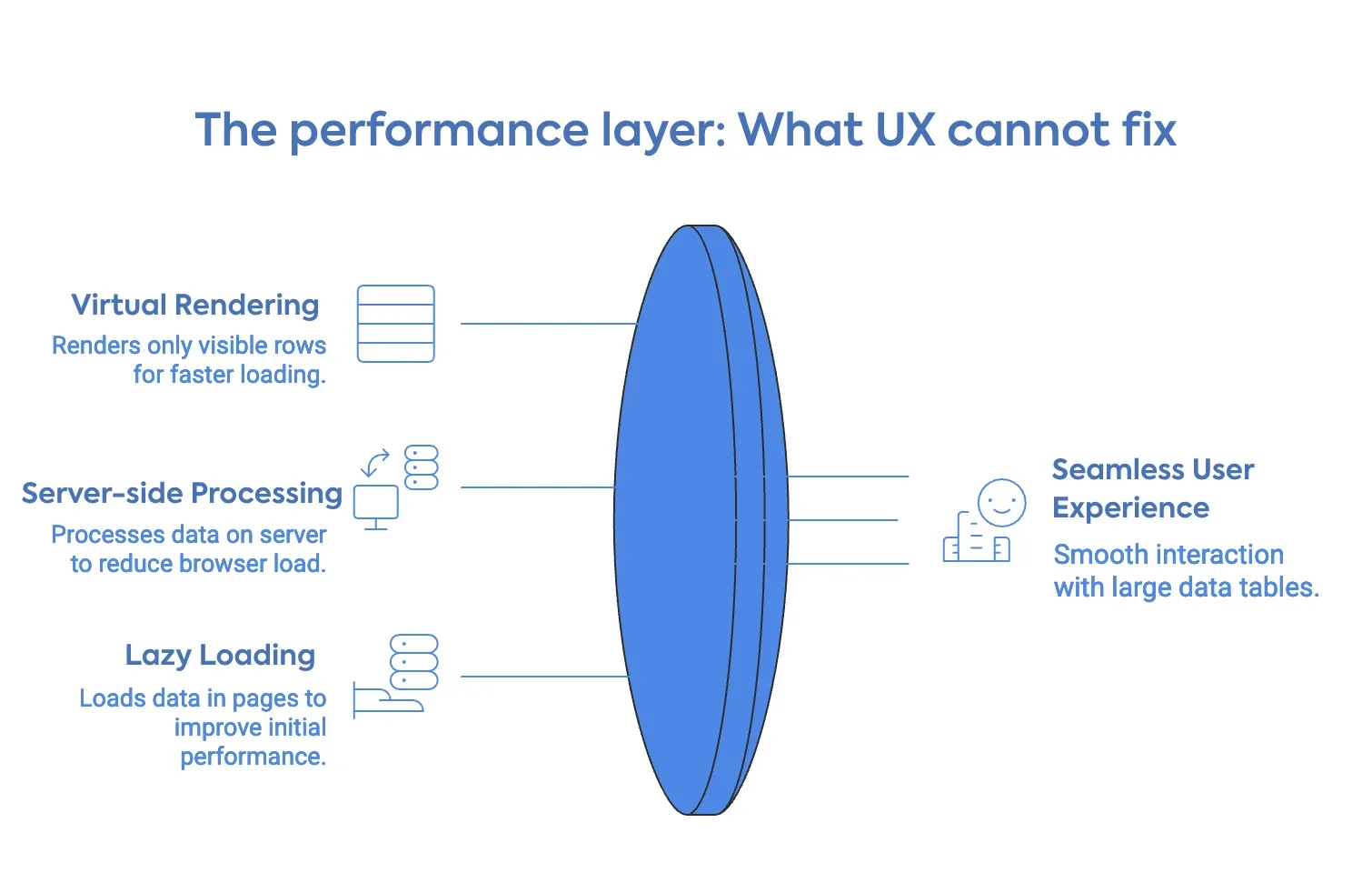
Virtual rendering means that instead of inserting every row into the DOM at page load, the table renders only the rows currently visible in the viewport. As the user scrolls, rows enter and leave the DOM dynamically. The visual experience is a seamless, infinite list. The actual DOM load at any moment is a few dozen rows. This is what makes 100,000-row tables feel fast.
Server-side data processing means that filtering, sorting, and pagination queries are processed on the server, and only the relevant slice of data is sent to the browser. The browser never holds the full dataset. This is the correct approach for any table where the total row count exceeds what should reasonably live in browser memory, which in practice is anything past a few thousand rows, depending on field complexity.
Lazy loading with incremental pagination sits between client-side and full server-side. Data loads in pages as the user scrolls or navigates, reducing initial load time while still delivering the full dataset over time.
Getting this layer right is not optional today, with a limited attention span and a busy world. It is the precondition for every UX principle in this article to matter at all.
All the UX principles in this article depend on one thing working underneath them: a rendering layer that does not buckle when the data gets heavy.
Where Ninja Tables fit into this
For WordPress users dealing with large datasets, the options are limited, and the trade-offs are real.
Ninja Tables currently handles the volume side of this problem. It is built to render large row counts in WordPress without the sluggishness that generic table plugins produce when data gets heavy. If you are managing several hundred to a few thousand rows and need a reliable, fast display layer inside WordPress, it does that work today.
The deeper UX controls and flexibility with features like advanced column-level filtering, multi-condition filter stacks, density toggles, and the richer interaction layer this article describes — are part of Ninja Tables advanced system. The next stage of development is focused precisely on the gaps for big data design systems: giving WordPress users the kind of data table experience that enterprise tools provide, without requiring custom development to get there. For now, if you are building in WordPress and working with meaningful data volume, you can explore what the plugin currently handles at the big data tables in WordPress. And if you want a sense of how the design decisions in this article connect to real table implementations on the web, the data table design examples are a useful reference point.
Right now, handling large datasets in WordPress often means compromising on speed, usability, or both. That’s exactly where things are about to change.
Ninja Tables introduced an improved data handling and rendering system, designed to work seamlessly within the existing interface while efficiently supporting large-scale datasets. The goal is simple: make complex data feel lightweight, responsive, and easy to manage without relying on external workarounds.
This update was recently rolled out. Try to get into the groove as we introduce more scalable approaches to work with data in WordPress—built to fit directly into your workflow without slowing you down.
What a good big data table design looks like in practice
The strongest large data table implementations share one visible quality: the interface understands what the user is trying to accomplish before they explain it.
A financial analyst opens a 20,000-row transaction ledger. The table loads fast. The transaction ID column stays fixed on the left; date and amount sit right beside it — the two fields analysts actually compare. A saved filter preset pulls up this week’s transactions in one click: 340 rows. She compares balances across three vendor accounts and exports the subset. Under two minutes, start to finish.
This is the same principle behind strong UX guidelines for ecommerce product pages — put what users reach for first within arm’s reach, and get out of the way.
That is the functional target for large data table design. Just a user who opened a table with a task in mind and finished that task without friction. The searchable and sortable tables guide covers the implementation side of building this kind of experience inside WordPress, for those who want the UX principles with examples.
FAQ
If I fix the design, will it fix slow load times?
No. Design and performance are different layers. A well-designed table that loads slowly loses users before they see the design. A fast table with poor structure loses them after.
What is the easiest single fix when users complain about a large data table?
Sticky headers. When column headers scroll away, users lose context and have to scroll back up to re-read them. It is the highest-return, lowest-effort change available and it affects every user on every session.
Should large data tables have row hover highlighting?
Yes. Row hover state helps users track which row they are reading as their eyes move across wide columns. Without it, users read the wrong row. The highlight does not need to be strong. A subtle background shift is enough.
How do I decide which columns show by default and which go behind a toggle?
Ask what a user needs to make their first judgment on a record. Those columns go in the default view. Everything that supports a deeper look goes behind the toggle, or you can use the ‘Responsive breakpoints’ option, like ‘initial hidden on desktop/mobile’. When uncertain, show less. Users who need more will find the control. Users who do not need it will not miss it.
Wrapping up
Designing large data tables is a discipline that sits at the intersection of information architecture, interaction elements, and front-end performance. Most teams treat it as a layout problem and address the wrong layer.
Performance is not a UX add-on. It is a precondition. Virtual rendering and server-side data handling are what make the design decisions matter at volume.
If you are building on WordPress, Ninja Tables handles the performance foundation today and is actively developing toward the richer interaction layer that large data tables require. The principles in this article apply regardless of what tool you use to build. What matters is that you make the structural decisions deliberately, based on what your users are actually trying to do.
Ninja Tables– Easiest Table Plugin in WordPress


Add your first comment to this post