Why Most Pricing Tables Confuse Visitors (And how to fix it)
TLDR: Six pricing table mistakes kill conversions: visual chaos, features without context, hidden comparisons, weak CTAs, no feature contrast, and ignoring different user types. Fix these, and clarity will follow.
So, a pricing table’s job isn’t just to display numbers. That’s the smallest part of it.
A pricing table serves as a decision-making interface. A comparison engine. A cognitive shortcut.
In UX terms, it’s supposed to reduce cognitive load– the amount of mental effort required to process information. When cognitive load goes up, conversions go down. Simple!
Yet most pricing tables increase it.
Why? Because they’re often built from an inverted perspective (“Here’s everything the product can do!”) instead of a user perspective (“Here’s what you actually need to decide on.”)
So, instead of acting like a guide, the pricing table becomes a warehouse. Let’s see where everything goes haywire, and if you are making any of these mistakes.
The Unspoken Design Crisis That’s Costing You Sales
Here’s a question that keeps store owners haunted: why do visitors abandon pricing pages faster than they close spam emails? The answer isn’t complicated- most pricing tables are designed to hide prices instead of showcasing them. And that’s exactly what we’re fixing today. We’re going to add transparency.
Before diving in, here’s the thing: you could be using Ninja Tables or similar tools to build your pricing displays, but none of that matters if the fundamental design principles are broken. So let’s talk about what’s actually going wrong, and how to make your pricing tables work for you instead of against you.
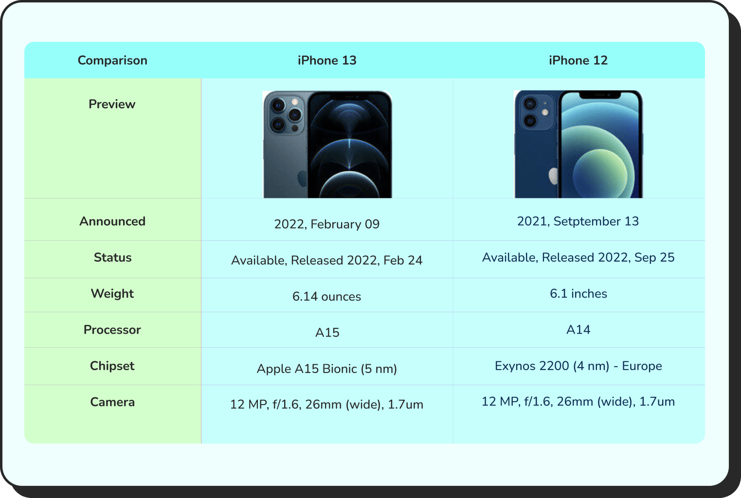
Take a look at the table below to get an idea of how a well-designed table looks!
Comparison | Product X | Product Y |
Preview |  |  |
Announced | 2022, February 09 | 2021, September 13 |
Status | Available. Released 2022, February 24 | Available. Released 2021, September 25 |
Size | 6.1 inches | 6.1 inches |
Weight | 6.14 ounces | 5.78 ounces |
Processor | A15 | A14 |
Chipset | Apple A15 Bionic (5 nm) | Exynos 2200 (4 nm) - Europe |
Camera | 12 MP, f/1.6, 26mm (wide), 1.7µm, dual pixel PDAF, sensor-shift OIS | 12 MP, f/1.6, 26mm (wide), 1.7µm, dual pixel PDAF, sensor-shift OIS |
Battery | Li-Ion 3240 mAh, non-removable | Li-Ion 3000 mAh, non-removable |
Resolution | 2532x1170 | 2532x1170 |
Buy |
Courtesy of Ninja Tables
Psychology Behind the Confusion
So, why do pricing tables fail so spectacularly? There’s legitimate psychology at play here. When your brain encounters too many options presented in conflicting ways, it experiences something researchers call “cognitive overload.” Basically, your decision-making abilities just… shut down.
Visitors land on a pricing page with genuine intent- they want to buy. But then they encounter a table that looks like a scribbled treasure map, and we’re wondering why people are looking at competitors as an easy way out.
The problem isn’t that people are indecisive. It’s that the tables aren’t giving them clear, confident reasons to choose. Missing visual hierarchy, unclear value propositions, scattered CTAs, these are all a recipe for abandonment.
Mistake #1: Visual chaos and missing hierarchy
Your eyes should know exactly where to look. They shouldn’t. Have you noticed how most pricing tables treat every single feature with the same visual weight? Headers look like body text. Prices blend into descriptions. Call-to-action buttons sit wherever there’s empty space.
Here’s what actually happens: your brain gives up. It’s not laziness, it’s self-preservation.
When everything looks equally important, nothing feels important.
Solution
To fix this, establish a clear visual hierarchy. Your recommended tier should practically glow. Prices need breathing room. Features should be organized by importance, not alphabetically. Using a tool like Ninja Tables provides flexibility, but only if you’re intentional about styling and spacing.
Size matters. Color matters. Position matters. Make these choices deliberately, not by accident.
Management and editing Unlimited tables Embed via Block or Shortcode Import from files Export of tables Formulas Basic table options Styling with CSS code Plugin Documentation Frequently Asked Questions | All Features Free Priority Email Support Responsive Tables Fixed Rows and Columns Buttons Row Grouping Counter Column Column Filter Dropdowns Individual Column Filtering Alphabet Search Search highlighting | All Features Pro Priority Email Support Custom Search Builder Periodic Table Import Advanced Access Rights Advanced Loading Server-side Processing REST API |
When all tiers blend together, visitors default to the cheapest option and leave. When one plan stands out, they see it as the obvious choice. That distinction is everything.
Use color, badges, and highlights to draw attention to your recommended plan. Add hover effects that respond to interaction. Differentiate the column with distinct styling. Make the checkout button obvious and easy to find.
PRO | Top! PLUS | BUSINESS |
4.99$/month with 4 days free trail | 9.99$/month with 4 days free trail | 19.99$/month with 4 days free trail |
1 GB Disk Space | 1 GB Disk Space | 1 GB Disk Space |
500 MB Bandwidth | 2 GB Bandwidth | 5 GB Bandwidth |
1 Sub Domain | 3 Sub Domain | 10 Sub Domain |
1 Email Account | 5 Email Account | 10 Email Account |
SMTP | SMTP | SMTP |
Monthly Traffic: 1000 GB | Monthly Traffic: 2000 GB | Monthly Traffic: 3000 GB |
Network Port: 50 Mbps | Network Port: 75 Mbps | Network Port: 100 Mbps |
Get table templates for free
WooCommerce
Amazon Products
WP Posts
Products Comparison
Pricing Table
Features Comparison
Mistake #2: Feature lists that don’t communicate value
What visitors actually need to understand is what these features mean for their lives. Not the technical specification- the outcome. “Advanced API access” means “build custom integrations that save your team 5 hours per week.” See the difference?
When features are listed without context, they’re invisible. Visitors skim over them. Worse, they might interpret them as irrelevant to their actual problem. That’s a missed opportunity to showcase genuine value.
Solution
The strategy here is to speak in customer-outcome language first, then add technical depth if needed. Better yet, organize features by benefit category rather than technical classification. Features that solve similar problems should cluster together.
Click "+" to Expand and Compare
| Model | Image | Capacity | Cooking Modes | Display | Special Features | Dimensions | Warranty | Price | Discount |
|---|---|---|---|---|---|---|---|---|---|
| Compact Series |  | 20L | Basic heating, defrost | LED display | Child lock | 45cm x 35cm x 25cm | 1 year | $129 | 20% |
| Standard Series |  | 28L | Heating, defrost, grill | LED display | Auto cook menus | 52cm x 40cm x 30cm | 2 years | $199 | 30% |
| Premium Series |  | 32L | Heating, defrost, grill, convection bake | Touch control with LCD | Smart sensor cooking, voice assistant compatible | 55cm x 42cm x 32cm | 3 years | $349 | 40% |
Mistake #3: Unclear comparison and hidden information
This one’s sneaky. Your pricing table might technically contain all the right information, but it’s arranged in a way that makes comparison nearly impossible. Do you have to scroll horizontally? Click + to reveal hidden features? Hunt through footnotes?
You’re essentially making visitors work for the privilege of understanding your prices. That’s not strategy—that’s self-sabotage.
Rhetorical question: Would you buy something when you’re not even sure what you’re actually paying for? Most people won’t either.
Solution
The modern solution is a responsive design that works beautifully on mobile and desktop. On smaller screens, your visitors need to easily switch between plans and see full feature lists without excessive scrolling. On a desktop, side-by-side comparison should be immediate and effortless.
Hidden information breeds distrust. Transparency breeds confidence. Every feature comparison, every price detail, every limit should be visible without extra clicks.
| 1 | 2 | 3 |
|---|---|---|
 Winter Starter Pack - Cozy Picks A budget-friendly bundle!
Ships by: 1 Week Price: $29.99 Sale Ends: Tomorrow |  Holiday Essentials - Most Popular The all-rounder bundle!
Ships by: 4 Days Price: $59.99 Sale Ends: Monday |  Festive Luxury - Premium Choice Gift that leaves impression!
Ships by: 2 Days Price: $149.99 Sale Ends: Tonight |
Mistake #4: Weak or missing call-to-action
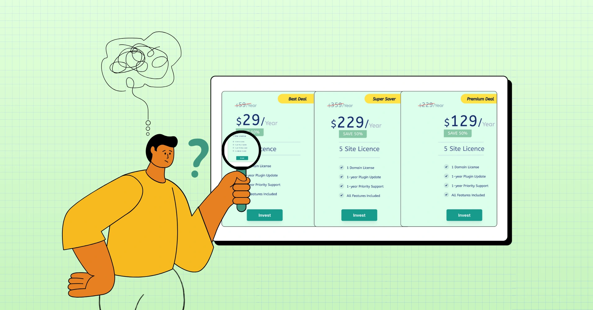
Your pricing table is basically a landing page within a landing page. And like any landing page, it needs a clear, compelling CTA. Yet most pricing tables have buttons that say… “Get Started”? “Sign Up”? “Buy Now”? Or worse- confusing “Invest” (!) and customers wonder what that even means!
Generic CTAs don’t move needles.
Solution
Actually compelling CTAs connect to the visitor’s specific situation. “Start free 14-day trial” beats “Get Started” every single time. “Try for your team” outperforms “Sign Up.” The specificity matters because it reduces perceived friction. You’re showing them exactly what happens next.
And here’s the critical part: the CTA should be visible without scrolling. Visitors shouldn’t have to hunt for the button to actually purchase. It defeats the entire purpose of having a pricing page.
| Image | Name | Category | Price | Quantity | Buy |
|---|---|---|---|---|---|
 | Beach essentials | Summer | Original price was: $50.00.$38.00Current price is: $38.00. | | |
 | Beach slippers | Summer | $15.00 | | |
 | Beach towel | Summer | $33.00 | | |
 | Beach hats | Summer | $28.00 | |

Create Smart Data Tables Easily!
Mistake #5: Features without comparison
Another big problem: features are often listed, but not contrasted. A checkmark alone doesn’t tell you much. Checkmark compared to what?
The real power of a pricing table is difference visualization. Showing not just what’s included—but how plans meaningfully diverge.
This means:
- Highlighting exclusive features
- Showing thresholds (e.g., limits, scaling, capacity)
- Clarifying upgrade triggers (“You’ll need this plan when…”)
Solution
Instead of three identical “Support” rows, try:
- Email support (48h response)
- Priority support (12h response)
- Dedicated success channel (real-time)
Now it tells a story. Now visitors can recognize themselves in a column. That recognition moment- that “oh, that’s me” feeling is where decisions start forming.
 Pricing: Product X
Released: July 2025
Seller: ElectroMag
| Plan | Monthly | Annually | You save | USP | Action |
|---|---|---|---|---|---|
Agency | $159 | $1590 | 10% | 24/7 support | Buy |
Professional | $79 | $790 | 20% | AI infusion | Buy |
Starter | $29 | $290 | 17% | Drag-and-drop | Buy |
Mistake #6: No context for different user types
Here’s the thing: a startup founder and an enterprise decision-maker are looking at your pricing table with completely different questions in mind. One’s worried about monthly spend. The other is thinking about ROI and implementation timelines. Yet most pricing tables pretend everyone’s the same visitor.
They’re not. And your table should acknowledge that.
Solution
Modern pricing displays are getting smarter about audience segmentation. Some companies now use toggle switches that let visitors see pricing customized for their use case- annual vs. monthly, small team vs. enterprise, specific feature sets vs. everything.
The magic question to ask yourself: who are the different people evaluating this pricing page, and what matters most to each of them? Once you answer that, your table can be structured to answer those specific concerns.
Single Site License | Agency License | Unlimited License |
79$/year (1 Domain) | Popular 129$/year (20 Domain) | 299$/year (Unlimited Domain) |
1 Year Plugin Update | 1 Year Plugin Update | 1 Year Plugin Update |
1 Year Priority Support | 1 Year Priority Support | 1 Year Priority Support |
All Features Included | All Features Included | All Features Included |
 | | |
Single Site License | Agency License | Unlimited License |
309$/year (1 Domain) | Popular 499$/year (20 Domain) | 749$/year (Unlimited Domain) |
1 Year Plugin Update | 1 Year Plugin Update | 1 Year Plugin Update |
1 Year Priority Support | 1 Year Priority Support | 1 Year Priority Support |
All Features Included | All Features Included | All Features Included |
| | |
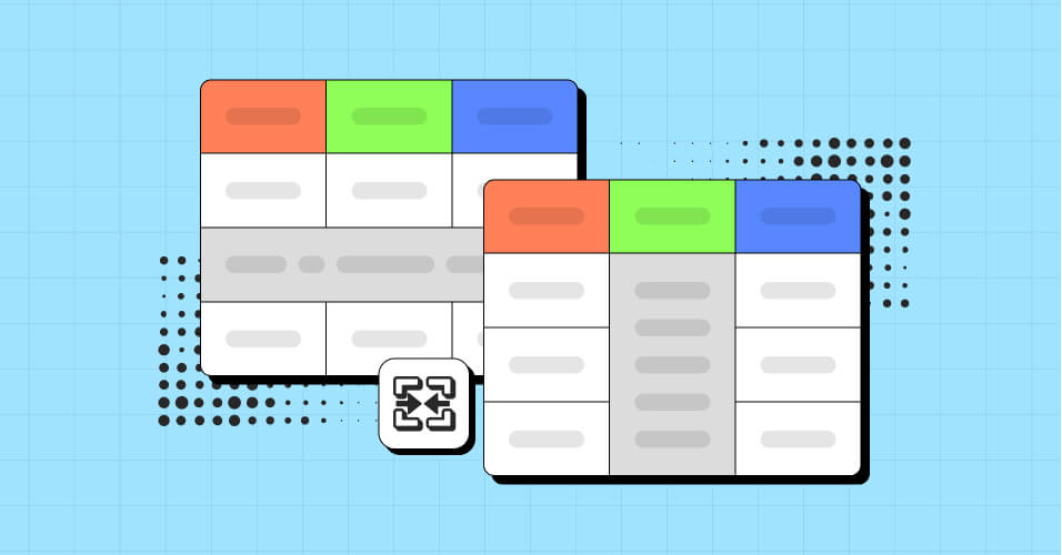
The Quiet Role of Structure (Where Most Tables Win or Lose)
Most pricing tables confuse visitors because they overload users with too much information, lack clear value differentiation between tiers, and suffer from poor mobile optimization, leading to decision paralysis.
This is where tools like Ninja Tables quietly change the game- not by being flashy, but by making structured comparison easier to build and maintain. We’ve gathered 15+ high-converting pricing table design examples for any website you can get inspired by.
Because structure is what allows:
- Logical grouping
- Conditional highlighting
- Responsive reflow for mobile
- Filterable or collapsible sections
- Scannable layouts instead of static grids
And when structure improves, conversion rate rides high.
Exciting new layout controls, responsive behaviors, and conditional formatting features in modern table builders are honestly one of those moments where you go, “Wait—pricing tables don’t have to be painful anymore?” Surprise shows up. In a good way.
So, instead of designing a pricing table as a one-time graphic, it becomes a living interface.
That’s a big shift.
Common Pricing Table Mistakes to Avoid
Too many tiers. More than four options and you’re creating paralysis, not choice. Most visitors will gravitate toward the middle option regardless, so consider whether that extra tier actually serves a purpose.
No highlight or badge to most ideal plan. Without a visual distinction, visitors see no difference between plans. If every tier looks identical- same colors, same effects, same styling. You’re not guiding anyone toward your recommended plan. You’re just displaying options.
Inconsistent feature availability. If you’re going to claim a feature is included in a tier, make sure it actually is. Hidden limits and restrictions discovered after purchase destroy trust.
Complicated pricing models. Usage-based pricing, seat-based pricing, or feature-based pricing can all work beautifully- but they need a clear, transparent explanation. No surprises at checkout.
Abandoning your table on mobile. Seriously. Test this. Some pricing tables completely change structure on mobile, making comparison impossible. Visitors abandon within seconds.
Forgetting about currency and payment terms. International visitors shouldn’t have to guess about exchange rates. If you support multiple currencies or payment methods, display that clearly.
We tested 11 pricing table best practices and ideas for conversion across different businesses. Some work everywhere. Others work for specific situations. You’ll find actionable ideas in each one.
The Technical Execution: Building Tables That Work
Let’s get practical. You could hand-code HTML tables, but that’s exhausting and inflexible. You could use spreadsheet-style tools, but they often look… spreadsheet-y. Tools like Ninja Tables exist precisely because pricing tables are complex enough to warrant specialized solutions.
What you actually need is:
Responsive behavior that adapts gracefully to every screen size. Your mobile visitors aren’t second-class citizens- they deserve the same clarity as your desktop visitors.
Easy customization without touching code. You should be able to adjust colors, typography, spacing, and content without requesting developer time for every small change.
Feature comparison logic built in. Toggling features on and off, organizing them by category, showing/hiding based on tier- these features should be native to your tool, not hacks you’ve jerry-rigged together.
Performance that doesn’t drag. Your pricing page should load instantly. No bloated table libraries that slow down your whole page. Every millisecond of delay loss of conversions.
What high-clarity pricing tables do differently
They don’t try to impress. They try to orient.
High-performing pricing tables usually:
- Start with who, not what
Each plan answers: Who is this for? before What does it include? - Translate tech into outcomes
“Server-side processing” becomes “handles large datasets without slowing your site.” - Create a visual hierarchy
One column is easier to focus on. Others support the decision. - Limit and spotlight
Not every feature is equal. The table admits that. - Support fast scanning
Short lines. Clear groupings. Breathing room. - Respect mobile behavior
Collapsing, stacking, or filtering instead of shrinking into unreadable grids.
And yes, they leave some space for curiosity. Because curiosity keeps people engaged…
Building Tables That Actually Work
So, if pricing tables keep confusing visitors, it’s not because users “don’t get it.” It’s because the table wasn’t built to guide. Most tables work like spreadsheets instead of decision-making tools. They list features instead of showing value.
When you fix this, something shifts. People stop scanning prices. They start seeing themselves in the options. They spot the right fit. The decision becomes obvious instead of painful.
A working pricing table has these traits: clear visual hierarchy that guides the eye, feature descriptions that explain outcomes, not features, transparent pricing with no surprises, and a responsive design that works everywhere.
Your competitors probably haven’t fixed theirs yet. They’re still losing conversions daily to confusing displays. This is where you gain ground.
The principle is simple: clarity beats chaos. Your visitors don’t need to be impressed. They need to be confident in their choice.
When you look at a pricing page and feel instant frustration, that instinct is correct. The table is the problem, not you.
Ninja Tables– Easiest Table Plugin in WordPress


Add your first comment to this post