
How to Make A Bar Chart or Graph in WordPress


If you’ve ever built a chart in Excel or Google Sheets, screenshotted it, and pasted it into a WordPress post as an image, you already know the problem.
The moment your numbers change, that chart is outdated, and now you’re back in Excel, re-exporting, re-uploading, and re-editing alt text.
A bar chart built directly inside WordPress eliminates this hassle. When your data changes, the table updates automatically, and the chart updates right along with it.
If you’re running a WordPress site, you can make a bar chart in a few clicks using a plugin you probably already have on your dashboard or one you can install for free in under a minute.
In this guide, we’ll walk through exactly how to make a bar chart in WordPress using Ninja Tables and Ninja Charts, plus what to avoid so your chart actually looks good once it is live.
Key takeaways
What Is a Bar Chart?
A bar chart (also called a bar graph) displays data using rectangular bars, where the length or height of each bar represents a value. The bigger the number, the longer the bar.
So what does a bar graph look like in practice? Think of a row of bars sitting side by side, some tall, some short, each one labeled with a category like a month, a product name, or a survey answer.
It’s one of the simplest chart types to read because comparison is instant. You do not need to study an axis for ten seconds to know which bar is winning.
Bar charts can run vertically (sometimes called column charts) or horizontally, and they can also be stacked, meaning multiple data sets are shown within a single bar instead of side by side. We’ll get into how to make a stacked bar chart a bit later.
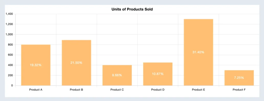
What Is a Bar Chart Used for?
Bar charts show up almost everywhere because they work for almost any comparison. A few real examples:
Sales reports
Comparing revenue across months or product lines is one of the most common bar graph examples out there. At a glance, you can see which month spiked, which product is dragging, and where to focus next quarter.
Survey results
When you ask people to pick from a set of options, a bar chart shows exactly how the votes stacked up. It’s far easier to compare five bars than to read through five percentages buried in a paragraph.
Website analytics
Comparing traffic sources or top-performing pages side by side makes patterns obvious fast. You can spot which channel is actually pulling weight without digging through rows of numbers in Google Analytics or Search Console.
Inventory tracking
Comparing stock levels across product categories helps you catch what’s running low before it becomes a problem. A quick visual scan replaces scrolling through a spreadsheet row by row.
Election or poll results
Vote share comparisons are practically built for bar charts. Each candidate or option gets its own bar, and the winner is visually obvious before you even read the numbers.
If you are trying to decide between a bar chart and something else, like a line chart, for tracking change over time, we’ve actually broken that down in our line graph vs bar graph comparison. Worth a quick read if your data has a time element to it, since that is where the two get mixed up the most
And if you’re working with sales numbers specifically, our guide to sales data visualization has more chart-picking pointers.
Why Add a Bar Chart to Your WordPress Posts?
Text-heavy blog posts, especially ones full of stats and numbers, tend to lose readers halfway through. A well-placed chart breaks that up and gives people something to actually look at instead of skim past.
It also tends to keep visitors on the page longer, which is good news for both engagement and how your content performs in search.
This is where a bar graph maker built right into your WordPress dashboard comes in handy. Instead of screenshotting a chart from Excel or Google Sheets and uploading it as a flat image, you get a live, interactive chart that updates automatically whenever your underlying data changes.

Get Exclusive Tips, Updates, and Inspirations in Your Inbox!
How to Make a Bar Chart in WordPress With Ninja Tables
You don’t need design software or a developer for this. You can easily create a bar chart with Ninja Tables along with every other chart type, and the whole thing runs from your WordPress dashboard.
Here’s the 4-step process, start to finish.
Step 1: Install Ninja Tables and activate Ninja Charts
First,
- Install and activate Ninja Tables on your WordPress dashboard
- From the dashboard, click on Charts and enable Ninja Charts
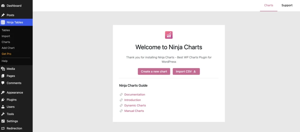
It’s the free companion plugin that turns your table data into charts. It installs automatically once you toggle it on inside Ninja Tables, so there’s no separate setup involved. Even on the free version of Ninja Tables, the chart feature works fully.
Step 2: Turn the table into a bar graph
If you already have a table with the numbers you want to visualize, great, you can use that.
If not, build a quick one. Say you’re comparing monthly traffic across multiple sources. Set up columns for the sources and the numbers for each month, add your rows, and save the table.
- Click on “Create a new chart” or “Add Chart”
- You can also import a CSV file directly if your numbers are already sitting in a spreadsheet
- Give a name to your chart and select Chart Renderer to “Chart.js“
Step 3: Pick your chart type
When you select a renderer, multiple chart-type previews will appear.
- Pick your chart type to Bar Chart and click Next
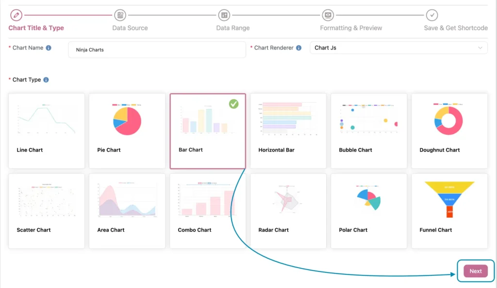
- Next, set your data source to Ninja Tables and select the table you just created or an existing one.
- Pick which columns should become your bars, and Ninja Charts will generate the chart automatically from that data.
You can also manually input your data, where you type in your labels and values by hand. Handy for one-off charts that don’t need a full table behind them.
Step 4: Formatting and review
This is where the chart actually becomes yours. You can adjust colors, fonts, axis labels, legend position, tooltips, and padding, all in real time, with a live preview so you see exactly what changes before saving.
Need multiple data sets inside the same bar instead of side by side? This is also where you’d switch on “Show stacked chart,” which is really all it takes to build a stacked bar chart in Ninja Tables.
Once it looks right, click “Update.” It’ll save your bar graph and will generate a shortcode.
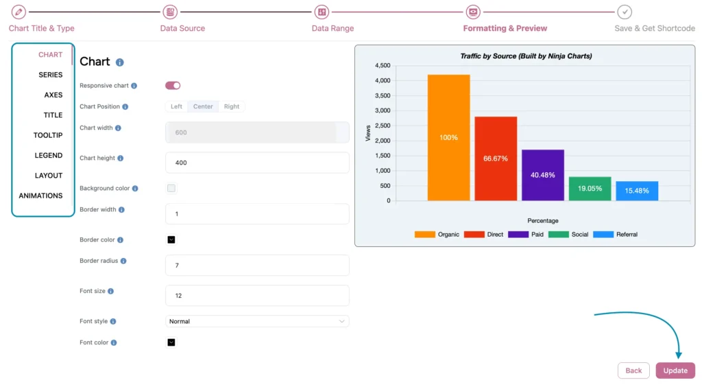
That’s the whole process of making a bar graph.
Drop that shortcode into any post or page, and your chart is live.
If you’d rather start from something pre-built, the free table templates library has layouts you can adapt into a bar graph template with your own data swapped in.
Get table templates for free
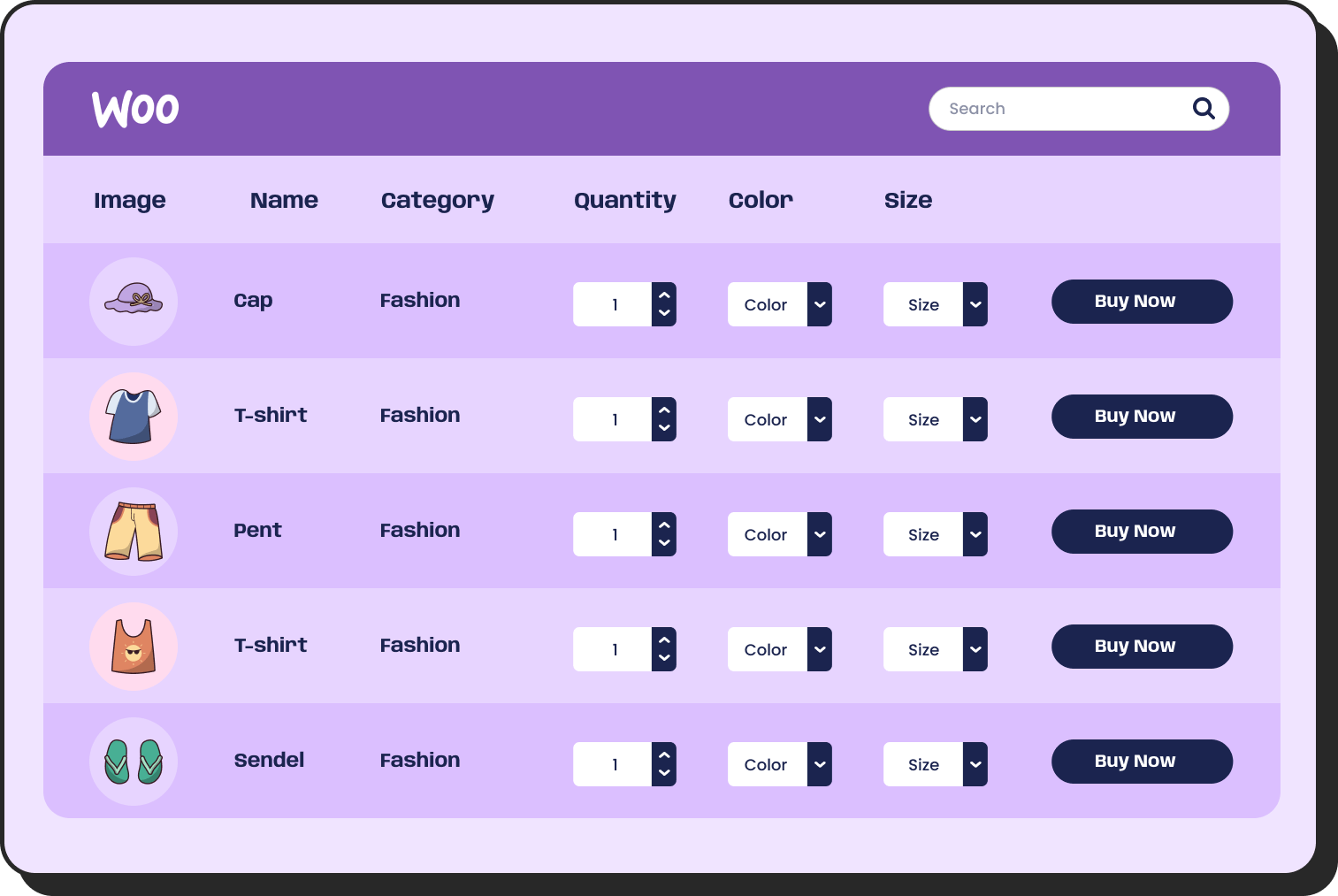
WooCommerce
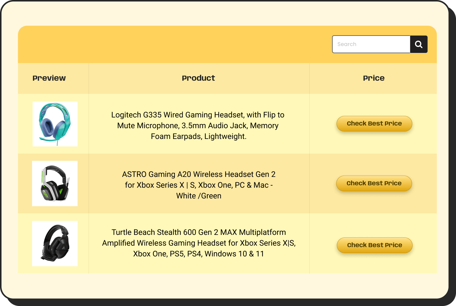
Amazon Products
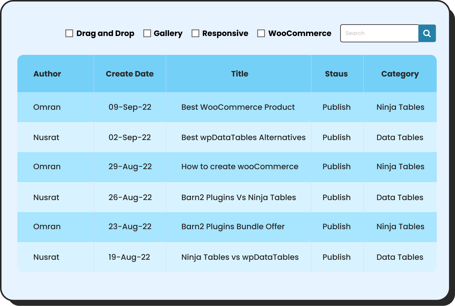
WP Posts
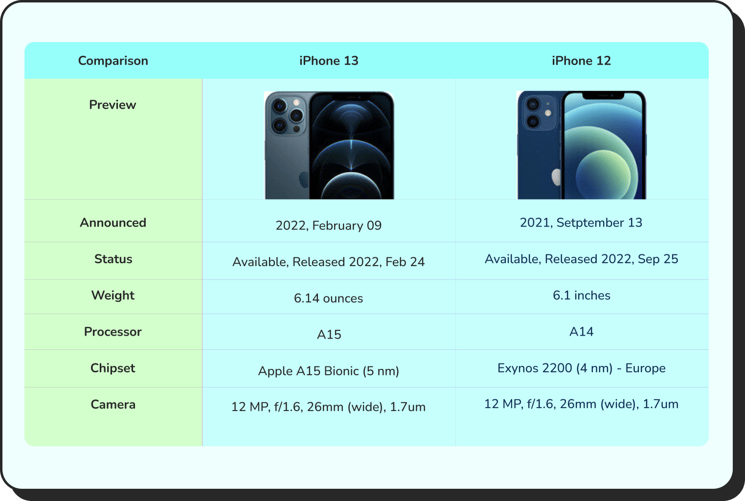
Products Comparison
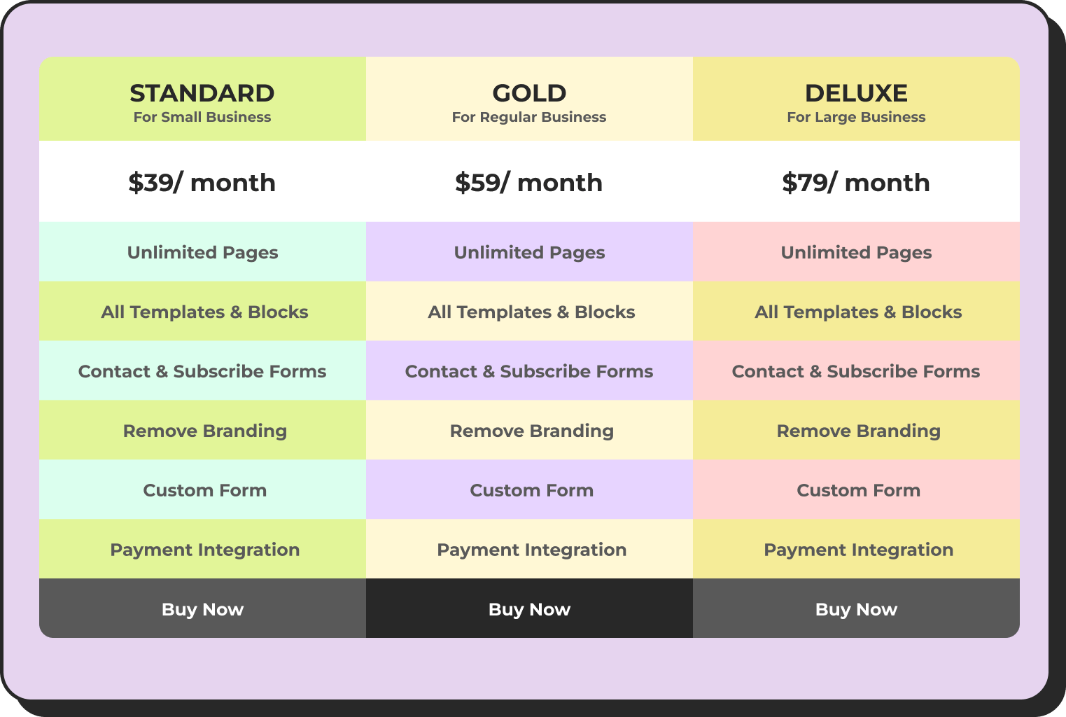
Pricing Table
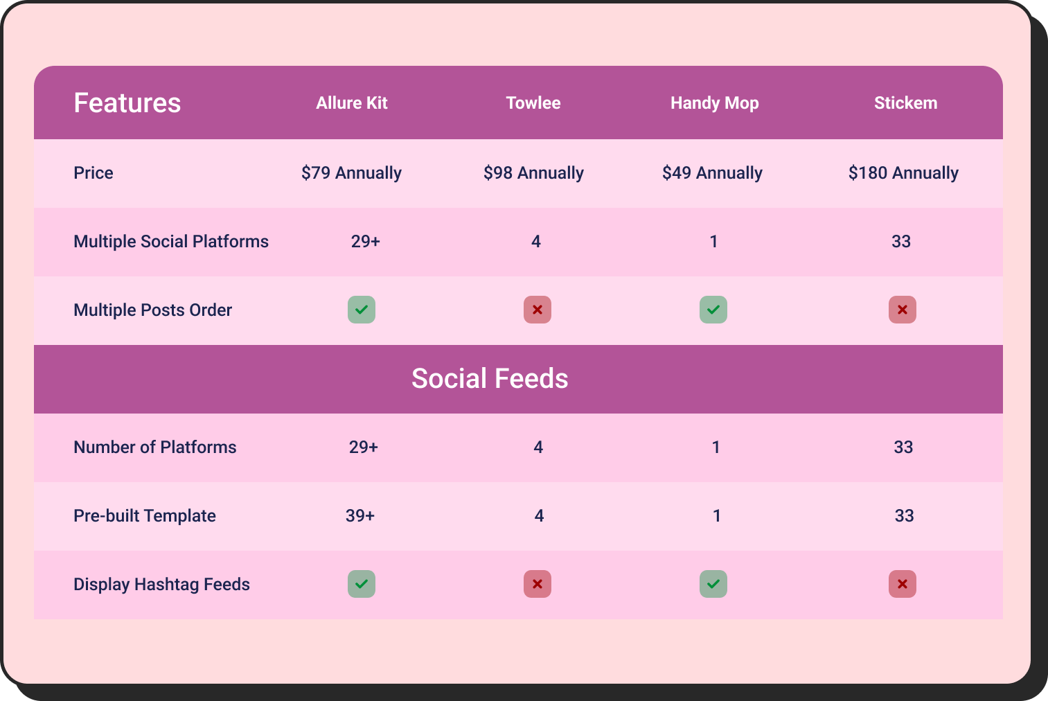
Features Comparison
Mistakes to Avoid While Creating a Bar Graph
It’s pretty simple to make a bar chart with Ninja Tables, but here are some things that can easily make it confusing. Watch out for these:
- Too many bars at once: past 8 to 10 categories, a bar chart starts looking cluttered rather than clear. Consider grouping smaller categories.
- Inconsistent or misleading scale: starting your y-axis at a number other than zero can exaggerate differences that aren’t really there.
- Using a bar chart for the wrong data: if you’re showing a trend over time with many data points, a line chart usually reads better. Bar charts shine at comparison, not continuous change.
- Skipping axis labels: a chart without labeled axes forces readers to guess what they’re looking at.
- Low contrast colors: bars that are too close in shade make it hard to tell them apart, especially for readers with color vision differences.
Most of these come down to one thing: picking the right chart for your data in the first place. If you’re not sure a bar chart is even the right call, our comparison chart types guide walks through when each chart type actually fits.
Read More: 7 Types of Comparison Charts for Effective Data Visualization
Start Building Your Bar Chart in WordPress
You don’t need design skills or separate software to make a bar chart in WordPress. With Ninja Tables, you build the table, pick your chart type, and customize it, all from your dashboard, all for free.
No exporting screenshots from Excel, no re-uploading every time your numbers shift. Update the data, and the chart updates itself.
Whether you’re comparing monthly sales, showing survey results, or breaking down traffic by source, the same three steps get you there. And once you’ve made one bar chart in WordPress, the next one takes even less time, since you already know exactly where everything lives.
FAQs
Can I make a bar chart in WordPress for free?
Yes. Ninja Tables and Ninja Charts are both free plugins, and the chart-building features work fully without needing the pro version.
What is the difference between a bar chart and a bar graph?
Nothing really; they’re the same thing. “Bar chart” and “bar graph” are used interchangeably.
Can I create a stacked bar chart with Ninja Charts?
Yes. While customizing your chart, toggle on “Show stacked chart” under the axes settings to display multiple data series within the same bar.
Do I need coding knowledge to use Ninja Charts as a bar graph generator?
No. Everything from chart type to colors and labels is handled through a visual interface; no code required.
Will my chart update automatically if my table data changes?
Yes, as long as your chart is connected to a Ninja Tables data source rather than manual input, any updates to the table will reflect in the chart automatically.

Ninja Tables– Easiest Table Plugin in WordPress







Add your first comment to this post