
Good Data Visualization: Master the Art of Visual Storytelling

In Brent Dykes’s book, Effective Data Storytelling he says:
“Data visualization is not just about pretty pictures; it’s about telling a story with data.”
Now, imagine dumping all data and statistics into a graph, only to find out it doesn’t make any impact on your audience! To truly captivate your audience, it’s better to embrace the power of good data visualization.
Remember, turning data into pictures is merely a part of visualization, the true purpose lies in conveying a story that connects with people.
Let’s dive in and reveal the secrets of effective data visualization and understand why it is a must-have skill today. This post will equip you with the best practices to help you create outstanding visualizations that will bring your data representation to life.
Why do we need good data visualization?
Human brains are designed to process information quicker from visuals than texts. Study shows that – the brain processes visual data at a rate of 90%. So, when you’re providing good visuals you’ll be giving accurate information to the people.
Data visualization relies on information and patterns, as raw data is complex to comprehend, visualization turns complex data into a powerful source of communication.
When illustrated in the right way – your information turns into a compelling story that vividly illustrates patterns and effectively makes an impact.
But, how can you determine if your data visualization is effective and understandable? The answer is, simply to minimize the common errors and visualize them in a good way. Data visualization stands on two basic formulas:
- You must find and showcase the correct patterns hidden in the raw data that were too complex to comprehend in its initial state.
- Present accurate information clearly and concisely that can be easily graspable by your targeted audience.
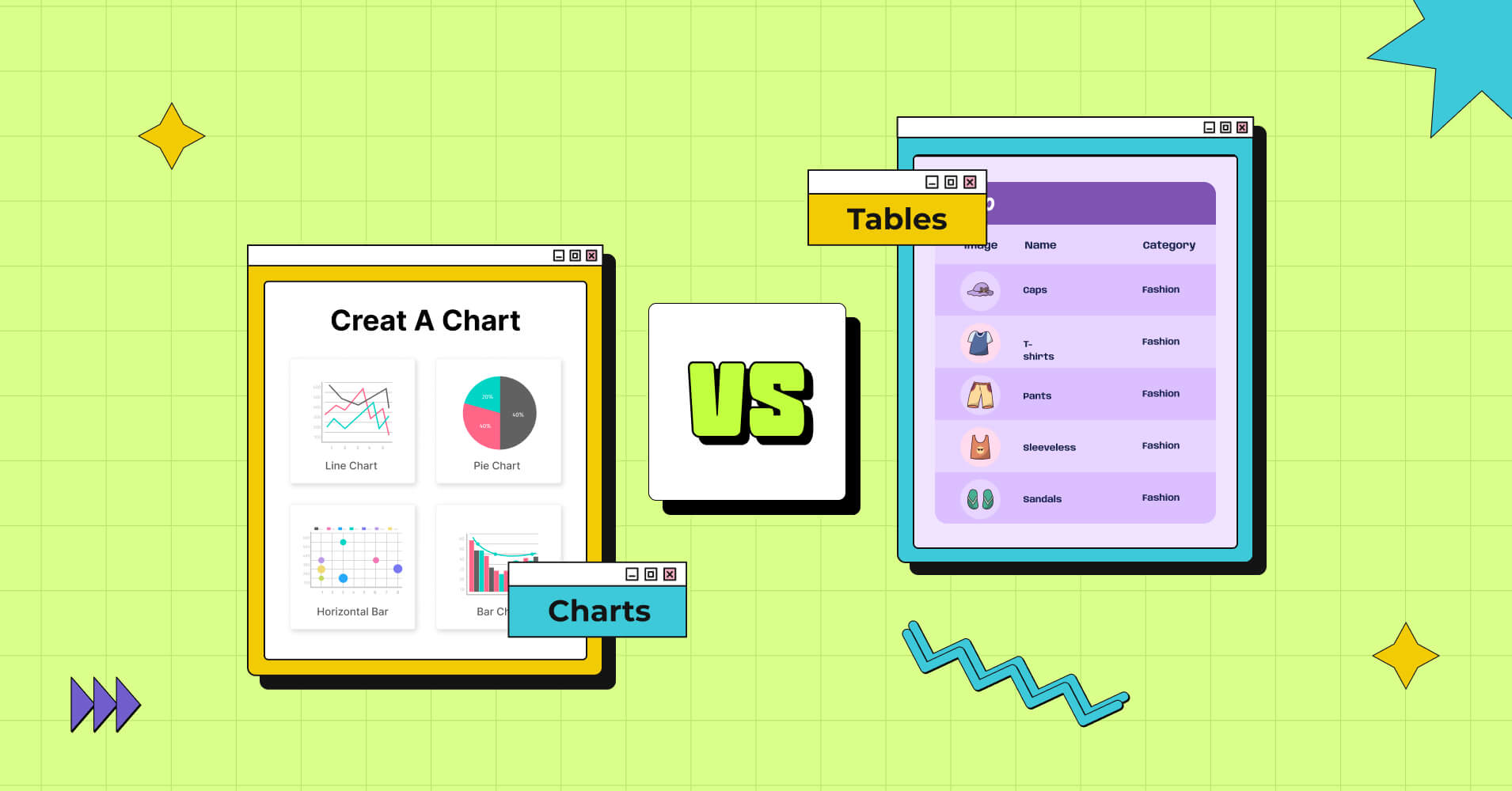
6 key components of effective data visualization

Data visualization might seem a simple task since you can visualize any data with tables, graphs, or charts. However, when it comes down to good data visualization, without proper skills and techniques, it can be a challenging task to complete!
“Data is the new oil, but without good visualization, it’s just crude.” -Andy Kirk
Let’s dive down to unleash the secret of data visualization best practices.
Clear and precise
Your data visualization should be like a shining beacon of clarity, illuminating insights with precision and ease, be it trends, comparisons, or correlations – make sure your audience can effortlessly comprehend the insights hidden in the data.
“By visualizing information, we turn it into a landscape that you can explore with your eyes, a sort of information map. And when you’re lost in information, an information map is kind of useful.” – David McCandless
McCandless gets to the heart of it – so, for data visualizations that effectively capture your audience’s attention, start by defining the why behind your visualization.
By understanding the purpose and potential engagement of your audience, you can create meaningful and easily understandable visualizations that will serve a purpose to your audience.
Audience-specific
Your visualization will be a guide to your audience so before creating visuals from the data you must know your audience and their specific requirements.
To achieve this, put yourself in your audience’s shoes and ask questions like: Do I know the context of my visualization? Am I serving my audience’s purpose? Is my visualization clear and concise? Or, am I providing too much information?
Once you can answer these questions, you will have unlocked the key to creating good data visualizations.
Right form of representation
The utmost important part of data visualization is to choose the perfect form that can do justice to your data.
There are numerous ways you can do data representation, each with its unique purpose, it is vital to find the proper form that best fits your data – delivering what your audience needs in an eye-catchy and meaningful way.
Here are a few suggestions for visual representation you can use:
Comparisons
Data comparison is one type of Table Data Visualization that represent a wide range of relationships, whether it’s between products, features, brands, prices, sizes, or even pros and cons.
It can be represented using Bar Charts, Line Charts, Column Charts, and any other comparison diagrams. By using any of such representations that suit your dataset, you can easily visualize the connections and contrasts among different variables clearly and concisely.
| Features |  |  | ||
|---|---|---|---|---|
| Table Design Options | Unlimited | Limited | Unlimited | Limited |
| Colors | Unlimited | Limited | Unlimited | Limited |
| WooCommerce | ||||
| Google Sheets sync | ||||
| WP Posts table | ||||
| Drag & Drop | ||||
| Pre-built templates | ||||
| Custom filter | ||||
| Export-Import Table | ||||
| Fluent Forms integration | ||||
| Advanced Styling | ||||
| ACF Field Mapping | ||||
| Charts | ||||
| Conditional formatting | ||||
| Value transformation | ||||
| Custom CSS |
Interactive Visuals
Interactive visuals are tables that allow you to sort, filter and search from data. It is the most easiest and useful medium of visualization.
Here’s an example of a WooCommerce Product Table.
| Image | Name | Category | Price | Quantity | Rating | Buy | |
|---|---|---|---|---|---|---|---|
| Beanie with Logo | Accessories | Original price was: $20.00.$18.00Current price is: $18.00. | | In Stock | |||
 | Beanie | Accessories | Original price was: $20.00.$18.00Current price is: $18.00. | | In Stock | ||
 | Belt | Accessories | Original price was: $65.00.$55.00Current price is: $55.00. | | In Stock | ||
 | Cap | Accessories | Original price was: $18.00.$16.00Current price is: $16.00. | | In Stock | ||
 | Sunglasses | Accessories | $90.00 | | In Stock |
The WooCommerce product table is designed by Ninja Tables.
Trends
To illustrate the patterns or fluctuations of various variables, whether distinct or similar, Line Charts or Column Charts can be your go-to data visualization technique.
Correlations
Scatter plots can help you uncover the hidden relationships and correlations between two variables, making it easy to spot any outliers or unusual patterns in the data.
An example of this can be a chart that shows the relationship between a person’s age and income. Each point present in the chart shows age and income, and the position of the point indicates how much they earn at a particular age.
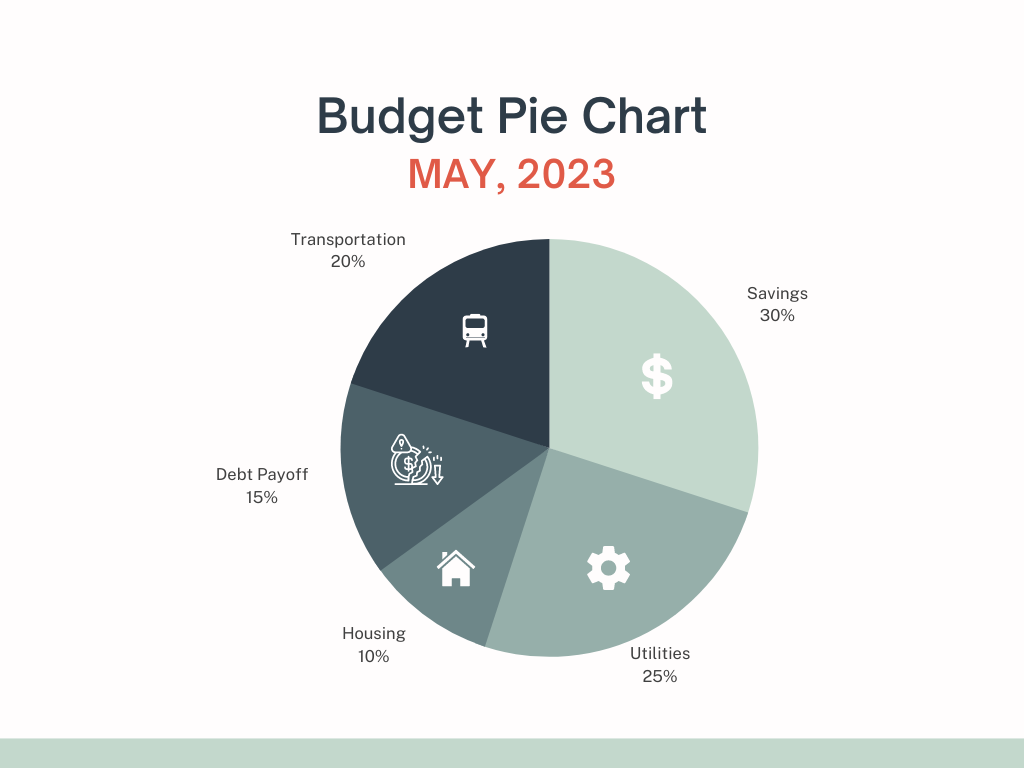
Part to whole
If you want to demonstrate how different parts of data contribute to the whole, Pie charts come in handy. They are perfect to represent the distribution of items within a category, proportionally.
Data Overview
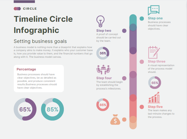
Infographics are a powerful tool to portray complex information in an easily digestible format using pie charts, bar graphs, and minimal text. The aim is to provide a holistic view of data through dynamic and visually appealing graphics.
Design fundamentals
Learning the design fundamentals include understanding the value of labeling, color, and text usage in your visualization.
Coloring
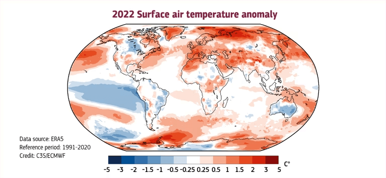
It plays a vital role in data visualization – which makes your visualization engaging to the audience. So, understand the impact the correct use of color brings to your design. We recommend,
- Use contrasting colors to highlight the differences while comparing.
- To showcase the degree of progressions such as in ratings, and temperature, use a gradient of the same color.
- Keep color consistent across the whole visualization, and use the same color for the same kind of data.
- Use colors that the viewer can associate with e.g. to visualize greenery with the green color or use blue to represent the ocean.
As we told earlier, the below image shows the 2022 surface air temperature anomaly.
Labeling
Labeling helps to identify what the visualization is trying to mean. Here are some basic tips for better labeling exercises:
- Always label your design with a headline/ title as it means what you are trying to depict.
- Only a title will not be enough sometimes so you need to label your axes for better representation.
- Label your data points if they are not clear enough to comprehend.
Avoiding bad data visualization
Visualizing data effectively elevates the quality of insights, whereas bad data visualization misleads the audience. Some of the bad data visualization practices are:
- Hiding important data to make the visualization more appalling or to make a point seem stronger.
- Overuse of information can mislead your audience thus you need to know your data and understand where you need to focus.
- Using too many colors that can confuse the audience too.
- If you don’t label your data when creating the visualization, the intended meaning of the visualization won’t be understood.
Storytelling with data
Storytelling with data is the practice of conveying a message or pattern from the data that can eventually help your audience to make a data-driven decision.
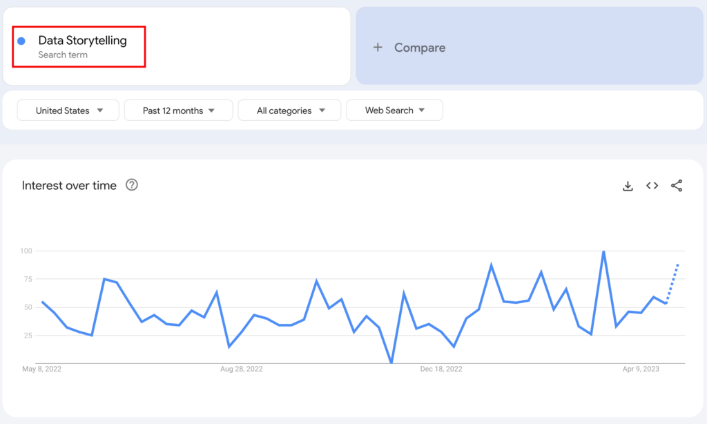
But does the term “data storytelling” really exist? And Does it create any impact?
Well, according to Google Trends queries for data storytelling, shows that it has become a popular concept in the USA over the past year. So, visual storytelling inevitably creates an impact on the viewer’s mind.
To convey a compelling story, you need to identify the key message, select the most relevant data points and then visualize as per your audience preference to support that story.
By effectively visualizing data, you’ll provide insight into the complex information to influence your audience in data-driven decision-making.
WordPress data visualization tools free
Up to this point, we’ve learned the importance of good data visualization, but do we know how to achieve it? If you are one of the 43% of WordPress users, the below list is about some WordPress free data visualization plugins.
Ninja Tables
Whether you’re showcasing products or services, the Ninja Tables plugin is a go-to option for creating stunning visuals for your website with ease!
It offers all the essential table-building features you need and also Ninja Charts, a feature-rich chart and graph maker.
The drag-and-drop user interface allows you to design interactive responsive tables easily. And with the advanced table builder, you can create almost any kind of table for your website.
Create Smart Data Tables Easily!
Visualizer
Visualizer: Tables and Charts Manager, a dynamic plugin that helps you to build fully customized tables and charts. It provides many handy features to users and has both free and premium subscription plans.
With its free version, you can create multiple interactive charts and tables that can be used for your blogs, posts, or products. Upgrading to the premium plan enables you to use the full potential of the plugin by getting access to many cool features like importing data from various sources, as well as a real-time editing feature.
TablePress
TablePress is another powerful WordPress table-building plugin that allows users to create tables on their websites. The most amazing thing about TablePress is that it comes up with many cool features like the ability to add, edit, sort, and filter data from your table.
wpDataTables
wpDataTables, another trusted and well-known WordPress visualization plugin alternative. Moreover, you will be able to create cool tables and charts with this. This free tool provides an array of features for you to make stunning visuals so you can visualize your data with ease.
Wrap-up
Good data visualization can be challenging, as it requires a combination of design skills, knowledge, and a deep understanding of the audience’s psychology. We’ve tried to cover all the key aspects of what makes data visualization effective.
So, focus on building your skills accordingly and leave the rest to our tools, Ninja Tables and Ninja Charts. With their powerful features, you can create impressive visualizations in no time.
Ninja Tables– Easiest Table Plugin in WordPress
That’s all for today. Share your thoughts and queries in the comment section below.


Great job for today, my father is a police officer so the whole data reminds me of an incident, that touk place a couple of months ago,