7 Types of Comparison Charts for Effective Data Visualization
Picture yourself facing a mountain of data, begging to be understood. You’ve got the knowledge to compare and analyze, but there’s a challenge: which comparison chart or graph is the perfect match for you?
You’re not alone! We’ve all been there – wasted our precious time and energy.
But, fear not, we have found the answer to your data visualization woes.
Here’s the thing, we compare data to uncover insights from patterns and trends – be it business, sports, social media analysis, or scientific experiments. Based on the data, you’d (probably) opt for a comparison graph.
However, for effective data visualization, you must choose the best chart to compare data.
In this article, we will introduce you to the concept of comparison charts and provide you with a brief idea of the types you can use that best fit your data.
What is a Comparison Chart?
A comparison chart is a data visualization method that allows you to compare and find contrast among different sets of variables. When variables are plotted in a chart – it shows relationships, patterns, and trends, making it easier to make informed decisions.
Importance of Making A Comparison Chart
Raw data are complex to understand, so you need to figure out a way to make it digestible. And, this is where a comparative chart comes to play.
A well-visualized data compared with charts is like a window to insights. It allows us to see the stories hidden behind the numbers.
So, here’s why it is so important for data comparison:
- Simplifies information to make it easier to understand patterns from the variables.
- By evaluating data points a person can select a product or service quickly.
- One of the clear and organized methods for effective data visualization.
- Saves time and effort in comprehending insights from complex data.
- Effectively highlights similarities and dissimilarities that enable better data evaluation.
7 Best Data Comparison Charts for Effective Data Visualization
There are several types of charts that can be designed for data visualization, but keep that in mind – not all charts are used for data comparison.
Following are the best comparison graph trusted by industry experts for effective data visualization:
Pie Chart
A pie chart AKA a comparison circle chart is the most common data visualization technique to compare the sizes or percentages of different categories within a whole data set.
*Courtesy of Ninja Charts
Marketing, finance, sales, and sports are the sectors that heavily involve these circle charts for data visualization. For better understanding – in cricket matches, they represent how a batsman scored runs in different sectors of the field using pie charts.
Primary use case:
- If you want to showcase part-to-whole comparisons.
- Illustrate proportions that have the most and least importance at a glance.
- When you have limited categories to represent that deal with percentages or numbers.
Bar Chart
A bar chart (or bar graph) is the simplest chart type for comparing different categorical data. You can create visually appealing bar charts that can be plotted both horizontally or vertically.
Most commonly, these charts consist of an x-axis that represents categories, while the y-axis represents the numerical values. Rectangular bars represent separate categories – that are presented in different colors to make a visually appealing graph.
Charts and tables for sales data reporting.
Primary use case:
- When illustrating a comparison of variables across different subgroups of data.
- To analyze and compare numerical data across large categories or groups.
- If you want to monitor changes over time, particularly if the amount is significant.
Histogram
It is a popular chart simply created for comparing numerical variables. It outlines quantitative data, such as height, weight, temperature, and length, which are measured by dividing the data into intervals or bins.
In such representations, intervals or bins are represented by the chart’s x-axis, and the frequency of data points in each bin is represented by the y-axis. The rectangular bars are next to each other because their bases cover the intervals, the taller the bar, the higher the frequency.
Primary use case:
- When you want to show the frequency of numerical data within specific intervals.
- To analyze whether the process changes from one period to another.
- Useful when dealing with data sets that consist of large numbers of data points
Line Charts
It is a visual representation that displays information as a series of data points connected using single or multiple continuous lines. Moreover, the data points depict the trend or pattern for a variable over a second variable for a certain period of time.
Typically, the x-axis represents the categories equally, while the y-axis represents numerical measurement values.
Learn how Ninja Charts integrates with Ninja Tables.
Line charts are very basic chart types frequently used in business, economics, and finance domain to typically illustrate stock prices, sales figures, or survey results. For instance, you can depict the monthly revenue of a company over a year.
Primary use case:
- Useful to summarize trends and fluctuations to make future predictions.
- Can easily illustrate positive or negative trends.
- To provide insights to stakeholders for decision-making through a one to one comparison.
Doughnut Chart
The name itself gives you a clear picture of what a doughnut chart resembles. It is essentially a circle chart with a hole at the center.
Here’s an example of a doughnut chart, illustrating the percentage of share the current operating systems holds in the global market.
Just like biting into a delicious doughnut, these circle charts will allow you to slice and analyze a portion of the total value in a visually engaging way.
FYI: Ninja Charts is a standalone plugin. But also comes built-in with Ninja Tables.
Primary use case:
- Useful when there is a small number of categories.
- When emphasizing the relationship between a central category and its subcategories.
- If you want to highlight the main categories while still providing a visual representation of the whole dataset.
Overlapping Area Chart
This is a mixed version of a bar chart and a line chart.
Like a bar chart, it has horizontal and vertical axes to represent data values, and like a line chart, it visually connects data points.
The overlapping area chart has data as a series of points connected horizontally using lines from left to right. Below the line, shades of transparent color are used to separate each area.
For instance, This type of comparison graphic can showcase the dominance of different wildlife populations among different species before another type gains momentum.
Primary use case:
- While comparing multiple data series and also showing the overall trend.
- If you have multiple data series with part-to-whole relationships.
- Best when illustrating a change of trends among different data sets within a graph.
Note: Overlapping multiple data series can lead to complexity and visual clutter. In that situation, use a simple line chart to show data comparison.
Combo Chart
The Combo Chart also referred to as the hybrid chart, brings together two distinct chart types into one powerful visual representation. It is a fusion of charts, typically combining elements from both bar and line charts.
These charts can be designed using single or two datasets, but, both datasets need to share common traits for comparison. For example – imagine your company wants to plot monthly projected vs actual sales numbers, you can demonstrate this using a combo chart.
Primary use case:
- If you want to illustrate one to one comparison between two different chart types.
- When you need to show both categorical data (represented by bars) and continuous data (represented by lines).
- To display complex data patterns that cannot be effectively shown using a single chart.
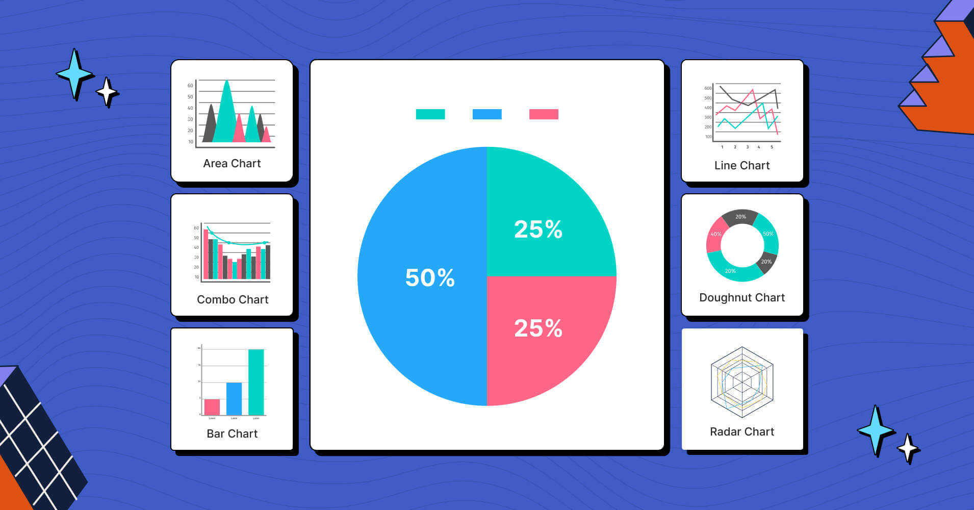
↑↑ All the charts above are made with Ninja Charts (built-in with Ninja Tables)
How to Create Popular Chart Types in WordPress
Every example in this article are created with Ninja Charts, a standalone+integrated addon of Ninja Tables.
Ninja Charts creates any type of chart you want as it supports 11+ chart types and Google Charts.
Creating WP charts with Ninja Charts (step-by-step)
Step 1: Activate Ninja Charts from your Ninja Tables dashboard. Or, install and activate Ninja Charts from WordPress repository.
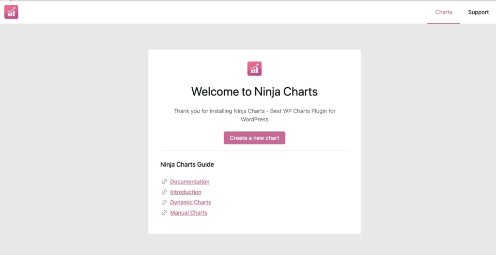
Step 2: Click “Create a new chart” to get to the chart creation module.
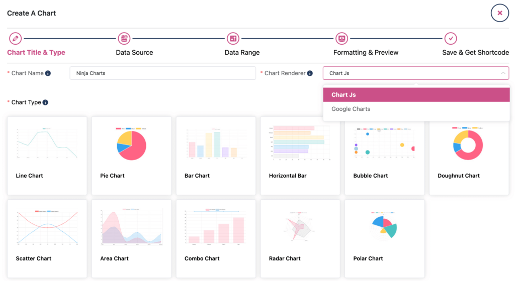
Here you’ll see 5 points to complete your chart. In “Chart Title & Type,” give your chart a name and pick your preferred chart renderer.
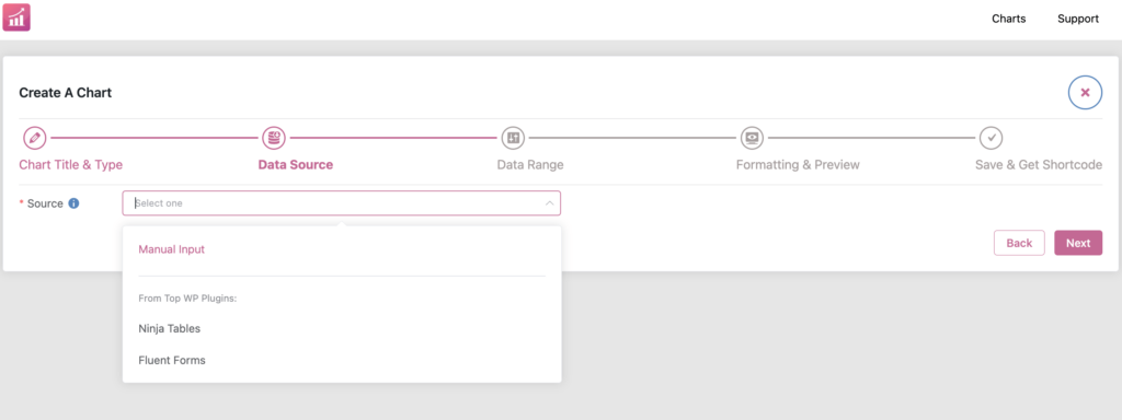
Step 3: Once you pick your chart type, you’ll be taken to the “Data Source” point, where you decide what data you want your chart to populate.
- Manual Input: Create your chart manually by populating it yourself.
- Ninja Tables: Use data table made with Ninja Tables as chart data source.
- Fluent Forms: Use form made with Fluent Forms as chart data source.
We have the detailed Ninja Charts documentation to help you through each step.
Step 4: In the “Data Range” point, you need to check if the data source you picked is a suitable format for the chart type (manual or not). Proceed by selecting columns to use in the chart and move to next point.
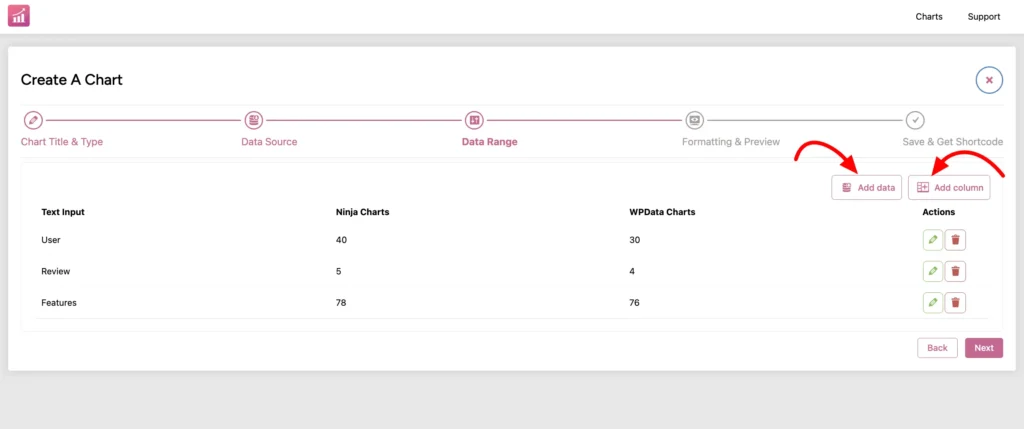
Step 5: Now it’s up to you to customize your chart from the “Formatting & Preview” point. Finish your edits and save it. You can copy the auto-generated shortcode and paste anywhere.
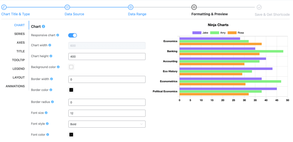
Your first chart is ready!
Ninja Charts is a standalone plugin and also a free chart addon for Ninja Tables. It’s built-in so you can create your charts using table data anytime you want. And the cooperation with Fluent Forms is another game changer!
How to Choose the Right Comparison Diagram
Choosing the right chart/diagram can (greatly) enhance the effectiveness of data visualization. It will help your audience to digest the valuable insights you wish to present.
See Comparison Table Best Practices for best data visualization of your website
For that, you need to follow the best charting practices. Here are some best practices to consider when you’re selecting the appropriate charts to compare data:
Understanding Data Type
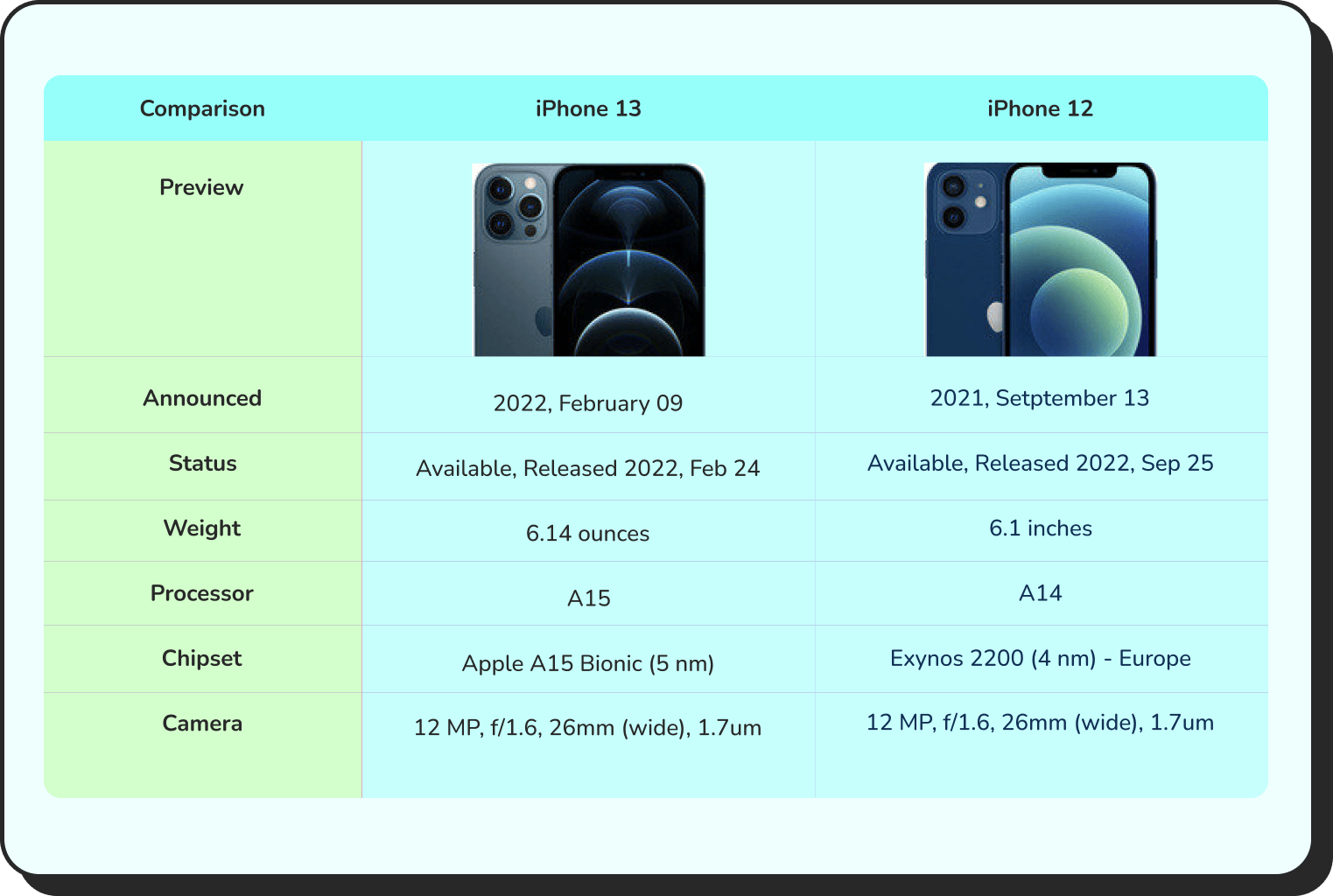
When it comes to visualizing data for comparison, there are two common approaches: table data visualization and data visualization charts.
Get table templates for free
WooCommerce
Amazon Products
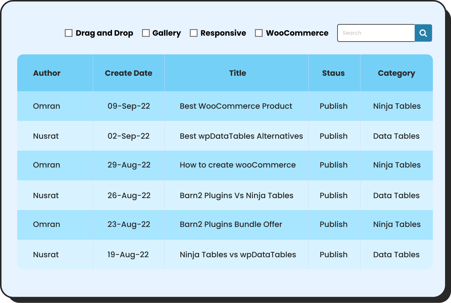
WP Posts
Products Comparison
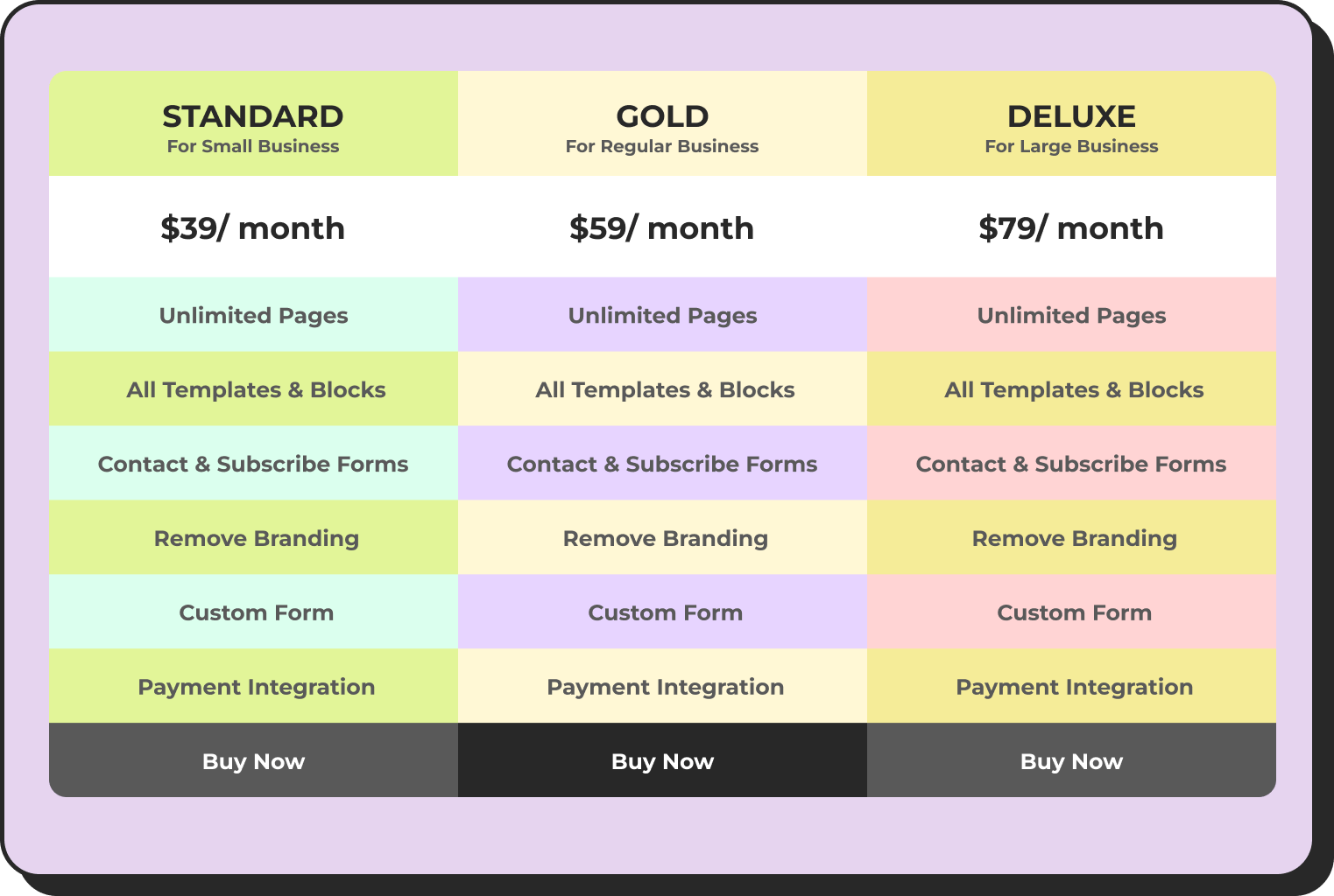
Pricing Table
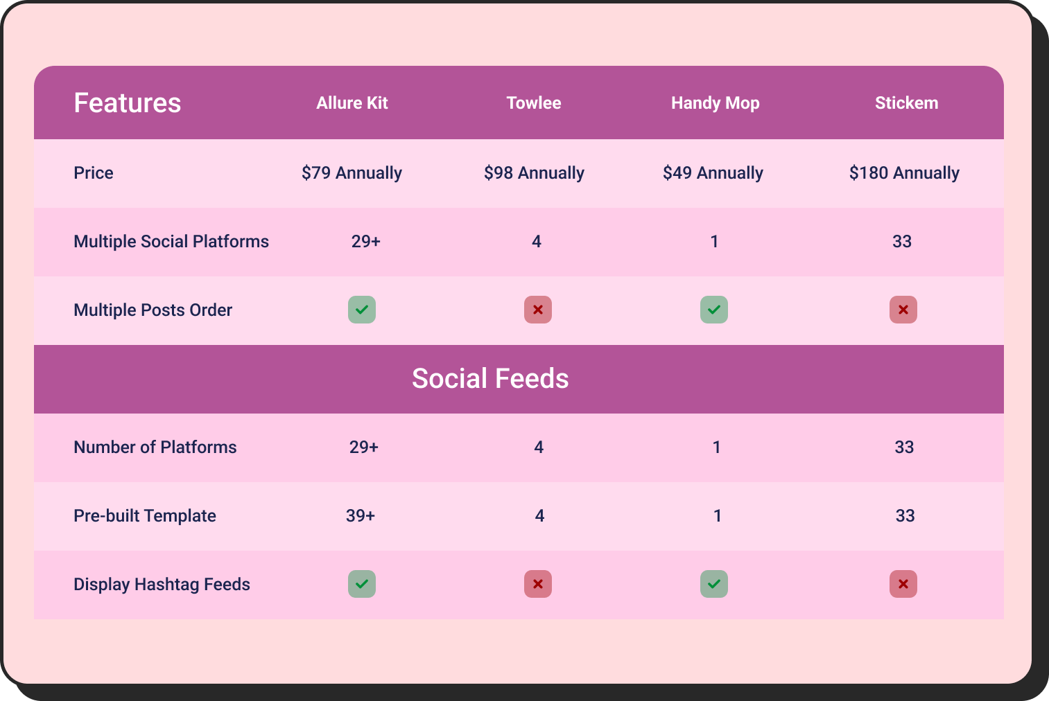
Features Comparison
However, at the core of these visualizations lies a fundamental principle: understanding the nature of your data.
Be it categorical, numerical, or time-series – assessing the data type will help you choose the correct chart type to make your data come to life.
Objectives of Comparison
You know your data type, but have you identified the purpose of your visualization?
Ask yourself a simple question, what story do I want to tell my audience? – there are 4 storytelling objectives when it comes down to making a chart for comparison. Each has its own purpose. They are:
- Comparison
- Relation
- Composition
- Distribution
Hence, knowing your purpose before making a comparison diagram will eventually lead you to identify the best charts for data visualization.
Data Size and Complexity
Imagine you are dealing with a large number of categories, and you chose a circle chart for comparison. Well, you are going in the wrong direction!
You should’ve chosen a bar or line chart when dealing with a massive dataset.
Here’s the thing – the size and complexity of your data are crucial factors to consider. You don’t want your data comparison to become a jumbled mess, making it hard to decipher.
That’s why, it’s important to assess the magnitude of your data and select the most suitable chart for a clear and concise representation.
Prioritizing Clarity
When we talk about prioritizing clarity in data visualization, we mean to ensure that – charts are easy to understand and interpret for the audience.
For that, clarity is crucial because if the information is not clear, then the visualization’s purpose is lost.
To prioritize clarity in your comparative chart, consider:
- Remove unnecessary elements, focus on the key info, and avoid cluttering.
- Ensure titles or labels for categories, axes, and data points are clear and concise.
- Use appropriate scaling that allows for clear differentiation between variables.
- Maintain consistency in terms of colors, fonts, and design elements.
You can also use dynamic WordPress comparison tables for smart data visualization
Comparison graphs have the ability to illuminate insights, simplify complexity, and guide us on the path to informed choices.
But, like any other tool, comparison graphics has its own set of benefits and limitations.
Pros
- All charts are quite easy to design.
- Simplest visualization method to show a comparative analysis of data points to reveal insights.
- There’s no specific restriction or limit of categorical or numerical variables.
- A simplified way to portray data story.
- Help you analyze data to predict and make informed decisions.
Cons
- A lack of standard rules for making charts may lead to misinterpretation of data.
- Complex variables are hard to visualize using comparative diagrams.
- If there are no common parameters among variables, it becomes hard to design these graphs.
Comparison Charts FAQs
Do you still have lingering questions? Allow us to provide the answers you seek.
What is the best comparison chart?
It varies depending on the data type and complexity. However, in common scenarios, charts such as bar charts, and line charts, are good for simple data comparisons.
Why are comparison charts important?
Comparative graphs are quite a useful visualization tool to showcase similarities, dissimilarities, trends, and patterns among different datasets. It provides valuable insights to the audience, helping them in making informed decisions.
How to make a comparison chart?
Since comparison graphs are quite easy to make. So, as per your dataset type – you can simply start making them using Excel, Google Sheets, Microsoft Power Bi, or Ninja Tables.
Can a comparative chart be interactive?
Yes, it can be! Interactive charts are an absolute delight for users. It can provide additional information while hovering over certain data points. With tools like Google Charts, Chart.js, or NinjaTables – charts can be made interactive.
What are the best plugins to create charts?
Go for Ninja Charts (FREE). It’s a standalone plugin you can use with or without Ninja Tables on your dashboard. Or you can try Visualizer (Pro). Note from our review of top 3 WP charts plugins.
Wrapping Up
As a business owner, data analyst, or academic, there comes a time when your need to make charts that compare deep insights from raw data.
Needless to say, you will need the best comparison charts that can work their magic – transforming complex data into visually appealing representations that captivate your audience and deliver impactful messages.
If you are looking for tools for effective data visualization then we recommend d3.js or chart.js. With the slightest bit of coding and time, you can make interactive charts.
In contrast, if you are in WordPress try NinjaTables for the best comparison table and chart experiences. It comes with deeply integrated Ninja charts to help you with unlimited interactive charts without a single line of coding.
Ninja Tables– Easiest Table Plugin in WordPress
So, we tried to list the perfect chart-making solutions for you. Tell us in the comment section which suits best for you and don’t forget to follow our social channels for all the new tips, tricks, and updates


Get special discount on the best table plugin made for you!


Good blog and learned new things.
Thanks! We appreciate the feedback.