Table Data Visualization: Efficiency and Guidelines
People consume data every day in multiple forms. Since everyone’s attention span is decreasing, you need to make data presentation smoother and faster and ensure that your audience is grasping all the info you’re delivering.
Human brain focuses better when they see a certain pattern, color, or cell. That’s why table data visualization helps people consume more data in a short time.
A tabular data presentation is an easier info distribution option for multiple dynamic data. Cells, rows, columns, and grids are simpler to skim through than long texts or charts, and graphs.
What is table data visualization?
By definition, it means presenting data in tabular format while organizing data in separate cells, header, rows, and columns. Some tables show gridlines and some don’t.
Data in a table doesn’t have to be quantitative only. The table data can be text, numerics, links, multimedia, lists, codes, buttons, dates, etc.
A single row can show more than one unit of info together against each column. And since every data is inside a table cell, all the info doesn’t overwhelm the audience.
Why you need data tables
Human eyes are drawn to patterns and blocks with specific padding. So data tables engage people with the cells, rows, and columns separation.
We can list lots of benefits of data visualization in tables.
- Organizing dynamic data types
- Data correlation is clear
- Rows and columns
- Merged table cells
- Sticky header or column
- Smart info distribution
- Data filter/search
- Multiple sets of related data
- Compare data
- Condense info
Guidelines to design better data tables: Table data visualization
Is a table a form of data visualization? – Yes! It definitely is!
Multidimensional info is harder to interpret in a chart or paragraph. You need to show the info in tabular format.
For example, a product table contains more info other than its price and name. product tables include details like stock info, product image/video, reviews, top features, and a “Buy Now” button.
All of these are not easy to consume or comprehend from a chart or a text paragraph. So, you need data tables.
Learn how to design data tables for proper table data visualization.
Header and table body
What’s a data table if it doesn’t have a defined table header and body?
The header text size should be different from the table body text size. Font style doesn’t necessarily need to change.
There should be a divider separating the header from the table body. If not a divider, it should show a different color than the rest of the table. And if the header background color is dark, header texts need to be readable.
You can alter table rows and columns color depending on odd and even numbers. Or add hover animation to rows.
Filter and search
A data table is successful when data are found easily and you don’t need to scroll rows/columns to find something specific.
A filterable data table with a search bar is far more convenient than any other data presentation.
Use custom filter options and/or a search bar on the table like the following.
| Company | Country | Employees | DUNS number | Profit | |
|---|---|---|---|---|---|
| Alva Co. | Sweden | [email protected] | 90 | 73-062-6234 | 40% |
| Adeleid | Canada | [email protected] | 52 | 43-759-9867 | 64.9% |
| Fizzy Group of Industries | Ukraine | [email protected] | 91 | 19-274-2334 | 35% |
| Lukoil Company | Russia | [email protected] | 27 | 68-529-1315 | 8% |
| Matsubishi | Japan | [email protected] | 27 | 68-529-1363 | 18% |
| Denesik Engil Constructions | Portugal | [email protected] | 45 | 14-374-1386 | 3% |
| SM Entertainment | S. Korea | [email protected] | 58 | 84-413-1810 | 26.3% |
| IKAA | Sweden | [email protected] | 71 | 44-573-6505 | 9% |
| Ayila Corp. | Philippines | [email protected] | 80 | 05-065-5384 | 62.7% |
Table with custom filter made using Ninja Tables
This makes tabular data visualization UX a hundred times better if the table is large and packed with unlimited data.
Grid lines and table border
Tables are generally made of header, rows, columns, cells, and data. There’s no need for visible grid lines to separate each of them. A nicely designed data table can have thin grid lines and make the data appear clean.
But sometimes, grid lines can be a bit too much. Simply utilize the white spaces between cells (rows/columns).
On the other hand, a table without border looks like it’s floating in the white space! A border to contain all your data is a smart way to organize the table.
Get Exclusive Tips, Updates, and Inspirations in Your Inbox!
Content alignment
Not everyone likes to see content center-aligned. Since we all read from left to right, data in a table might also appear like that. It depends on how you want to showcase the data.
You can center-align the header texts but keep the body text left-aligned. Or center-align all of it. In that case, cells with shorter data will have more white spaces around. You might want to add grid lines here.
Multimedia
The whole purpose of designing a good data table is to show multiple types of data like numbers, buttons, links, multimedia, etc. comprehensively.
Suppose a movie review website has tables with movie details like rotten tomatoes, IMDb rating, release date, but no poster or trailer of the movie itself. That isn’t much reliable, is it? People would wanna see the poster, watch the trailer, then maybe consider the reviews.
This table definitely needs multimedia.
A table with dynamic data entry should show images, GIFs, videos, or links to video sources.
| Poster | Movie Title | Rating | Trailer | IMDB Link |
|---|---|---|---|---|
 | Minions: The Rise of Gru | 6.6 |  | Learn more |
 | 12 Angry Men | 8.9 |  | Learn more |
 | Pulp Fiction | 8.9 |  | Learn more |
 | The Dark Knight | 9.3 |  | Learn more |
This IMDb table is a Ninja Tables demo
Table color
Everyone values beauty. Just because it’s a data table with important official data, doesn’t mean you can’t beautify it with colors!
Throw on some captivating colors to your header, rows/columns, borders, texts, or cells to make the table stand out. Of course, you don’t need to go overboard with colors and make it a carnival!
A presentable layout is when it’s minimalistic but bright.
| Name | Gender | Joining date | |
|---|---|---|---|
| Venita Benford | [email protected] | Female | 10/28/2022 |
| Sylvan Messier | [email protected] | Male | 8/28/2022 |
| Padget Moffat | [email protected] | Male | 6/30/2022 |
| Trever Muck | [email protected] | Male | 11/9/2021 |
| Raymond Roughey | [email protected] | Male | 2/26/2022 |
| Dougy Londing | [email protected] | Male | 1/5/2022 |
| See Marqyes | [email protected] | Male | 3/29/2022 |
| Minor Eisikowitz | [email protected] | Male | 11/14/2021 |
Customize table design to fit your business.
Responsiveness
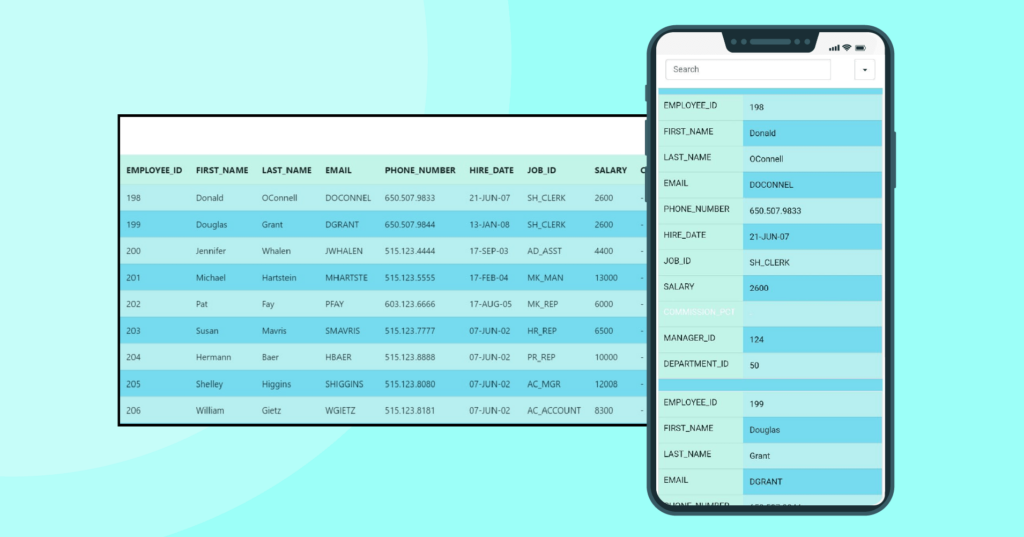
No matter how pretty the table is, if it breaks down on a mobile device, it’s no good.
Making the data table responsive to big or small devices will make the audience comfortable enough to skim through the data. They won’t have to scroll horizontally to see more columns.
People use their phones more than desktops. So, a mobile responsive table is your answer. Make the table rows stack on top of another to create separate tables, for instance, “Stackable tables.”
CTA button
One of the main purposes of using a data table is the presentation of dynamic data, including a call to action button.
The “Buy Now” button of a pricing table is as important as the “Add to Cart” button of a WooCommerce table.
| Image | Name | Category | Price | Choose | |
|---|---|---|---|---|---|
 | Blue Hoodie (Zipper) | Hoodies | Original price was: $40.00.$35.00Current price is: $35.00. | | |
 | Hat | Hat | Original price was: $20.00.$15.00Current price is: $15.00. | | |
 | T Shirt | Half sleeve | $45.00 | | |
 | T-Shirt with Logo | Tshirts | Original price was: $10.00.$8.00Current price is: $8.00. | | |
 | Beanie with Logo | Accessories | Original price was: $20.00.$18.00Current price is: $18.00. | | |
 | T-Shirt | Tshirts | $18.00 | | |
 | Long Sleeve Tee | Tshirts | $25.00 | | |
 | Polo | Tshirts | $20.00 | | |
 | Hoodie with Logo | Hoodies | $45.00 | | |
 | Hoodie with Pocket | Hoodies | Original price was: $45.00.$35.00Current price is: $35.00. | | |
 | Hoodie with Zipper | Hoodies | $45.00 | | |
 | Beanie | Accessories | Original price was: $20.00.$18.00Current price is: $18.00. | | |
 | Belt | Accessories | Original price was: $65.00.$55.00Current price is: $55.00. | | |
 | Cap | Accessories | Original price was: $18.00.$16.00Current price is: $16.00. | | |
 | Sunglasses | Accessories | $90.00 | | |
 | Tank Top | Tanktop | Original price was: $45.00.$40.00Current price is: $40.00. | |
WooCommerce product table by Ninja Tables
Sticky header/column
Ever used Google Sheets’ “Freeze row” option? You can freeze the header of data table just like that.
Columns of a table have names and corresponding data in multiple rows. But if the table has unlimited entries with unlimited rows and columns, sometimes it’s hard to remember what the column data is about.
There is a simple solution to that. Just make the table header (column labels) sticky. The audience can scroll as far below as they need, the header will indicate what column they are looking at.
Cell highlight
You don’t always need custom filters or search bars in the table. If there’s a specific data you want your audience to focus on, simply highlight the data cells with a different background color or border.
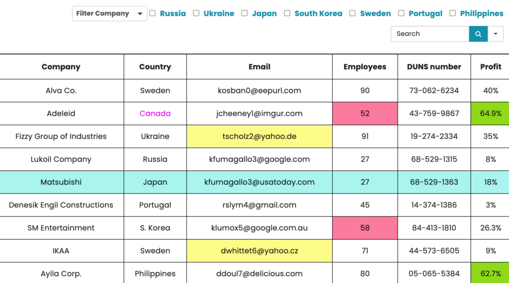
Use conditional formatting to highlight table cells. For example, Ninja Tables cell conditions.
Merge cells
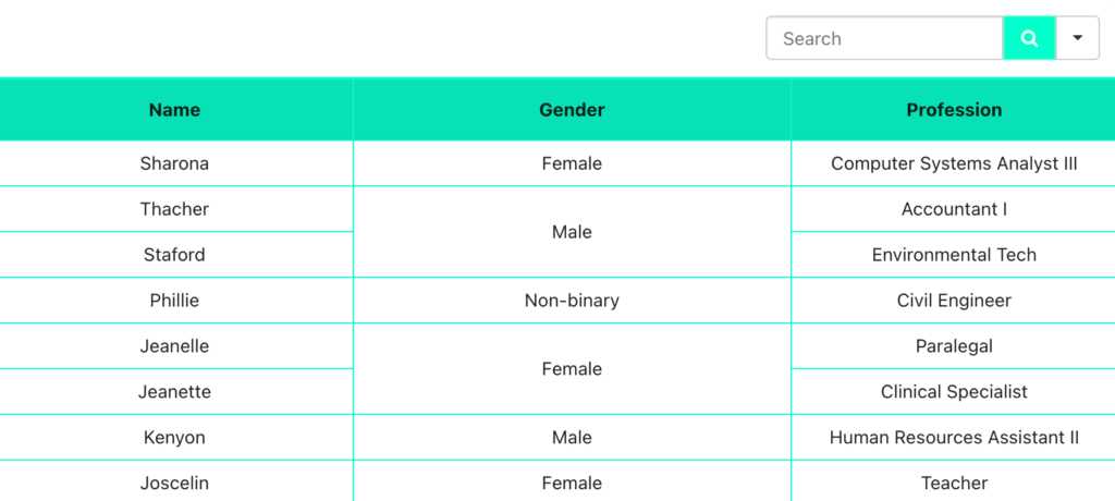
If several consecutive cells have identical data, it’s best to merge them into one big cell. This will make the table less messy and the data presentation will look better.
Here’s what a data table will be like after merging cells.
That’s it for data table design guidelines. We’ll get back with some more insights soon.
Follow these data table design ideas for smarter data presentation.
Try Ninja Tables for tabular data visualization in WordPress.
It also comes with Ninja Charts, a free chart-maker for your website.
So, Charts or Table?
Table templates for dynamic data
If you’re looking for ideas to create tables, Ninja Tables has 30+ free table templates for you.
Install and activate the plugin, download the JSON file of any table template you like, and import the table to customize.
Conclusion
An overwhelming amount of information or a long text paragraph can make your audience close the tab real quick! You want them to grasp the details fast but comprehend correctly.
So, presenting the information in a structured and organized data table is what you should go for.
Table data visualization is a smart solution to dynamic data showcasing. It also adds a nice design to your website, blog, page, or posts.
You can customize data tables however you want if you’re using the proper tool. Distinguish the data cells with labels, borders, colors, or add multimedia and CTA buttons to tell the stories right! And don’t forget to make the table mobile responsive.
For more on data visualization, check out the techniques and examples.

Ninja Tables– Easiest Table Plugin in WordPress



Add your first comment to this post