
Table of Contents
Whether it’s sales, subscriptions, or any other opt-in actions, tables play a pivotal role in presenting data effectively. In this dynamic landscape, a “Call to Action” (CTA) button element empowers users to take prompt actions.
With Ninja Tables’ fully customizable CTA button element, you have the tools to design compelling pricing tables, comparison tables, and WooCommerce product tables that drive results.
Let’s add a Button element to our Ninja Tables!
Properties of Button Element #
| Scope | Option Name | Type |
|---|---|---|
| General | Editor box | Text Editor |
| Background Color | Graphical Color Selection | |
| Border Color | Graphical Color Selection | |
| Border Size | Numeric Value | |
| Border Radius | Numeric Value | |
| Full Width | Toggle On or Off | |
| URL | Text Field for Link of the Button | |
| Open in another tab | Toggle On or Off | |
| Text | Font Color | Graphical Color Selection |
| Font Size | Numeric Value | |
| Font Style | Bold, Italic & Underline | |
| Icon | Enable Icon | Toggle On or Off |
| Hover | Button Hover | Toggle On or Off |
General #
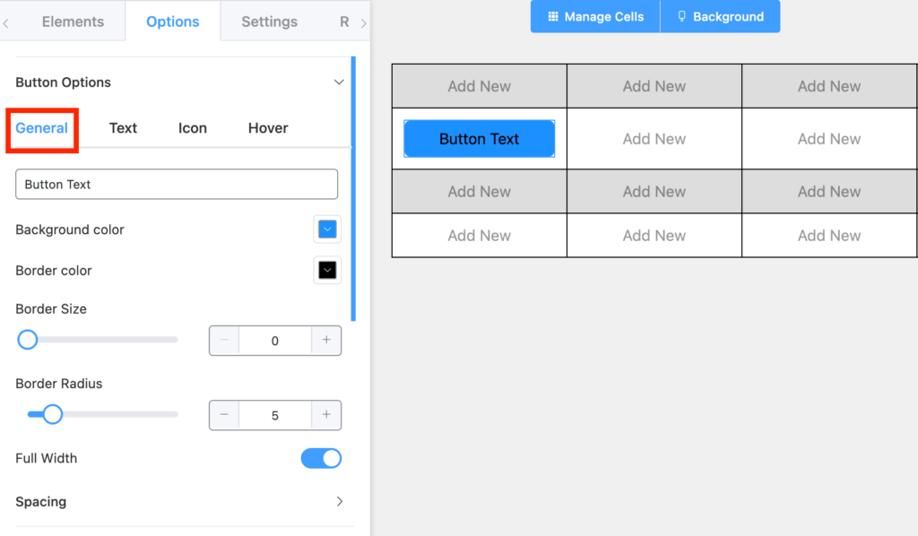
- Button Text Editor: You can either click on the button element or edit the text in this Editor Box.
- Background Color: You can change the color of the Hover Background. By default, it is set to Blue.
- Border Color: You can change the color of the Button. By default, it is set to Black.
- Border Size: You can control the size of the Border of the Button Hover. By default, it is set to 0.
- Border Radius: You can control the radius of the Border of the Button. By default, it is set to 5.
- Full Width: You can toggle On or Off the Button to the Full width of the cell.
- URL: You can edit the link URL for the Button here.
- Open in another tab: You can toggle On or Off the Link behavior to open the link in the same window or in a new window.
Text #
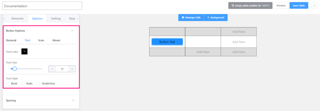
- Font Color: You can change the color of the text. By default, it is set to Black.
- Font Size: You can change the size of the text. By default, it is set to 15.
- Font Style: You can change the Font Style orientations. Available options are Bold, Italic, and Underline.
Icon #
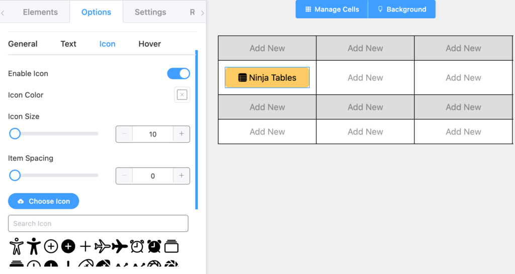
Enable the icon option for more customization like below.
- Icon Color: You can change the color of the Icon. By default, it is set to Black.
- Icon Size: You can change the color of the Icon. By default, it is set to 15.
- Item Spacing: You can control the space between the Icon and the Text of the Button.
- Choose Icon: You can upload any image as an icon for your “Text icon” element.
- Search Icon Library: There are plenty of Icons to choose from in the library.
- Icon Position: You can position the icon left or right to the text. By default, it is set to left.
Hover #
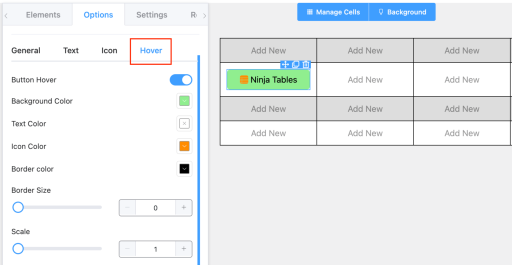
Turn the “Button Hover” option on to get more customizing features like below-
- Background Color: You can change the color of the Hover Background. By default, it is set to Blue.
- Text Color: You can change the color of the text of the Button. By default, it is set to Black.
- Icon Color: You can change the color of the Icon. By default, it is set to Black.
- Border Color: You can change the color of the Button. By default, it is set to Black.
- Border Size: You can control the size of the Border of the Button Hover. By default, it is set to 0.
- Scale: You can control the scaling of the Button on Hover. By default, it is set to 1.
Conclusion #
We hope this documentation helps you understand the functionality of this Ninja Tables button element.
Let us know your thoughts and questions.


Cannot locate these settings in my version of NinjaTables. 🙁
Thank you,
David
Pro Member/Subscriber
Hi David,
Ninja Tables *Drag-and-drop* mode provides these elements. Kindly make sure you’re using that to best utilize Pro Features.
Also, you can try upgrading to our latest version 5.0.18 of Ninja Tables.
If this issue still occurs, kindly contact our support engineers. They’re always available to provide you with the best solution!
Contact- https://wpmanageninja.com/support-tickets/
Have a great day!