
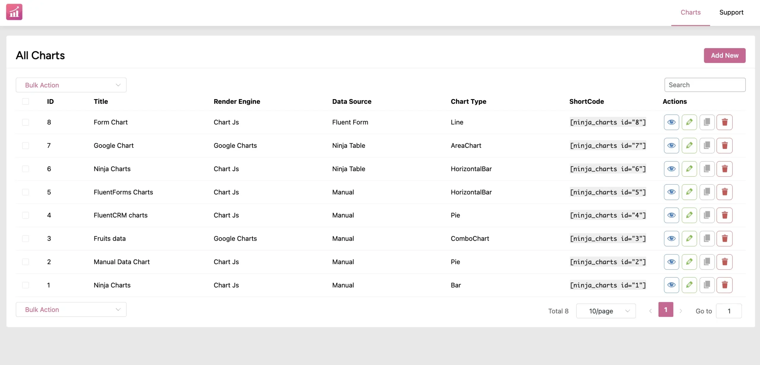
Want dynamic data charts on your website? Ninja Charts is here for you!
This free chart generator in WordPress lets you create and customize all sorts of charts easily. For example, pie charts, line charts, bubble charts, histograms, etc.
Create a Chart with Manual Data Input #
- To create a Manual Chart, click on the Add New button from the Ninja Charts dashboard.
- Then enter your Chart Name and choose your Chart Renderer. Two types of chart renderers are available: Google Charts & Chart Js.
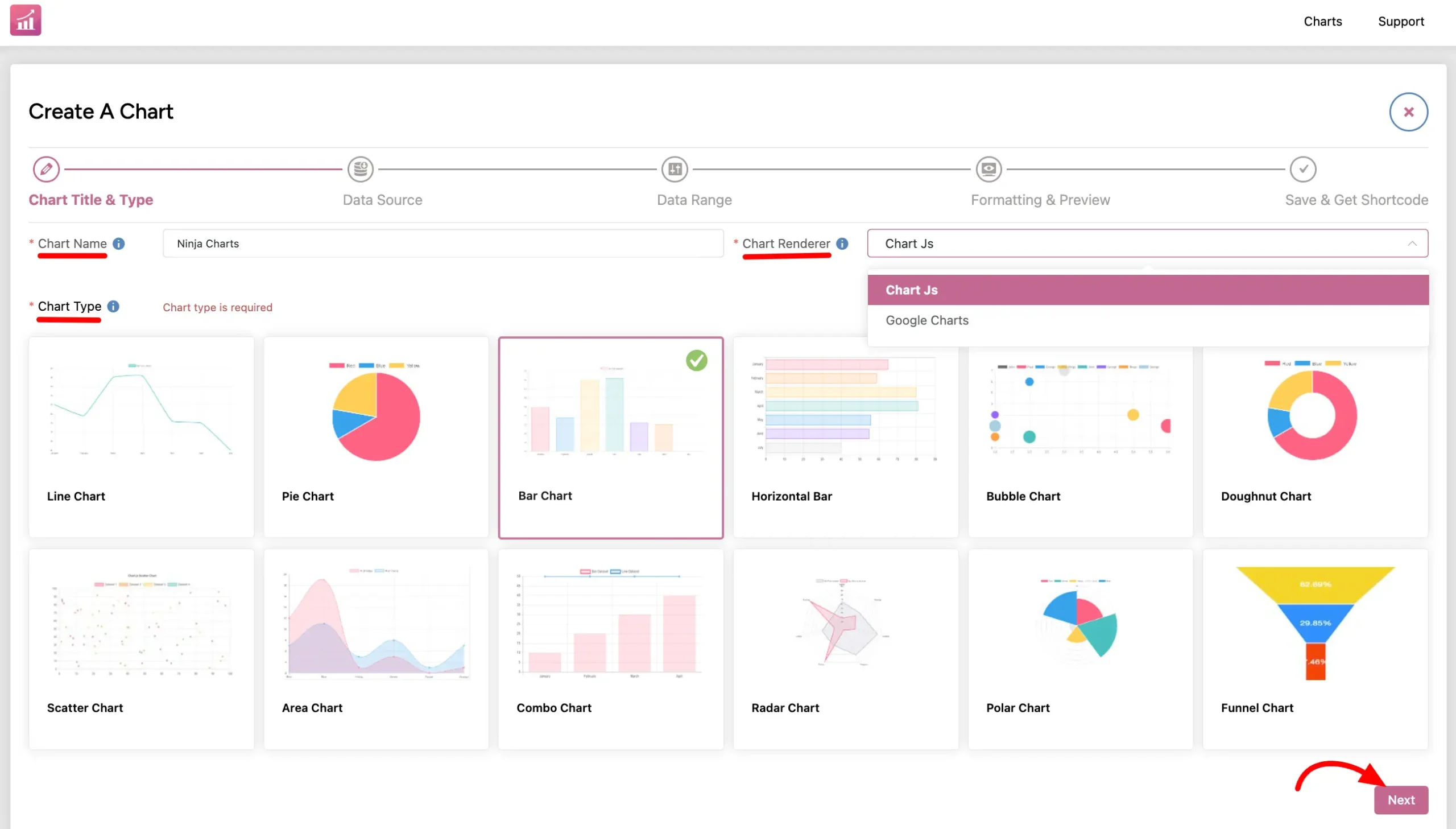
- Now choose your preferred chart type. You can pick any chart type from the 10+ options.
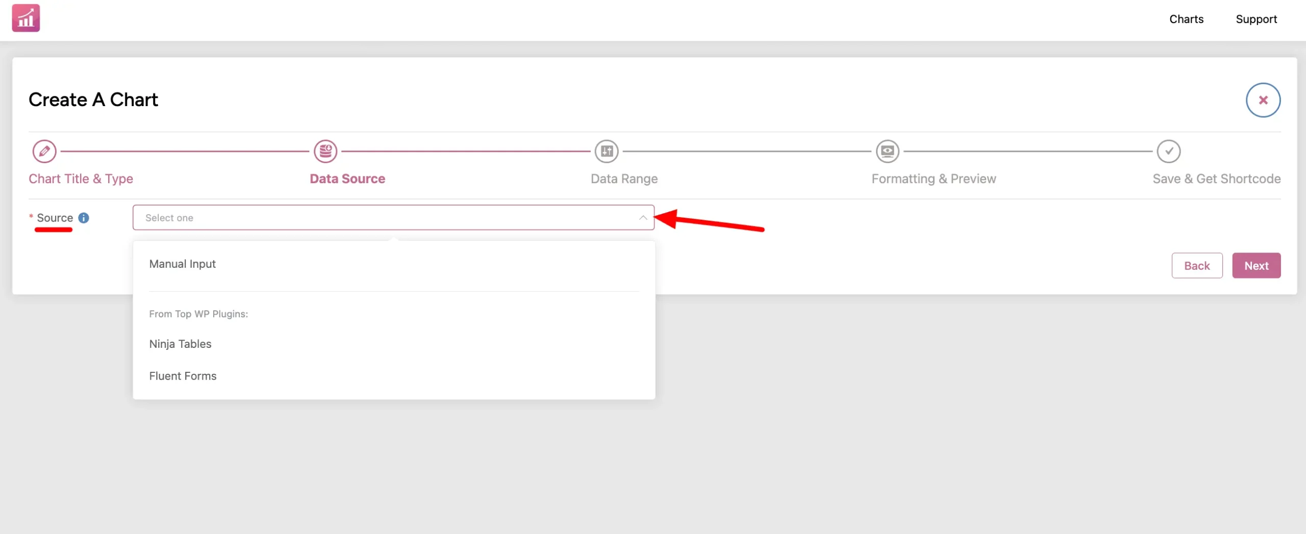
- In the Data Source tab, select Manual Input. Select and move to the next tab.
- In this Data Range option, hit the Add Column button first to input the data column to the chart. Then Add Data. You can add as many data as you want.
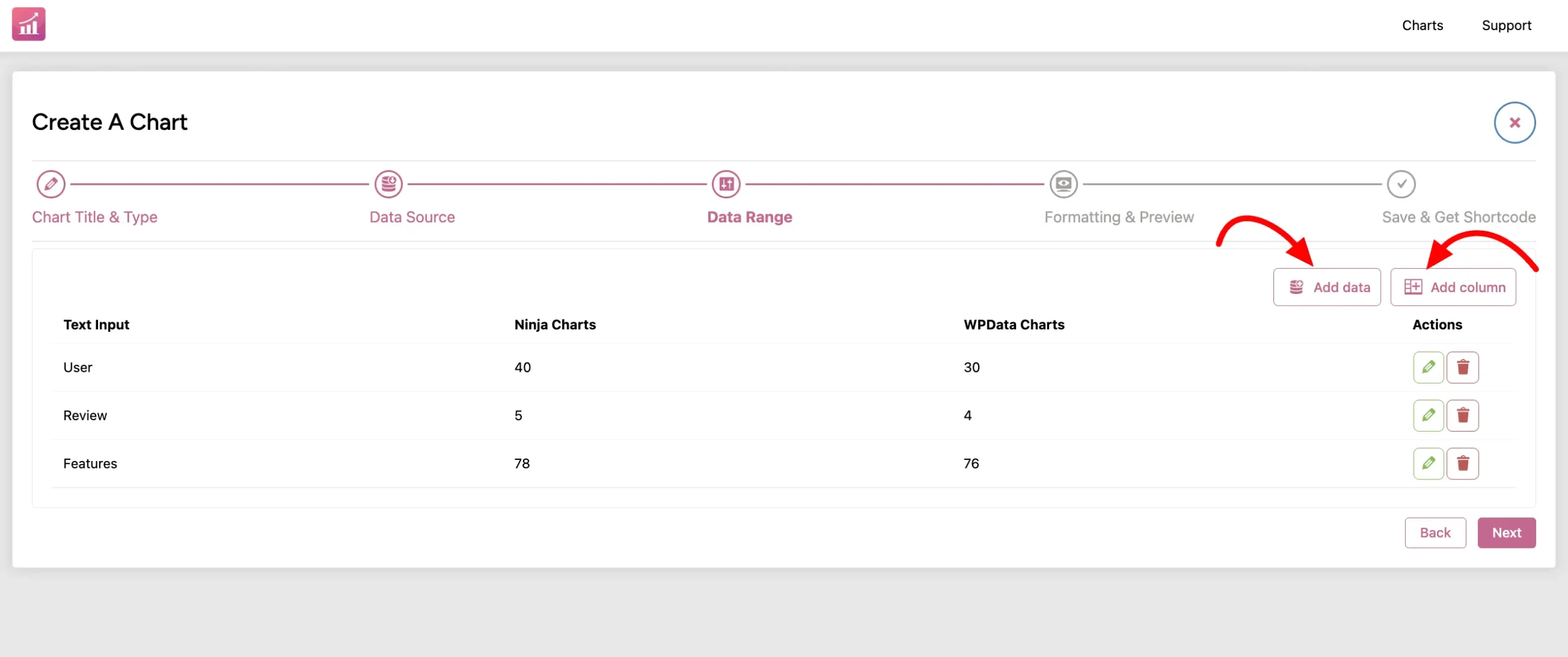
Text Input #
This input text can generate the chart label.
Number Input #
The number input can generate chart data.
Don’t forget to click the Next button. Now you’ll be moved to the Formatting & Preview tab where you can customize the chart in real-time.
Manually Created Chart #
Once you hit Next and move to the Formatting & Preview tab, you’ll see the Bar Chart is ready with the data you put manually.
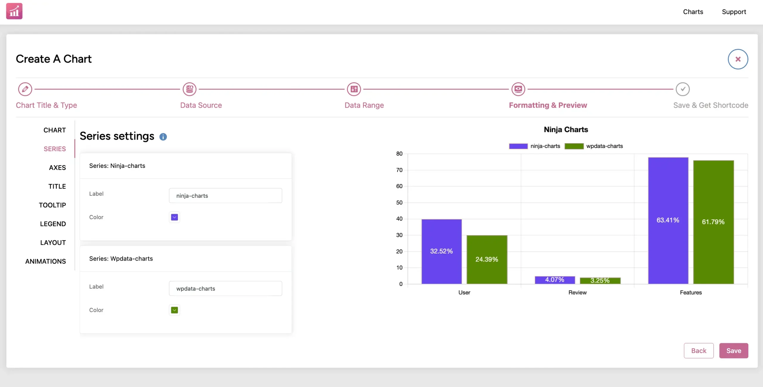
Now, it’s done. Customize the chart from here all you want. Then hit Save and copy the auto-generated shortcode to use on your website.
This is how you can easily create Manual Charts using Ninja Charts.


