
Table of Contents
One of the most useful elements of a table is the “Icon.” Introducing the Icon element, the powerful feature of Ninja Tables.
It allows you to add icons to your WordPress tables. This can be a great way to add visual interest to data tables and make them easier to scan.
Ninja Tables offers an “Icon” element to give your tables an eye-catching view.
Add an Icon element to Ninja Tables and customize the color, size, or anything.
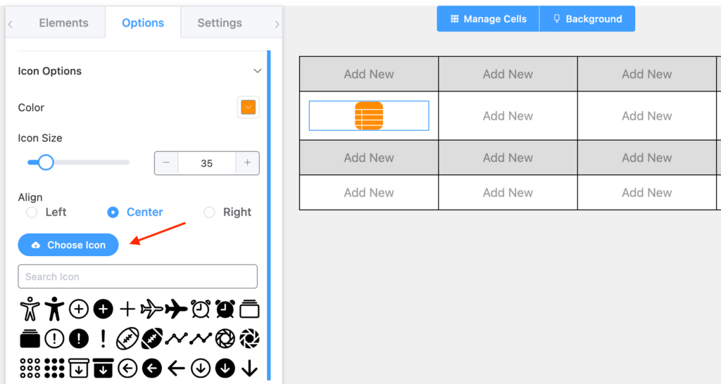
Once you pick the icon element and drop it on a cell, Ninja Tables shows you a default icon of the logo. Of course, it’s customizable.
Icon Element Specific Properties #
- Color: You can change the color of the Icon. By default, it is set to Black.
- Icon Size: You can change the color of the Icon. By default, it is set to 15.
- Alignment: You can align the icon to the left, right, or center. By default, it is set to Center.
- Choose Icon: You can upload your own image as an icon to add to the table.
- Icon Library: A library of Icons to choose from.
Conclusion #
We hope this documentation helps you understand the functionality of this Drag & Drop icon element.
Let us know your thoughts and questions in the comment box.


