
Ninja Tables has a useful feature that allows users to display data in a table utilizing 6 separate responsive breakpoints. The device widths are all configured to the exact values appropriate for your goal. This feature helps to ensure that your website’s tables are responsive.
Here is a brief instruction on configuring Ninja Tables’ Responsive Breakpoints. So let’s go over how this operates –
- First, go to the Table Configuration tab and click on the Edit icon (Pencil icon) on the right side of the column to modify your desired column to configure the responsive breakpoints.
- You will notice a drop-down containing six options in the Responsive Breakpoint field.
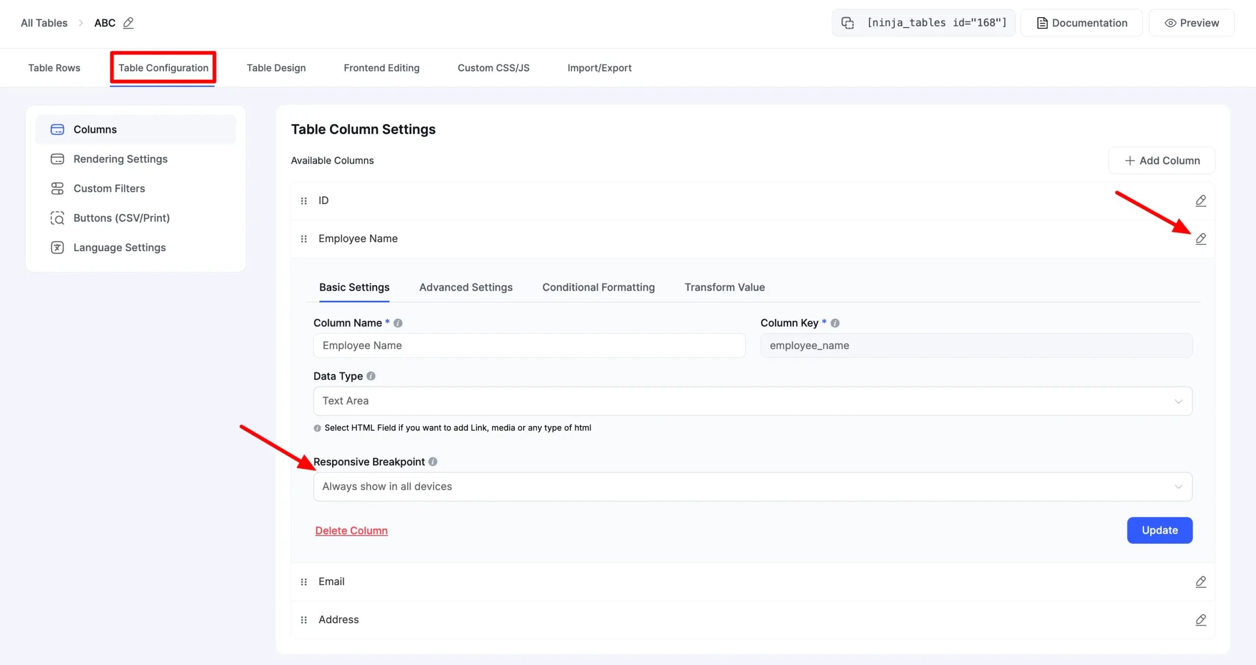
Let’s talk about the six responsive breakpoints in detail below –
- Always show on all devices: This lets the column be displayed on every device.
- Hidden On Desktop: The column will be displayed on mobiles & tablets except for desktop devices.
- Initial hidden mobile: This allows you to view the columns on all devices other than mobile devices. The column hides beneath the plus(+) icon in the mobile view. So when a user clicks this icon, the hidden column data will be shown.
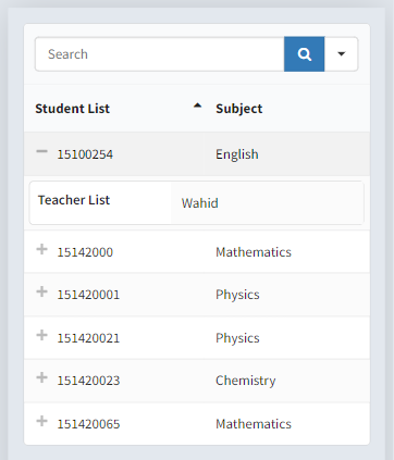
- Initial hidden Mobile and tab: This lets you view the columns on all devices other than mobile & tab devices. The column will be hidden under a plus(+) icon on mobile and tab devices. The data from the column is shown when this icon is clicked.
- Initial hidden Mobile, Tab, and all Regular Computers: After selecting this option, the plus(+) icon will hide the column data on all kinds of devices. Like the previous options, users must click the plus(+) icon to display the data.
- Totally hidden on all devices: This option allows you to keep the columns hidden on all devices.
You can choose any of the choices that best fit your needs. When you want to show certain data on limited devices, make sure you select the suitable configuration from the Responsive Breakpoint segment.
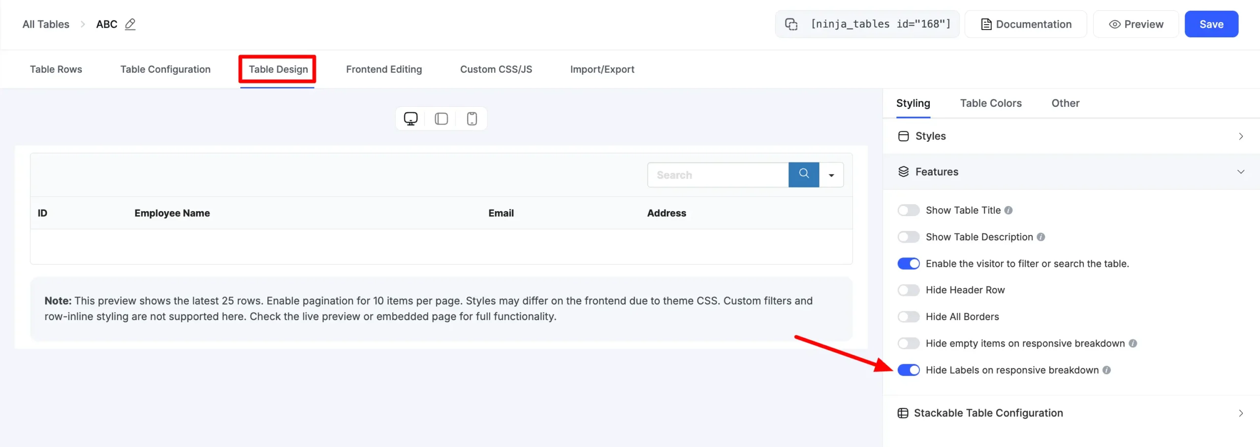
- Hide Empty Items on responsive breakdown: If You enable this, then the empty cell items of a column, then the responsive breakpoint will not show on this column.
- Hide Labels on responsive breakdown: If You enable this, then column headings will not show in a responsive drawer / Stackable View.
Configuring responsive breakpoints in Ninja Tables can make your data tables adjust to all screen sizes. And once you hide a column, it still can be visible when you click the “+” sign.
Try using this feature when you don’t want to show a column that carries somewhat irrelevant data.


