
Progress Bar, also known as “Circle Rating,” is only available in the Ninja Tables Drag and Drop module as a pro element.
It shows progress status, availability, reviews, and statistical values in linear and circular formats, which are far more attractive than regular styles.
You can add such a beautiful element by dragging it to your desired cell in Ninja Tables drag and drop.
Let’s add the Progress Bar element to our table.
Properties of Progress Bar Element #
| Progress Type | Linear, Circular, and Dashboard. |
| Color | Graphical Color Select |
| Text Font Size | Numeric Value, drag bar |
| Progress Bar Percentage | Numeric Value, drag bar |
| Progress Bar Width | Numeric Value, drag bar |
| Progress Bar Thickness | Numeric Value, drag bar |
| Alignment | Left, Center, and Right |
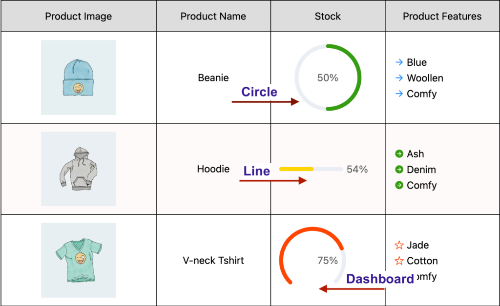
- Progress Type: You can change the type of the Progress Element style. Available options are Linear, Circular, and Dashboard. The most used version is circular. By default, it is set to Circle.
- Color: You can change the Color of the Progress Element. By default, it is set to Black.
- Text Font Size: You can change the Text Size of the Progress Element. By default, it is set to 15
- Progress Bar Percentage: You can even change the percentage of the Progress Bar. By default, it is set to 50%.
- Progress Bar Width: You can change the width(size) of the Progress Bar. By default, it is set to 100.
- Progress Bar Thickness: You can even change the thickness of the Progress Bar to make it thicker or thinner.
- Alignment: You can align the Progress Bar to the left, right, or center. By default, it is set to Center.
Conclusion #
In the example image shown above, we’ve used all 3 types of Progress Bar elements. In that product table, circle, line, and dashboard progress bars show the available stocks of the products. But this element can also show progress of a certain project, how far people have read a book, or how good/bad the reviews are.
Let us know your thoughts and questions in the comment box.


I wish to have a Progress-Bar which take the sum of all form inputs for one field.
Hi Jerome. I’m afraid I can’t quite understand your query. Please open a support ticket(https://wpmanageninja.com/support-tickets/) and send us the details of your problem. We’ll see to it ASAP.