
In the Ninja Tables Drag and Drop mode, you’ll find Text Icon element. This element lets you add text beside an icon and it’s only available as a pro element.
It’s almost similar to the “Styled List” element because of the use of an icon and a text box side by side. However, the Text Icon element is a single text box and not a list. Unless you stack them as a list.
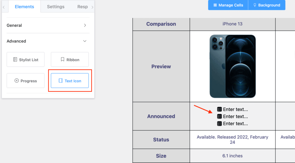
Let’s add a Text Icon element to our Ninja Tables and check its properties and possibilities.
Follow this path- Elements >> Advanced >> Text Icon.
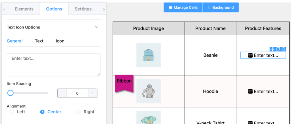
You can click the “Text Icon” cell and customize the icon and text both.
Properties of Text Icon Element #
| Scope | Option Name | Type |
|---|---|---|
| General | Editor Box | Text Editor |
| Item Spacing | Numeric Value, drag bar | |
| Alignment | Left, Center, and Right | |
| Text | Font Color | Graphical Color Selection |
| Font Size | Numeric Value, drag bar | |
| Font Style | Bold, Italic & Underline | |
| Icon | Color | Graphical Color Selection |
| Icon Size | Numeric Value, drag bar | |
| Choose Icon | Upload from Computer | |
| Icon Library | Selection from Library | |
| Icon Position | Left & Right |
General #
- Editor box: A text editor where you can edit your element text.
- Item Spacing: You can add space or gap between the Icons and text Items. By default, It is set to 0.
- Alignment: Align the text and icon to the left, right, or center. By default, it is set to center.
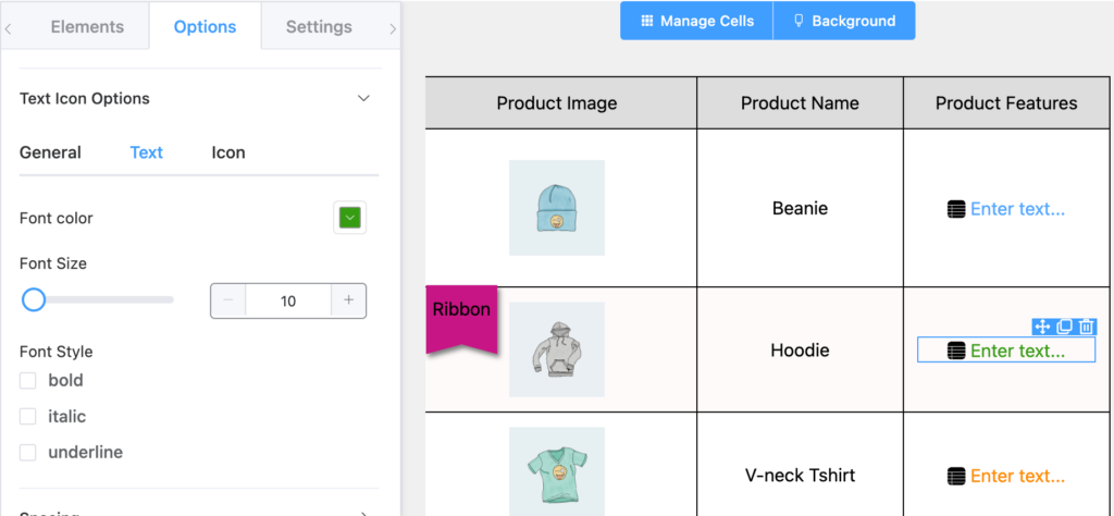
Text #
- Font Color: You can change the color of the text. By default, it is set to Black.
- Font Size: You can change the size of the text. By default, it is set to 10.
- Font Style: You can change the Font Style orientations. Available options are Bold, Italic, and Underline.
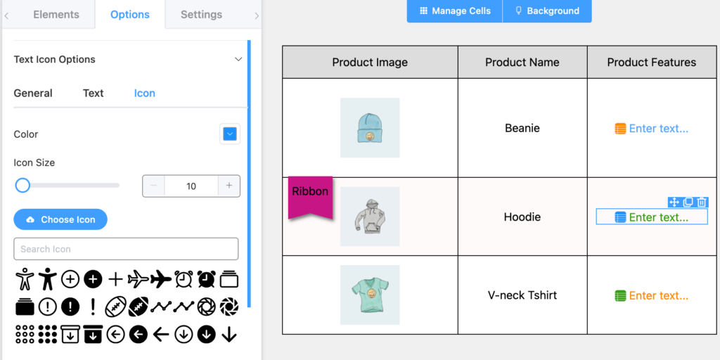
Icon #
- Color: You can change the color of the Icon. By default, it is set to Black.
- Icon Size: You can change the color of the Icon. By default, it is set to 10.
- Choose Icon: You can upload any image as an icon for your “Text icon” element.
- Icon Library: There are plenty of Icons to choose from in the library. By default, it is set to a black Ninja Tables logo.
- Icon Position: You can position the icon left or right to the text. By default, it is set to left.
Conclusion #
Use a text icon element on your data table to make it dynamic and not a boring table with text only. A relevant icon with a text can make the table appear more engaging.
Let us know your thoughts and questions in the comment box.


