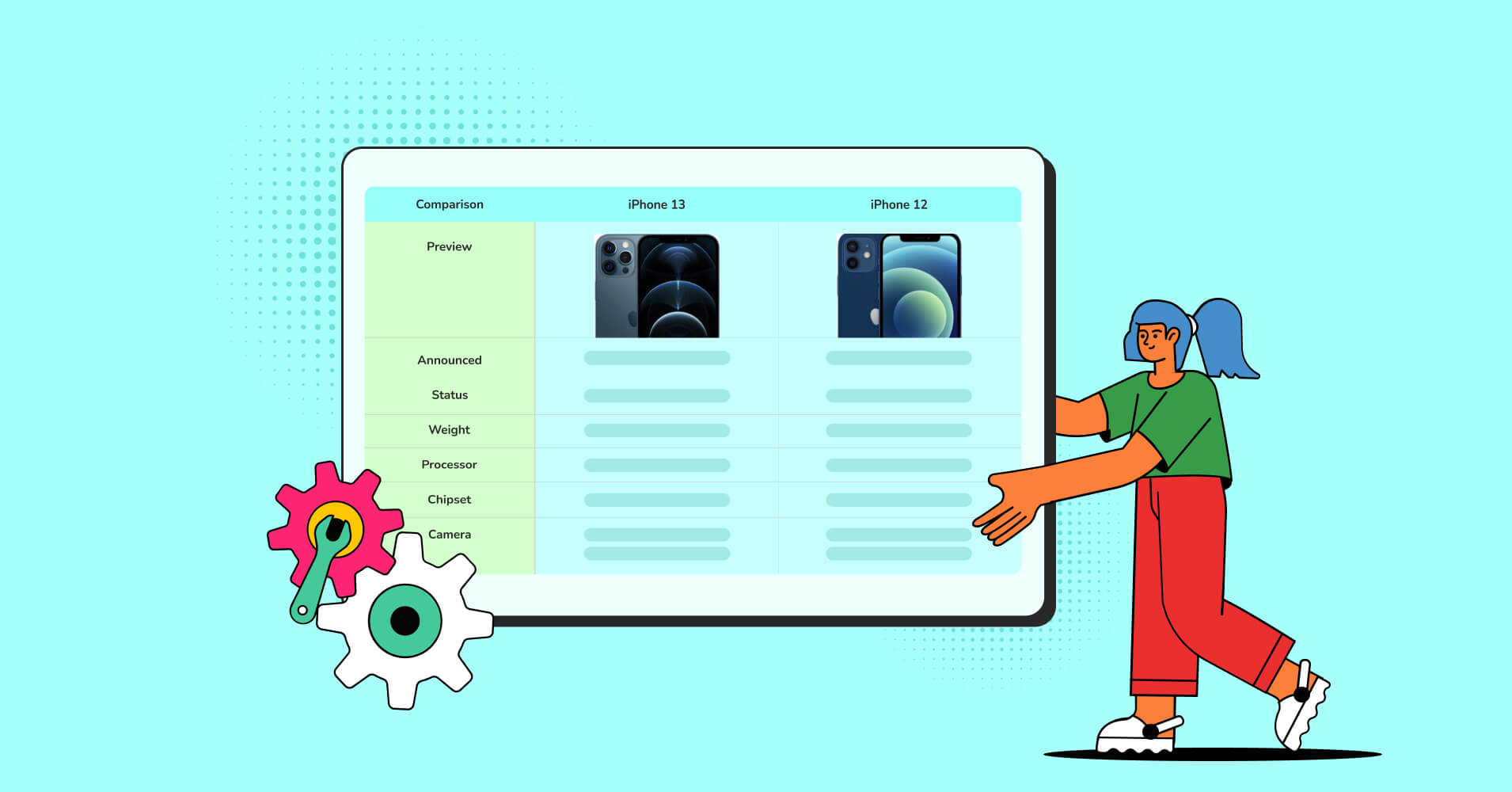
Enhancing UX with Searchable & Sortable Tables

TLDR: Searchable and sortable tables cut user frustration by 40%. Data-heavy applications need search bars, column sorting, and smart filtering. Combine these features with clear headers, hover actions, and responsive layouts. Users find information 3x faster with proper table design. These trends matter now.
Users arrive with a question. “Who’s on the team this week?” “Which products sold the most?” “What’s available in blue color?”
A table sits there, inert, waiting for them to find the answer themselves. This is where design fails.
Most tables treat data as a display problem. They show information. They don’t help users use information. The gap between showing and helping is where frustration grows.
Here’s what happens: A user opens a table with 200 rows. No default sort. Filters are buried in a dropdown. Search field nowhere to be found. They waste 90 seconds clicking around. Then they give up or call support.
This costs real money in support tickets, user churn, and lost productivity.
The challenge: tables hold lots of data. Without search and sort features, users drown in information. They click back and leave your site. They switch to competitors.
2026 brings a shift. Users expect tables to work like search engines. They want to find data instantly. Designers who build better data displays win customer loyalty.
Good tables make data easier to visualize, digest, and sort- so people can actually use it. From where the search field sits to how results are sorted by default, every choice matters. Let’s explore how to upgrade your tables for 2026 UX trends with visitor comfort front and center.
What Users Actually Want From Tables
Users don’t read entire tables. They scan for one thing: what they’re looking for.
When you ask users about tables, they say the same things:
“I want to find information fast.” Search bars do this. A text field at the top lets users filter thousands of rows in milliseconds.
“I want to organize data my way.” Sorting does this. Users click a column header and reorder instantly. They compare numbers, dates, or names side by side.
“I want to see only what matters.” Filtering does this. Checkboxes, dropdowns, and date ranges let users narrow results by category, price, or status.
These three features work together seamlessly. When combined, they transform tables from dense walls of data into tools that users actually like.
| Name | Position | Office | Age | Start date | Salary |
|---|---|---|---|---|---|
| Zorita Serrano | Software Engineer | San Francisco | 56 | 2012/06/01 | $115,000 |
| Zenaida Frank | Software Engineer | New York | 63 | 2010/01/04 | $125,250 |
| Yuri Berry | Chief Marketing Officer (CMO) | New York | 40 | 2009/06/25 | $675,000 |
| Vivian Harrell | Financial Controller | San Francisco | 62 | 2009/02/14 | $452,500 |
| Unity Butler | Marketing Designer | San Francisco | 47 | 2009/12/09 | $85,675 |
| Timothy Mooney | Office Manager | London | 37 | 2008/12/11 | $136,200 |
| Tiger Nixon | System Architect | Edinburgh | 61 | 2011/04/25 | $320,800 |
| Thor Walton | Developer | New York | 61 | 2013/08/11 | $98,540 |
| Tatyana Fitzpatrick | Regional Director | London | 19 | 2010/03/17 | $385,750 |
| Suki Burks | Developer | London | 53 | 2009/10/22 | $114,500 |
| Sonya Frost | Software Engineer | Edinburgh | 23 | 2008/12/13 | $103,600 |
| Shou Itou | Regional Marketing | Tokyo | 20 | 2011/08/14 | $163,000 |
| Shad Decker | Regional Director | Edinburgh | 51 | 2008/11/13 | $183,000 |
| Serge Baldwin | Data Coordinator | Singapore | 64 | 2012/04/09 | $138,575 |
| Sakura Yamamoto | Support Engineer | Tokyo | 37 | 2009/08/19 | $139,575 |
| Rhona Davidson | Integration Specialist | Tokyo | 55 | 2010/10/14 | $327,900 |
| Quinn Flynn | Support Lead | Edinburgh | 22 | 2013/03/03 | $342,000 |
| Prescott Bartlett | Technical Author | London | 27 | 2011/05/07 | $145,000 |
| Paul Byrd | Chief Financial Officer (CFO) | New York | 64 | 2010/06/09 | $725,000 |
| Olivia Liang | Support Engineer | Singapore | 64 | 2011/02/03 | $234,500 |
| Michelle House | Integration Specialist | Sidney | 37 | 2011/06/02 | $95,400 |
| Michael Silva | Marketing Designer | London | 66 | 2012/11/27 | $198,500 |
| Michael Bruce | Javascript Developer | Singapore | 29 | 2011/06/27 | $183,000 |
| Martena Mccray | Post-Sales support | Edinburgh | 46 | 2011/03/09 | $324,050 |
| Lael Greer | Systems Administrator | London | 21 | 2009/02/27 | $103,500 |
| Jonas Alexander | Developer | San Francisco | 30 | 2010/07/14 | $86,500 |
| Jennifer Chang | Regional Director | Singapore | 28 | 2010/11/14 | $357,650 |
| Jennifer Acosta | Junior Javascript Developer | Edinburgh | 43 | 2013/02/01 | $75,650 |
| Jenette Caldwell | Development Lead | New York | 30 | 2011/09/03 | $345,000 |
| Jena Gaines | Office Manager | London | 30 | 2008/12/19 | $90,560 |
This is one of those tables where everything just clicks. All the features come together, and the whole view makes sense.
The Three Core User Tasks (And Why They Matter)
Nielsen Norman Group nailed this years ago, but it’s worth repeating because most teams still miss it: when users interact with a table, they’re doing one of three things:
1. Finding specific information (“Show me all overdue invoices”)
2. Comparing information across multiple records (“Stack these three plans side-by-side”)
3. Acting on data (“I need to edit these three customer records”)
Each task shapes the entire design. If finding is priority 1, your search field needs prominence. If comparison matters most? Your column headers need clarity and alignment patterns that let eyes move vertically. If users need to act? Hover states, quick-view panels, and bulk action areas become critical.
Here’s the question you should ask before designing any table: Which of these three tasks does my specific user actually need to accomplish? Most teams design for all three equally, creating bloat. Good designers identify the primary task first, then design everything else around it.
Most tables try to serve all three equally. This creates bloat. Smart designs pick one primary task, then build everything else around it.
Knowing which task matters most changes every design decision that follows.
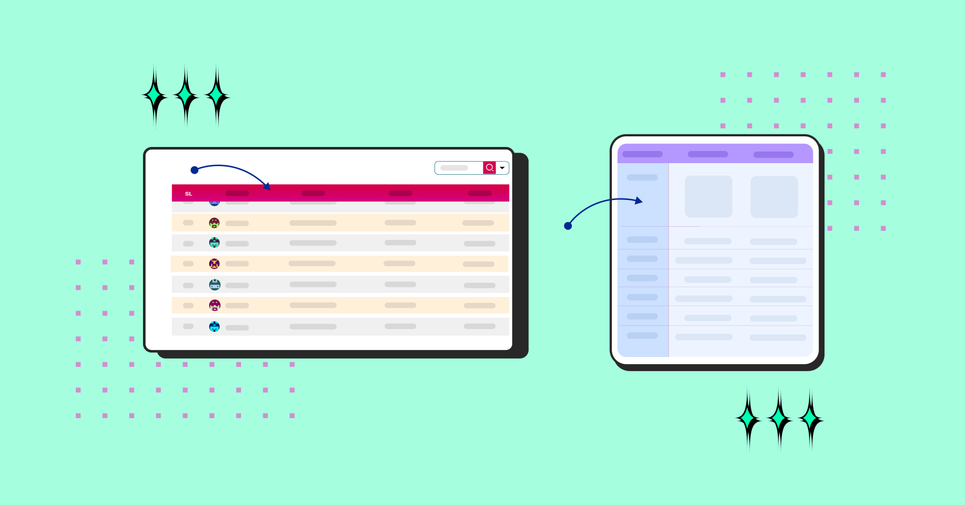
Search in Tables: Making Data Discoverable
So, you want users to find data quickly. Not eventually. Quickly. Search is the fastest way to find one thing in a sea of data.
A search bar in your table should work instantly. As users type, the table shrinks to match rows. This real-time feedback keeps them in control.
How to create a searchable table
Place the search bar above the table, aligned left. Keep it simple: one text field with a magnifying glass icon. Make the field wide enough to read what users type.
Search should look across all columns. If a user searches “John,” the table shows every row with John in any column (name, email, notes). This breadth saves users from guessing which column to check.
Why? Cognitive load reduction. Users’ brains can connect “I want to filter by Status” → “Here’s the Status column” → “Here’s the filter” in one visual sweep. Separate these mentally, and you’ve added unnecessary friction.
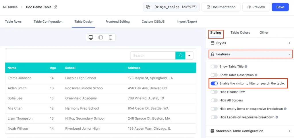
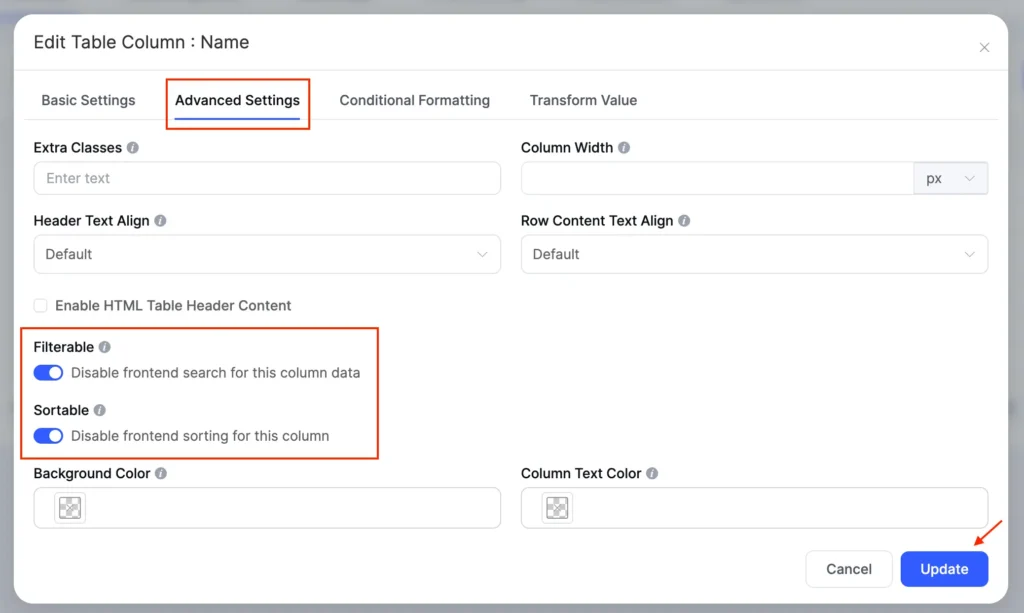
If you want it customized or disable the search function for a specific column, that also works in Ninja tables. In such a case, filters should sit adjacent to the columns they control. Not buried in a dropdown. Not tucked into a sidebar three clicks away. Right there, next to the column header.
Search Behavior: Real-Time vs. Click-to-Apply
Here’s where opinions split. Real-time (instant) filtering creates a magical feeling—users type, and the table reshuffles in milliseconds. Click-to-apply (where users hit a button to trigger search) feels more deliberate and controlled.
The answer? It depends on data weight.
- Real-time is best when your table has fewer than 5,000 rows or the data lives on the frontend
- Click-to-apply is better when you’re querying a database with millions of rows or complex filtering logic
Why? Because real-time on massive datasets = slow, laggy interfaces = frustrated users. Click-to-apply signals “this is a heavyweight operation” and manages user expectations.
Sidebar filters sit to the left of the table. Checkboxes, dropdowns, and sliders let users build filters step by step. This layout works well for complex data with many filter options. Many E-commerce sites use sidebar filters to show products by price, color, and rating. Admin dashboards use top bars to filter by date or status.
- Make the search case-insensitive. Users type “JOHN” or “john” and get the same results.
- Here’s the psychological trick: proximity is trust. If a search field lives near the table header, users intuitively connect it to the table. If it lives somewhere else—a sidebar, the top of the page—users have to consciously connect the two. That friction adds up.
Ninja Tables handles filters differently. By placing them at the top instead of in a sidebar, the experience feels more natural and easier to use.
Sorting: Letting Users Organize Data
Sorting rearranges rows by column values. Users click a header, and the table reorders instantly.
Sorted columns should show a visual indicator. An arrow (↑ or ↓) tells users which direction the sort goes. A small triangle or icon to symbolize ascending or descending order in the header works well. This clarity prevents confusion.
Allow multi-column sorting. Advanced users may want to sort by status first, then by date. Each click adds another sort layer. This depth serves power users without confusing beginners.
Show sortable headers clearly. Use a different cursor (pointer hand), slight color change, or icon to signal that a header is clickable. Users need to know they can click.
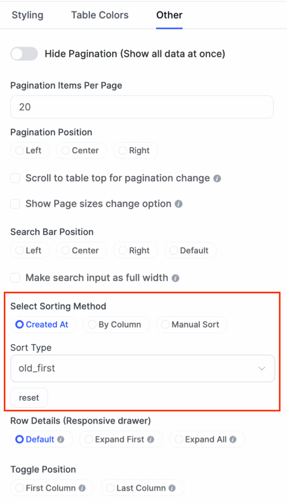
Include a “default order” option. Add a small button or link that resets the sort to the original order. Users sometimes get lost after clicking multiple columns.
Please, stop sorting by the first column alphabetically. This is 2025. Alphabetical sorting is the UI equivalent of a participation trophy—it exists, but nobody actually wants it.
Instead, ask yourself: What’s the most relevant information for this context?
- In an invoice table: Recently created (newest first)
- In a task management table: Due date (earliest approaching)
- In a customer table: Most recent interaction (most engaged first)
- In a product inventory table: Sales volume (highest first)
- In a product table: Product size, or stock volume (smaller or low stock first)
The best sort order is predictive. It anticipates what users actually need before they ask for it.
Common Mistakes to Avoid
Hiding search and sort options. Don’t tuck these into a menu. Put search prominently at the top. Sort headers should look clickable. Users need to find these features in under 2 seconds.
Sorting without a clear direction. Users click a header, and the data rearranges. But which direction? Up to down? A to Z? Show an arrow. Show state. Remove guessing.
Unresponsive filters. Users check a filter box and wait 3 seconds for the table to update. This breaks the flow. Update instantly or show a loading indicator. Instant feedback is the 2026 standard.
Too many columns at once. Don’t show 20 columns because they exist. Show 5 to 8 essential columns. Hide the rest behind “Customize Columns.” Dense tables overwhelm users.
Unclear headers. If users don’t understand what a column contains, they can’t search or sort effectively. Use plain language. “Created On” beats “Timestamp (ISO 8601).”
Quick Pro Tips for Better Performance
Table Customization
Users work differently. One person always sorts by date. Another always filters by status. A third always hides two columns. Let them save their preferences. Also, they can focus on 2 columns at a time, let them stack or hide other columns when they’re looking through those selected ones.
Sortable Columns
Make column headers clickable. Click once for ascending. Click again for descending. Click a third time to clear the sort (return to default).
Use visual feedback. Show a filled arrow (↓) for descending, an outlined arrow (↑) for ascending, or triangle up or down indicators.
Designing Table Headers That Work
Headers are the foundation of sortable tables. They tell users what each column contains and how to sort it.
Make headers bold and darker than row text. This contrast shows users where columns begin. They scan headers first, so make them stand out.
Left-align text in headers. Numbers go right-aligned in columns, but header labels should start on the left. This follows reading patterns and looks balanced.
Keep column headers fixed and visible while users scroll down through rows (Essential for tables with more than 15 rows). Without fixed headers, users scroll past the data and lose context. They forget which column is which.
Combining Search, Sort, and Filter
When all three features work together, tables become powerful.
A user arrives at your table with 1,000 product listings. They search for “blue shoes.” The table shrinks to 150 rows. They sort by “price” to see the cheapest first. They filter by “in stock” to hide sold-out items. Now they see 30 blue shoes in stock, sorted by price. They found what they wanted in 10 seconds.
This workflow is the gold standard for 2026. Tables that offer this speed and control win user satisfaction.
The key: features don’t fight each other. Search filters the visible rows. Sorting rearranges them. New filters narrow further. Each feature adds power without removing previous choices.
Responsive Table Design for Mobile
Collapsed rows stack column names and values vertically. This vertical stacking reads naturally on phones.
Expandable rows start collapsed. Users see essential columns (name, status) on small screens. Clicking a row expands it to show full details. This balance saves space and keeps information accessible.
Horizontal scroll as a last resort. If the table has many columns, let it scroll. But prioritize critical columns on the left. Keep name and status visible while other columns scroll off-screen.
Test on actual phones. A table that looks fine at laptop screen breaks at a phone screen size. Use real devices. Watch real users. Adjust based on what breaks.
2026 UX Trends for Tables
Another year, another wave of “What to expect in 2026” guides. We’re sure you’ve already scrolled through a few. Now, from our analysis, we’re seeing many design trends, but the table design or UX trend is hard to pinpoint. Still, we gathered some major trends not
Smart pagination or infinite scroll. Pagination (Page 1, 2, 3) works well. Infinite scroll works too. Choose based on your data and users. Mobile users often prefer infinite scroll. Desktop users often prefer pagination.
Visual feedback on interaction. Rows change color on hover. Sortable headers show a preview of the sort direction. Search results highlight matches. These small details make tables feel responsive and alive.
Hover Actions upon cells or rows. Reveal actions (edit, delete, export) when users hover over a row. This keeps the interface clean but makes actions discoverable. But hover doesn’t work on touch devices. Always provide an alternative. Add an actions menu or expand icon that works on all devices.
Zebra Striping is an underrated functionality. Alternate row colors—subtle, not garish. Something like alternating white and light gray (#f9f9f9). Why? Because your eyes are lazy. Zebra striping gives your eyes a “landing pad” that helps you track. But here’s the caveat: if your table has only 3–4 columns, zebra striping is overkill. The wider the table, the more you need it.
Conditional formatting adds more value. Mark significant values, indicators, data, or information, if you’re sure that’s the basic thing people search for primarily. Create your base foundation on this, then combine the rest of the advanced features around that. It’ll enhance users readbility, on-page time, and eventually the clarity, which will eventually lead to conversion.
Conclusion
Searchable and sortable tables are not folklore anymore. There are the ultimate toolkit for any display mode that shows data.
Users expect tables to work like search tools. They want instant results. They want to organize data their way. They want to hide the noise and see the signal.
Whether you’re building from scratch or refining an existing table, the principles stay constant: understand your users’ primary task, remove friction, test relentlessly, and prioritize accessibility that’s built-in, not bolted on.
And if you want to skip the technical complexity? Tools like Ninja Tables handle the heavy lifting. But even with a tool, the strategic thinking- what should sort first, where filters belong, whether search should be real-time, that’s still on you. And that’s where this guide’s value lies.
The trend for 2026 is clear: tables are getting smarter, faster, and more personal. Build yours to match.
Ninja Tables– Easiest Table Plugin in WordPress


Add your first comment to this post