How to Present Marketing Report Data Using Tables

You’ve got all the numbers from your spring campaign—traffic sources, lead volumes, conversion drops, and flagging areas trailing behind last year. But if that data isn’t structured right, it’s just clutter. Campaign reporting is your roadmap through the maze of marketing data. It bridges that gap between what’s working and what needs fixing. Without it, you’re navigating blind.
Instead of hopping between spreadsheets and tools, visualize everything in one place using Ninja Tables. Whether assessing online ad performance or adjusting digital ad spend, marketing reports ensure every dollar is well-spent. With interactive tables, you turn messy metrics into insights that drive strategy. Structured tables cut through complexity, turning raw numbers into clear insights.
In this blog, we’ll break down how to present your marketing report data effectively using tables and how that improves decision-making across the board. By the end, you’ll see how visualizing your data empowers your team to sharpen tactics.
What is marketing report?
Marketing reporting is the process of collecting, analyzing, and presenting performance data across various channels to evaluate how your marketing strategies are performing. It’s not just a routine task. It measures the data against key performance indicators and goals, and provides a holistic view of your campaign’s performance.
A marketing report consolidates this data and compares it against predefined KPIs (Key Performance Indicators) and goals. It gives your team a holistic view of your campaign’s performance, what’s driving results, what’s underperforming, and where optimization is needed. Marketing optimization is all about efficiency. It’s all about getting more out of what you put in. These reports can be broad, covering all marketing activities over a quarter, or narrow, focusing on specific channels or campaign tracking.
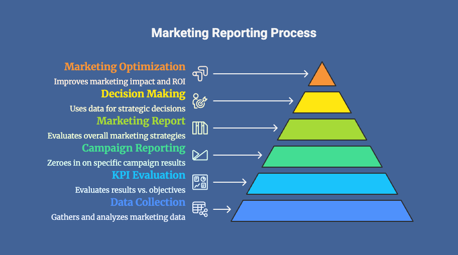
Marketing campaign report, on the other hand, zeroes in on individual marketing campaigns. It evaluates the impact of all the tactics used in that campaign—content, ads, social posts, email blasts, etc.—by tracking key metrics like impressions, clicks, conversions, bounce rates, cost per lead, and ROI.
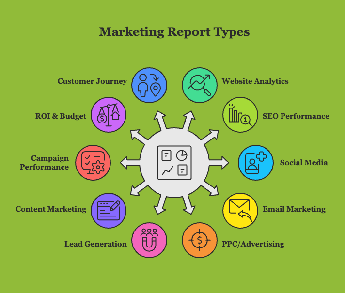
Types of marketing reports
Marketing reports aren’t one-size-fits-all. To get a full picture of performance, you need specific reports for different channels, goals, and strategies. Each report focuses on a unique part of your marketing efforts and helps answer key questions about performance, audience behavior, and ROI.
Here are the most commonly used and important marketing reports:
Importance of marketing reports
Marketing reporting isn’t just a routine task—it’s the backbone of informed strategy.
What makes campaign reporting effective is its ability to connect scattered data points into a single narrative. Numbers like CTR or bounce rate aren’t just stats—they show how well your message landed, if your targeting was right, and whether the campaign met its goals.
Modern reporting tools and templates help streamline this process. But the ultimate goal remains the same: to simplify complex data and turn it into actionable insights.
Here’s why marketing and campaign reporting are critical:
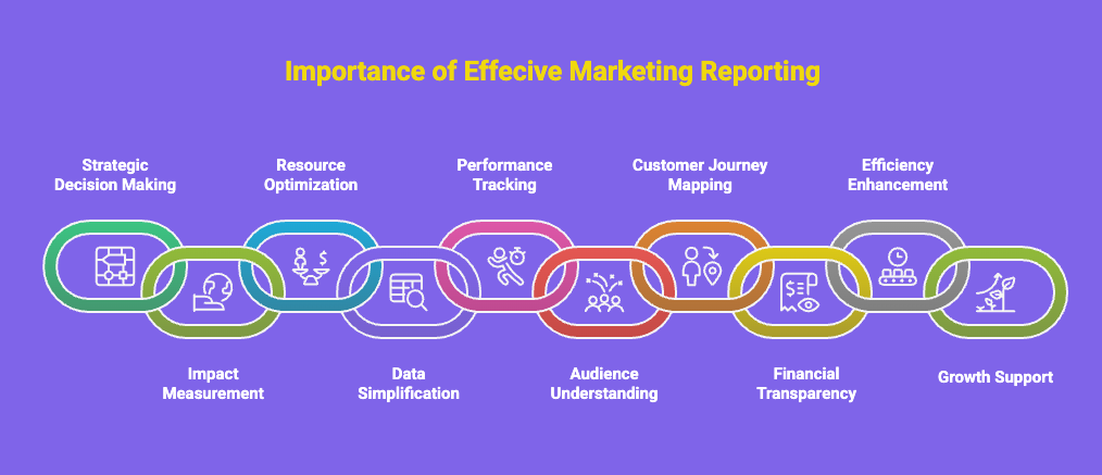
Marketing reporting connects the chain of events between audience behavior, campaign results, and business outcomes. It doesn’t just tell you what happened—it cuts through the noise and tells you exactly what to do next.
Why use tables and charts for marketing data reporting?
That benefit is part of the problem: Once you start looking for marketing data, the sheer amount you can track can quickly become overwhelming. So, where do you get started? What information do you need? What is the best way to present data? The solution is simple- Tables! Can you imagine? Here’s why you need tables to present, curate, and display marketing reports using tables.
Tables organize campaign data into rows and columns, enabling quick comparisons of KPIs like clicks, impressions, and conversion rates. Charts, on the other hand, visualize trends and patterns, making it easier to spot high-performing campaigns or areas needing improvement. Together, they create a compelling narrative for marketing reports.
Ninja Tables features to display marketing data
Let’s break down the features that are perfect for your marketing reports:
Feature | Why It’s Useful |
 Advanced Filtering & Search Advanced Filtering & Search |
|
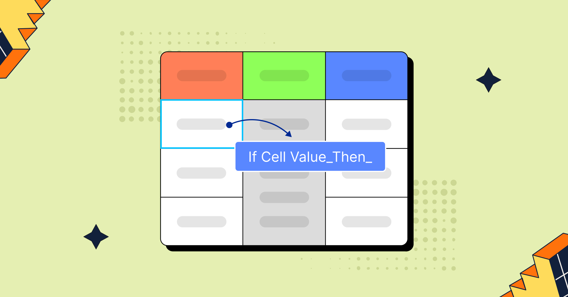
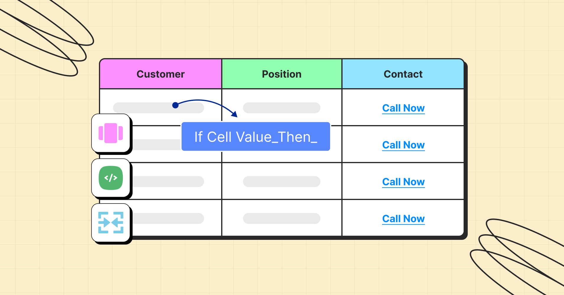
 Conditional Formatting Conditional Formatting |
|
 Data Import from External Tools Data Import from External Tools |
|
 Responsive Breakpoint Control Responsive Breakpoint Control |
|
 Integration-Friendly Shortcodes Integration-Friendly Shortcodes |
|
 Rich Media Support Rich Media Support |
|
 Chart Integration (Pro) Chart Integration (Pro) |
|
 Role-Based Access Control Role-Based Access Control |
|
 AJAX Table Loading AJAX Table Loading |
|
 Smart Sorting Options Smart Sorting Options |
|
 Automated Table Updates (via Sheet Sync) Automated Table Updates (via Sheet Sync) |
|
 Export & Print-Friendly Format Export & Print-Friendly Format |
|
Use cases for marketing data reporting
Each data point has a purpose, from campaign performance to budget allocation. Here are key use cases where marketing reporting (especially with tables and charts) helps drive meaningful action. Let’s see a presentation of data in visual form in different types and layouts.
Marketing Strategy Reporting
Purpose: Start with a comprehensive view of your overall marketing direction, aligning campaigns with business objectives. This report consolidates key strategic elements—current business goals, active initiatives, target markets, tactics, and allocated budgets—into a single visual format.
Marketing Strategy Report | Company: Sugar Date: 20, July 2024 |
Business Summary | |
Q3 objective: Expand market share in Southeast Asia region through digital acquisition, localized campaigns, and partnership programs. Revenue target: +20% YoY growth. | |
Business Initiatives | |
| |
Target Market | Strategy |
|
|
Budget | |
Total allocated: $450,000
| |
Campaign & Performance Reporting
Purpose: Now, track those strategies you set for your campaign. Monitor how individual campaigns perform across platforms like Google Ads, Facebook, or email marketing, or any campaign insights.
Veralia Q2 Ad Campaign Report For year 2025 (April- June) | |||||
Google Ads 75% Facebook Ads 65% Instagram Ads 55% YouTube Ads 80% KPIs | Awareness Drive Video Ad Top-of-funnel engagement focus Retarget Blitz Display Remarketing ROI boost from past visitors | Email Nurture Flow Automation Conversion from mid-funnel Product Launch Search Campaign High-performing on Google Ads | |||
CTR 70% ROAS 90% | Conversion Rate 60% Bounce Rate Reduction 75% | Budget Utilization Snapshot Budget Spent: $6,750 / $10,000 (YTD) Highest Spend: Google Ads Avg. Daily Spend: $225 | Budget Remaining: $3,250 Remaining Least Spend: LinkedIn Budget Burn Rate: 68% | ||
Underperforming: Instagram Ads Conversion Rate: 14.6% | Facebook Ads Conversion: 31% Objective: Brand Awareness | ||||

We’ve created a free marketing report template table just for you—and that’s not all. You’ll also find many more table templates curated across different categories to suit your needs. Customize it to review performance, showcase employee profiles, and much more!
Lead Generation Source Breakdown
Purpose: Identify which sources bring in the most qualified leads. Let’s see a marketing analysis report containing those sources and break it down in ways to display data.
Ninja Charts is included in Ninja Tables plugin. Try out Ninja Charts to build engaging and insightful examples of marketing reports that turn data into strategy.
Customer Journey Mapping & Funnel Analysis
Purpose: Track how users move through the funnel—from awareness to conversion. Here are some examples of marketing reports on customer journey.
The table provides details for diagnosing issues (e.g., slow pages, poor CTAs). Both together give a 360° view of your journey mapping.
| Funnel Stage | Users | Drop-off (%) | Conversion (%) | Avg. Time in Stage | Notes |
|---|---|---|---|---|---|
| 🌐 Awareness | 10,000 | — | 100% | — | Traffic from ads, SEO, referrals |
| 📖 Interest | 6,500 | 35% | 65% | 2m 20s | Blog reads, video views |
| 🧠 Consideration | 3,200 | 50.70% | 32% | 3m 10s | Newsletter signups, demos |
| 🛒 Intent | 1,500 | 53.10% | 15% | 4m 45s | Cart adds, trial start, inquiries |
| 💳 Purchase | 680 | 54.60% | 6.80% | — | Final transactions |
Marketing ROI & Budget Optimization
Purpose: Understand how much return you get on your marketing spend and which channels are most cost-effective.
| Campaign Name | Channel | Budget Allocated | Spend Used | Revenue Generated | ROI (%) | Notes |
|---|---|---|---|---|---|---|
| Spring Launch | $5,000 | $4,800 | $21,000 | 337.50% | High return, budget on point | |
| Summer Promo | Google Ads | $7,000 | $6,300 | $19,800 | 214.30% | Slight underuse |
| Product Teaser | $3,500 | $3,800 | $9,000 | 136.80% | Overspent slightly | |
| Lead Magnet Test | $2,000 | $2,000 | $4,400 | 120.00% | Fairly balanced | |
| BFCM Campaign | Meta (FB/IG) | $10,000 | $9,200 | $36,000 | 291.30% | Top performer |
| Webinar Ads | YouTube Ads | $4,000 | $3,500 | $11,200 | 220.00% | Under budget, great ROI |
| App Install Boost | Google UAC | $6,000 | $5,900 | $12,000 | 103.40% | ROI barely above breakeven |
| End-of-Season Sale | $2,500 | $2,200 | $6,100 | 177.30% | Cost-effective | |
| Retargeting Push | $3,000 | $3,100 | $7,500 | 141.90% | Slight overspend, good return | |
| Abandoned Cart | $1,000 | $950 | $4,300 | 352.60% | High ROI, minimal cost |
If you already have your marketing report format in Excel, you can easily publish it online and connect it with Ninja Tables. From there, customize, embed, and display it directly on your dashboard. Want to see how it works? Check out our guide on Google Sheets integration in WordPress with real examples and use cases. Also, you can create an income statement or present more financial data using free table templates.
Modern reporting tools help streamline the process of CTR or bounce rate calculations. But to justify long-term organic growth, you need to accurately calculate SEO ROI. This ensures your budget is allocated to the channels that deliver the highest lifetime value.
PPC & Advertising Reports
Purpose: Track and analyze reporting on ad campaign results, paid campaigns across platforms like Google Ads, Facebook Ads, and LinkedIn Ads to measure ROI, budget efficiency, and campaign performance. This reporting helps marketers optimize ad spend, improve targeting, and boost conversions in every format, like any short-term, one-off campaigns.
| Metric | Month 1 | Month 2 | Month 3 | Month 4 | Month 5 | Month 6 |
|---|---|---|---|---|---|---|
| Spend ($) | 1,000 | 1,200 | 1,300 | 1,500 | 1,400 | 1,600 |
| Clicks | 85 | 50 | 70 | 75 | 65 | 70 |
| Impressions | 1,000 | 1,200 | 1,300 | 1,500 | 2,710 | 2,910 |
| CTR (%) | 8.5 | 4.17 | 5.38 | 5 | 2.4 | 2.41 |
| CPC ($) | 11.76 | 24 | 18.57 | 20 | 21.54 | 22.86 |
| Conversions | 5 | 7 | 9 | 9 | 10 | 10 |
| Conversion Rate (%) | 5.88 | 14 | 12.86 | 12 | 15.38 | 14.29 |
| Cost per Conversion | 200 | 171.43 | 144.44 | 166.67 | 140 | 160 |
If you want to display the specific indicators or rates for your advertising reports, you can employ Ninja Charts. It’s the best way to present data, numbers, and complex ratios. It can be used as a PR campaign report example as well.
Content Marketing Report (WP Posts)
Purpose: Track who published what and when—perfect for managing team activity, deadlines, and content coverage. It also works as a searchable table of contents for blogs or affiliate sites, helping visitors browse and find content easily.
Not sure how to analyze the marketing data of your published content? Up next is a smarter, streamlined way to do it.
Track Content + SEO Performance in One Place
Purpose: Combine content publishing records with SEO performance data for a full picture view of the digital marketing performance report. Ideal for internal teams who want to track not just who published what, but how well each piece ranks, drives traffic, or gains backlinks according to SEO tools. Track content performance, see growth, and plan next steps all in one filterable table. This also serves as an example of a competitive marketing position report.
| URL / Page Title | Keyword Cluster | Position | Traffic % | Top Keyword | KD | Search Vol. | Backlinks | Notes |
|---|---|---|---|---|---|---|---|---|
| /fall-marketing-ideas | Fall Marketing | 5 | 23.70% | fall marketing ideas | 38 | 1.6K | 22 | Potential to reach top 3 |
| /black-friday-campaign-checklist | BFCM Checklist | 9 | 18.20% | black friday checklist | 44 | 2.3K | 16 | Refresh for 2025 |
| /compare-wordpress-plugins | Plugin Comparison | 3 | 14.60% | feature comparison | 35 | 1.2K | 30 | High backlink potential |
| /email-marketing-trends-2025 | Email Marketing | 6 | 12.80% | email marketing trends | 29 | 950 | 14 | Needs internal linking boost |
| /best-woocommerce-store-examples | WooCommerce Store Design | 12 | 9.50% | woocommerce examples | 52 | 670 | 5 | Improve keyword usage in H2s |
| /how-to-use-ninja-tables | WordPress Tables | 15 | 8.30% | ninja tables tutorial | 22 | 800 | 10 | Add FAQs for long-tail keywords |
| /content-calendar-template-2025 | Content Planning | 4 | 6.70% | content calendar | 31 | 500 | 7 | Link from newsletter/blog |
| /holiday-email-automation | Email Automation Campaigns | 10 | 3.90% | holiday email funnel | 36 | 320 | 3 | Needs CTA optimization |
By exporting data in CSV format from marketing reporting analytics tool like Ahrefs, Semrush, or Google Analytics, you can use Ninja Tables to display that data using the ‘Import’ option. This makes it easy to monitor content performance, spot top-ranking posts, and plan updates—all from a single, sortable table. Learn more about Ninja Tables export-import tables in WordPress.
Email Marketing Reporting
Purpose: Measure the effectiveness of your email campaigns by tracking opens, clicks, bounce rates, and conversions. Email marketing reports help optimize subject lines, content, and send times to improve engagement and ROI. Here’s an example of marketing report on an email campaign for each period.
Monthly Marketing Campaign Reporting
Purpose: Now combine every individual niche-specific performance data in your monthly reports. Give stakeholders a high-level snapshot of everything: web traffic, email metrics, ad spend, conversions, and overall performance.
Monthly Performance Summary Total Engagement Rate: 74% Total Website Traffic 158,000 Top Performing Channel Top Performing Channel: Facebook Ads | Overall Conversion Rate 80% | ||
MoM Change Website Traffic 13% Email Open Rate 2% CTR (All Channels) 9% Total Conversions 15% Ad Spend 5% ROAS 6% Leads Generated 11% |  Highlights Highlights
 Issues to Review Issues to Review
| ||
Conclusion
Marketing reports aren’t just about tracking numbers—they’re about transforming data into direction. With tools like Ninja Tables, you can present complex campaign insights in a clean, actionable format that everyone—marketers, managers, and stakeholders—can understand at a glance. From lead breakdowns to ROI tracking, structured tables and charts help you make smarter, faster decisions. Whether you’re planning your next move or refining current strategies, visual reporting keeps your marketing efforts aligned, agile, and impactful. Ready to cut through the chaos? Start building your reporting toolkit with Ninja Tables today.
Ninja Tables– Easiest Table Plugin in WordPress


Add your first comment to this post