Mobile-First Table Design Principles for 2026
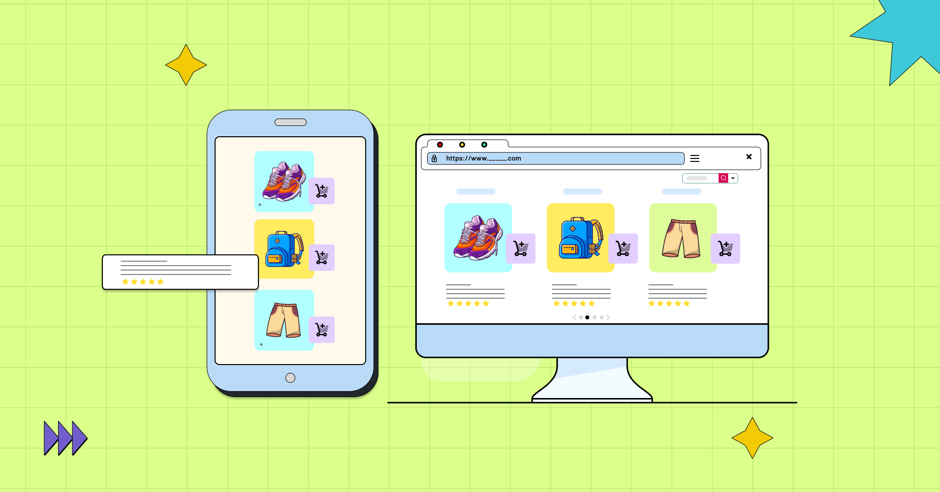
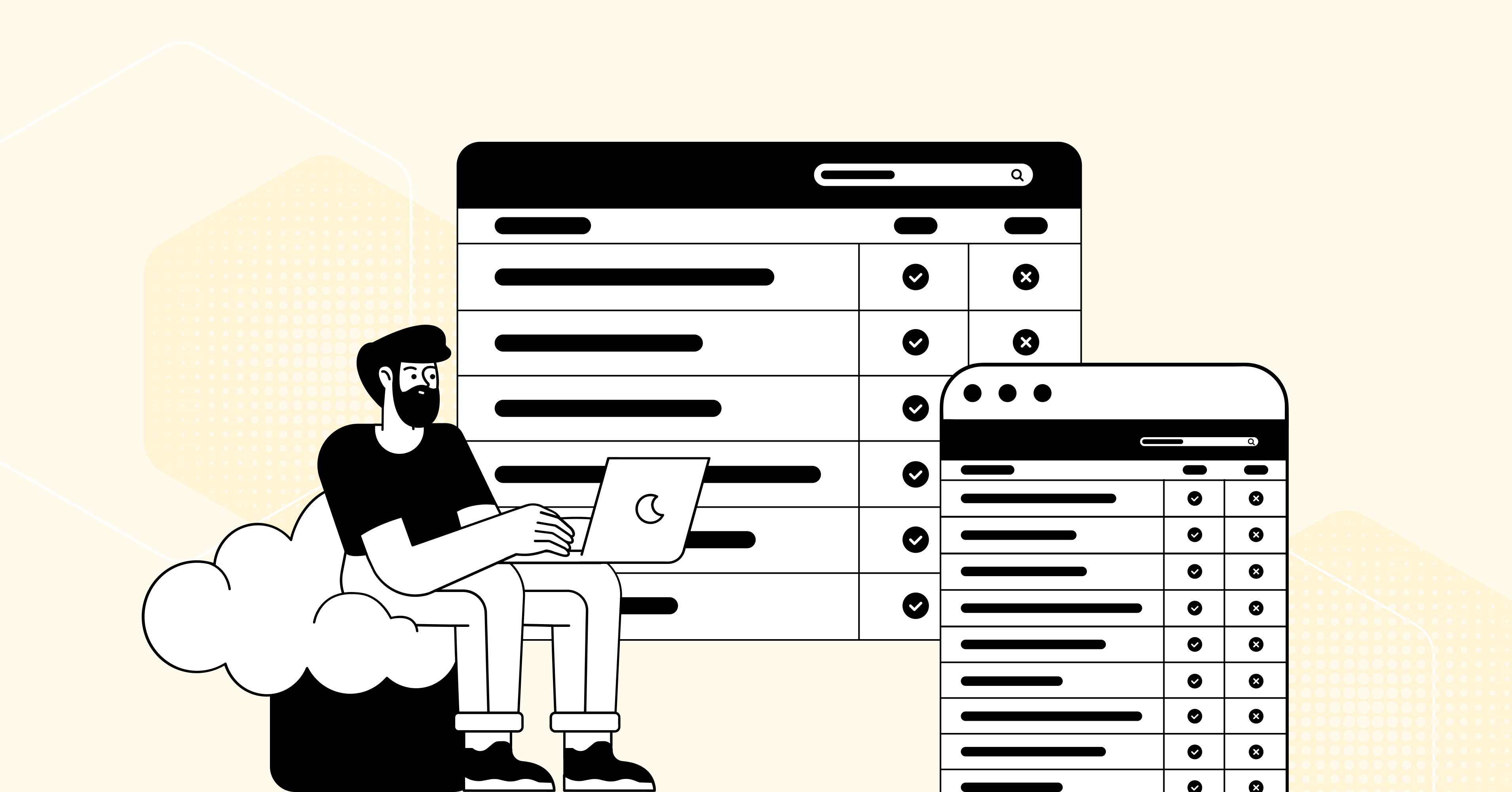
Over 70% of global web traffic now comes from mobile devices. That number keeps climbing. If your data tables are not built for small screens, you are already losing more than half your audience before they read a single row.
Mobile-first table design is not about making a desktop table “fit” on a phone. It means you design for the phone first, then scale up. This approach forces you to decide what data matters most. The result is a table that works everywhere, not just on a wide monitor.
This guide covers the core principles that make tables work on mobile in 2026, and shows exactly how Ninja Tables supports each one.
Why Mobile-First Design Matters in 2026
Mobile-first isn’t a trend anymore. It’s the baseline expectation.
Google’s mobile-first indexing means your mobile experience directly impacts search rankings. Users expect instant, readable content regardless of device.
A standard HTML table has no sense of screen size. On a desktop with a 1200px width, a ten-column table looks fine. On a phone with 390px, those same columns squeeze together, overflow the screen, or force the user to scroll sideways. Most WordPress table plugins ignore this reality. They either force horizontal scrolling (frustrating), shrink text to unreadable sizes (useless), or simply break the layout entirely (embarrassing). The fix is not to reduce your data. The fix is to change how the table presents that data, depending on the screen size it lands on.
We need to understand and implement core mobile-first design principles specifically engineered for data presentation.
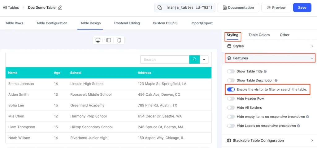
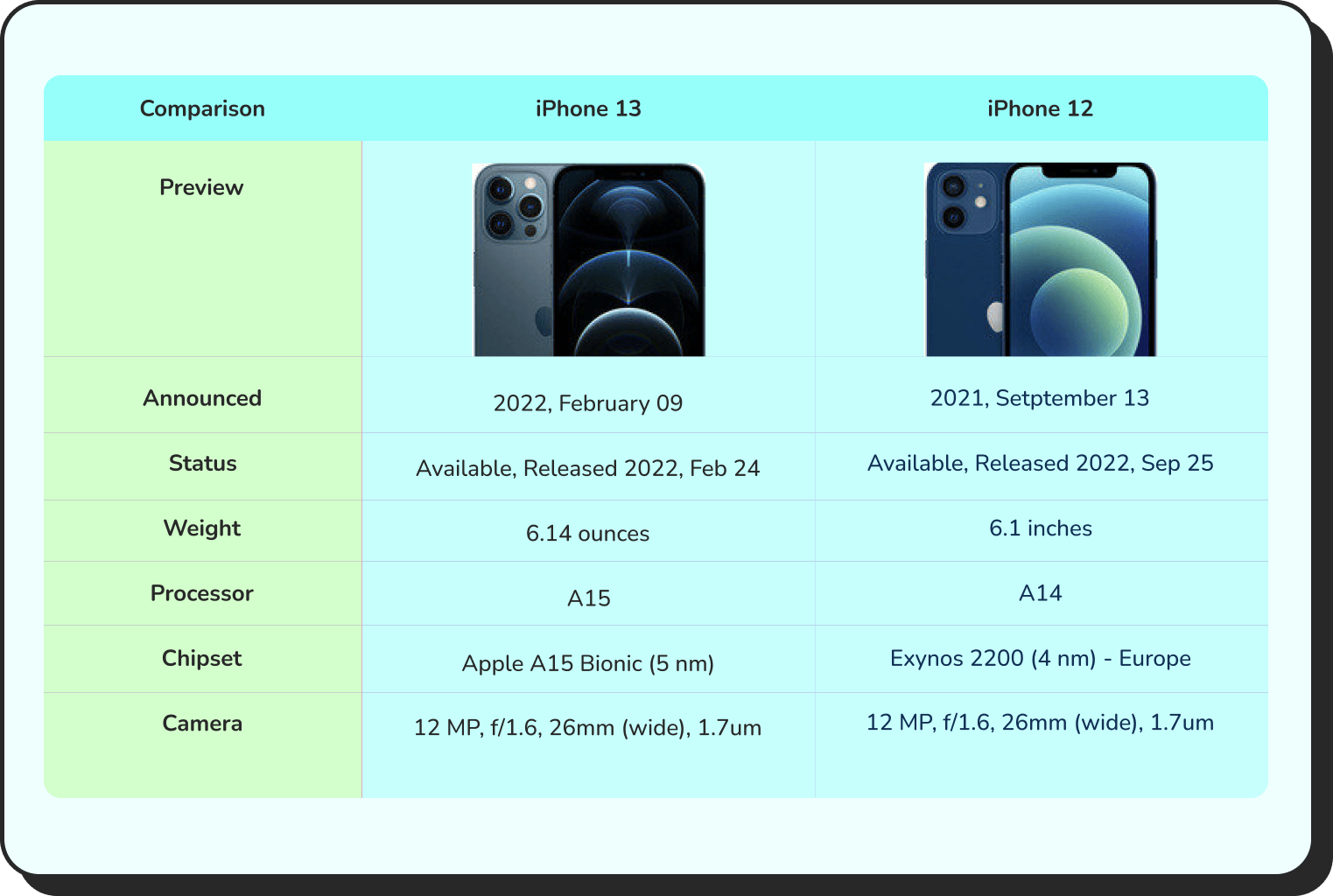
Principle 1: Prioritize the most important columns first
Not all columns carry equal weight. On mobile, you cannot show ten columns and expect the layout to hold. You need to decide which two or three columns are non-negotiable for the user.
For example, a product table might show the product name and price on mobile, and hide weight, SKU, and dimensions unless the user expands the row. The user gets the key facts fast. They can dig deeper if they need to.
Ninja Tables handles this with responsive breakpoints. For each column, you set a breakpoint that tells the table when to hide that column. Set a column to hide on specific devices. The table stays clean. The primary data stays visible without any horizontal scrolling.
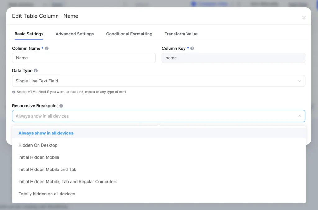
You can combine multiple responsive breakpoints across different columns to create a layered view. The most critical columns always show. The secondary data hides until the screen is wide enough to display it properly.
| Name | Position | Office | Age | Start date | Salary |
|---|---|---|---|---|---|
| Zorita Serrano | Software Engineer | San Francisco | 56 | 2012/06/01 | $115,000 |
| Zenaida Frank | Software Engineer | New York | 63 | 2010/01/04 | $125,250 |
| Yuri Berry | Chief Marketing Officer (CMO) | New York | 40 | 2009/06/25 | $675,000 |
| Vivian Harrell | Financial Controller | San Francisco | 62 | 2009/02/14 | $452,500 |
| Unity Butler | Marketing Designer | San Francisco | 47 | 2009/12/09 | $85,675 |
| Timothy Mooney | Office Manager | London | 37 | 2008/12/11 | $136,200 |
| Tiger Nixon | System Architect | Edinburgh | 61 | 2011/04/25 | $320,800 |
| Thor Walton | Developer | New York | 61 | 2013/08/11 | $98,540 |
| Tatyana Fitzpatrick | Regional Director | London | 19 | 2010/03/17 | $385,750 |
| Suki Burks | Developer | London | 53 | 2009/10/22 | $114,500 |
| Sonya Frost | Software Engineer | Edinburgh | 23 | 2008/12/13 | $103,600 |
| Shou Itou | Regional Marketing | Tokyo | 20 | 2011/08/14 | $163,000 |
| Shad Decker | Regional Director | Edinburgh | 51 | 2008/11/13 | $183,000 |
| Serge Baldwin | Data Coordinator | Singapore | 64 | 2012/04/09 | $138,575 |
| Sakura Yamamoto | Support Engineer | Tokyo | 37 | 2009/08/19 | $139,575 |
| Rhona Davidson | Integration Specialist | Tokyo | 55 | 2010/10/14 | $327,900 |
| Quinn Flynn | Support Lead | Edinburgh | 22 | 2013/03/03 | $342,000 |
| Prescott Bartlett | Technical Author | London | 27 | 2011/05/07 | $145,000 |
| Paul Byrd | Chief Financial Officer (CFO) | New York | 64 | 2010/06/09 | $725,000 |
| Olivia Liang | Support Engineer | Singapore | 64 | 2011/02/03 | $234,500 |
| Michelle House | Integration Specialist | Sidney | 37 | 2011/06/02 | $95,400 |
| Michael Silva | Marketing Designer | London | 66 | 2012/11/27 | $198,500 |
| Michael Bruce | Javascript Developer | Singapore | 29 | 2011/06/27 | $183,000 |
| Martena Mccray | Post-Sales support | Edinburgh | 46 | 2011/03/09 | $324,050 |
| Lael Greer | Systems Administrator | London | 21 | 2009/02/27 | $103,500 |
| Jonas Alexander | Developer | San Francisco | 30 | 2010/07/14 | $86,500 |
| Jennifer Chang | Regional Director | Singapore | 28 | 2010/11/14 | $357,650 |
| Jennifer Acosta | Junior Javascript Developer | Edinburgh | 43 | 2013/02/01 | $75,650 |
| Jenette Caldwell | Development Lead | New York | 30 | 2011/09/03 | $345,000 |
| Jena Gaines | Office Manager | London | 30 | 2008/12/19 | $90,560 |
Principle 2: Collapsible rows or stack
When you cannot hide columns, you need a different strategy. Collapsed and stackable layouts solve this by reformatting the row itself.
A collapsed table keeps all the data but rolls each row into a card. The user sees the primary column by default. They tap to expand and see the rest of the row. This works well for tables with lots of columns and lots of rows, like a comparison table or a data-heavy product list.
Ninja Tables supports both collapsed and stackable layouts. The stackable layout goes a step further. It takes each row and turns it into its own mini-table. The columns become rows. Each piece of data gets its own labeled line. This is ideal when every column value is equally important and you cannot afford to hide any of them.
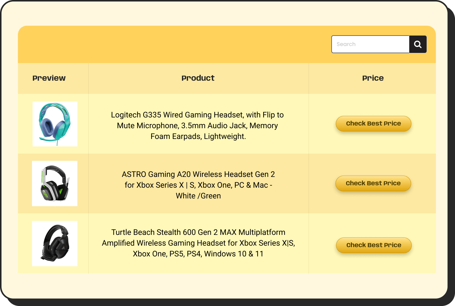
Plugin | Key Features | Rating | Active Installations | Pricing |
 |
| 80k+ | ||
 |
| 7M | ||
 |
| 70k+ |
To turn on the stackable layout in Ninja Tables, go to Table Design and check the Stackable Table option. That’s it. The table restructures itself for small screens automatically.
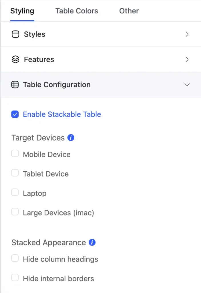
One important note: you cannot use both Stackable Table and Responsive Breakpoints at the same time in Ninja Tables. You pick the method that fits your data. If some columns are less important, use breakpoints to hide them. If all columns matter equally, use stackable.
Click "+" to Expand and Compare
| Model | Image | Capacity | Cooking Modes | Display | Special Features | Dimensions | Warranty | Price | Discount |
|---|---|---|---|---|---|---|---|---|---|
| Compact Series |  | 20L | Basic heating, defrost | LED display | Child lock | 45cm x 35cm x 25cm | 1 year | $129 | 20% |
| Standard Series |  | 28L | Heating, defrost, grill | LED display | Auto cook menus | 52cm x 40cm x 30cm | 2 years | $199 | 30% |
| Premium Series |  | 32L | Heating, defrost, grill, convection bake | Touch control with LCD | Smart sensor cooking, voice assistant compatible | 55cm x 42cm x 32cm | 3 years | $349 | 40% |
Principle 3: Support swipe navigation for wide tables
Some tables are genuinely wide. A financial table or a schedule grid might need eight to twelve columns, and hiding any of them would remove data the user needs. In these cases, you allow horizontal scrolling, but you make it deliberate and smooth.
This is the movable table approach. The table stays full-width. The user swipes left and right with a finger gesture to see the entire table. The header row stays fixed, so the user always knows which column they are reading.
Ninja Tables includes horizontal scrolling table support. When you set a table to this mode, the full horizontal layout becomes swipeable on touch devices. The user does not have to zoom or pinch. They just swipe, which is a natural gesture on any phone.
| No | Appointment | Patient's Name | Gender | History | Treatment Type | Phone No | E-mail Address | Date of birth | Attendee |
|---|---|---|---|---|---|---|---|---|---|
| 1 | 5/10/2025 10:0 AM | Rick Nielson | Male | New Visit | Routine Check | +1 212 555 4567 | [email protected] | 3/16/1989 | No |
| 2 | 5/11/2025 11:0 AM | Pamela Tov | Female | Revisit | Crowns | +1 212 555 8756 | [email protected] | 7/22/1980 | Yes |
| 3 | 5/17/2025 11:0 AM | Jim Anderson | Male | New Visit | Bone Grafting | +1 212 666 2768 | [email protected] | 8/24/1996 | Yes |
| 4 | 5/21/2025 2:0 PM | Stanley Cooper | Male | New Visit | Scalling & Polishing | +1 212 555 3111 | [email protected] | 12/2/2000 | No |
| 5 | 5/14/2025 3:0 PM | Allison Sydney | Female | New Visit | TMJ Treatment | +1 212 777 3218 | [email protected] | 11/28/1997 | No |
| 7 | 5/14/2025 12:0 AM | Harvey Spencer | Male | Revisit | Dental Emergencies | +1 212 555 9034 | [email protected] | 2/17/2003 | Yes |
This approach works best when the data has a natural left-to-right reading order. Think timelines, schedules, or side-by-side comparisons where each column represents a different time period or category.
Principle 4: Add search and filtering
A table with 50 rows on a desktop is manageable. On a phone screen, the user sees maybe four rows at a time. Scrolling through all 50 is slow and frustrating.
Search and filtering fix this. The user types a keyword or selects a filter, and the table shrinks to only the matching rows. They find what they need in three seconds instead of sixty.
Ninja Tables includes a built-in search bar and filter controls for all table types. You can make the table searchable with one checkbox in the settings. Users type directly into the search field and the table filters in real time. No page reload, no waiting.
For more structured filtering, you can add dropdown filters tied to specific columns. A user browsing a pricing table can filter by plan type, or a visitor reading a staff directory can filter by department. The table responds immediately.
Principle 5: Use pagination to keep load times fast
A table that loads 500 rows at once is slow on any device. On mobile, where many users are on cellular data, the load time is worse. A five-second wait is enough for most users to close the tab.
Pagination breaks the table into pages. Each page loads a defined number of rows, say 10 or 20. The user clicks next to load the following page. Load time drops because the browser is never handling the full dataset at once. But to utilize this feature at its highest efficiency, understand the use cases, where it is necessary or works effortlessly. Read this article on ‘Infinite Scroll vs Pagination: How to Balance UX and SEO’ to know its best strengths and weaknesses as when to add what.
Ninja Tables supports pagination out of the box. You set the number of rows per page in the table settings. The plugin generates the page controls automatically. You do not write any code to make it work.
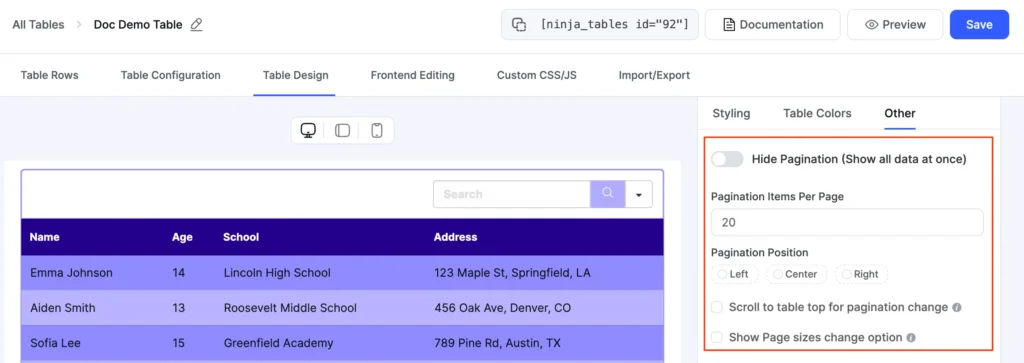
For users with fast connections who prefer scrolling, you can also set the rows-per-page number higher. The goal is to match the pagination depth to the size of your dataset and the likely connection speed of your audience.
Ninja Tables also supports AJAX pagination, where page changes load instantly without full page refreshes. This creates a smoother mobile experience, especially on slower connections.
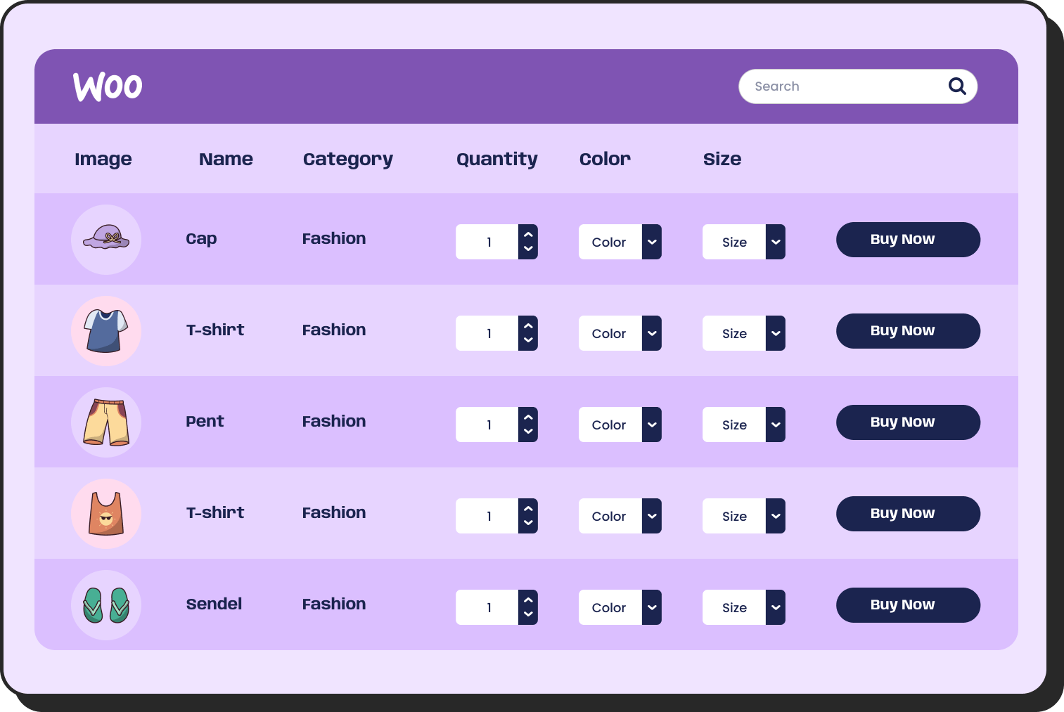
| Image | Name | Category | Price | Choose | |
|---|---|---|---|---|---|
 | Blue Hoodie (Zipper) | Hoodies | Original price was: $40.00.$35.00Current price is: $35.00. | | |
 | Hat | Hat | Original price was: $20.00.$15.00Current price is: $15.00. | | |
 | T Shirt | Half sleeve | $45.00 | | |
 | T-Shirt with Logo | Tshirts | Original price was: $10.00.$8.00Current price is: $8.00. | | |
 | Beanie with Logo | Accessories | Original price was: $20.00.$18.00Current price is: $18.00. | | |
 | T-Shirt | Tshirts | $18.00 | | |
 | Long Sleeve Tee | Tshirts | $25.00 | | |
 | Polo | Tshirts | $20.00 | | |
 | Hoodie with Logo | Hoodies | $45.00 | | |
 | Hoodie with Pocket | Hoodies | Original price was: $45.00.$35.00Current price is: $35.00. | | |
 | Hoodie with Zipper | Hoodies | $45.00 | | |
 | Beanie | Accessories | Original price was: $20.00.$18.00Current price is: $18.00. | | |
 | Belt | Accessories | Original price was: $65.00.$55.00Current price is: $55.00. | | |
 | Cap | Accessories | Original price was: $18.00.$16.00Current price is: $16.00. | | |
 | Sunglasses | Accessories | $90.00 | | |
 | Tank Top | Tanktop | Original price was: $45.00.$40.00Current price is: $40.00. | |
Principle 6: Design for touch, not clicks
Desktop users navigate with a cursor that can target a 5px element precisely. Mobile users navigate with a thumb. A thumb needs more room.
Any interactive element in a table, whether it’s a sort button, a filter dropdown, or a link in a cell, needs to be large enough to tap without hitting the wrong target.
Ninja Tables outputs tables with touch-friendly controls by default. The sort headers, pagination buttons, and filter dropdowns all have enough padding for comfortable thumb interaction. You do not need to add custom CSS to meet this standard.
Beyond button size, touch-based interaction on tables also means designing the sort behavior carefully. On a phone, a user taps the column header to sort. The tap should register quickly and the table should reorder in under half a second. Slow sort responses make the table feel broken.
A good example of efficient sorting is shown below. Click the ‘On call’ column header to see it in action. With a single click, the Yes/No values group together automatically, and the matching cells are highlighted using Ninja Tables’ conditional formatting—no extra CSS, classes, or manual code needed.
| Name | Role | Department | On-Call | Leave Dates |
|---|---|---|---|---|
| Dr. Maya Khan | General Physician | Outpatient | Yes | N/A |
| Nurse Leo Martin | Nurse | Emergency | No | June 10–12, 2025 |
| Dr. Priya Sethi | Pediatrician | Pediatrics | Yes | June 20–22, 2025 |
| Dr. Omar Salim | Surgeon | General Surgery | No | N/A |
| Rina Das | Lab Technician | Diagnostics Lab | Yes | June 5–7, 2025 |
| Jamal Uddin | Receptionist | Front Desk | No | June 18, 2025 |
| Dr. Eva Moreno | Dentist | Dental | No | June 15–17, 2025 |
| Anya Chowdhury | Nurse | Pediatrics | Yes | June 25–28, 2025 |
| Dr. Karim Faizal | Cardiologist | Cardiology | No | N/A |
| Sanjana Paul | Pharmacy Lead | Pharmacy | Yes | June 13, 2025 |
Principle 7: Start with the right table type
Not every table serves the same purpose. A WooCommerce product table has different needs than a blog post list or a pricing comparison. Choosing the right table type from the start saves hours of rework.
Ninja Tables offers more than ten ways to create a table. You can build from scratch, import data from Google Sheets, connect a WooCommerce product feed, use a CSV file, or start from one of 50+ pre-made templates.
Get table templates for free
WooCommerce
Amazon Products
WP Posts
Products Comparison
Pricing Table
Features Comparison
The templates cover the most common use cases: pricing tables, product lists, comparison tables, schedules, and more. Each template is already responsive. You load it, replace the data, and the mobile layout is ready.
If your data lives in a Google Sheet, Ninja Tables can pull it directly into a WordPress table and keep it in sync. You update the spreadsheet, and the table on your website updates automatically. This is particularly useful for tables that change often, like inventory lists, event schedules, or live rankings.
Principle 8: Test responsiveness while you build
Many designers build a table, publish it, then open it on a phone and find the layout broken. The fix is to test during the build, not after it.
Ninja Tables lets you preview the responsive behavior of your table directly inside the table editor. You can see how the table looks at different widths without switching devices or opening a browser inspector. This cuts the back-and-forth between editing and testing.
You can also test each responsive mode, collapsed, stackable, and movable, before deciding which one fits your data best. The visual preview shows the exact output the user will see on their device.
Ninja Tables offers multiple responsive table modes, including stackable layouts that automatically transform your tables based on screen size.
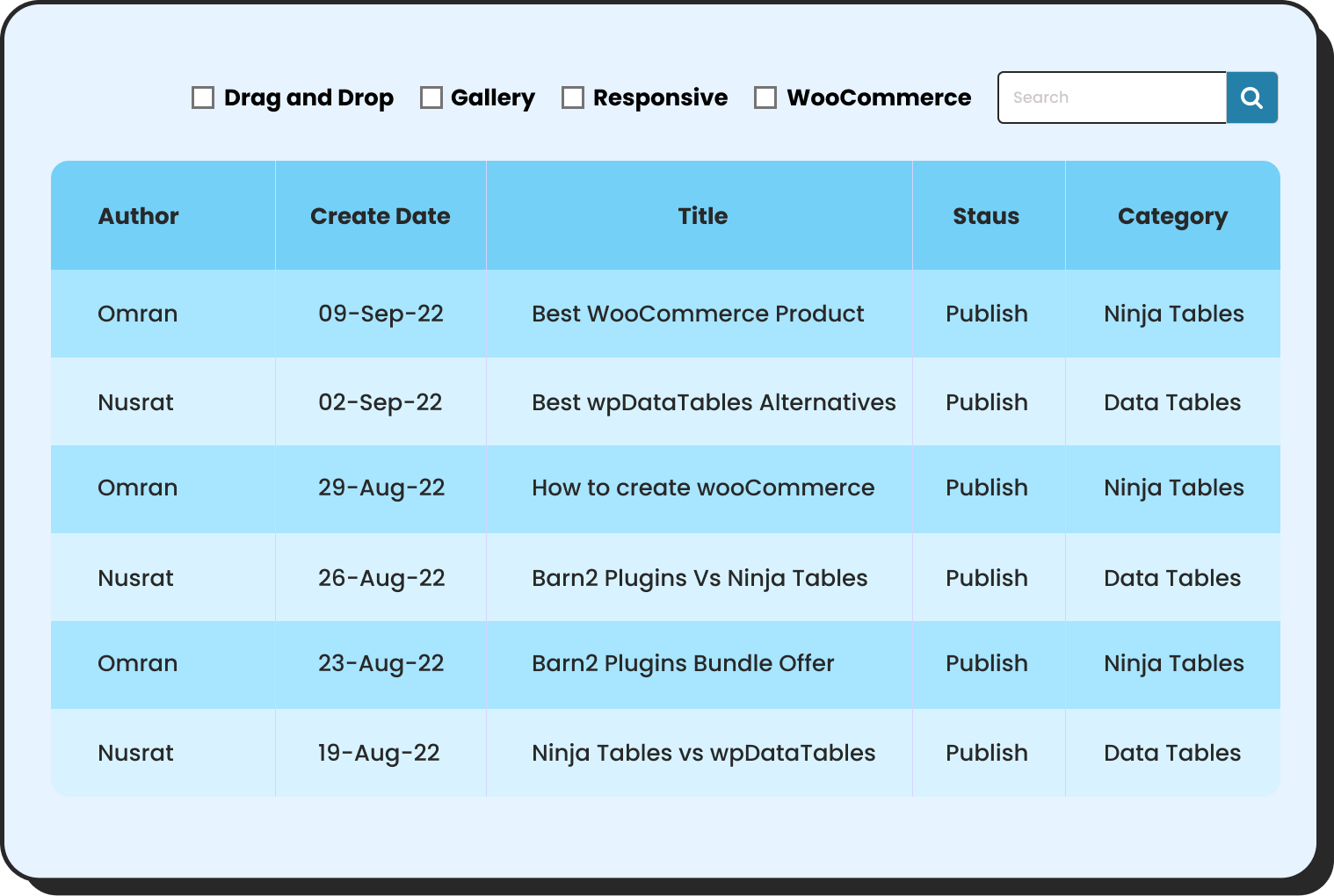
Why Ninja Tables Stands Out
Ninja Tables isn’t just another table plugin with responsive features tacked on. Mobile optimization is built into every aspect of the plugin:
- Three responsive modes: Choose scroll, stack, or hide columns per table
- Visual breakpoint editor: See exactly where your breakpoints trigger
- Real device preview: Preview tables at iPhone, Android, and tablet sizes without leaving the editor
- Performance first: Tables render efficiently on lower-powered mobile devices
- Touch gestures: Native support for swipe, tap, and long-press interactions
- Offline capability: Tables remain functional even with spotty mobile connections
Putting It Together
Mobile-first table design in 2026 comes down to a simple rule: decide what the user needs most, show that clearly, and give them tools to find everything else.
Ninja Tables supports all the responsive modes that make this possible. Collapsed tables keep all data accessible without clutter. Stackable tables reformat rows for small screens. Movable tables let wide data scroll naturally on touch devices. Responsive breakpoints hide less critical columns at specific screen sizes. Search, filters, and pagination keep large datasets fast and navigable.
The plugin works without code. You make decisions in a visual editor, and Ninja Tables handles the HTML output. Over 80,000 WordPress users rely on it to do exactly this.
If your tables are not built for mobile today, the steps above give you a clear path to fix that. Start with your most-viewed table. Apply a responsive mode that fits the data. Test it on a phone. Then move to the next one.
Mobile traffic will not slow down. Your tables should keep up with it.
Ninja Tables– Easiest Table Plugin in WordPress

Add your first comment to this post