How to Create Responsive Tables Without Compromising UX

Tables are crucial tools that let users scan, examine, and compare data. But they can be a real headache for users on small screens, like mobile.
Creating responsive tables is tricky. And as the number of mobile users grows, presenting data on mobile devices is a must.
When was the last time you thought about data table’s responsiveness? If your website has embedded tables, you should know what they are, what are the best practises, and how to create them.
Here you can learn how to effectively and consistently represent data on mobile devices. You’ll be able to create a responsive table without compromising the user experience.
What are Responsive Tables?
The prime purpose of a table is to display a lot of data in an organized way that makes sense. As 90 percent of the global internet population use a mobile device to go online, you must give them a great user experience.
This is because the screen’s display is wider than the table’s rows and columns. It can be frustrating and confusing for viewers to attempt to scroll through the table.
Responsive tables reformat and adjust themselves according to the screen size.
Sometimes, it means breaking a large table into sections. Alterations could also be necessary to make the data fit on the screen.
The best option is a responsive data table. Each WordPress theme handles tables differently. And fortunately, there are a few plugins that let you create a responsive table much easier. We’ll get to that later.
Learn how to create responsive tables in WordPress (code & no-code).
Data Table Best Practices: Responsive Tables Without Compromising UX
A good mobile table design adapts to the user’s screen requirements and makes it simple to view, filter, and sort data as well as perform other operations like exporting, copying, or deleting it.
Indeed, responsive tables aren’t easy to create, and they compromise the users’ experience. Let’s go through the alternatives: Collapsed, stackable, moveable, and shortening tables.
Collapsed tables: Prioritise primary information
When discussing responsive tables, collapsing tables is the way to go if you don’t want any data to be hidden. To use this method, table rows must be collapsed into separate cards.
It’s useful for tables with huge amounts of data as it’s a versatile way of displaying the information. Be aware that comparing detailed data between rows can become difficult unless you consider hierarchy.
To emphasize the most crucial components entails underplaying secondary and tertiary information.
Keep in mind:
- Try changing the font weight or color instead of the font size to control the hierarchy
- Don’t overlay colored cells with light gray
- Labels should be used as a last resort unless they are technical specifications
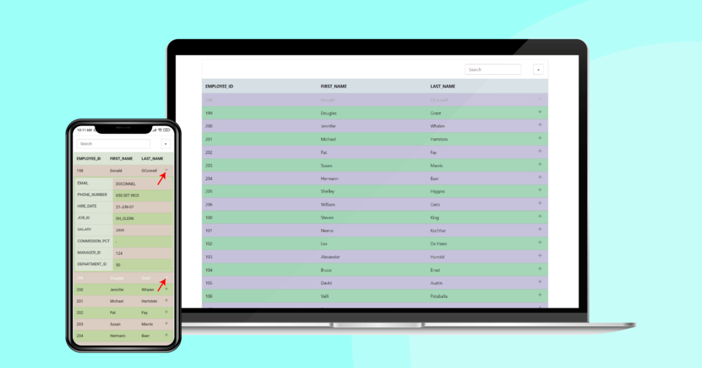
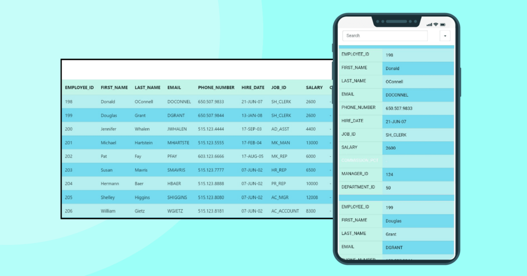
Here’s an example of a table with an active responsive breakpoint.
Click the “+” sign to find the hidden column.


*Courtesy of Ninja Tables
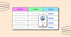
Stackable table: Make your table more descriptive
It’s a foolproof answer to the most difficult problems. The main rule is the collapsing of the table rows into separate cards. At this point, the rows become columns, and the columns become rows.
It applies to various types of content with a huge amount of data. It’s useful because of its ability to collapse and hide some data. And the end of the task gives a versatile form of data presentation.
Moreover, it can filter and sort the content easily and divide the content into separate pages.
On the downside, you’re looking at repeated row headings and multiple data pages. Plus, comparing data from different columns might be a challenge.
Movable Tables: Visualize the whole horizontal table
Despite not being a fully responsible technique, movable tables are arguably the most common pattern on mobile tables.
Why?
Movable tables require users to use swipe gestures to see the entire horizontal table simply because it’s simple to use and quick to implement. It is not recommended in tables with a lot of content because a lot of the content is hidden.
Here’s the video.
There are a few features you can add if you choose to go this route to enhance the overall experience:
- Keep the primary column fixed to preserve context.
- Use alternating color rows.
- Avoid using many font styles and weights.
- Use sort & filter
- Make sure columns are resizable.
- Allow columns to be reordered.
- Indicate if the horizontal scroll is needed.
Shorten tables: Display the key data only
Another common pattern is shortening tables; it hides unnecessary columns and leaves only the crucial data on display. You can apply it to any data and various types of content.
It would help if you considered you’ll have limited space and that you’ll have to resign to part of the data, which can be a bummer. Adding a view more button can be a good practice in this case.
It’s the smartest solution and applicable to any data and various types of content. It’s easy to use and develop with simplicity.
On the downside, it provides limited space for data presentation and needs to resign from part of the data. So, if you don’t want to drop any of your data, the above solutions may be a better fit.
Begin With a No-Code Mobile Table Builder Plugin
Regardless of your level of expertise, creating WordPress responsive tables via coding can be challenging. To be honest – even we find ourselves a bit uneasy when it comes to dealing with HTML and CSS.
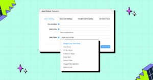
But, is there any no-code solution available? Well, yes, there come Table Builder Plugins.
A WordPress table plugin can help you finish this task with ease. Using a plugin will save time and remove the hassle of coding.
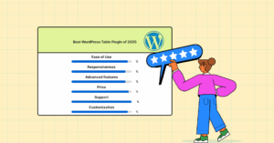
Now, If you’re wondering which plugin to go for, then the answer is Ninja Tables.
Ninja Tables is the most advanced, robust, and easy-to-use WordPress table builder plugin. It can design responsive data tables that adapt to any mobile screen size with all its features and accessibility.
Learn how responsive modes in Ninja Tables work.
Final Thoughts
Your choice of solution largely depends on the type of data you have. A good practice is working closely with a front-end developer to select the option that requires the least amount of time and technical expertise.
And for the users with little knowledge of HTML and CSS, a table builder plugin is the best solution.
Here we introduce Ninja Tables, a great table plugin used by 80k+ users worldwide. It has the easiest interface to build, design, and customize website tables.
Ninja Tables– Easiest Table Plugin in WordPress
Get in touch with Ninja Tables
If the article helped you, please don’t hesitate to share. If you have questions or would like to give some feedback, please comment below.
Get special discount on the best table plugin made for you!


Add your first comment to this post