Dynamic Data Visualization Ins and Outs

Doom scrolling or browsing with a purpose, we all want information and details handed on a platter to engage with something. And dynamic data visualization helps with decision-making by transforming unorganized data into a readable and interactive medium in real-time with charts, tables, graphs, and maps.
It’s not specific to the world of the internet. Everywhere you look, you’ll see some kind of data organized in different sorts of medium. Your report card, semester schedule notice, office employee data, prescriptions, the receipt from the grocery, everything uses data visualization. But these are all static, not dynamic.
Dynamic visualization moves away from paper and pops up on the screens.
In this blog, we’re going to dig into all that goes behind a correct and incorrect data visualization. What it is, what tools and types are the best, how to correctly visualize data, challenges and mistakes, etc. all of it.
What Is Dynamic Data Visualization?
In short, it’s a presentation of data that viewers can interact with in real-time and use some actions (click, zoom, swipe, etc.) to get results of any kind.
There was a time when printed maps were popular. Now with interactive and smart Google Maps in our pockets, we rarely need a printed map. Users can zoom, filter, and explore with intuitive controls of the app. It’s more engaging and also shows patterns and correlations that flat static visuals on a printed map can often miss.
You can also see it in eCommerce sites where the “Add to cart” button adds products after a click. It’s the real-time visual and interactivity that makes it dynamic.
How Dynamic Data Visualization Enhances User Engagement
User experience and user engagement are non-negotiable for any website. Data presentation should be dynamic and interactive so that your target audience can have a smooth experience while browsing your website.
Captures user attention
Anything that’s clickable and pops up with some info on your screen is interactive. This function is specifically dynamic visualization, not static since it’s not possible on data presented on a piece of paper.
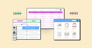
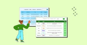
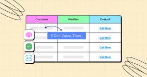
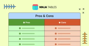
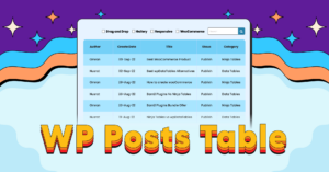
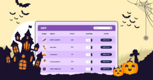
Features like custom filters, zoom in and out, and clickable elements make people engaged in exploring. Like this WP Posts table below.


Unlike static visuals, interactive data presentation allows the audience to participate in the process actively. They’re focused and interested and it shows up in their actions, with every click.
Complex information simplified
A smart dynamic visualization helps the audience understand and act on patterns, trends, and anomalies faster.
They can drill down to data points, adjust their views, check tooltips, click/zoom and expand, or search/filter to properly process the information. Interpretation of large datasets is easier this way.
Take Google Maps for example. It’s more interactive and comprehensible than a printed map.
Storytelling
Transitions, slides, color palettes, and exploring dynamic datasets create an immersive storytelling experience. This helps in understanding narratives effectively, making the data more actionable and impactful.
Tailored experience
When you play a video game, you get to select the difficulty level – Hard, medium, easy. Each level is tailored to the player’s gaming experience.
Interactive visualizations can be customized for audiences’ different levels of expertise, ensuring accessibility for diverse user groups from general audiences to business persona to data scientists.
Info absorption
The more interactive your website data is, the better your audience experience.
The engaging nature of interactive visuals ensures that users soak up the information faster and easier compared to traditional methods.
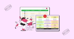
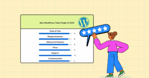
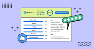
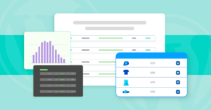
See how visitors can comprehend reviews, ratings, key features, and visit the product site all from one place.
WP Ratings 4.6 out of 5 Stars | 94% | ||
Ease Of Use 95% Design 90% Settings 90% Price 95% Support 100% Overall Quality 94% | Pros
Cons
Pricing per year
| ||
A fun interactivity leaves a lasting impression.
Predictive analysis
If data is interactive, it’s easier to predict future trends based on historical data. The forecast, detected outliers, anomalies pointing out probable issues – These insights help people make better decisions and avoid unexpected results. See weather forecasts, Google Search Console, sports predictions, etc. for example.
Interactive Data Visualization Best Practices
There’s no right or wrong answer here. A dynamic data presentation depends on what the audience wants first, what’s trending second.
Still there are some best practices you should pay attention to.
- Know your audience: Whatever the data or visuals, tailor them based on the audience’s familiarity with the data and preference. They might not be too eager to interact with a page with too many animations, buttons, vibrancy, or required actions.
- Define your story: Focus on the story you want the data to tell and connect with the audience. Not overdoing it is the key.
- Keep It Simple: Avoid unnecessary and irrelevant elements that clutter the data presentation. The data should be easily digestible.
- Use colors wisely: Interactive maps use colors to perfectly define traffic situations. Use colors that are relevant to the data. Data visualization color palettes shouldn’t hurt the eyes and shouldn’t mislead.
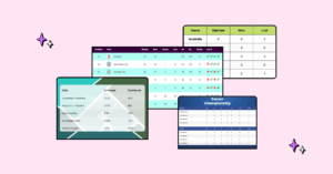
- Choose the right tool: Match the data visualization tool to the data’s purpose. Showing test scores in a table makes more sense than using graphs or charts.
- Clarity and precision: Visualizations should be clear and precise and highlight the insights.
- Mindful design: Design your data table or chart in a visually appealing way to make them easy on the eyes. Use proper scaling, engaging media, and interactive elements like tooltips, hovers, filters, click-to-expand, etc.
- Units and labels: Wrong units or labels in tables, charts, or graphs can mislead your audience. Simplify large numbers with their known units, add calculated amount if it’s numeric showcasing, proper labels and tooltips, specify axes in charts and row-columns in tables, etc.
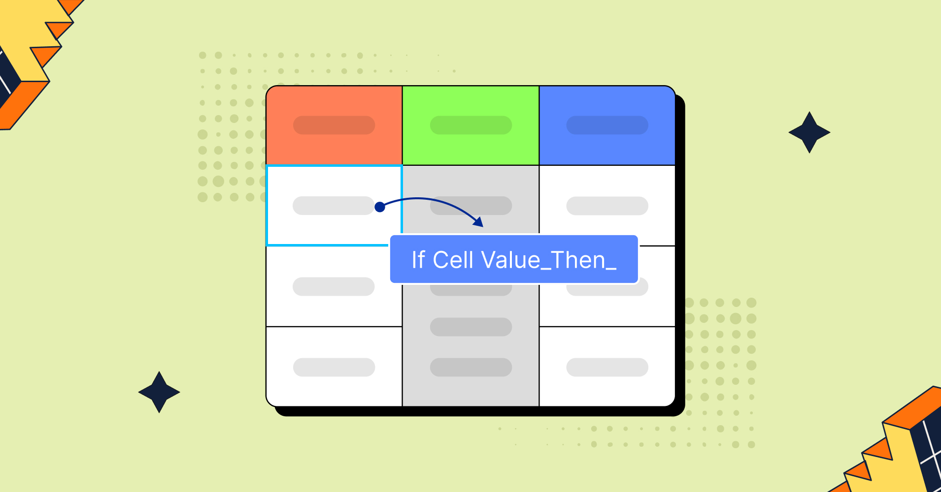
- Tables and charts: A properly customized and designed data table or data chart can save a lot of your time. Utilize dynamic data input for filter, sort, search, action buttons, and links in tables. Style rows/columns, border, and table content with the right alignment, color, or data type.
Common Challenges: Avoid Data Visualization Mistakes
Since it’s used widely, pointing out mistakes in dynamic data visualization is quite difficult now. Everything somehow becomes a trend!
But there are some common data visualization mistakes to avoid under any condition.
- Using misleading visuals. Don’t confuse your audience with wrong element placement, wrong scaling, units, or labeling.
- Avoid bad designs like too many bright colors, colors that don’t complement each other, hard to read combinations, or color palettes that don’t follow your brand guideline.
- Never clutter the data. Visualizations should be simple and comprehensible, not a never ending collection of data hard to grasp or big data in small spaces.
- Don’t miss labels, tooltips, chart axes, table headers, or simple hover animations. These help people interact with the visuals better.
- When using table data visualization, be careful of tables with huge amounts of data or too many rows/columns/cells. Don’t miss custom filters, search bars, table borders, dynamic data types, proper colors, and alignment.
- Avoid cramming data and crowding the space. Data in both tables and charts should be easily comparable.
- Careful not to include too many variables or visuals. This overwhelms viewers.
Read more about data visualization common mistakes.
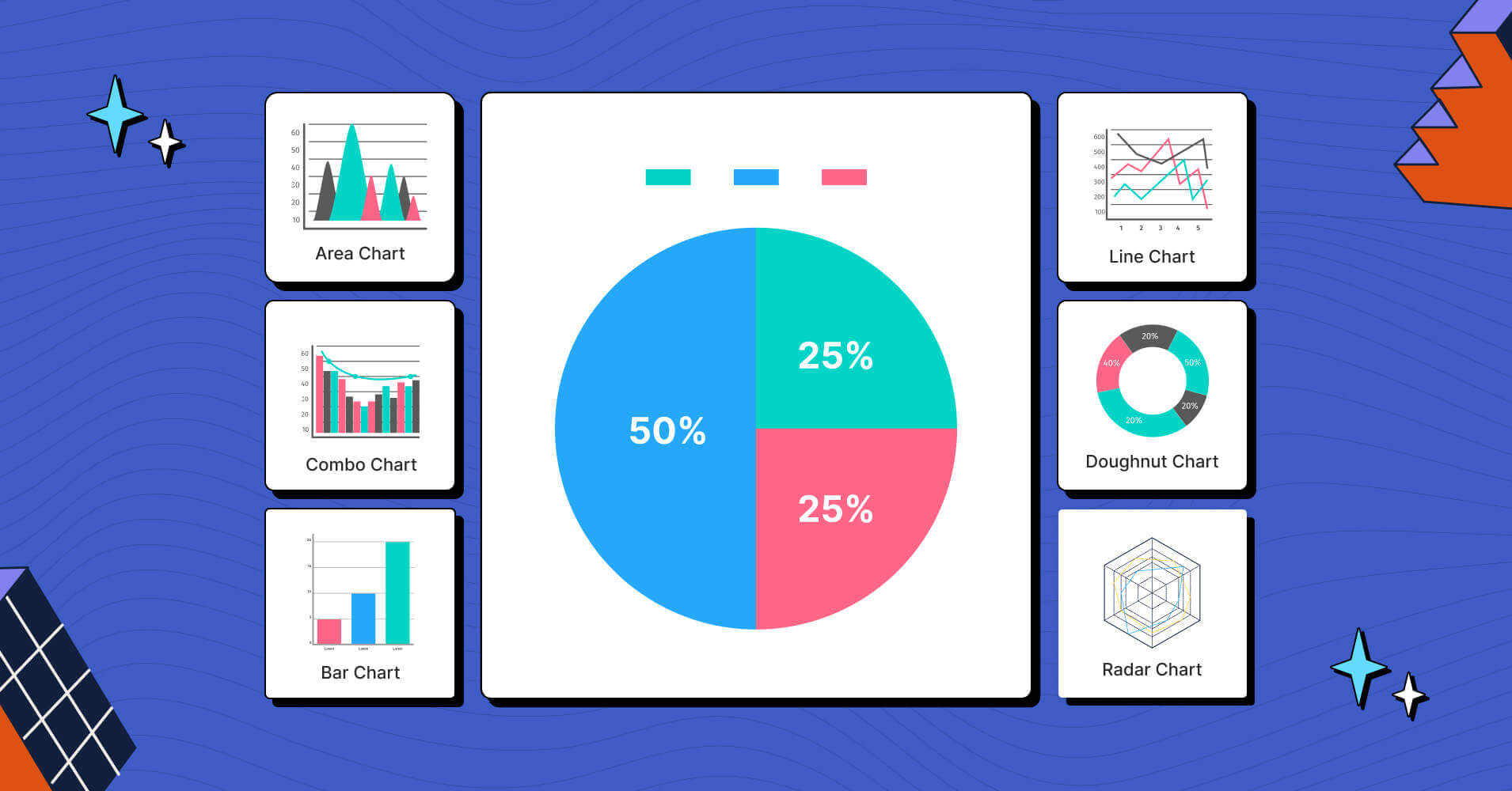
Top Data Visualization Tools
We’ve listed top 5 data visualization tools based on their popularity, features, and versatility.
- Tableau: An interactive visual analytics software to help solve problems.
- Google Charts: Web-tool for dynamic charts and integrates with all Google tools.
- Looker: Cloud-based tool with advanced data modelling capacity.
- Ninja Tables: Table data visualization tool in WordPress with free chart integration.
- wpDataTables: WordPress tool for table data and chart presentation.
These 5 tools cater to different needs depending on user base, data type, functions, price, and accessibility.
Check out some more data visualization softwares.
Have you tried any of them?
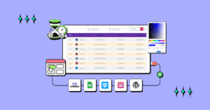
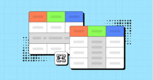
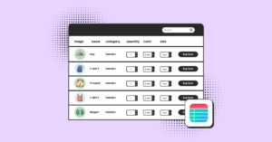
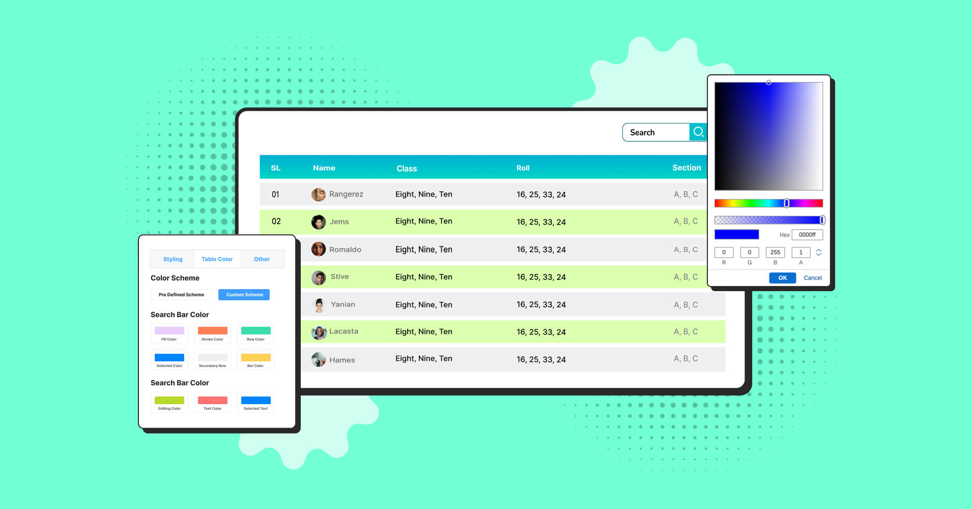
How Ninja Tables Can Enhance Data Visualization
As a simple yet feature-rich table plugin in WordPress, Ninja Tables is one of the most useful data visualization tools. You can create tables of any kind and turn them into interactive and engaging data tables in the frontend.
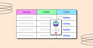
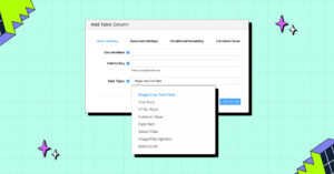
Dynamic data types
Your table can handle a big amount of dynamic data – Text, numbers, date range, multimedia, buttons, links, icons, and more!
Interactivity and usability
With features like custom filters, data sorting, data search, pagination, and hover animation, Ninja Tables makes creating and controlling data a lot more fun.
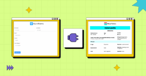
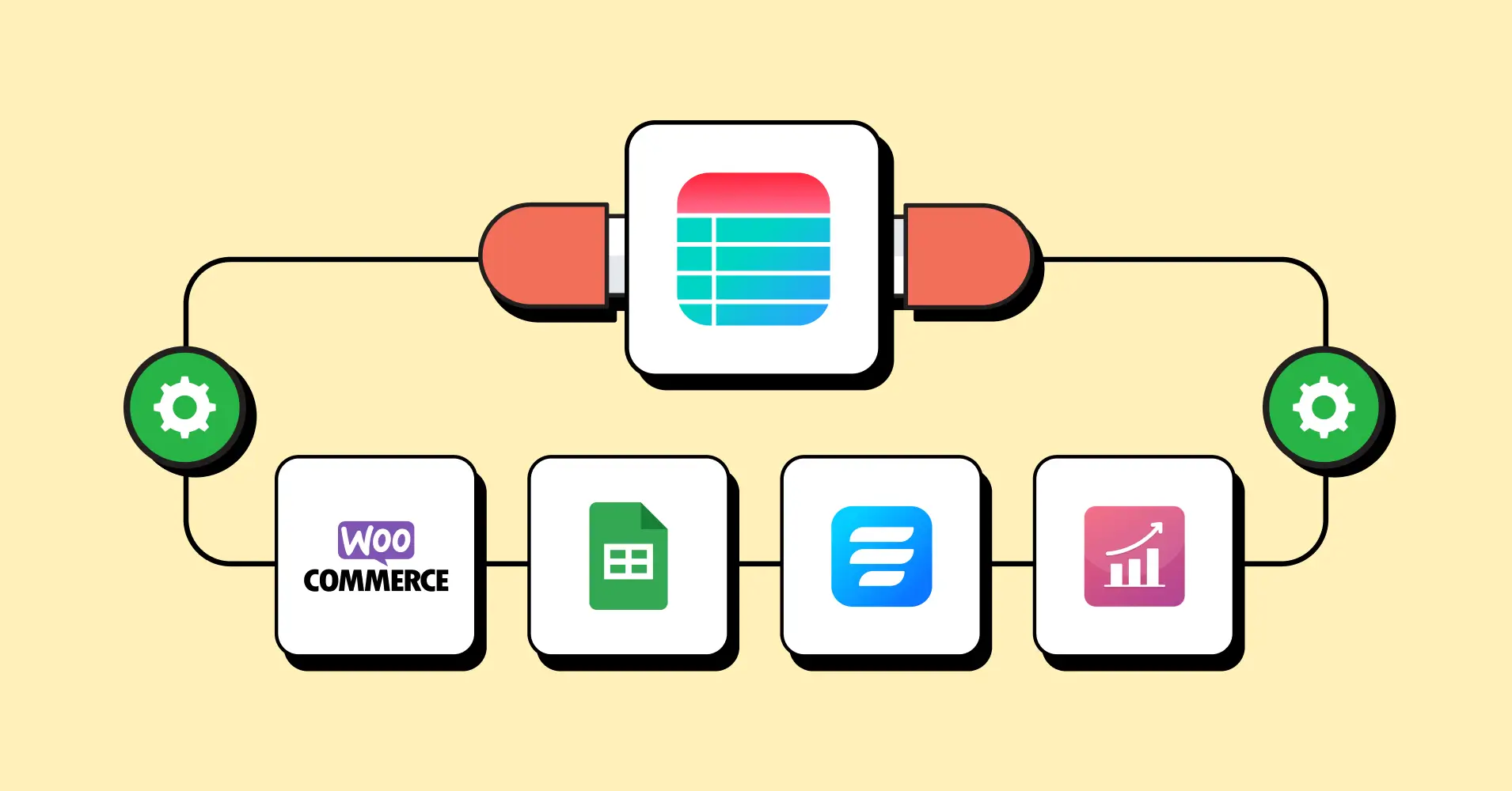
Integrations
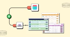
Real-time data fetching from external sources is another interactive feature of Ninja Tables. Integrate Google Sheets, WooCommerce, Fluent Forms, and external CSV/JSON files for dynamic data import and boost your WordPress site.
Advanced customization
100+ table styles, customizable color schemes, table element alignment, conditions, border colors, and some more features add to the interactive aesthetics
Responsive tables
Your tables can adapt to any device for better view in mobile or tablets. Stackable table feature breaks down big data tables and stacks each row on top of each other creating separate tables. And Responsive Breakpoints ensure you hide a column in a device of your choosing.
Easy table creation
4 different table creation options make data organizing more fun. Ninja Tables lets you create tables in Advanced mode or Drag and Drop mode. There’s also a free table templates page that already has pre-designed tables for you to use. And you can always import!
Front-End editing
Select user role and let users edit table entries in the frontend. It reduces backend dependency and ensures clarity.
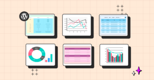
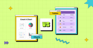
Charts
Integration with a free WordPress charts plugin like Ninja Charts boosts the data visualization power of Ninja Tables even more.
Data Visualization Trends
AI may or may not take your job, but it’s definitely taking over every tool! AI-infusion is something we can see all around us. Even if other trends fail to convey the right info, it’s evident that AI will keep evolving as a data visualization assistant.
Here are some key trends.
- AI and Machine Learning (ML) will provide dynamic updates, real-time insights, and smart recommendations, making complex datasets easier to handle. AI-infusion will be more crucial and necessary in the near future.
- Static data is almost obsolete now. Interactive features like zooming, filtering, and click highlights have taken over for good.
- AR/VR or 3D data showcasing is on the rise worldwide and they improve data comprehension in virtual spaces.
- Real-time data dashboard is becoming more necessary for businesses to find dynamic metrics and adapt to market shifts.
- Storytelling and gamification will make complex data relatable and bite-sized.
- Every tool has a dynamic data visualization feature for data analysis and reports. It will only improve rather than stop.
Check out some more trend details while you’re at it.
Human brain takes time to process textual, numeric, or media data. Some take a lot of time. Dynamic data display is making sure we don’t lose our precious time analyzing data manually. The future is all about dynamic and interactive data!
Unique Dynamic Data Visualization Examples
It’s not just small businesses checking data from tools to master sales or schools presenting results on the web. Big corporations have found many unique uses of dynamic data visualization.
“Eyes on Asteroids” by NASA
It’s a 3D interactive visualization that allows space-lovers to view real-time positions of asteroids. You can zoom in and out, track celestial bodies, and track their trajectories.
“Drowning in Plastic” by Reuters Graphics
It compares the size of daily plastic waste to popular landmarks. This visualization offers an eye-opening scale to understand the magnitude of pollution. This truly is a unique and important visualization.
Scale of the Universe
This site allows you to explore the relative sizes of objects and animals in the universe, from the smallest of particles to the vast galaxies! Use the scroll bar to zoom in to Planck length and zoom out to the huge nothingness we can’t even measure.
Netflix Interactive
A Black Mirror episode “Bandersnatch” (2018) had 5 main endings and the viewers watching on Netflix could choose their pathways to see the end. Each pathway had different endings and branches.
Some use cases and examples of data visualization.
FAQs
You probably have some more questions about dynamic visualization. Here we’ll answer the common queries.
What is the difference between static and dynamic data visualization?
The primary difference between static and dynamic data visualization is in the interactivity. Static visualizations are still, printed, written, and fixed. For example, a printed map, a book, or a movie poster in the cinemas.
On the other hand, dynamic visualizations invite the audience to interact with it using click, type, swipe, or tap. For example, mapping tools, Kindles, dashboards, simulations, etc.
What is an example of dynamic data?
The first rules of dynamic data are real-time updates, elaboration, and interactivity. So, a good example of dynamic data would be our social media feeds. Or the smart home devices that can read the changes in environment and update room temperature with every fluctuation in real-time. And of course, the tools you use to analyze data. For example, Google Analytics.
What are the three types of data visualization?
The basic 3 types of data visualizations:
- Charts
- Tables
- Maps
They can be static and dynamic both.
Make Data Visualization Fun Again!
We’re used to screens, pop ups, clicks, and transitions. Interactive and dynamic data visualization is all around us.
From the ticket machines at the movies to vending machines at school and from watching interactive Netflix shows to big corps tracking their sales predictions, we’ve all experienced it.
Simplifying complex info, helping in decision making, and gamifying every aspect of work, life, and academics, smart data visualization is now an integral part of our lives.
If you’re still hesitating to incorporate it into your everyday activities or business, think again!
Ninja Tables– Easiest Table Plugin in WordPress


Add your first comment to this post