Responsive Table Modes in Ninja Tables | No Coding
Making responsive tables in WordPress is a tricky task. And if you belong to the majority of WordPress users with no coding skills then it can turn into a (huge) mess. So, you need a smarter solution. Right?
Guess what, you are in luck!
This guide will help you learn the tips & tricks to create stunning mobile responsive tables in less than 5 minutes – that too without any expertise in coding.
What you need is Ninja Tables.
The Importance of Responsive Tables
According to Statista, approx 55% of web traffic comes through mobile devices.
Say, you’ve got visually appealing data tables on your website, but here’s the catch: they’re not optimized for mobile.
You’ll probably lose over half of your potential website traffic! So, Mobile Matters.
Have a look at this image:
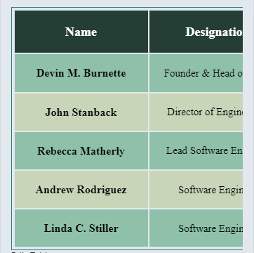
Non-responsive table viewed on Google’s developer tool
If you ever land on a website where the data tables look similar to this, will that provide a better user experience for you? In most cases, the answer would be NO.
73.1% of web designers consider that non-responsive website is one of the top causes of high bounce rate – GoodFirms
So, no matter how big your tables are on web pages – to ensure a better user experience make sure they are mobile-friendly, readable, and re-adjustable for all screen sizes.
There you have it – Ninja Tables.
How to Make Responsive Tables in WordPress With Ninja Tables
Making a mobile-responsive data table gets easier and simpler with Ninja Tables.
This plugin comes with two different modules of the table-building facility.
• Advanced Table (Classic table builder)
• Drag and Drop Table (Simple table builder)
We’re going to explain how to make responsive WordPress tables with both Ninja Tables’ modules.
Advanced Table Responsiveness
As you navigate through the Table Design panel, you’ll notice many checkboxes and settings options on the right-hand side for customization.
Each checkbox can transform your table appearance, allowing adjustments in borders, rows, layout, title, description, and more.
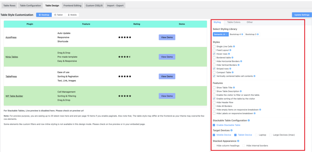
That’s not all! Moreover, the default table has versatile table types to make data tables without compromising UX such as:
- Collapsed Table
- Stackable Table
- Movable Table
- Adaptable Table
- Shortened Table
These table layouts can adapt to any screen size according to the users’ preferences.
Let’s find out how you can make each of these tables responsive.
Collapsed Tables
Your primary data will be visible here without any horizontal scrolling – ensuring navigation using vertical swiping.
For each column, you will find a dropdown field of the responsive breakpoint in column “Basic Settings.”
By choosing a breakpoint, you can show or hide any column – keeping only primary data visible in a device-specific manner.
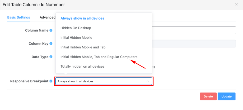
Oh, and here’s another quick guide – data columns that you hide for a device, don’t (really) disappear. They’re cleverly tucked in a little + sign.
All it takes is a gentle tap on that plus sign, and voilà! The hidden data emerges to visibility.
| Name | Position | Office | Age | Start date | Salary |
|---|---|---|---|---|---|
| Zorita Serrano | Software Engineer | San Francisco | 56 | 2012/06/01 | $115,000 |
| Zenaida Frank | Software Engineer | New York | 63 | 2010/01/04 | $125,250 |
| Yuri Berry | Chief Marketing Officer (CMO) | New York | 40 | 2009/06/25 | $675,000 |
| Vivian Harrell | Financial Controller | San Francisco | 62 | 2009/02/14 | $452,500 |
| Unity Butler | Marketing Designer | San Francisco | 47 | 2009/12/09 | $85,675 |
| Timothy Mooney | Office Manager | London | 37 | 2008/12/11 | $136,200 |
| Tiger Nixon | System Architect | Edinburgh | 61 | 2011/04/25 | $320,800 |
| Thor Walton | Developer | New York | 61 | 2013/08/11 | $98,540 |
| Tatyana Fitzpatrick | Regional Director | London | 19 | 2010/03/17 | $385,750 |
| Suki Burks | Developer | London | 53 | 2009/10/22 | $114,500 |
| Sonya Frost | Software Engineer | Edinburgh | 23 | 2008/12/13 | $103,600 |
| Shou Itou | Regional Marketing | Tokyo | 20 | 2011/08/14 | $163,000 |
| Shad Decker | Regional Director | Edinburgh | 51 | 2008/11/13 | $183,000 |
| Serge Baldwin | Data Coordinator | Singapore | 64 | 2012/04/09 | $138,575 |
| Sakura Yamamoto | Support Engineer | Tokyo | 37 | 2009/08/19 | $139,575 |
| Rhona Davidson | Integration Specialist | Tokyo | 55 | 2010/10/14 | $327,900 |
| Quinn Flynn | Support Lead | Edinburgh | 22 | 2013/03/03 | $342,000 |
| Prescott Bartlett | Technical Author | London | 27 | 2011/05/07 | $145,000 |
| Paul Byrd | Chief Financial Officer (CFO) | New York | 64 | 2010/06/09 | $725,000 |
| Olivia Liang | Support Engineer | Singapore | 64 | 2011/02/03 | $234,500 |
| Michelle House | Integration Specialist | Sidney | 37 | 2011/06/02 | $95,400 |
| Michael Silva | Marketing Designer | London | 66 | 2012/11/27 | $198,500 |
| Michael Bruce | Javascript Developer | Singapore | 29 | 2011/06/27 | $183,000 |
| Martena Mccray | Post-Sales support | Edinburgh | 46 | 2011/03/09 | $324,050 |
| Lael Greer | Systems Administrator | London | 21 | 2009/02/27 | $103,500 |
| Jonas Alexander | Developer | San Francisco | 30 | 2010/07/14 | $86,500 |
| Jennifer Chang | Regional Director | Singapore | 28 | 2010/11/14 | $357,650 |
| Jennifer Acosta | Junior Javascript Developer | Edinburgh | 43 | 2013/02/01 | $75,650 |
| Jenette Caldwell | Development Lead | New York | 30 | 2011/09/03 | $345,000 |
| Jena Gaines | Office Manager | London | 30 | 2008/12/19 | $90,560 |
**Check on the “+” sign
Stackable Tables
This format can visualize your data tables in the most simplified form by collapsing the rows into separate cards – making the horizontal table into a vertical one.
This is the iconic “Stackable Table Configuration” feature.

The Stackable table configuration is in the table design panel. Once enabled, this option opens up two additional sub-sections.
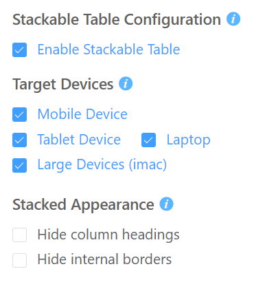
- Target Devices: Allows you to select the specific devices you want, to showcase the stackable view of your table.
- Stacked Appearance: Gives you the luxury of hiding borders or heading according to your needs.
Click the Update Settings button after applying any changes into the right sidebar.
Movable Tables
This format is automatically applied to all default tables in Ninja Tables, eliminating the need for extensive configuration. This layout is particularly useful when you’re dealing with large data sets with numerous columns and rows to accommodate.
Therefore, all you have to do is simply add your data to the table, customize its style, and leave it as it is.
Though this is not an efficient solution yet it’s used quite often nowadays. It allows horizontal scrolling through the entire table via swipe gestures.
Adaptive Tables
Adaptive format dynamically adjusts its size and layout based on the screen size.
Ninja Tables also has this format integrated into its system so if you prepare a relatively tiny table, say you’ve got a 3*3 / 4*4 table, then it will adapt to any screen size without any external configuration.
Shortened Tables
Ninja Tables provide some useful advanced shortcodes. These shortcodes can be used to customize your tables to display only primary data on separate pages/posts in a different setup.
Advanced shortcodes seamlessly combine the Shortened Table layout with any other responsive table format mentioned earlier.
Here’s the step-by-step process of making shortened tables:
Step 1: Label your table rows and columns clearly for understanding.
Step 2: Keep your header fixed at the top.
Step 3: Maintain the same font size and use different colors for the rows.
Step 4: Save the table and access the advanced shortcode panel to copy your desired shortcode.
Step 5: Paste the advanced shortcode in the editor area and replace with the actual ID of your table.
Drag and Drop Table Responsiveness
Drag and Drop table builder is a simple and convenient aspect of Ninja Tables. It can design tables for your websites effortlessly.
Ninja Tables consists of pre-made customizable templates, already optimized for responsiveness. These table templates automatically adapt to mobile devices, ensuring a better user experience across devices.
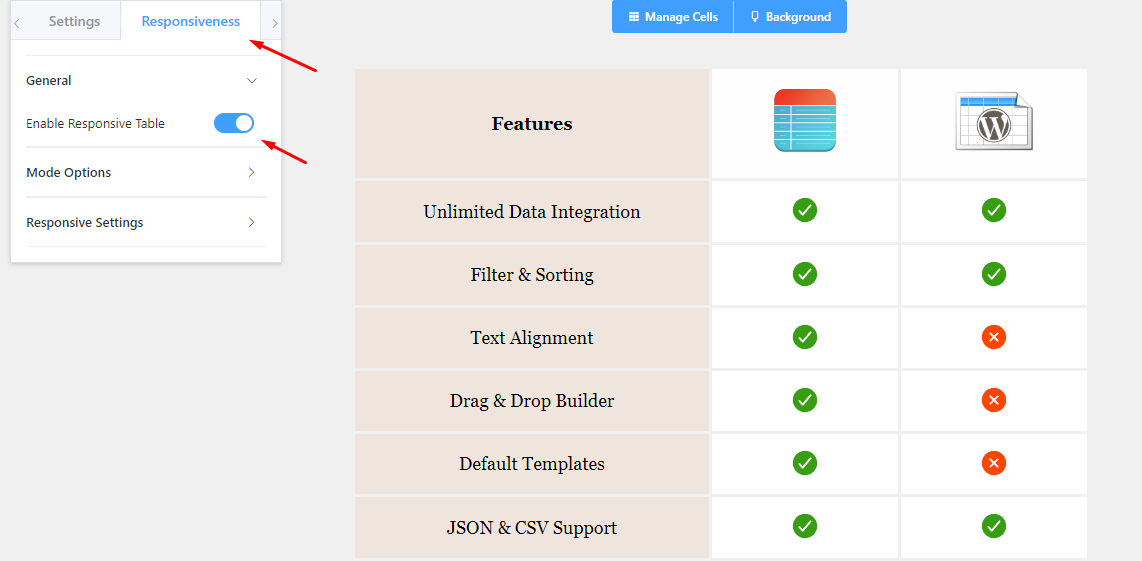
The responsiveness controls can be found towards the left sidebar of the drag-and-drop design panel.
To ensure your data table flawlessly adjusts to any mobile screen, follow this pathway: Responsiveness >> Enable Responsive Breakpoint and your table will be adjusted for all screen sizes.
Having said that, you can also tweak the table appearance for mobile, tablets, and desktops by exploring the Mode Options & Responsive Settings.
After making changes don’t forget to hit “save”.
Responsive Properties
To tweak the table layout for responsiveness, drag and drop table builder has some properties tucked in the responsiveness panel.
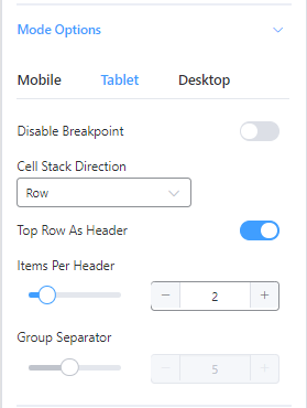
Let’s check out the use case of these properties.
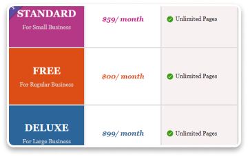
Disable Breakpoint
Disabling the breakpoint will make the responsive output the same as seen in the desktop mode.
Cell Stack Direction (Column)
You can change the table appearance from row-wise to column-wise if you want.

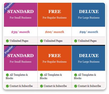
Top Row as Header
You can set the top row as the header (or turn it off) for mobile devices.
Items Per Header
This option lets you choose how many items you want to display on tablets/ mobiles.
Testing Your Responsive Tables
When editing in the Table Design panel, the default (advanced) table provides three options for a live preview of how your table will appear on Desktops, Tablets, and Mobile devices.
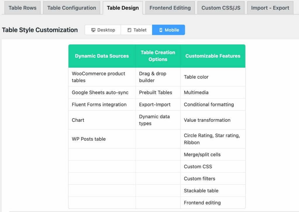
And you can always hit the “Preview” button at the top right corner.
For the drag-and-drop table, you’ll find specific modes for different screen sizes in the responsiveness tab on the left sidebar.
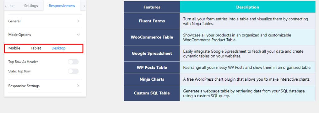
Likewise, this mode also has the “Preview” button, you can check how your table appears on the front end.
While editing in Ninja Tables, you can efficiently configure the responsiveness to see how your audience will view your table on different devices.
Examples of Some Mobile Table Design
So, you already know the art of making your tables responsive.
Check out the following tables on the mobile screen to see if they are readable.
If you’re using your desktop for this, you can use the Google developer tool to see if the table fits smaller device screens. Or you can just check on your smartphones/tablets.
Amazon Product Listing Table
| Preview | Product | Price |
|---|---|---|
 | Ninja 13 Unicorn Wired Headphones |  |
 | Sungao 4 in 1 Waterproof Electric Razor Kit with Charging Stand for Men | |
 | Wired Headphone with Extra Beats | |
 | Bluetooth Headphone TWS |
Image Gallery Table
Responsive Posts Table
Stackable Table With Responsive Breakpoints
(Stackable only on mobile & breakpoints appear on bigger devices)
| Name | Position | Office | Age | Start date | Salary |
|---|---|---|---|---|---|
| Zorita Serrano | Software Engineer | San Francisco | 56 | 2012/06/01 | $115,000 |
| Zenaida Frank | Software Engineer | New York | 63 | 2010/01/04 | $125,250 |
| Yuri Berry | Chief Marketing Officer (CMO) | New York | 40 | 2009/06/25 | $675,000 |
| Vivian Harrell | Financial Controller | San Francisco | 62 | 2009/02/14 | $452,500 |
| Unity Butler | Marketing Designer | San Francisco | 47 | 2009/12/09 | $85,675 |
| Timothy Mooney | Office Manager | London | 37 | 2008/12/11 | $136,200 |
| Tiger Nixon | System Architect | Edinburgh | 61 | 2011/04/25 | $320,800 |
| Thor Walton | Developer | New York | 61 | 2013/08/11 | $98,540 |
| Tatyana Fitzpatrick | Regional Director | London | 19 | 2010/03/17 | $385,750 |
| Suki Burks | Developer | London | 53 | 2009/10/22 | $114,500 |
| Sonya Frost | Software Engineer | Edinburgh | 23 | 2008/12/13 | $103,600 |
| Shou Itou | Regional Marketing | Tokyo | 20 | 2011/08/14 | $163,000 |
| Shad Decker | Regional Director | Edinburgh | 51 | 2008/11/13 | $183,000 |
| Serge Baldwin | Data Coordinator | Singapore | 64 | 2012/04/09 | $138,575 |
| Sakura Yamamoto | Support Engineer | Tokyo | 37 | 2009/08/19 | $139,575 |
| Rhona Davidson | Integration Specialist | Tokyo | 55 | 2010/10/14 | $327,900 |
| Quinn Flynn | Support Lead | Edinburgh | 22 | 2013/03/03 | $342,000 |
| Prescott Bartlett | Technical Author | London | 27 | 2011/05/07 | $145,000 |
| Paul Byrd | Chief Financial Officer (CFO) | New York | 64 | 2010/06/09 | $725,000 |
| Olivia Liang | Support Engineer | Singapore | 64 | 2011/02/03 | $234,500 |
| Michelle House | Integration Specialist | Sidney | 37 | 2011/06/02 | $95,400 |
| Michael Silva | Marketing Designer | London | 66 | 2012/11/27 | $198,500 |
| Michael Bruce | Javascript Developer | Singapore | 29 | 2011/06/27 | $183,000 |
| Martena Mccray | Post-Sales support | Edinburgh | 46 | 2011/03/09 | $324,050 |
| Lael Greer | Systems Administrator | London | 21 | 2009/02/27 | $103,500 |
| Jonas Alexander | Developer | San Francisco | 30 | 2010/07/14 | $86,500 |
| Jennifer Chang | Regional Director | Singapore | 28 | 2010/11/14 | $357,650 |
| Jennifer Acosta | Junior Javascript Developer | Edinburgh | 43 | 2013/02/01 | $75,650 |
| Jenette Caldwell | Development Lead | New York | 30 | 2011/09/03 | $345,000 |
| Jena Gaines | Office Manager | London | 30 | 2008/12/19 | $90,560 |
All tables shown here are the courtesy of Ninja Tables.
WordPress Responsive Tables FAQs
You got a question? We got answers!
How do you make a large table mobile-friendly?
To make a large table mobile-friendly, keep a simple design, focus on the primary data, and apply responsive design techniques, and breakpoints.
What is a responsive table?
Responsive tables automatically adjust their layout and appearance to provide a better user experience on devices, like desktops, tablets, and mobile phones. The layout adapts to any small or big screen size – ensuring better readability and easy navigation.
Can tables be made responsive?
Yes, like any other elements of a website, tables can be made responsive too. Either you use HTML & CSS codes or you can just go for plugins.
How do I make my table responsive easily?
Here are some best practices you need to know:
- Ensure table headers and labels are clear and consider using sticky headers.
- Optimize table performance by avoiding unnecessary font sizes, columns, and rows.
- Compress image sizes to improve loading times, especially for larger files.
- Keep your table visualization simple, and prioritize important information only.
- Test the responsiveness on various devices using the Google developer tool.
- Regularly check and update the table to ensure accuracy.
- Consider using mobile-friendly table plugins or frameworks.
What is the best table plugin for WordPress?
Ninja Tables – the go-to WordPress table plugin for customization and responsiveness. It allows you to create two distinct table types using one plugin, both can be effortlessly optimized for mobile devices.
Do Ninja Tables support different types of responsive table layouts?
Yes, Ninja Tables supports different types of responsive layouts, such as collapsed tables, stackable tables, movable tables, shortened tables, adaptable tables, and drag-and-drop tables.
Closing Remarks
Making responsive tables in WordPress should not have to be a daunting task anymore.
In this article, we’ve covered the process of creating responsive tables using Ninja Tables. With this powerful tool, tables on mobile appear perfectly readable for your audience.
And all this happens without coding!
So, don’t let your fear of coding hold you back. Start creating stunning tables today and ensure that your tables adapt to any screen size.
Finally, if you ever get stuck somewhere, check our documentation page for clarification, or you can simply knock us for any queries.

Ninja Tables– Easiest Table Plugin in WordPress




Add your first comment to this post